Lesson Info
9. Working With Color
Lessons
Introduction
01:41 2Minimalism - A Few Words to Start
01:31 3The Power of Negative Space
12:08 4Learn to See Visual Clutter
08:40 5Isolating Your Anchor
05:47 6Composing for Better Minimalist Photographs
09:27 7Choosing Gear to Create Minimalist Photographs
13:16 8Black and White the Classic Approach
08:41Working With Color
09:06 10Location Session - Apex Beach
11:50 11Apex Beach - Wrap Up
02:24 12Timing and Weather
08:24 13Common Traps and How to Avoid Them
10:29 14Post-Processing - When I Use it and Why?
17:41 15Print Your Work and Harness the Power of Minimalism
02:13 16Three Easy Exercises to Kick Start Your Journey into Minimalism
02:55 17Location Session - Sled Dog Portrait
04:05 18Sled Dog Portrait Image Review
07:34 19Sled Dog Portrait Key Takeaway
03:33 20Location Session - Arctic Drone Flight
05:14 21Arctic Drone Flight Image Review
06:36 22Arctic Drone Flight Key Takeaways
03:31 23Snowkiting In the Canadian Arctic - Location Session
06:07 24Snowkiting Image Review
08:32 25Snowkiting Key Takeaways
02:52 26Summary
03:08 27Wrap-up
01:18Lesson Info
Working With Color
So they're gonna be times when you're going to be able to create a stronger minimalist image or a more compelling minimalist image when you choose to include color versus processing in black and white, black and white, you do get to remove a bunch of distraction. It's true and you do get like a cleaner image that way, but it's not always going to create the most compelling or the strongest image. For example, this first image here I've took in P. E. I. A few summers ago down on the beach at sunset and it's a group of kids, I guess, or maybe a family playing in the ocean. And I feel like this images it shows it's a really good example of strong silhouettes and space in between each individual person. So you're creating a lot of that very good like isolation that we've been talking about. I also believe that this very strong horizontal line of the beach going back into the horizon is a very nice sort of bottom rule of thirds um, element. But what really I think ties this whole image toge...
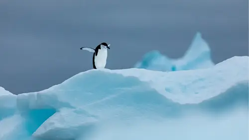
ther is the color itself that warm sunset light without that light. If we took if we strip the color out and just had this image in black and white, I believe we'd be missing a very big storytelling part uh, of the image that being the warmth, the summer kind of that end of the day glo that everybody can hopefully remember from being a kid and playing on the beach or whatever in black and white, that part will be gone. I feel like you have a less compelling image. It wouldn't be a strong, it wouldn't create such a connection to the viewer or of like a memory of the time that they may have experienced. So in this situation, the use of color creates a stronger minimalist photo here again, is an abstract sunrise photo from the arctic from nunavut's and minimalism works really well sometimes for abstraction. And I find that most of the time with these more abstract intentional movement sort of shots, colour works better than black and white. A lot of the time I want this image to be clean, I want it to be simple. I think it could work well hanging on a wall because it just gives the impression of sunrise. It gives the impression of that colour that popped that glow that moment just before the day starts. And uh if this was black and white, I feel like you'd be missing some of that feeling of that impression. So again, here, color seems to in my mind create a stronger image than if it was in black and white. So here we have a detailed shot zoomed in telephoto shot of the sand dunes in the Gobi desert. This is a location known as the singing sand dunes or Hunger and L's in the south, southern part of the Gobi desert in Mongolia. Amazing, beautiful location. It's one of my favorite places in the world to shoot. You could spend days and days and days out there just getting lost, literally getting lost but hopefully not too lost in these dunes shooting anytime of the day or night. But there is something to be said for shooting when the light gets a little bit lower and you get these beautiful, like some of the cleanest bluest, clearest skies and you get these really nice angles and shadows. And if you're using a telephoto, you can focus in on a lot of these interesting patterns and shapes. And this whole image in my mind is about that these interesting patterns shapes the play of light and shadow. The warmth of the dunes and that beautiful clean blue sky also that blue just complements the warm tones of the sand really well. So if you're gonna be using color to create minimalist images, any image really. But in particular minimalism because there's not, you're not relying so much on some of the other compositional elements using complementary colors will really help elevate the image. And I'm going to show you this image in black and white and you can see just how it sort of lacks that same pop that uh, that glow that feeling as it did when it was in color. And so again here complementary colors uh really help elevate them. This is a really simple image from the north. It's just a shipping container on the beach, a raven flying overhead, uh, a bit of a snowstorm in black and white. I've tried it. The conversion actually works. It's not so bad, but there's just something really nice about that simple single papa read right in the middle. I feel like it just instantly draws us in and I don't know, I have a soft spot for the shipping containers. I love how colorful they are. I love how they kind of dot the landscape up there and they just really pop against that bright white background. Like I said, it actually does work in black and white and I'd like it in black and white as well. I just prefer in color and that's something to keep in mind. It's not always about, it has to be in color because color is better or it has to be in black and white is black and whites better. There's so much room for like personal preference on that scale and it'll slide image the image and it might, you know, maybe tomorrow like black and white more. But for right now in my mind, color really helps. And the popping of color red on white in particular looks really good. Or yellow or blue. And here's just another simple image of a prairie landscape. We had some nice snow that fell and then it's sort of like ice fog rolled in and it was sunset slash moonrise. And again, I'm just using complementary colors. I'm kind of playing with that abstraction a little bit. I'm really letting the frost and the fog soften all of the texture and details so that it looks cleaner, gives the eye, you know, a chance to wander around and kind of get lost in this scene. And the color is important here because it was important to me to highlight the time of day. And if I took the color out, it was black and white. You know, when the moon is in the sky, maybe it looks like the middle of the night, which isn't what I was going for. I was wanting to portray that transition from daytime to nighttime. Next to images are a little penguin in Antarctica, a little gentoo penguin. This guy is just out looking for, you know, maybe a good time. I don't know, but I love shooting penguins in Antarctica and isolating them against clean back backdrops. The image in black and white works really well too. I think it's pretty strong actually, I think is a print framed and matted and hanging on the wall. It's gonna look good. It looks good in color. I don't know. To be honest, I don't really know if I prefer one over the other in this situation. Kind of really like how the orange pops on his beak and I like the contrast of the orange and the blue and the black and the white and I think that that combination just uh makes it kind of playful and fun and iconic. Black and white looks really classic though and I'm a sucker for black and white shots of penguins. Here's a photo of my friend uh Erik Boomer and he's kite skiing in the north, eric's professional adventure athlete and uh he does some of the craziest and wildest trips and adventures like on this planet and here he is just like plowing through a big bank of powdery snow. He's using a kite to propel him. He's on skis. The kite is at a frame, it's up into the right corner there, well at a frame, 20 m out and he's wearing a red jacket. So in this situation, I'll show you the black and white. If I hadn't told you what you were looking at, I don't know that it would be that obvious, granted, it's not super obvious in the color either, but it is pretty obvious where I want you to look. You can see that papa read and it really in this situation helps push eric out of the snow, it brings them to the forefront, it brings them to our attention and then our eyes starts to like wander around the details of the snow against those goggles. You start seeing his mitts, you look at the lines going at a frame. The black and white just kind of looks flat, somewhat an interesting and I don't know if I would spend a lot of time investigating this photo to figure out what it is. I'm looking at another thing to keep in mind with the colour version of this. If I was doing this as part of a commercial campaign or advertising campaign, you know, you might, and they were looking for that minimalist style but still wanted to sell the color of their jacket or their gloves or their goggles or whatever it happened to be. You'd want to include that over black and white. And the final thing I want to talk about is this little trip I took in interview to a place called Apex Beach outside of Iqaluit. I went down there looking for a red boat which has been on the beach for years and years and years. And it's a, it's a pretty iconic spot and I wanted to try to capture that boat and how the beautiful red pops against the white landscape. And so I'm gonna go through that little adventure with you guys. I've got a whole little video of my trip down there, so I hope you enjoy that. And I'll talk about the image and I'll talk about why I prefer to color over black and white, so that's coming up next. Okay. Mhm.
Ratings and Reviews
user-3b9448
This is a brilliant course which I can highly recommend. I have done some Minimalist photography but still found the lessons very interesting. I enjoyed the discussion on colour vs. B&W. My favourite part was to learn how long it takes to plan a shoot, wait for the right conditions, even change the subject if the initial idea doesn't work and see the other images taken during the shoot before (or after) the final image. The presentation is excellent - love the cat :-).
Deb Williams
Great class, good length and easy to follow along. A fantastic way to challenge yourself to look at composition differently and a course full of useful tips to try out.
Bradley Wari
Great Job! Great course! loved the bloopers, had a few laughs. I really enjoyed how he showed a little of how he worked the scene of a few of his images. showing multiple images and how he got to THE shot.