Lesson Info
3. The Power of Negative Space
Lessons
Introduction
01:41 2Minimalism - A Few Words to Start
01:31 3The Power of Negative Space
12:08 4Learn to See Visual Clutter
08:40 5Isolating Your Anchor
05:47 6Composing for Better Minimalist Photographs
09:27 7Choosing Gear to Create Minimalist Photographs
13:16 8Black and White the Classic Approach
08:41Working With Color
09:06 10Location Session - Apex Beach
11:50 11Apex Beach - Wrap Up
02:24 12Timing and Weather
08:24 13Common Traps and How to Avoid Them
10:29 14Post-Processing - When I Use it and Why?
17:41 15Print Your Work and Harness the Power of Minimalism
02:13 16Three Easy Exercises to Kick Start Your Journey into Minimalism
02:55 17Location Session - Sled Dog Portrait
04:05 18Sled Dog Portrait Image Review
07:34 19Sled Dog Portrait Key Takeaway
03:33 20Location Session - Arctic Drone Flight
05:14 21Arctic Drone Flight Image Review
06:36 22Arctic Drone Flight Key Takeaways
03:31 23Snowkiting In the Canadian Arctic - Location Session
06:07 24Snowkiting Image Review
08:32 25Snowkiting Key Takeaways
02:52 26Summary
03:08 27Wrap-up
01:18Lesson Info
The Power of Negative Space
Oh, one of the most important concepts and minimalism is the idea of negative space. If we can learn to see the space between our subjects and the balance between the subject and that space, we can create stronger cleaner images. Negative space can be smooth or colored, it can be textured. It can even contain some details were surrounded by such open blank canvases every day, clear skies, fog, snowy fields and unadorned wall. These are all examples of negative space. It's the space that lets your subject breathe and doesn't compete for attention. It gives context and scale negative space. Very simply is the space that surrounds the main element of interest in your photograph. Positive space by default then becomes the main element of interest or your subject. Here's an image of pack ice from Antarctica. If I asked you to specifically Point out or identify one single piece of ice in this whole photograph, you probably have a hard time recognizing it. Compare that to the second image whe...
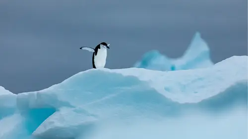
re we've incorporated the idea of negative space. Now, if I asked you to identify three pieces of ice in the top right corner, it's very, very simple, very easy and you can probably do it relatively quickly. Every image is a balance of positive and negative space. And using that relationship, we can leverage the power of negative space to help us identify and easily recognize the subject that you want the viewers to pay attention to. This First images from a camping trip that myself and some friends took a couple years ago up to the Greenland ice sheet and we stayed up there for a few days and we're wandering around looking for frames, looking for locations to shoot. And this is a really nice shot that sort of depicts that moment or that trip Stephen here in the foreground paul further off in the distance, with the footpath going over all the nice textured snowfields you have like lovely blue sky day with a little bit of cloud texture. There's a lot of interesting detailed light shadow. There's a lot going on in this image for what it is. Compare this to the second image of just paul on the horizon in a clean, clean, stripped down version of a person walking on the Greenland ice sheet. I think the second image, it's much easier to identify the person in the distance and there scale the relative position in the world and how small they really are. And there's a lot of room for our eyes to kind of wander around and take the scene in and feel the weight of this big space. The second images taken from a whale watching trip off the coast of Newfoundland and oftentimes Junior out there looking for whales. You're also going to go to a ton of seabirds as well. And these are the north atlantic puffins uh that were so famous for, and I love photographing these little guys, but it can be hard sometimes to isolate them when they're this close to the water from the rest of the flock. So using negative space, it's much, much easier to recognize right away what I want you to see. And that is that puff and you can't not see the puffin in this virtual sea of negative space. Again, an iceberg from Antarctica. This is a sunset. It was a beautiful moment. We were out for hours that night taking photos of whales and basking seals and beautiful icebergs. Just gorgeous light. And it is a really nice, photographic, I like this image a lot and I think it tells a really nice story about Antarctica. But if I wanted just to tell the story of an iceberg on the ocean and that's it. I feel like this is a much stronger image. This first image while the iceberg is up front and center, you do get somewhat distracted by the highlights on the mountains in the distance and the reflection in the foreground on the ocean. Compared to the second image where the iceberg is 100% in the middle of the frame and there's basically nothing else distracting your eye from seeing. That negative space is also really great for exploring the balance of space between subjects. So if you have multiple subjects in your frame and you know, you have more than one thing, you can still create a minimalist photograph as long as you're really aware of. And keeping an eye on the space between those multiple subjects. Here is an image I took from baker lake in Nunavut's up in the arctic in Canada. It's basically just some kids playing pond hockey. And I saw this was I was photographing some other things on the beach that day and I spent a a couple hours actually watching them on and off to wait for a moment when I could get this shot where the space between all my subjects was clean, so they didn't have players overlapping one another. You know, the kids who are getting ready and putting their skates on aren't on top of each other. There's really good separation and measured sort of distance between which I quite like. So sometimes it's a matter of patience and waiting for your moment. But it is really important to wait for those key moments when that space opens up, if not then creating them. So I'm talking a lot about the balance of positive and negative space. So what do I mean? What what is this balance all about? I've got a few images here that I'd like to go through the first one of this beautiful chinstrap penguin in Antarctica. And this image is a really clear example of what mostly positive space in your photograph would look like most of the real estate. And this shot is taken up by the subject. The positive space. You can see from these little graphics that I've inserted that all of this is positive space. This is what I want you to see. This is where I want the I to go. These little elements represent the negative space, obviously more positive than negative. Here's an example of what I consider to be a more balanced positive to negative relationship. It may not be 5050, but it's somewhere in the middle positive, the penguin negative everything else nice and clean, but still not really exaggerated. Now, this final images, a more exaggerated version of that balance here. We have a positive space element with the penguin in the foreground and we have a positive space element with the mountain peak in the distance. But everything else in this image is basically negative space. It's not distracting, it's not really taking your eye. And we have a really nice clean platform to showcase our penguin with the sort of repeated pattern, triangle peak in the back there. And I feel like the weight of this whole thing works really well because we've allowed so much negative space and so much room for the image to breathe. And there's no magic formula for this relationship. This scenario, but a good place to start if you're interested in trying it is maybe a balance of twice as much negative to positive. Here's this example from nunavut in the arctic, in Canada. It's a really simple shot I got low on the sea ice, there was like a decent gust coming through. So a lot of the powder snow was blowing up, it was backlit by low light, it was sunrise. And I really, I use a telephoto lens and I really isolated, zoned in on this simple slice of light. And you can see here that if I categorize that slice of light as a positive space and everything else is negative. It's not like quite a 2 to 1 relationship, but it's pretty close to twice as much negative as there is positive, especially if you take in the uh powdered snow that's reflecting light in the top half. Here's another example of that from whale watching in Newfoundland again, uh it's a puffin who's kind of flying into this spray of a whale whose breaching uh and blowing and you can see that most of this image is negative space. And then there's this really interesting dynamic of positive space with that being the black outline of the puffin uh and also the white mist of the blow from the whale. So you can sometimes have positive and negative space that are different colors or different light values. It doesn't have to be negative spaces black, positive spaces, white or vice versa. You can have both in the same image, But this image is another example of that 2-1 relationship that I was talking about. It's also fun to break all these rules and just like put a little bit of positive space in a massive amount of negative space and just see what kind of drama or attention or energy or emotion you can evoke with that. Here's an example of that. Um it's an iceberg off the coast of Newfoundland. Again, just this tiny, tiny little cap white cap kind of floating out there in a wall of fog. And I wanted to include a ton of negative space above it because I wanted the iceberg to look small in comparison to its surroundings. I wanted to play with this concept because icebergs in general, I just thought it was being big and massive and I thought it would be fun to see what it would be like to make it feel small. And that brings me to my next point when you're using negative space, you can really harness the power of visual masses, the subject. So sometimes we've been talking about positive space as the subject, but sometimes the negative space becomes the subject as well, or one of the subjects. It's just as important. Often in telling the story with your image as the positive space or the subject is. Here's an example taken at Cape Spear, the most easterly point in north America. It's the first place to see the sunrise on the continent. And this is the historic lighthouse on the Cape lit up with a starry, beautiful, clean, starry night. And I thought that this next image really showcases the visual mass. Here we have a lot of negative space which is the sky and very little positive space which is this lighthouse in the bottom, right in the middle there. And the more I look at this image, the more I wonder what's in the sky, the more I wonder about the stars, the more my eye drifts up there. And so it's very clear when you first look at it that the positive space, the lighthouse is the prime subject. But slowly, the more you look at it, the more the visual mass. And that negative space also becomes a very important storytelling piece also becomes a subject in this image. We are conditioned as humans to recognize importance in the human shape and form. So any time you put a person in a photograph, whether they're close to the frame, like it's a portrait or they're tiny in the distance. Like this one here, we instantly give it more value and more weight than almost anything else in that composition. So using the human element is a really great way to show scale, but it's also a great way to play with that balance of positive and negative space. And use like a tiny subject that has like an adequate amount of weight to balance out all of the negative space. So at first glance, a lot of this might seem like we're taking away from the importance of a subject by making them so small. So it's kind of like an ink stain on a shirt. Often the impact of the subject, it grows when it becomes smaller. And here's a final example of that. Here's a whale humpback whale uh coming up in Antarctica and it's very obvious and clear at first glance that it's uh huh that that it's a whale and that I want you to look at this whale in its environment. But then the longer I look at it, the less I'm kind of drawn to it, I guess compare that to the second image of a humpback whale who's just showing one finn, one white thin and a solitary black ocean, and you've got the mountain that kind of draws your eye in first in the background there it's a very strong element. But then the more time you spend with this image the more my eyes drawn down to the whale again. And I start wondering about that whale. I start wondering about the space, how big it is, how isolated it looks like, what the story of this place is. It just looks so interesting to me. And for me this second image, the idea of this tiny subject which on first glance doesn't seem as important over time grows and that impact grows as well. This second image is taken from Newfoundland on a whale watching trip. You go out and uh you do the hokey pokey. This first image is from a camping trip that some friends of mine took. Uh This first image is from a camping trip that some friends of mine uh Mhm. Yeah that myself and some friends took. This first image is from a camping trip. Yeah.
Ratings and Reviews
user-3b9448
This is a brilliant course which I can highly recommend. I have done some Minimalist photography but still found the lessons very interesting. I enjoyed the discussion on colour vs. B&W. My favourite part was to learn how long it takes to plan a shoot, wait for the right conditions, even change the subject if the initial idea doesn't work and see the other images taken during the shoot before (or after) the final image. The presentation is excellent - love the cat :-).
Deb Williams
Great class, good length and easy to follow along. A fantastic way to challenge yourself to look at composition differently and a course full of useful tips to try out.
Bradley Wari
Great Job! Great course! loved the bloopers, had a few laughs. I really enjoyed how he showed a little of how he worked the scene of a few of his images. showing multiple images and how he got to THE shot.