Lessons
Lesson Info
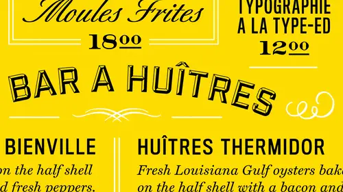
Six Types of Grids
The next step you want to take is to plan the structure planning in the approach of your layout is usually one of the thea most important things that I've always been taught in graphic design, and one of those is the format you want to see how the reader is going toe interact with that content and ah, we have u s and european alliance here as faras formats, so menus they're smaller something news or larger, depending on the restaurant, what they're offering very first thing from their has to organize that content in the structure that you build on is a grid. So before study the type you want to build a uniform and horizontal and vertical rhythm with the grid, okay, the great of a page should be heavily influenced by the content. The purpose of the greatest to organize is to see how the reader is going to see the content in what order. Okay, here is some great options that I usually have looked at in the past, and you want to choose a grid that's going to be conducive of what content an...
d environment it's going to be in. So, for instance, number four there is higher our goal that might be for website design, because everything is broken up in a horizontal kind of manner, um I usually try to use modular grids for larger formats like posters like twenty four by thirty six inches because you're dealing with a lot of real estate that you have to keep, um the content in the visuals in harmony with each other um when you get into multiple grids, that depends on the format itself. For instance, if you have a six by nine layout, which is small, you're not going to usually have more than a couple of columns because you're you're ah measure withs of your columns where your text goes is going to be very narrow, ok? And then you have a son like asymmetrical or it's more like a textbook format where you're gonna have pullouts, you know, on either side of the main content. Once the page side is established, sketch out how the elements will fit on the page. I usually start try to start with a grid when I'm sketching you assume you do that later. Um, but I always try to place the content first, and then I work around the visuals of how those visuals go with that content that would give me another standing of how much imagery is needed and how it's tied to that content, so if I know a visual is needed to to make something jump out on the menu, then uh, you know, I'll put it with you know that content on in the layout there's an example of what I'm talking about side how the structure we're late to the content vice versa, right? So if I'm usually dealing with normal size in half by eleven page I typically gee have ah mentality of twelve columns to start with because aiken interchange those to be either two, three or four columns quickly term also you want to use wide spaces determines basis of rest the negative space so our step three is to set up a flavorful system and when I'm talking about here is hierarchy and I usually start with a sizing chart like this because I learned in the past that no matter what we're doing and design, it always comes down these four areas and how you build a typographic system for the content and you always start with the body copy, which is typically in the range of nine to twelve let's say for service and then subheds air somewhere in oven overlap of nine to eighteen let's say and then headlines air all the larger types of course and then legal and body copy I mean legal and captions are down here under you know below the nine point range from sixty eight let's say when you lay out your content, you're always going to start with body copy first because you're talking about copy fitting at that point so you want to build your system up from there and since I'm a numbers guy you know I start with that range and since the environment that I'm usually working with for print isn't points in pikus I still worked that way uh the points in pakistan based on common denominator of three and so I always try to use that number system to make sure that all my content is in harmony with each other through the numbers okay then you build your subheds on top of that and this is where you start building your emphasis system to get the eye to go to certain spots on the page where you want to lead the reader okay and then headlines on top of that largest type on the page have plenty of white space around I'm usually in the upper third of the of the page so as a demonstration for that if we have straight content here on the left and step one it is just comes in as a default if you're working in in design it comes in with just you know, twelve point minion let's say and here it is and then you start to build from there so if we were referring to that last slide you know I'm going to start with the dish itself tuscan kale salad and try to emphasize that just with wait to start with okay and those air called for in this instance runnin subjects and then on top of that, I want to know what part of the menu I'm in whether it's, elder desserts or entrees so I want to try to emphasize that so now put a sand surf with that for the subjects step four I'll go up to the headers in try another version of that sand surf in this case it's a gothic and make it all calf but very compressed eso just adds another look or level a third level and then after that all use captions and those air usually a few points pointer to smaller than the body content may be emphasizing away like a metallic and it's emphasizes even more with as you can see what this one spaces in between the main content and then from there last I always try to add color last because it's an added bonus on the separation of the content and get to these two items to jump forward even further. Okay, so here it is all on one side and one in a nutshell. I always start here with the body copy and work my way to the top and then come back around. Usually I've been working that way for twenty years and it's worked out so far another kind of ah way to look at it for in design a lot of people work differently within design, but I always try to start with it the traditional way of working from character styles up two paragraph styles and get because here you're tryingto fit the content and just make your basic decisions there. And then paragraph styles. Or more for all the content together on the page and adding a little bit more emphasis, like rules and things like that or bullets. Ok, so why you style shoots? This is one of those things and in design that you really want to use, because it saves you a lot of time. And you have repeated actions in the software. So these style shoots, whether character, paragraph, save you time and, uh, by using them, obviously changed the foreman. If your entire document, by changing your style, definitions, and when I get into laying an example out here, I'll show you what I mean by that.
Class Materials
Bonus Materials with Purchase
Ratings and Reviews
a Creativelive Student
InDesign is a program I use on occasion so this class has been great for a quick refresher on making it work for me. He keeps it clear and concise so it is easy to follow. Even if you are using a newer version of InDesign this class will help you.