Lessons
Lesson Info
Analyzing Menus
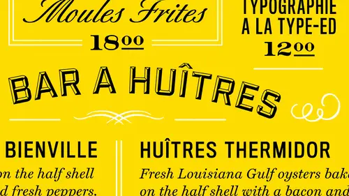
So what I'd like to do next is, um, big curl up here and we'll talk about some menus on the wall here just to show you what's happening out there right now and, uh just explain to her about what we're looking at in some of these menus there's a lot of different kinds here, so um for many, many different kinds of restaurants here we have something where you could see the grid I was talking about structure first when I'm looking at menus like this so um you could see some have pretty prominent grids and there may be some that don't they're more kind of an editorial style, I would say where it's got multiple grids within the layoff and then you have the type itself where what I'm looking for usually in a good menu is is, uh, where I can find what I need very quickly okay, so in this case, I know I'm talking about maybe meets here vegetables over here I can see them really because they're really big headers and same with this one the typeface choice it is really kind of nice where pulls fo...
rward think about this this menu here is it's very beautiful but its greatest maybe not as consistent as some of the others that it's got two scripts as well, which might be kind of difficult to read it's very elegant, though and that's another thing you have to factor in and in many design is what kind of food is it? What is the chef after? Um you know what? What what do we want a place as an emphasis you also want toe tap the discussion of talking about, you know, what do we want to sell? Do we want to put certain menu items closer to the top where the viewer season right away to sell them easier? Okay or bring bring out of it emphasis, right? So these air kind of pulled out and have their own borders as well as these this kind of information. So corolla, when you look at all these, what do you what do you see first after I've kind of mentioned all that, um, so the first thing I see is the most attractive to this particular one, and I'm thinking I'm not look, I'm not reading the content, but I'm thinking whatever restaurant are these based on the face and based on the layout, so because this one has, um, incorporated some artwork, and because of the ratio of the negative space, I find it that it's a more upscale place, a swell a cz, this one of the most attractive to them, just out of curiosity because they just look like they're a little more upscale truth of the choices of the typeface and just a choice of the layout and just having a correlation in my mind with you know what I think about restaurants versus what the menu look, frank does a format making a difference to you because this is a like a landscape in this is a portrait um this one seemed just more interesting to look at where as that looks really for more and because of the formality and because of the simplicity of it, it just looks like it would be an upscale right place where these two just when I look at them, I think I'm going to a comfortable restaurant because of the former ended choice so that my face is territory, even the typeface in the format wolf kind of give you an idea of, um maybe how expensive it's going to be for you? Yeah, yeah, and if I was to, like, perhaps pull this up online, I would just kind of get an idea of how much I'm going to spend or what I would be wearing because these field more leads lay back and this to fill more formal and you get that feeling mostly from just the whether it's, horizontal or vertical or is it's coming straight from the type is a lot of these don't have very many visuals at all, with the exception of used to somehow um, in my mind, I attribute vertical as more formal yet because here you just have a lot of things going on. And because of the choice of the imagery and just the amount of content in prison so formal at all, what has somehow negative space is translating in my head as if, like, more upscale. Was that right? Okay, great that's, a great analogy. Okay, great, thanks. Strong appreciate.
Class Materials
Bonus Materials with Purchase
Ratings and Reviews
a Creativelive Student
InDesign is a program I use on occasion so this class has been great for a quick refresher on making it work for me. He keeps it clear and concise so it is easy to follow. Even if you are using a newer version of InDesign this class will help you.