Lessons
Class Introduction
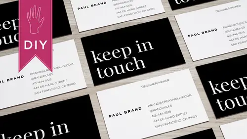
03:42 2What Information to Include on your Business Card
01:56 3Size & Orientation of a Business Card
03:31 4Choosing a Hierarchy & Layout for your Business Card
09:10 5Choosing & Using Fonts for your Business Card
09:36 6Color Combinations on a Business Card
06:47 7Logos & Images on a Business Card
06:53 8Printing & Paper Options for a Business Card
03:54Lesson Info
Color Combinations on a Business Card
So we've been talking about black and white up to now color can bring your design toe life choose colors though that align with your message and your content and don't use too many colors. I remember back in the day if you had a business card with a lot of colors on it, it meant that you spent a lot of money on the card, but today, with digital printing that's not the case you don't have to be careful of is it one color to color for color? But a lot of times if you take that restriction away from people, they can just go wild with the colors so let's start off by looking at some good color combinations so there's, black and white you can't go wrong with that a lot of times with a white background, what I'll do is I'll adjusted to be a little bit off white, so it looks a little bit more finished I sort of like that I also like really bright colors, so a lot of the times I'll just use a super bright color and white and that works for me I would probably do the pink one and then the cream...
in the brown it looks a little bit like a she might work in a health food store, so I'm not sure is a designer if I'd want to use that color combination the one in the upper right I think works really well with the teal in the yellow and that's also a great example of using color to emphasize an element so here yellow helps her name pop let me show you some bad color choices, so any time I see a gray palette, it sort of reminds me of my computer, my the interface and the windows and the chrome so I would stay away from that it's just if you can choose a color white she's gray right red and blue don't look good together, they sort of vibrate and yellow with white text usually doesn't read well, so you don't want to choose something you don't want to choose colors that are going to run the risk of being not eligible and then that peachy weird green with a green it's just sort of it looks like it's sort of sickly, so I would, you know, work with color in a smart way if you feel like you're not very good at choosing colors, you know, read a little bit about color theory and using the color wheel to decide on pallets that's super helpful some people are just really good at, you know, combining color or just stick to black and white and maybe you put color on the backside, so when you're working with color on a business card you want to make sure that it seemed like a so that is for print versus rgb which is the format for webb if you want an exact color, you're going to want to use a color matching system so a lot of people that I know work on the computer and then they printed out on their office printer and what they see on paper looks very different from what they see on the monitor and no matter what you d'oh, you're not going to be able to make those two things look the same it's just the technology it's the device it's part of its optical so imagine if you have a digital file and then you're sending it to get printed from an online vendor and they're sending you a digital proof and you're printing it out on your office computer there's no way to get that color on your monitor toe look exactly like the printed card so you just have to lower your expectations when it comes to color unless color is crucial to what you're doing. So if your brand color is coca cola red, you should have coca cola read on your business card not some weird to mate over read so what I used to ensure accuracy and this is the industry standard isa pantone's watch book and I keep this in a case this isn't the case for it but I don't want them to fade right because you want the colors in your pantone guide toe always remain accurate so some people put him in a plastic bag. I just happen to have this this is actually like fifteen years old, but it still works and it shows me different colors, right? And it gives me the number I can match that to what I see in the pantone palette in whatever software program I'm in. You can also see that two second half of the book has paper with a matte finish and codes for those colors because depending on the paper it absorbs think differently and we'll talk more about that later. This is a very, very old pantone book it's a great investment because like I said, if your brand colors red and your business card does not match your other collateral or the stuff in your office it's going to look unprofessional so color checklist let's have an example of a card from one of my colleagues. I love her use of color, so you've got this nice pop of orange and then for the other information instead of black she's got it at a dark gray so it looks like about an eighty percent black she's using a font called archer and then combining it with avenir so that's a slab sarah if combined with the sand saref, I think the size look really looks really nice and again, just that pop of color. And if you knew her, I think that he would probably say, like, that card totally looks like christine. And then what she did with the back is clever, so it ties into the front. It looks friendly, you know, it's just sort of like, hi, hello, great time with the backside carries over the typeface, a good example of a nice, clean, simple card. And I would totally hold on to this and keep it as an example of good design.
Class Materials
Bonus Materials with Purchase
Ratings and Reviews
a Creativelive Student
Hey Lara! I just checked out your course on CL, How to Design Business Cards, and absolutely loved it! Everything about the course was awesome from content, information, presentation, and your personality. Would you please do more courses? You have a wealth on knowledge, I can tell, and with your easy-going presentation it is a great combo. I would love you to do a course on InDesign or simply on design with various projects from business cards, posters, brochures, etc. Anyway, thank you for that course. You rock! Thank you for your time.
a Creativelive Student
I'm designing my first business card and Lara took it step by step so clearly that I've got something I can be proud of right out of the gate. She showed great strategies to make them professional and attractive and bonus ideas about how to get people to keep them around for reference. That's pure genius!
Sara C. Madsen
Great, little course. Inspiring.