Lesson Info
11. Business Card Demo: For Play
Lessons
Class Introduction
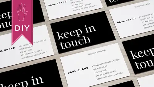
03:42 2What Information to Include on your Business Card
01:56 3Size & Orientation of a Business Card
03:31 4Choosing a Hierarchy & Layout for your Business Card
09:10 5Choosing & Using Fonts for your Business Card
09:36 6Color Combinations on a Business Card
06:47 7Logos & Images on a Business Card
06:53 8Printing & Paper Options for a Business Card
03:54Lesson Info
Business Card Demo: For Play
So now I'm going to design a second business card this will be for play for and we're going to do it a portrait instead of landscape so I'm going to open the mood template that I downloaded for in design and you can see that this is a bit different because the orientation of the card is now vertical same guidelines same safe area that's the term area and then the pink is the bleed area so what I'm going to do is set up a new I actually I have two options I can set up a new campus and work within that or work within the mood temple it I'm going to work within the mood template so I'll go to the pages palate I know that I want multiple pages for this card because it's gonna have backs so I'm going to make copies and so now I've got the front of my card and I'll create four versions of the back so the purpose of this card will be foreplay and a copy and paste the information out of my text edit document so aaron was the chief strategist at global widgets and her side hustle is that she ma...
kes doughnuts so this card will be for her to get started with her doughnut business so I want to work from the your design layer and I'll turn off the guidelines layer select the text tool and paste the information so I don't need to see these characters right now while I'm designing so I'm going to say hide hidden characters and there's my information so there's less information on this card because she doesn't have an address for her doughnut making business yet she does have a gmail address that she's using for that and she's a huge twitter person so she's including her twitter handle on this card right now it's set in the default typeface which is a sarah of style and I want this card to be super friendly so I have a typeface in mind and it's called avenir it comes with the creative suite so you should have it too if you're using in design and it's got this nice friendly flavor it also comes in a number of weights so anywhere from light to heavy I'm going to actually make this light and then I'm going to bump the point size down to ten because twelve is really big I'm going to increase the leading since we have enough room on the card and we want to make the lines of text breathe let's increase it to fourteen so the fun thing about the vertical cards is there a little bit different and if the information that the lines of the information aren't too long they can fit nicely within that space I'm actually going to center this information and yeah, I like the way this looks definitely need more letting when I increased it to eighteen and see how that looks okay and I want to make it all lower case because again I'm going for a very friendly feeling into me when something set in all lower case it feels really accessible so I like the way that looks again I'm gonna separate her contact information from her name and her occupation and all right so I think I'm gonna make all of the text of color and when I think of donuts I think of hot pink so I'm gonna actually she was just a hot pink and I'm gonna bowled her name so that it stands out a bit more and again avenir has a heavy version so let's see how much contrast that's creates ok I like the way this is looking I don't like the phone number for matt so I'm going to put dots in between instead of the parentheses and since there isn't a lot of text I'm gonna have it feel even more airy by increasing the tracking which is the space between the letters so just ease small little touches khun really make a difference what's it gonna put her number on the bottom because I like the way that shape feels it's sort of like the hole in a doughnut in a weird way I want to add a little bit more visual interest so I think what I'll do is I'll just create a line with a stroke in the same color we'll see how that looks ok so I always want everything to be perfectly aligned so you can do that through the line panel I'm going to select the text box and the stroke I'm going to tell them to align to each other and then I'm also going to ask to align to the page all right so everything should be perfectly aligned looks pretty good to me I actually feel like I want to add you know maybe I'll just move it all down a little sort of perfectly centered all right so let's just check the artwork guidelines it looks good to me so what I'll do now is oh they dragged that up to the front so for the back I think what I want to do is show photos of errands doughnuts so no draw an image box I've got the photos on my desktop saved his j pegs and all right so I'm gonna start with an apple fritter okay and I'm gonna have the object fit the content proportionally so you can see that the image is actually something that is formatted to really uses a banner on a web site perhaps so what I'm gonna do is I'm gonna have it fit the frame proportionally zoom out and I just sort of want to capture the area where the apple fritter is ok that looks pretty amazing I'm going to place another photo and this time ah, I like that I'm going to enlarge it and these photos are very high res hi, resolution. So I don't have to worry about these not looking good because I made them larger. Ok, I like that. And so you khun place images two ways you can size them before you place them or you concise thumann in design. This is a nice one. Okay, so he's got these wonderful images of doughnuts going to do one more? I actually like the ones that don't have people in them and it seems to just give the hint of a have a donut so you know what it is? I like that. Okay, I'm actually going to get rid of these u k like those, so if I'm printing with move, one of the really cool things is I can do up to fifty backs of cars with one side remaining constant, so the side with the information will be the constant, but they'll be fifty versions of the back, so I could have every kind of donut imaginable and then the front of the card would always be the information. Okay, so this is my mood template, so I clicked this I can see the safe zone, the cutting edge in the bleed, right? This is actually this box is my text box, so I'm good this is the area that I want to make sure my text doesn't go over, so now what I'm going to do is I'm gonna export my cards as play front said it to print and then used the pre set that I used earlier, that move specifies, and I'm going to ask it to just export the front of the car and everything spelled correctly nice. So now I'll just export oh, each of the back of the cards and again I can do is many of those as I want. Nice, I like that, so I'll do one more back and call this chocolate uploading page three and excellent, so these look really good, I'll upload the front and all of my backs to move and then wait for the printed proof or the web proof, and I'll then printed out and remember, you always want to print out your cards because you we're looking at them on the screen while you're designing, and you can't really tell how the font size works and how everything really works in the context of a small printed area unless you do the printing out of the card, so always print yourself out always proof read follow the guidelines, and you'll have an amazing business card, whether it's for work or for play, thanks.
Class Materials
Bonus Materials with Purchase
Ratings and Reviews
a Creativelive Student
Hey Lara! I just checked out your course on CL, How to Design Business Cards, and absolutely loved it! Everything about the course was awesome from content, information, presentation, and your personality. Would you please do more courses? You have a wealth on knowledge, I can tell, and with your easy-going presentation it is a great combo. I would love you to do a course on InDesign or simply on design with various projects from business cards, posters, brochures, etc. Anyway, thank you for that course. You rock! Thank you for your time.
a Creativelive Student
I'm designing my first business card and Lara took it step by step so clearly that I've got something I can be proud of right out of the gate. She showed great strategies to make them professional and attractive and bonus ideas about how to get people to keep them around for reference. That's pure genius!
Sara C. Madsen
Great, little course. Inspiring.