Using Color Theory to Affect Mood with Effects
Lesson 6 from: Color Theory for PhotographersBlake Rudis
Using Color Theory to Affect Mood with Effects
Lesson 6 from: Color Theory for PhotographersBlake Rudis
Lesson Info
6. Using Color Theory to Affect Mood with Effects
Lessons
Class Introduction
04:34 2Introduction and Importance of Color Theory
23:32 3Basic Color Theory Adjustments in ACR and Lightroom
09:09 4Manipulating Color Properties in Photoshop
08:48 5Color Theory and the Curves Adjustment Layer
09:15 6Using Color Theory to Affect Mood with Effects
16:02 7Advanced Selections for Color Theory
10:28Lesson Info
Using Color Theory to Affect Mood with Effects
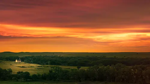
Color theory and mood and more importantly color grading. This is a form of color grading, because we're taking the colors in the image and we're manipulating to a point that they no longer were. You probably see a lot of movies that look like this. And really good high quality productions will usually pay very close attention to the colors in their movies, especially at very particular times, when someone's somber or crying, notice how things are really blue, even if it's like a sunlit day. You would think it doesn't look right. It's in broad daylight, it's not gonna be blue. But when you see it, you start to get that mood and you start to get that feel. So we would be amiss as photographer artists to get nice technical perfection as far as tone is concerned, get nice technical perfection as far as our colors are concerned, and then to just say, "Okay, we're done. "It looks exactly like I want it to look, let's go," because you're missing that one thing that I said it was, the third t...
hing I said is very important to color theory as a photographer, and that's your artistic expression. How do you express yourself? How you get your point across, and this could separate the mice from the men. In one of my old websites, I did something called an HDR concert and these HDR concerts where I would give, I don't wanna call it a competition, I felt like a concert was like a symphony, so everyone brought their own instrument to it with the (mumbles) that they were doing. So what I would do is I would give those HDR brackets to people and this would go all over the world, I mean you'd have people from Germany and Australia and America, believe it or not (chuckles), post processing these images, but because it's HDR, the cool thing about HDR is everyone does it differently. Some people do it really well, some people not so well, but all these images would come back to me, and it didn't matter how the image looked, I would put it up on the web page so that you could see how everyone looks at the exact same brackets differently and creates a completely different image. Everyone, could be 13 to 20 different people that would do this and every one of them would be different. And that happens with color grading. That's your particular style, that's what you bring to the table, and you're probably gonna gravitate to colors that you really enjoy. Like I said, I enjoy those blues, I enjoy those greens. So I'm gonna open up some images here to talk about different ways that we can color grade very effectively. And some of these ways, I wouldn't say they're better than others, but they can do some really interesting things really quickly. And the three that I'm gonna talk about are the solid color fill, the gradient map, and the gradient itself. Now, the solid color fill, you're probably thinking, why would I ever go up to this adjustment layer and fill my image with red? What the heck, Blake (chuckles)? Why are we doing this today? Well, the thing is, we have other ways that we can modify these things, there's a lot of math that happens in Photoshop and there's these things called blend modes, if you're familiar with blend modes, you might have one that's your absolutely favorite and then you might have 12 of them that you're very scared of. Okay, but like I said, experimentation. You know how I got to know blend modes? Not by watching a tutorial. Not by going through them randomly and seeing what they do, but by doing things in that experimentation time, on my color wheel, on my tonal value areas to see what's happening with those blend modes as they apply themselves to the image. So this solid color fill by itself is not good. But when we change that blend mode to something like color, still not good (chuckles). But the concept here is, what does the color blend mode do? All right. The color blend mode, especially with color theory, is critically important because what the color blend mode does is it says, okay, I'm red. But I'm gonna let anything in the tonal range underneath me come through. So what happens here? Shadows get protected, highlights get protected, and the red applies itself to the image, protecting the tonal values and only allowing the red to lay itself over it almost like a transparency of sorts. Still not good, right? I hope you don't like it. But we'll go to opacity, we'll drop that opacity down to something like, let's say, 15%. Now look what happens. We start to change the image to a more warm feeling, it gets more red, obviously, but if we double-click this, what I love about this is once you set that up, once you set up that color on there and you set the opacity, you can now come in here and change this to any color you want. So if you come down here and you grab this little toggle here and move it up, now it's more yellow, now it's more in the greens, now it's moving towards the cyans, now it's moving towards the blues. You can change the whole conversation of the image, you can change the whole mood and feeling that's happening between the viewer and the photograph with one adjustment layer, so the people that tell me, "Oh you know what? "I don't have time for Photoshop." You don't have time to do something like this? How long did that take? I'm teaching you this and it took me a minute and a half. Okay, now if you just came in here and did this and maybe had an action for it, press play. There's your solid color layer. So another blend mode you can use that I'll give you a little tip on here, is it changes from color to soft light, because what soft light's gonna do is it's gonna allow that color to apply itself to the image, but also boost the tonal contrast in the photograph, which is kinda the opposite of what it did with color, cuz color will just apply that color to the image and allow those tones to come through, whereas soft light allows that color to go through but also boost the tonal contrast in the image while it does it and we can see that by bringing this up to something like 100%. So I don't tell you to experiment with things simply by making things at 10% and saying Blake said 10%, 10%'s good for me. No, bring it up to 100%. Break it. Have you ever heard people that say, "Oh, I fractured my arm "and then I went to the doctor and he broke it "and put it in a cast." You're like, why would you break it? Why on earth would you break someone's arm to make it heal back the right way? Well, it does that because if you just had that fracture there then your arm would grow back crooked and you'd look like something out of Lord of the Rings. So what we do here is we really bring things up. We break it. And then we slowly fix it and we slowly repair it. So when you bring this solid color fill up, and we bring something like this little tone chart that I put on the bottom there, you can start to see how this color is affecting the tones in the soft light or how this color is affecting the tones in the color blend mode, and notice how they're very different. There's a protection that's happening with soft light because soft light's interesting especially when you use it on what's called a 50% gray layer and you add white and you add black to it, which is my favorite form of dodging and burning. Because soft light allows whites to get more white, but never get pure white. Blacks, you get pure black but never get pure black. But when you mix a color to that, you're now adding that color contrast in with that tonal contrast as well. So notice that chart at the bottom here. This is a very nice progression of white to black with that color on there when that's set to soft light, but what happens when it's set to color? It's a little bit different. So go in there and experiment with those blend modes. I know the one I'm gonna show you, (mumbles) gonna go ahead and get this to a point that it actually looks pretty good cuz I can't just leave it like that. And boom, and if we change that color, let's go ahead and just double-click here, change that color to something like cyans, different color. The cool thing about this too, specifically with this one is if I wanted to accent the tonal value of her skin, her skin tones, I can actually use this little eye dropper and click on her skin tones and I get the exact color of her skin to make her skin more amplified. Or, if I wanna amplify her red lips, it's now making that red a little bit more red, pushing the other colors back. So you see how we have, this is even a practical way of using it and a technical way of using it rather than exaggeration form of using it. So then, the next one I wanna show is going to be the gradient map. And a gradient map, I love the gradient map. I fell madly in love with the gradient map. My wife is watching this, sorry babe. So the gradient map, the cool thing about the gradient map is, you're looking at a guy, why would you fall in love with something like that? Well the gradient map maps out the tones in your image and attributes the colors that you use with that gradient to those tones. So when we talk about the best black and white conversion you can ever make, I'm gonna tell you right now it's the gradient map. Don't turn something to grayscale. You're throwing away your color information. Don't do it in Lightroom or Adobe Camera Raw, because it throws away the color information when you check that little grayscale thing and then put it into Photoshop, it imports it into grayscale. You lose your red, greens, your blues and all of your colors there that make a black and white image great. And the work flow of course, we'll talk about that. But the cool thing about a gradient map is if we change this gradient to black and white, we're mapping out the tonal values, we're mapping out those tonal values with the color we're applying to it. This one we happen to be using black and white but watch what happens if I come down here and I grab the color wheel and I change, if I drop the saturation here, perfect, we already have, look at that. We dropped the saturation down to make a black and white image, what did we make? We made a gray gray gray gray gray gray gray gray gray gray and gray image. We didn't make a black and white image, we took the grays and we took the highest form of saturation and told it to become 50% gray. Watch the complete difference that happens here with the gradient map. And we change that to black and white. Oh, not green and red, black and white. Look at the difference. We're attributing the proper tonal color to the colors on the color wheel, so the proper tone for blue is gonna be that dark of a tone, right? The proper tone for yellow is gonna be bright. Much different than taking your saturation and flopping it down, right? Well when we look at that in terms of black and white, sure, it's a great black and white adjust, but what happens when we use a different color on there and change that gradient map to something like this? And we put that zone chart down there. Look what's happening. This gradient is saying okay, anything that's in the dark areas of your image, turn this color magenta. Anything that's in the light areas of your image, turn this color tan. Similar to what we do in Adobe Camera Raw, we call it split toning, right? So if you look the zone chart, there we have our tan color for our highlights and we have our magenta color for our shadows. Again, we have blend modes, right? So we don't have to stick with that. We can drop this down to the color blend mode, preserve those tones underneath and then come in here and slightly drop the opacity down. It's a very subtle effect but it's working. Now if we come up here, we have all these other gradients that we have in here. I make gradients all the time, they're really easy to make, you just come down here, click this color, click this color, change this to whatever color you want. So now we have a different color gradient. Totally different look, really quickly and real easy. Now you don't just have to stick with two colors. It's not a split tone at this point, it's a tri-tone? I don't know, it's got three colors in it now. We can change this color to any color we want so that our mid tone areas become a different color, let's say, green. So now when if we look at that zone chart, we have a spread from tan to green to, look a cyan-ish color, and it's happening on that tone chart and it's also happening in our image because of that, okay. One of the other ones I wanna talk about is the gradient. The gradient fill. And this one is a recent love of mine that almost replaced, not my wife but the gradient map. (chuckles) So we'll go here and we'll click on the adjustment layer and I'm gonna hit a gradient. And again, you're gonna be like, "Great, I've seen gradients before, Blake." And I'm glad, I'm glad you've seen gradients before. But what we're gonna do is we're gonna change this to a, let's just go ahead and change, let's change this first to a radial gradient. I put this radial gradient right here. You're like, "Wow, great, you just blocked out the sun." It's like an eclipse, should have made it black. So what we'll do is we'll change this opacity here down to about 25 or 30%, let's go 34% and then change this to something like soft light. So now with this gradient here, we can change this gradient to whatever we want, this one doesn't happen to be gray to transparent, but what happens if we change this from gray to transparent to something like... Green to tan. We start to get a whole nother look in this image. If we change this to something like this red and orange, we're changing the whole idea of this image, so those sunsets that you have that aren't so great, you can make them great. I was telling somebody the other day, they said something about the realism of photography and where that realism is and, the interesting thing about this is, it's probably not a good question to ask. It's like an interrogation (chuckles), okay? So, a raw file. A raw file has data in it and it wants to give it to you without giving it to you, so it's your job to either beat it out or finesse it out, okay. It's a good analogy, it works. So what we can do (chuckles) with this, losing composure. What we can do with this is we can change this from a radial gradient to something like maybe a linear gradient. Notice, so the solid color, whole wash of color, right? The gradient map, map our your tones, right? But, the gradient, what's it doing? It's applying a big swatch of color with other color around it if you choose radial or it's allowing them to split themselves and make yellow at the bottom and orange at the top or red at the top, right? So one of the cool things about this is that, I even said in one of my tutorials on Youtube that, as photographers we have this thing called the diamond gradient. I was like, "You're never gonna use diamond." Are you kidding me? Diamond is like the craziest, silliest gradient you can ever see, cuz if you look at it like this, that's the diamond gradient. How can this possibly become something of value? Well if you change this to soft light as we've done with out adjustments in the past and you drop this down a little bit here and then we double-click this, we have this cool thing right here called reverse, so I go reverse this, so that's now a yellow in the middle and it's got this nice red around the sides. Look at how beautiful that is. That was so simple. So you don't have time to come in here and do that? You don't have time to make an action and press play and do that? So I did a whole course on gradients, it's a 90 minute course just on gradients. I'm just telling you how to use gradients for what, 10 minutes here? The gradient is a very, very powerful tool to use very quickly. Now if we look at our zone chart here though, it's not gonna be that different. The only thing that's happening in our zone chart here is that we've got the yellow that's coming down like this, and doing this kind of thing with the diamond and everything else is getting that orange around it, but the cool thing about those gradients too is that the gradient has something called scale in it, so that you can take this scale and you can drop it down, make it really small, or you can bring it up and make it really bright. So very quickly, very easily. So does the diamond have a place as a photographer? Yes, I would say so, particularly with sunsets, but you can even use something like radial, but I think the diamond is so nice because it gives it that glowing type of sunset look.
Class Materials
Bonus Materials with Purchase
Bonus Materials
Ratings and Reviews
Sabrina Lungen
Amazing class!!! Lots of useful information, very clear and precise in a short course. One of the most useful courses I have ever seen. The teacher also is very dynamic, fresh and clear. This course has encourage me in believing in my own intuition and also opened my possibilities to create photography with more confidence. Thank you!!
user-def74a
Great class! I wish it was longer, because Blake has such fantastic information to share, and his enthusiasm is inspiring. Very much worth the time, although it is best if you have some basic knowledge of Photoshop.
Cheryl Tarr
Blake shares some very interesting concepts and tricks which I hope to learn how to use. As a beginner who is still struggling with Photoshop, it went too fast but it is a short class where he covered a lot of ground. I will need some more basic understanding of Photoshop and then I want to watch this again to get a better grip on the tricks he showed. I can see where learning the material in this class will improve my processing workflow and help me bring to fruition the vision I have in my head for where I want an image to end up. Thank you!