Lessons
Class Introduction
04:19 2Tools & Materials
07:45 3How to hold the Brush, Posture & Body Mechanics
07:46 4Learn Basic Strokes
06:39 5Basic Strokes: Picket Fences
06:05 6Basic Strokes: Tapered Strokes
04:14 7Basic Strokes: Pressure and Release
04:53 8Basic Strokes: Transitional Strokes
06:24Lesson Info
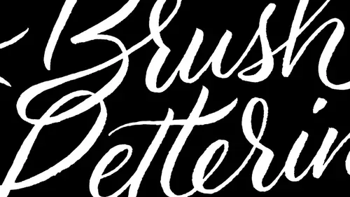
Understand Brush Lettering Styles
So let's talk about this removed from this stuff. So I've got some examples of expressive lettering on here, and I'll show you some things and kind of what I was thinking while I was doing this. So we've got a list of adjectives to work with, and I find that whenever I am at a loss as far as what to practice, expressive letters and themes are really good. Way to go. So, for example, you could have a fairy tale theme you could have, you know, like a geometric modern theme that you anything that you can really think of, just something that really helps you, you know, emote, emote stuff. So when I was working on this, for example, as you can see, like this rough the way that I did the word rough is you know, I really did this, making it really look, you know, rough. And it actually showed through in the way that I was doing the lettering. You know, I was really pushing down and being kind of harsh with it. Hard on hard on the brush. I mean, I toured that Russia part. Let me tell you on th...
e way that you know I did. Wendy was, you know, with the sound effects. Of course. Get so much better. What sales go through? Some other examples. You know, like this boy. I wanted it to be playful and fun and spontaneous. And so the way that I'm drawing it was, you know, this really like heavy touch, like touch, heavy touch, light touch. And so it's all kind of like a dance. You know, that's a really good metaphor. Is that you know, you kind of start out by sort of like rehearsing like how that feels. And so, you know, something like, give a good example of this, like this natural least, you know, it's the flow kind of languorous movement with the brush, because the word itself, naturally So what does that imply? It's much different than the word rough. Eso you really kind of have Teoh push that emotion that you have for the word. And I tend to repeat the word over and over again, like a mantra while I'm doing this. So you know, same thing here, like amazing was anything. And so you know it, like a fed lettering, is a visual voice. And so you know, as you're doing this, you're kind of speaking through these letters, and your physical actions have to convey that it's fall. A couple of others crash plays, killer eerie area. I wanted to be, like, just really funky and kind of weird, And it was really strange kind of staccato, you know, movement to kind of get that look. That crash was, you know, you know, almost like if something was, well, letters, air crashing together. So you'll kind of get the idea that you really want, you know, those letters to be expressed there. So why don't we go ahead and get started with this part right here? You know, I want you, Teoh have a lot of fun with this now that you've learned some basic letters. So let's start out with a couple of these adjectives. Just really easy ones like let's dio, you know, Let's go ahead and dio angry. It's one of my favorite words. I think it's like one of the best words ever be invented, because what happens when you get angry? If you're like me, I mean angry. I mean, whenever you get hungry, you get angry, so you get angry. So how do you feel when you get angry? You know, you're like, desperate and you want to eat. And there's this, like, this rage building up inside you. And so that is how you would let her the word hang gree. So feel the hangar coming through as you're doing this, I'll show you how all do it. So I am going to get super angry on your guys, right? Let me hanger that again. A little more rush. Other. That's how I feel when I'm hungry. So what's trying to maybe a little bit something that's more leisurely? Let's go back to the seventies and we're in leisure suit. Make sure that I know how to spell leisure. It's Ellie. I right. Okay, So what about that rule I before E except I before E, except after C and 90 other examples. They're lying to us. Okay, Like with the angry, You know, I'm trying to kind of, like, really get like this. That's rough, you know, kind of brush this'll feeling, and it's very staccato, sharp, intense movements. But if I'm going to do you know, leisure or relaxed, I'm gonna be really light and gentle and delicate, So I'm just gonna go relaxed. Let's dio I've said that I would do leisure. Now I tend to like the letter kind of on the large side. It allows me to use my entire arm. See, that's some leisure. And then she see You know, you noticed that I was kind of, you know, holding the brush really light. I was going really slow. And so my physical movements relates to the outcome of the letters. So we could also do something like so crazy. I mean, what does it look like when something Everybody has a different different definition of crazy? I'm just gonna do something really wacky. Kind of a little bit of what I would call like an intermezzo design. You know where I'm trying? Different styles, different letters. You know, I could also do Crazy Lake. You know, something like that? Yeah. Can you talk a little bit about the spacing of the letters as you're kind of doing this expressive or just in general, I thought some questions about how do I know how much space How many's based diabetes Really? Really Good question. In fact, remember, how is saying that the letter end is the magical letter. So what makes the lower case and really, really interesting is that it provides kind of ah, good amount of spacing. Let me do a little bit of a so something that's kind of interesting here, and I mean, doesn't a little bit. Let me make a little bit. Listen. So the spacing between letters, it tends to be a tiny bit smaller. This spacing right here tends to be just a little bit smaller than the counter space, and a counter space is the open space between a letter. So this from here to here is almost the same distance as you can see from this inside of this end. And so, generally, that's usually kind of a good rule of thumb when it comes to spacing. So another thing to consider about spacing, though, is spacing effects, the heaviness or the lightness of letters. And so this becomes really important because if you want something toe look really bold, part of what makes a letter look bold is not just you know how dark the black ends around it, but it's the absence of the white space around it as well. So you know, if you have a bull, you want something look really bold. All of those letters need to be really tight and next to each other. If you want something to be loose and light looking, then you have more white space. And so both of those things become really important to kind of play off of one another. But in general, if you want kind of an average take a look at the end. And that's why I really recommend doing the n a N b and C nd eso won. That particular exercise is a great exercise for learning spacing. All right, back to some funky stuff. Let's do what's you excited? Because excited is exciting. All right, so I'm gonna do this word excited. I'm gonna do this really kind of just like that. That looks excited to me. And you can see in the night you know, you can't go too fast with letters or else, you know, you tend to end up running out of a little bit of ink and things get kind of dry, but you still want to go a little bit faster. So what? You guys go ahead and then I'll take a look at what you're doing. And I'm kind of curious to see what you what you all have going on. Let's just spend a couple more minutes on this, and then we'll move into doing some some your own name. Oh, this is an exceptional hang gree over here. That is a really amazing one. Oh, I love it. That is very Allah. Guys, that's incredible. Your letter forms air. Great on that. This is one of the best exercise is just, you know, to play around, experiment with different letters. You know, I recommend keeping in kind of a theme, you know, as you're getting started. So if you're trying to do, like, a dry brush lettered set and you're using the word angry or angry, we're whatever it is. I mean, continue to kind of keep that that rhythm, going with other words that are very similar and that will really help train you to get usedto to doing that. Love it. I think we should post some of the stuff up on the board. What do you think? Ah,
Class Materials
Free Download
Bonus Materials with Purchase
Ratings and Reviews
lynny
Wow!!! Great class, terrific presenter! Easy to follow, professional, enthusiastic, fun!!! Most CL presenters have at least one of those attributes, but not all. CL Management: have potential new presenters learn from Laura's class. Only one suggestion: Laura's constant hair interference gets really tiresome and irritating. She frequently tosses her hair over a shoulder, and moves her hair behind her shoulder with her hands, and "fights" her hair being in the way during the whole presentation. Very distracting. Laura obviously loves how her very long hair defines her personality, and I'm not suggesting that is a bad thing. But for these short presentations, perhaps Laura would consider corralling all that hair with a loose ponytail, behind her back? That said, I bought the course anyway, as she is an outstanding teacher.
Debbie Smith
I loved loved loved this class. So wish I had been there in person. Although I'm not so great with the brush lettering, Laura was so perfect in her teaching and I definitely have some ideas to put into practice.
Shawn
This class was amazing it had high energy lots of details . It shared new ideas on where I could use such beautiful lettering I'm super excited to use it in my business and on my note cards! Buy it!