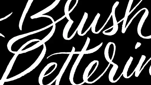
Lessons
Class Introduction
04:19 2Tools & Materials
07:45 3How to hold the Brush, Posture & Body Mechanics
07:46 4Learn Basic Strokes
06:39 5Basic Strokes: Picket Fences
06:05 6Basic Strokes: Tapered Strokes
04:14 7Basic Strokes: Pressure and Release
04:53 8Basic Strokes: Transitional Strokes
06:24Lesson Info
Write Numerals
we're gonna go through and do some of these numbers here. We're gonna skip a couple of them because there's, you know, some similar forms here. Let's go ahead and let's start out with something a little bit more complicated. But one is pretty easy. I'm just gonna demo it really fast. It's going to do a straight kind of an upstroke here. I'm sorry. A little bit of a curved stroke and then we'll do a down stroke to create that. Here we go. And then with the number two, we're going to start out with kind of this middle Ogi curve right here and then connected up at the top. Go back around and then at the bottom. This was kind of treated like a Z stroke. So it's just this nice taper outwards that way. So the number three we're going to start out kind of like how we did the to a little bit better there, halfway down, curve around this way. And what's really important with this number three is that you need to make it a much wider letter than what you're used. Teoh, because there's so much de...
tail here and we have a part that's kind of in the middle. It has this tendency to get kind of clogged up and look, really, you know, a little bit heavy with the four I tend to prefer and open looking for. And I also like to make the four go really far down to the bottom. So when we come in to draw this vertical stand, you can see that this horizontal stem right here really comes down about 2/3 of the way. Otherwise, you know, if you have it up too far, it starts looking a little funny and a little bit smaller compared to the others again, it's kind of a complex form, and therefore you have to make some optical corrections to make it look the same width in the same size is all of your other letters. So we'll do the five, and I generally will start out with that middle. You know, whores are vertical stem there. Come around into the spool right here. And then we create kind of this flag at the top. A nice tapered stroke out. We don't want it to be a just a solid stroke. All right. Sold us six. So we come around in a pushing stroke like that. And then I actually will usually pick up here and start this way so that I could get a nice round stroke that like that Do that one more time, cause that turn out exactly the way I wanted it to its nice round stroke. Here, pick back up into the middle of this stem. Come right back around there to meet it. All right. In number seven. So this is again. It's another tapered stroke. Just like you remember doing the carrots there and with a nice, consistently weighted diagonal stroke in the middle. And so these seven, you might, you know, you should be able, Teoh essentially draw kind of like a little bit of a rectangle around it to get its proportions. This end right here. Generally want to have almost meet that diagonals them, right? Let's do an eight a couple different ways that you can draw the letter. Eight. So first we want to do just like one little bull here, come back around, and then we could've start in the middle and overlap and draw second bowl and then finish it up on that side. So actually did. This is one continuous stroke. That's kind of wrong. So one here, back in the next second stroke here, like this. Like that. All right, We can also do something like this within a day. I think this is a little bit of a harder one to dio. We start out with that kind of a curve and then moving into that way so you can see I went that direction and I went that direction. So number nine to a couple different ways. You can do a nine start out with a round stroke like this, just kind of like if we were drawing the lower case a and then add in a vertical stem. We can also start out here doing a nice round form again. But instead, we're gonna make this look like an upside down six and started at the top and meet that stroke. Then come back around that way. Try that again. Just like that, with the letter zero letter zero with the number zero. It tends to be a lot a lot narrower than the letter O. So it just kind of keep that in mind. This is gonna all be done is one full stroke just like that. There we go, Done with numerals. And now we're gonna get to the fun part, which is expressive lettering. Yes. And Laura, before we get to the fun part, of course, what happens is once we showed some of the work that people are sharing online, more flooded in. So we wanted to say a little bit more. Look at the hash tag creativelive design. And have you let people know how they're doing at home as we go through a few more? I think this is fabulous. Doesn't look good. So let people know what they should be doing differently or what? Particular pieces? Yeah. You think so with this one? Yeah. These are zehr really tough. This is the best one right here. That one looks really good, and it's hard to kind of do some of that joining there, and it's it's a practice of really overlapping. Sometimes a mistake that people make is they try to meet and end with the strokes. But we want to make sure that we overlap those, um so these look really nice through here loving this queue right there. Yeah, this is great. How about another one? Oh, nice. Yes, Nat. Nat Wills Design. You're doing a very good job, Matt. If that's your name shirt short for Natalie. You look great. I'd love in. This s right here in this W is fantastic. Absolutely fantastic. So with this are right here. Sometimes you can actually do kind of more of, like a straight are, like, where it's not so curvy. And that and maybe give that one a shot. All right? Yeah. Oh, Victoria. Victoria seven. I think I think I'm familiar with galette, like, kind of, you know, met her through the cyber land in some way. Anyways, that looks wonderful, of course, because man says my name in there, so that looks great. I think that this callous totally getting it awesome.
Class Materials
Free Download
Bonus Materials with Purchase
Ratings and Reviews
lynny
Wow!!! Great class, terrific presenter! Easy to follow, professional, enthusiastic, fun!!! Most CL presenters have at least one of those attributes, but not all. CL Management: have potential new presenters learn from Laura's class. Only one suggestion: Laura's constant hair interference gets really tiresome and irritating. She frequently tosses her hair over a shoulder, and moves her hair behind her shoulder with her hands, and "fights" her hair being in the way during the whole presentation. Very distracting. Laura obviously loves how her very long hair defines her personality, and I'm not suggesting that is a bad thing. But for these short presentations, perhaps Laura would consider corralling all that hair with a loose ponytail, behind her back? That said, I bought the course anyway, as she is an outstanding teacher.
Debbie Smith
I loved loved loved this class. So wish I had been there in person. Although I'm not so great with the brush lettering, Laura was so perfect in her teaching and I definitely have some ideas to put into practice.
Shawn
This class was amazing it had high energy lots of details . It shared new ideas on where I could use such beautiful lettering I'm super excited to use it in my business and on my note cards! Buy it!
Student Work
Related Classes
Lettering