Lessons
Class Introduction
04:19 2Tools & Materials
07:45 3How to hold the Brush, Posture & Body Mechanics
07:46 4Learn Basic Strokes
06:39 5Basic Strokes: Picket Fences
06:05 6Basic Strokes: Tapered Strokes
04:14 7Basic Strokes: Pressure and Release
04:53 8Basic Strokes: Transitional Strokes
06:24Lesson Info
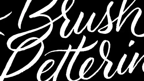
Learn Lowercase Letters
So the first thing that I want to talk to you guys about and this is really like one of the only definitions little hands you. What I find is interesting about this definition is if you look it up online, you really won't find a lot of information. But it's a very important term, and it's called duck tous. So doctors is the number, sequence and direction of strokes needed to create a letter form. And as you can see, there's a little diagram down here. We have this A that's drawn with 123 arrows going in that direction. So we see that we have three strokes to create this We have. You know, we see what direct, what sequence they grow in 1 to 3. You know what? And then the arrow's gonna show us what direction they go in. So the number one question that I always get whenever I teach brush lettering workshops is where to the thick and thin strokes go. You guys always wondered that everyone wants to know this. So here's the general rule and this is true about 90% of the time. Maybe even more...
so, The fix stroke is the down stroke, so we go heavy on the down stroke light on the upstroke. Now there's a really good reason for this. It really comes into body mechanics, so it's much more comfortable for us to make pulling strokes. It's much more natural, just works out better for us. We have less control on pushing strokes and that sometimes depending on what tool your using. For example, if you're using pointed pen, it becomes really clear how important that IHS. There's actually limitations on that tool that make it nearly impossible to create a heavy upstroke. And with the brush, it's possible to make a heavy upstroke. But it's harder you have less control. So it's something that really informs us of. You know, the doctors will really tell you exactly how the form is supposed to look where all the fix and thins go. But remember this and repeat this like a mantra heavy on the down stroke light on the upstroke. So now let's go into the lower case alphabet, so we're not gonna get a chance to do. All of these letters were going to dio as many of them as we can get through All right. So here we have some basic strokes up here. Oh, yeah? And before we even do that, I wanted Teoh. I let people know at home. I know we aren't gonna be able to do all of the letters, but one of the goals for this class is that by the end of it you'll be able Teoh hand letter your name. So perhaps, is we're looking at how to do thes different thes different letters. You focus on the ones that make up your name. Yeah, absolutely. All right, let's start out with the letter. A started the very beginning because it's a very good place to start a song. Okay, so what we're gonna do and we have some lined paper that's in your hand outs if you guys want to go to that so you know you for practice. Using line paper is really helpful for some people, it's not necessary for others, but kind of fun to dio you all will develop different sizes of lettering that you like to dio. So let's go ahead and do this little a here. So here's a quick little note is that whenever we get to these numbers So on and so forth. It's not entirely necessary that you actually stop and lift your brush off the page as you go, but it's more of a pause or a transition point. It's just that you know that you know, I actually create the letter. A is generally as one full stroke, but it does have three different components to it, and it does provide places where you need to kind of pause. So let's do the A here and the bacon be related to the D, the G and the Q. This is why we don't do all of them necessarily. So we want to start out. It kind of like one o'clock and it's slight pushing motion around into this curve, and then we come back up. You want to go all the way back up to the top of the letter, and then we do a down stroke, a quick flick up, show that again. And so this exit stroke right here, You want to come about halfway up between the body of the letter trying that again like that, and if you want, you can go ahead and try some of these others that in the family before we move on to the next letter down stroke. The lined paper is something that's included in your bonus materials, and it kind of gives you some guidelines. Forest proportions. Go Generally descend erred letters such as the D sender of Ah a J or a G. You know, the tail that hangs down below that generally would be a little bit longer than the A center is tall. So just try a couple here, do a G. And so again it kind of starts out as a bit of a pushing stroke curves around, and we want a branch all the way back up to the top. You see how just kind of stopped right there? One thing you want to avoid is kind of stopping short. You don't want to stop right here and then draw a line down here because what ends up happening is you can kind of create, like, a bit of attention point right in here. There's a lot happening. So stopping, you know, like right, going up to the very point gives you a nice amount of space in between the, uh, the bull of the letter, Understand? Yeah, Well, I just wanted Teoh remind everyone at home that if they have already purchased the course, what you're gonna want to do is make sure that you've downloaded the pdf that does show you that whole alphabet and all the strokes for each each letter on did. This is what you're gonna want to use to practice all the letters. Is that right? Absolutely. And something else I recommend as well is take tracing paper or translucent paper, usually caught incompetent, has a bit of translucency, and it's a little bit sturdier than tracing paper and feel free to put that over the top of that exemplar that was shown and letter right over the top of that. I'm telling you, it's a quantum leap and you're learning. This was how I taught myself when I was younger, how to do lettering. And, you know, it was funny because I think that there's this. There's almost like this taboo that we all have that comes to tracing, you know, like it feels inauthentic. But as long as you're not posting it online and saying it's your own, it's completely fine, and it will take you to the next level so fast. It's one of the best tips that I can convey, you know, in lettering is Teoh. Print out other exemplars examples of lettering and, yeah, take tracing paper to it and you'll be able to figure out a lot with it. So let's move on to doing though. So the again is kind of like the A where we start out with a little bit of a pushing stroke, and then we just come right back up to the top and meet there. So remember, go gentle. A lot of times I tend to overlap. That stroke is I'm going back up. Give a try on the on the E. So again that starts out like the A with a bit of pushing stroke. At one o'clock comes back around, you pull this exit stroke out about halfway up, and then there's two different ways to do the So we start kind of in the middle here, and we can do an upstroke creative form of you can also do the IUs a single stroke, and they both have a bit of a different look and feel to them. And so it's really kind of a personal thing in traditional calligraphy. If you're dealing with pointed pen and other materials, generally you do this type of it in Evan E. Where you are starting out with, you know, going down like this and then starting kind of in the middle of the E and then doing an upstroke that way so it's usually done is to separate units. Okay, so next let's move over to the magical letter n. So what I love about the letter N is it's a really nice rhythmic letter. It also has a very important role in spacing. So the letter and is approximately the same width as all of the other letter. It's like the average of all of the other letters in the alphabet. And so one of the best lettering drills you can dio is to practice going N a N d N c nd and so on. And so you're able Teoh. With this, you're able to get a lot of nice rhythm and flow going with letters. But you're also able to really space those letters out in such a nice way that you're able to really pay attention. Teoh. You know the white space between all of them. So this is straight stroke down. And then at the very bottom of the stroke, we want a branch all the way back up to the top and then come back around and you can see where that wave came into play. So again, the straight stroke down ranch up from the bottom, come back around here and you can create several other letters here. You know, you can create the H and the M and a couple of others. The M The spacing in here is generally gonna be a little bit smaller than it is between the end. Let's do the I the I is nice and simple, so that's just simply straight down. And then a nice little exit stroke. And then we dot the I, which the technical term for the dot on the I is the tittle. T I t t l e. Just think it's funny. So and that's just usually just a nice little, you know, straight struck down. It's a down stroke. You want to keep that the dot of the eye relatively large. We want people to be able to see it. So now let's move through and let's go to doing, say, like you in the in the UAE. So the U is pretty much, you know, the opposite of the of the end, right? So it's a down stroke and then we curve up all the way up to the top, just like we did with a and some of these other letters. And then it's a down stroke again and then halfway up with the exit stroke. And so the same thing with the why kind of just like the u straight stroke down, back up to the top here, straight stroke down and then is you're going into this a sender. You're kind of You're kind of pushing the stroke. You see here is some kind of pushing it off to the side. Nice little taper. Let's get into some of the diagonals. We're going to do the V and the W. So the V you know your your brush. Actually, you start to kind of tilt your hands in a bit of a different direction. It's neither the scraping motion, the side motion that we do with most letters, and it's neither this horizontal stroke method. It's kind of something in between It's kind of, you know, your hands is a little bit crooked, almost like if you were on the hook, right? Or left handed hook writer. So the V stroke this vertical one is almost kind of a straight stroke. And then to create this other side here, the right side we started to top and it's a down stroke down and it becomes nice Taper. And it's kind of like the little carrots that were practicing. And so this side right here needs to be lighter than this side. Otherwise, divvy starts looking really heavy. Same thing with the W. The W can be kind of a combination of the U or the V. It's sort of up to you so we can do this and kind of curve that out, stroke there, finish that a little bit. We can also do it w like this with to these essentially. But then the 2nd 1 just like the V goes into a down stroke. So you notice here. When I did this part of the W, the second stroke, I just made it into a light upstroke, and then I went into a heavy down stroke and then I did another taper down stroke a swell to the side. So now let's move into doing some of these funky letters, which I consider to be the f k Are X and Z. Some of these letters air the bane of my existence, especially the X. But let's go ahead and do the effort first. I'm just gonna demo each one. Okay, so the F starts this kind of a bit of a pushing stroke when we come straight down. Generally, I like to have the F drop a little bit below the baseline, and the crossbar sits on what is called the waistline or the mean line. So you know, this whole piece right here is called the X Height. This right here is the baseline, and this middle line right here is called the Waistline or the mean line. Generally, it's called the Mean line and graphic signed waistline. It's more common for calligraphy. That's where the crossbar goes. So let's try the K because it's we have two different methods for the case. We have a straight stroke here, and then we can either do this to kind of a tapered tapered stroke, then start in the middle and create a little bit of a tale that goes down and the tail that goes down, you know, your hands is kind of turning a little bit more to the fight like this rather than some of the other ways that we were holding. You can also do a loop K so straight stem down stroke. We go up to the height of the waistline and curve into this nice little loop here and then we have a little bit of a tale. Yes, Laura, I'm actually wondering if you could take a step back and maybe I'll give you mine and kind of explain, because I was I haven't started to use would come up and hands Teoh to use the lined paper yet because I wasn't exactly sure what the different heights on everything. Let me explain that you're all right. So here in the lined paper and that we have and this is one of the bonus materials. A swell. The C represents the cap line, the cap height in script letters. Caps are usually a little bit taller, then thin the A center. The second line down the is a center. The W is the waistline, and then we have the beauty as baseline. This is where you start doing letters. And so this area right here, it's kind of our x height. So this would be our end. The D is the descend er, so that would go here and so we can see the A thunder up here and that barred in the middle of this great bar is just basically like a separator. Otherwise, it feels like it runs in all together. All right, so now let's go through and do the are. So we're going to do two different ours, and I'm gonna do this kind of quickly here long. All right, so straight stroke down branch back up to the top, and then when you get to the top, you can stop. And then you add just kind of a little hook down here and with this form right here, you want to keep it really narrow in compact because generally, you know, you have another letter that's following it, and it content to leave a big kind of a whole big gap right there. So we want to make sure that we're keeping that a little compact. So now a cursive. Are is a thin upstroke like always remember light on the upstroke, having on the down stroke. And then you can come down here and we create a form like this, which is almost looks like a little bit of an apostrophe and then straight down here, vertical strokes. So let me actually draw it on this lined paper because I want to show you something that's really important about the are in the asks or the r and the S is that they're very tall letters. We actually want this part of the art to go up to, almost like a center line that's a little bit tall and then draw it down this way. And the reason being is because otherwise if we don't, this letter looks really small. I mean, look at how small that looks. If I put it next to a letter end, it starts to look pretty diminutive. So it's the same thing with the S. The S rises above the waistline and then we push back that way. So another version of drawing let me drive the S one more time. So it's a little upstroke here, and then it comes down just kind of like the f r with e that little bit of a hook, and then we turn it into a bowl. We can finish it up just like that. So now let's take a look at Let's see the X and dizzy. So the X definitely is a completely different way of handling the brush than you would otherwise. So we actually want to kind of have your arm to the side here. And so typically in like this, or like this, so could create this bar of the X. And then we want to have a nice pulling stroke here. There we go. That's nice looking X. You can also kind of this one right here. This 1st 1 I have curved, curved up. You know, I start with it curving in towards the left, and then I drop off with curving out towards the right. But here's another way that you can do it. You can actually kind of have it curving towards right first and then the opposite way. They both have different looks. To them, it's personal preference. Let's do the Z. We have two different versions of letters E. We're going to dio this one. I just showed the plane. Roman ones. Let's just do that one, because that's the more common Z. So this is remember, horizontal strokes. We hold our brush a little bit differently. We're not coming from the side, but we're coming from the top here. So we give ourselves a nice look, crossbar, diagonal stroke and then an outward pushing stroke. Great bottom of that. See, you could make it a little bit fancier if you want. Here we go. Looking good. So here's the thing about, you know, practicing the alphabet here is you know, it really is a matter of putting in as much time and as much ours as you possibly can. Now that you guys kind of have a pretty good idea of how everything is constructed, I think let's move on to doing some upper case letters
Class Materials
Free Download
Bonus Materials with Purchase
Ratings and Reviews
lynny
Wow!!! Great class, terrific presenter! Easy to follow, professional, enthusiastic, fun!!! Most CL presenters have at least one of those attributes, but not all. CL Management: have potential new presenters learn from Laura's class. Only one suggestion: Laura's constant hair interference gets really tiresome and irritating. She frequently tosses her hair over a shoulder, and moves her hair behind her shoulder with her hands, and "fights" her hair being in the way during the whole presentation. Very distracting. Laura obviously loves how her very long hair defines her personality, and I'm not suggesting that is a bad thing. But for these short presentations, perhaps Laura would consider corralling all that hair with a loose ponytail, behind her back? That said, I bought the course anyway, as she is an outstanding teacher.
Debbie Smith
I loved loved loved this class. So wish I had been there in person. Although I'm not so great with the brush lettering, Laura was so perfect in her teaching and I definitely have some ideas to put into practice.
Shawn
This class was amazing it had high energy lots of details . It shared new ideas on where I could use such beautiful lettering I'm super excited to use it in my business and on my note cards! Buy it!
Student Work
Related Classes
Lettering