Lessons
Lesson Info
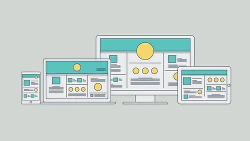
Adding Widgets
Once you go to the selection tool, that black arrow and click away to deselect. We'll center align this. You can just drag it if you want, so smart guides. There is also an align panel in here you can work with. If you look on the right you're gonna see something called the widgets library panel. Once again, this is what we looked at for the menu. Now we're gonna dig in a little bit and show you a couple of these, how they work basically and what they are. You'll see buttons. We actually have a couple different kinds of buttons. These are what's called stay buttons or rollover buttons. If you drag it out, it's gonna mean that it's already set up. If you hover over a button it's gonna change colors and do different things like that. You're gonna see that we have compositions. Compositions, these are awesome. If you want to show content in a small area, let's suppose you've got an area on your webpage where you want to show a lot of different things. You want to have it where someone can...
click or tap on a tab and content will fade in and fade out, and you have a bunch of content in one place. Those are composition widgets. You can put just about anything you want in them. I can put a movie, I can put text, pictures, different things like that. So we also have like we said before the forms. Forms, really simple contact, I'll show you that in just a second. Menus, we have panels. These are kind of like if you want to see a tab panel system, a bunch of tabs. Tap on one and it shows different content in one area. You can also do slideshows, and there's social content. If you want to put in things like a Google Map, you want to sell something with a PayPal button, put a video, do all that, a lot of that's already there. You just drag it in and tell it what to replace the content with. So we're gonna do a slideshow, so I'll go to slideshows here. And you can see there's a bunch. There's a really cool slideshow call fullscreen. If you drag it out you can make it so that it's fullscreen, covers everything basically. I'm gonna do a blank one, that was we control what's in it. So drag one out if you want to, drop it on your page somewhere. You're gonna see I dropped it way on the left side of the page and the reason for that is just because I wanted to make sure I was right where I needed to be. Okay. Now I've got it out there and what I want to do now is I want to start to adjust some things. You'll notice like I said there's always some kind of options you set for any of these widgets you drag out. If we look in here one of the first things we're gonna do is we're gonna add our images. We can add all types of different images. A word to the wise here. If this is a website we're looking at a screen size that's 1,100. Remember we set that for the maximum width? Gotta make sure your images are big enough. Once again if you take an image that's 200 pixels wide and you stick it in a slideshow like this, you're asking for trouble because it's gonna look bad. It's gonna take that thing and just stretch it out and it's gonna look pixelated and bad. You also have to be careful about not putting images that are too large in scale, and also too large in file size. Because Muse does a pretty good job when it comes to export and publishes content of trying to optimize your content, but you've gotta keep it within reason. About the size you're gonna use it roughly. So I'll come to Add Images and click on the folder. I've already created some. I created some in Illustrator and I also created a few in Photoshop. So I'll go to Slideshow and I've got these PNGs and SFG. And you're gonna see I'll just click around so I can show them to you. They're just parts of the projects we've done before for instance. So I'll choose them all, click Open. And it just puts them out there basically, and it's gonna fill up that area. Now we have a ton of settings for slideshows. Right now, slideshow, this one is set to autoplay. It's just gonna run, it's just gonna start going from slide to slide. If you wanna turn that off, turn it off. You can go and say resume it after so many seconds, you can have a different transition. I love this. Transition by default is actually gonna fade them in and out, each different part of the slideshow. You can say let's do a horizontal like this, or let's do a vertical going like this. You've got a lot of options in here, it's really cool. And down here you're gonna see we can shuffle them. They're swipe enabled, which basically means if you do this on a touch device, somebody could do that to go to the next one. We've got all of these different objects as well, we actually have this little caption we can work with. We've got previous, this little previous button, we've got a next button, and we've got a counter. I don't always keep all this stuff, so if you want to you can turn off some of this. You can turn it off, turn it on. And if you change your mind later you can always click on this little blue circle right up here and turn it on or turn it off again. There's a lot of ways to work with this. All right, I think it's good. I think most of the defaults are pretty good. Now the next thing we're gonna do is, all of these, these widgets, slideshows, compositions and forms, they are responsive by nature, which means they're gonna do this as the screen is smaller or bigger, et cetera. But what we need to do is kind of make it look good in out design right now. Once again I'm designing at full size here, at the larger size to begin with. So to do this remember I said if you drag a widget out it's usually like a group of objects. You can go in and click on individual objects and move them and do different things. So click on the main image here. I clicked on it once, I selected the whole slideshow. If I click once more on that I'm gonna say, okay, now I actually have what's called the Hero image, that's the big picture. I'm gonna take that, and what I want to do is I just wanna make this thing stretch out. We're just gonna stretch it to the edge of the page here. Easy way to do that. You could drag both sides to the edges here, all the way out. You can also if you remember when we deal with objects of any kind, all of them have a response of nature. So remember I said that there's this resize option up here and we did it for the logo and the menu? Everything has this. So what you can do is you can change it, and I usually do this, I check it before I'm done or finished with my larger scale size before I start going smaller to check out my design. So right now it's gonna be responsive width and height which means it's gonna act like a regular old image, like a JPEG. It's gonna do this as the screen size is smaller essentially. I just want to stretch it. So if you choose none it's just gonna always stay that size and you just kind of move around like this, or stay centered or however you do it. I'm gonna choose stretch to browser width. I'm just gonna go, wham, stretch it out. Now, no matter what I do with this, responsive, it's gonna stay that size, the size of the actual page, the window rather. Now what we can do is we can take all of these items, the caption, the counter, the arrows, and just move them around. If we don't want them we can actually delete them, and all that means is it turns it off, the check mark. So I'll click on the caption and I'll maybe put it up here. I'll click on the arrow, and what's funny is in here, if you click on an arrow it's gonna go to the next slide but it's gonna look like garbage, okay? Because it's not gonna look cool, how about that? So it's not gonna do the cool thing or do the slidy or the fade, or whatever it is. I'm gonna move this one up here, and I'll move this one up over here, something like that, and you'll notice that we have, these smart guides are pretty awesome. So you're gonna see those are all lined up right now, that's great. And this counter, I don't want that. So like I said before we can turn it off in the options. You're gonna notice that little blue circle, you can go to the options there too if you want. I'm just gonna delete it. That way we don't have it, it turned it off. Now we're gonna check it out. I'm gonna drag that gripper once again, I think I'm good, and yes there's not a lot on this page, I know, but as you build you're gonna put your stuff and then drag the widget to make sure it works. And I'll take a look and say okay, not too bad. Now you're gonna notice, look at the text. Ah, that looks pretty bad doesn't it? So here's a cheat for you. I'm gonna click in there to select it, it's gonna say, "Nope, you have to bounce" "back out to the large size." "You haven't set any other sizes." If I click on the text box, come up top to resize, you're gonna see Stretch to Browser Width. I know that that text, I want to keep it in the center, so if I stretch that text box all the way to the edges, it's almost never even on a mobile device, it's never gonna wrap that text within, it's never gonna do anything. So I'll choose stretch to browser width. That looks pretty good. And I wanna make sure the text stays in the center. So what we can do is we could center pin it, but because we stretched it, we're done. It's already centered. I centered the text in the box and we got it. The only other thing we could do if we wanted to is we could go to each one of these objects, you could do this, watch. I could click on the slideshow and click on say that arrow right there. All that is actually is a text box, that's really all it is. Look up top at resize. You're gonna see that it's responsive, you can say, "Don't do anything to it," "let it stay the size it is." It's this teeny arrow. So I could choose none for that. Everything in here we can go in and start to tweak and set up. Do we want to resize? Where do we want it to sit, et cetera? All right, I think that looks pretty good. Now the last type of widget we're gonna put out here, we're gonna put a little form. It's gonna be pretty fast because they're pretty easy to do, honestly. So what I want to do is I want to go back to my site. You can click back on the tab, we're gonna open another page here. Not too bad, you can see the portfolio page out there. We're gonna go to the contact page and double click that to open it. Now you'll find that there are faster ways to get around in Muse. There's as far as going between and things like that. What we want to do now is I just want to kind of move around a little bit. So here's a couple tips for you. You've got your page out here, maybe it's hanging over here. I want to zoom in, I want to do things like that. If you press the Spacebar out here, you get the hand tool and you can kind of move it a little bit. I tend to do things like this. If you want you can actually use Pinch Zoom if you've got a trackpad on your device. You can use that to zoom. Or under the view menu you're gonna see Zoom In, Zoom Out, all these different things that you're probably used to in Illustrator in design Photoshop. And we also have the Zoom tool, so you can do that. All right now we're gonna add a couple things here. First of all I'm gonna go and add a form, and maybe we'll do something else, okay? So if you look over here on the right we're gonna start to add some different forms and different things like that, including links, but the first thing I want to add is I want to add one more type of widget here. We're gonna add a Google Map. This is basically our contact page, I want people to know where we are. So if you look on the right over here you're gonna see we have a ton of social widgets, we've got a lot over here. We've got things like Facebook, Twitter, Google Plus, all kind of things. I want to put in a Google map. Way long ago in Muse we used to have to go out to the Google website and copy paste code, which we can still do by the way. You can take HTML content from other sites, and within reason if it's an I-frame or other things like that and it's not dependent on a lot of files, you can just copy and paste it right in your page, and like I said if it doesn't have a lot of dependencies it'll work. I'm gonna take the Google Map widget and just drag it in. So I'll drag it into the page, drop it out there. It's pretty cool, it just does it. Now what you want to do with this, these are something that are already responsive, it's gonna sit there and scale if you want it to. You just go to the properties here and you can set up an address, just type in another address. You can make it look like, hey, let's go in and have it be satellite or some other thing. You've got a options if you want to do that. I think it looks pretty good. Just do some things if you want. You can also go out here with this selected and do things like add a stroke, like a border around it and different things. I'm gonna move it over here toward the right and I'll snap it over to the edge. Now we would probably normally put up some sort of header up here. I could copy the header from the other page, that type of things. But we'll leave this right now as is. And what I want to do is make sure that this is gonna work, but we're gonna add some more content in just a minute here. So I think that looks pretty good. Now the last thing, do you notice that as I'm dragging this Google Map look what happens to the footer stuff. Remember I said that, that line. Anything below is gonna move down. That's awesome, that's a great way for us to keep things separate and have your page grow as necessary. Now you've gotta make sure also that anything that is in the footer, is in the footer, meaning below that guide. All right. I don't want my Google Map to hang out right at the footer, so what I want to do is I want to make this page taller. Now we can cheat and draw a box down there that's transparent or something simple like that. We can also set properties for things. So do that if you come under Page you're gonna see something called Page Properties. If I choose Page Properties, for each page you can change some things. We can do things like change margin guides, where they sit, maybe one moves down, these are pulled in, that type of thing. You can set the minimum height, you can do all kinds of things. What I want to do is want to change the minimum height. I'm gonna type this in because I don't have patience. I'm gonna type in 1000. If you click in another field it should just do it. That's your minimum height now, that way your stuff isn't resting right on top of that footer for instance. You'll also notice that we have things like metadata. This program does have a lot to do with SEO and different things like that we can do. I think we look good, I'm gonna click on Okay. I'm gonna save this, and like I said before the next thing we're gonna do here is we're gonna go out and we're gonna add some links and we're gonna add some forms.
Ratings and Reviews
wendy fite
Tasked with creating a website for a friend's start-up, I looked at various template driven tools in the market and also signed up for this Creative Live class. My experience with CL classes is wonderful and this Quick Start class for Adobe Muse CC did not disappoint. Brian Wood is very knowledgeable. His pace is fast, and the content he presents is awesome. He de-mystified Muse for me (I am generally a Photoshop/Lightroom users). After the class I was able to start packaging the information story-boarded for the website content so I can confidently design the first draft. I also bought the course so I can revisit some of the tips and tricks. Recommend this course.
Vince Tutay
I've always been curious to see what Muse had to offer but didn't know where to even start. This was a great intro to take you through the steps you would take to design and publish a site. Brian does a great job in explaining stuff which you can easily follow if you have the program open!
Phyllis Bostanci
I didn't know Adobe Muse was easy! Thanks Brian, can't wait to watch the rest of the videos in this series.