Lessons
Class Introduction
08:32 2Hue Saturation For Color Correction
12:35 3Gradient Map Color Correction
10:19 4Camera Raw For Color Correction
04:22 5Channel Pulling For Color Correction
12:08 6Painting & Rendering Fabric Effects
20:02 7Adding & Removing Detail
03:47 8Frequency Separation
08:44Lesson Info
Gradient Map Color Correction
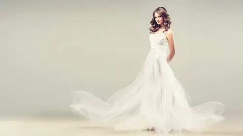
Alright, my favorite, I love this tool. I shouldn't call it my favorite but it 100% is my favorite. Alright, I'm gonna show you but I do wanna talk a little bit about the process 'cause some folks get a little confused by this. Color grading is a very popular term that folks are using nowadays and it's effectively taking gradient and mapping it to the tone that's underneath. So what that was gonna mean, and I'm gonna do a demo on this, is I have a lot of gradients. And in fact I do believe in the bonus material I have given you quite a few extra gradients because I love gradients. So I have literally on my file, this is me emptying it out. I think I scroll for like 75 days on this, I really love it. Because what will happen is if I've done a really particular cool look that I like, I wanna save it and keep it for later. For those of you out in the world who wanna try this there's an Italian painter named Pontormo, a Florentine painter. His colors are amazing and I will often take those...
colors. I will put a painting in my file on top and I will sample his colors and make a gradient out of it. Sargent, you might like his colors. Maxfield Parrish has a particular pallette that's gorgeous. These are painters. Heck, if you're a Mondrian person and you like Mondrian's colors, why not use that as a color reference? Yeah, right? It could be fun. Anyway, so what it does, and I'm gonna explain this in a nutshell, is you basically have a gradient bar and on that gradient bar you have a color, you have these color houses that you're gonna assign. That means you pick the color, I'm gonna show it. You can do it preloaded or you can change it. And the key thing is on the top it's gonna tell you whatever house of color, house of pies, house of color, huh? House of color, house of cards, that color's gonna be applied to the dark tones. Whatever color's here is gonna be three quarter, mid tones, quarter tones, highlights. Coolio? And that way you can do a lot of really super groovy stuff. So let me go ahead and do that demo and then I'll go back to the slides after. You're having fun. Alright, gradient maps. Seriously, seriously love this technique. And because I get bored on occasion I have put a bunch of different colors in here. Meaning when you guys look at the file that you get that we've been demoing, I haven't made the dress red in every single picture because I wanna see different colors. You can try this technique with all the same color if you like but that would be boring. So as in before, I don't wanna remask this so I'm just gonna copy my mask. I'm gonna throw my gradient map away. Throw my gradient map away. And here I've got my lady and I wanna colorize her and the hand is up, the hand is down on the option key, delta dawn, let's go to that yin and yang and we're gonna go to gradient map. Can I please be very clear, you're not on gradient, you are on the gradient map. Mistake number one, I promise you, gradient map. And I call it color, I call it dress, I will often call it the colors I pick but here's the bear, I never know what colors I'm gonna pick 'til I'm done so I have to rename it afterwards. Alright, so by default folks tend to get a black and white default color. So you have your gradient tool which we'll not talk about right now. In your presets you have your gradients and your properties. You wanna have your properties menu up when you're doing this. Pardon me. And when you click on it, your gradient editor comes up. So let's just for giggles, 'cause we're having fun, let's look at what's already here. Oh boy, she lost her mind. This isn't even half of what I have. And let's, because we're fun, go to the bottom. So on the bottom I have a dark color. I usually keep a dark color for my dark areas. I have olive green which is not so pretty. I have a mustardy yellow and then I have a white. I tend to have a dark color and solid white in my file. Why? Because I wanna keep that highlight color and I wanna keep a shadow. So a couple things, let's just talk about this. There's a house, house of cards. I can slide it down. Please note what happened, I just said that color value is now gonna color the three quarter tones. Uh oh, my picture got lighter. Maybe that's okay. Now my picture got darker. It is actually mapping onto the tone. So it's gonna change it. And that's a basic color. I'm just gonna hit OK for just a second and then I'm gonna say well, I'm not sure I wanted to change the tone, I just wanted to change the color. Normal, switch that to color. Then you don't switch the tone. Do you understand? So two different ways to use the exact same thing. I'm gonna spend a minute here because there's some stuff you can do, there's some juicy bits in here, I think. Alright, so I'm gonna go down below to the red and again, what I like about this particular technique is that you can do a quad tone, you can do a two tone, you can do a three tone, you can do seventeen tones. As many color houses you want you can put in there. So you could warm up your highlights and cool down your three quarter tones if you want. So let's talk about that for a second. There's a house. You can pull it off. You can click and add one. Pull it off. Click and add. Click and add. You have to click below. See the color picker down here? Alright, what do I want? Okay. Pick whatever you want. Red's nice, that's pretty. You can move the mid tone, this is gonna be pretty subtle for this kind of screen. You can actually see it more in the background. Do you see that? Because of the nature of this dress, you see what I'm changing right here more than in the dress. See that? You can change the house out, you can add a house and say, "Hey I thought she said she likes white at the top." Yes, I do. And there's some white. And you can tighten this up if you like. Anything you want, the sky's the limit. So, I don't have a demo for this because there's a live component to this that makes it difficult. There is a program by Adobe called Adobe Color. It used to be Cooler but now Color. It's got a phone app. I could actually take my phone and shine it on Kenna and it will pick four colors from her. I could shine it, I could be in Provence, France and be in a lavender field and pick up that phone and take a picture of that lavender field and upload it to Adobe Color, it will pick the four colors and you can adjust it. I could save that as a gradient preset and I could come back in and say, are these the colors that you want? So I kid you not, when I was talking to the author of this book, we were in a cafe, kind of old fashioned, funky, artsy cafe, and she was like, "Well, you know, "these kind of colors." And I said, "Oh, the colors in like the wall "and the room here?" I took out my phone and I made a color section and that was how she told me which colors. Because you know when you're dealing with people and you say color, well do you mean blue? Well, do I mean cyan blue or do I mean royal blue? And it takes it all out of the equation with my camera. Adobe Color, you should look it up. So, is there anything else I wanna say about this? So, what we've done is we've changed the houses, we've added houses, we can add another house, you can add another color. You can get nutsy if you want. Be careful of banding. Production people, be careful of banding. You might get it. And then another thing, I don't wanna elaborate on too, too much right now but if you're not gonna put it on colorize, if you're not gonna put it on color, you can actually select the brightness value of a color to match the brightness value of the tone you're mapping it to. I'm gonna say that again. You can actually select the brightness value of a color to match the tone you're mapping it against. I'm kinda not, I'm a little like ah, what does it feel like? But printers, someone who's got really precision stuff, that's what you'd wanna do. Cool? Okay. And then just as a reminder, the other option is it's on color mode or it's on normal mode. Downfall, you gotta mask it, more than likely. No, not even more than likely. In a situation like this, you 100% have to mask it because it's mapping the tone to the entire image and somehow I don't think jaundice is what the author is going for right here. So that's why I keep the mask handy. Cool, everybody's happy, everyone's loving it? I'm gonna go back to the keynote please for just a moment. You're gonna love it too, I'm telling you. Cars, objects, all sorts of thing. Alright, so just to reiterate, normal mode or color mode will absolutely change how it maps. And you know what's really interesting about this and about this gradient tool? You can't even see the yellow in that one. Look, I mean it's barely, barely there and that's because that's the tone of the dress, you just can't see it. The dress is actually fairly dark and so I got a little bit of highlight in it. But can you see the difference? It's a little subtle but there's definitely a difference if it's on color mode versus normal mode. Like look in here versus here. And then I wanna reiterate that the normal mode will change the tone of the picture, color mode will not change the tone of the picture.
Class Materials
Bonus Materials with Purchase
Ratings and Reviews
Sean
Photoshop Lisa is the best teacher. She makes learning Photoshop fun. Great course. Lisa has a great teaching style. She mixes in a great speech cadence, great voice up and down and pausing, jokes, and is extremely knowledgeable and fun to watch. Awesome course. Learned that skills can apply to other projects, not just clothes. More tools for the toolbox.
Charlotte Madsen
Love this class! Lisa is so energetic in her way of presenting her knowledge and she has an amazing way of making complicated stuff sound simple and affordable. I find this class very motivating and can't wait to get started. Oh, and she has a great sense of humor as well!
Amy Vaughn
Fabric retouching presents some unique challenges and I appreciate finally getting a class devoted to it. The explanation about how to change from dark to light (or vice versa) was my favorite thing I learned from the class, and I appreciate the out of the box techniques like using frequency separation (it isn't just for faces!) and painting fabrics. The slides were outstanding, well organized and I appreciate how we get them all as downloads with the class for very fast visual reference when we're trying to remember how to do something from the class later.