Lessons
Introduction to Adobe Lightroom Landscape Photography
1Introduction
02:51 2A Basic Process for Editing Landscape Photos
22:58Full Photo Editing Sessions
3Golden Hour Lake
22:12 4Sunset Skyline
18:51 5Snowy Lake Scene
12:29 6Sunrise Magic
10:47Lesson Info
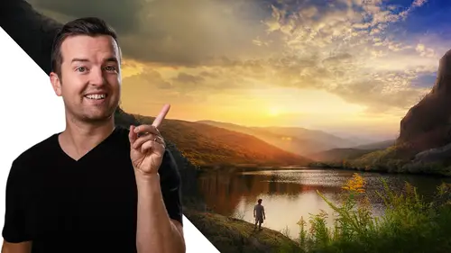
Snowy Lake Scene
Welcome to another lesson in this landscape photography course in this one, we are going to be editing this photo on the left the snowy lake scene and turning it into something like this on the right, adding a pop of color, playing with uh some clone and healing brushes and just really just trying to make this a little bit more vibrant of a photo. So if you're following along, go ahead and download and open the snow photo and let's get straight to it. So we'll be here in the development tab as always hoping that photo up. So first thing first, it's just totally distracting to me is it looks like a photographer or something? It looks like another a hand with a lens in the bottom corner. I actually like the crop of this photo. So I'm not going to crop it at all from here, but I do want to get rid of that hand. So one option is to crop it. But we have some other tools here in uh lightroom that can help us spot removal this one right here and you can either choose clone or heel heel. Does ...
it a little bit more intelligently and blends layer blends your selection so that it helps remove whatever you're trying to remove a little bit better clone will literally just copy and paste one part of the photo to another. So I'm gonna increase the feathering a little bit size is good. And basically what you do is you just click and drag and paint over whatever you want to remove. So this is typically used for blemishes like pimples or wrinkles or things like that. But you can also remove things from your actual photo like so, and you can see that it actually just got rid of it just so easily. If I go before and after with the backslash key, you can see how well that does removing it. You'll also see what I did was if you go back to this removal, if you hover over that dot Selected, I can move this selection around and see this is where it's taking and kind of blending in with the spot that I painted on originally. And so you'll wanna find an area that's similar. Luckily, the snow right here is a perfect place to use as sort of a blending method to get rid of that. All right. So once we're done with that, I'm happier now and now I'm just going to play with my overall exposure with snow. This is a difficult thing to photograph because the exposure can be so high and blown out. So I'm actually gonna jump right into my whites and highlights and see if drops. This brings back a little bit more detail. It does. But you know, because it is snow because it is not a sunny day, but it is shot during the day. There should be some pure whites or some very hot bright spots of this photo. So I'm fine with that. The shadows though. I do want to bring up the shadows a little bit just to get some of that detail on the mountain side. And then as I normally do, if I bring up my shadows, I might just go down my blacks, just bring them down just a little bit to bring back a little bit of that contrast. This photo, there's so much detail in it. So moving down, I am going to boost the clarity just a little bit so that edges of things become a little bit sharp and you get a little bit more of that HDR look. Now I'm not gonna go too far like so, but just going a little bit kind of helps. There isn't much color in this photo and that's what we're going to use. Our artistic license to do is adding some color to the sky and to this lake. But boosting the saturation overall kind of helps bring out some of the reds and the browns in the rocks and the parts of this photo that need color. Another thing we might wanna go check down below is if we boost the greens at all, if we can get any of that green up or even going over to hug, I'm looking for these trees to pop out a little bit of green. Select my color picker, go into my greens and you can see that as I hover over these trees, the color that I'm going to select is highlighted over in the HSL panel. So if I drag up or down, you can see that it's adding some color. So if I make my yellows and drag those to the right. Same with my oranges wondering if I take my reds. Yeah, if I take my reds, it also adds more green to it, but I don't necessarily want to do that because I like having the greens of the rocks or the red of the rock down below. So if we bring that up, now let's go back to saturation. Bring up the saturation of our yellows oranges. I think mostly the yellows is what's bringing out that green. We get some color back in those trees and maybe it's a little bit manipulated color, but I like how that looks. All right. Next, what we're going to do is play with some local adjustments. So to get some color on this water, what I'm going to use is a brush, I'm also going to turn my auto mask on and we can use a pretty big brush. I'm gonna make sure my mask overlay is on, check that box or press o on your keyboard and then I'm just gonna paint on like so and I want my flow and density to be all the way up. So now that I have most of the lakes selected, going to make my brush a little bit smaller and then just starting in the inside of the lake and then going closer to the edge. It helps with the auto mask. If I would have just started on the edge and then painted onto the lake like so it starts picking where I clicked first. So if I go in the lake and then go over the edge, it does a better job at not getting the edge of that lake or the rocks on the side. I'm gonna have to go in here and with the erase tool, just erase the edges that were selected because I really do just want the, I just want that water to be selected. We can also go in here, turn on our mask, uh, range mass for color. Then if we select the color of the lake, that's gonna do a pretty good job at selecting that color. And when we apply color adjustments, it might blend a little bit better anyways. All right. Pressing OTA. So we don't see that there's a couple ways to add blue to this lake. One is just by dropping the temperature. If I go too far. Too much. You can see what that's doing or another is with this color option down here, adding a more specific blue. If you're going for something a little bit more green or teal, which is actually pretty nice, something like that's pretty good if you find the color that you like and sometimes I just click and drag over and go like left to right and see what I like. But if it's too saturated, you can just use the saturation slider to go up or down to boost the vibrancy of that color. You can also type in a specific hue or specific color right here. If you know it something like that's pretty good. And again, we can go back down to our range masks and increase the slider or decrease it depending on what you think is gonna look at. Now, maybe I just want the blue to really be applied to this part of the lake over here where there's not the reflection of the trees. So I can take my color picker again and just pick that area a little bit more. And now we s drop down that slider and I can turn on a mask overlay, see if I drop it down even more. It's more or less just selecting this area. And you always got to remember that you can actually click and drag to select a selection of colors which will help it choose even more intelligently. I don't want it to be, I do like it to be more blended and not have hard edges. So a little bit more blended like that. It's looking better. Now, the blue color itself is looking a little bit funky to me. Something like that's pretty good. Now you can go too crazy with this. But so what's kind of, this is a more subtle edit I think than I did originally. But what's sort of off for me is that if the water is blue, the sky should be blue too. So let's add a gradient overlay. We're gonna select the sky like so we're gonna turn our luminance, may I ask? And then just pick a more a brighter range, something like this. Now we're selecting mostly the sky and now let's first, let's do a little de haze to see if we get any more detail in there and then drop this temperature or maybe even what would be better is to match the color of the brush that we used, which if we go back to our brushes, click here, let's look at our color. It was 219 and 34%. That's good to know because now we can go here. We could change our color here. 213 0 gosh, I have such a bad short term memory. Was it 34%? 34%? Let's see how close I was. Yeah. and 34. Wow, Phil, you need to do better. At that. But we are at 213 and 34. And you can see that that's the right color. I might want to boost the saturation just a little bit because I think it does make sense that the sky will be a little bit more blue than the water. Let's see if we could bring some detail out in the sky. Just bring slide, using the whites and highlight slider, maybe clarity a little bit more, something like that's looking a little good. It's, you know, it's subtle, it's subtle, but I don't, I like it to be settled that way. If I want to add even more blue, maybe just dropping that temperature slider helps a little bit too. Selecting a little bit less though. Yeah, that's looking pretty good. All right. So now let's see the before and after before and after now, let's see compared to what we did in the other edit. So here we have our original edit here is our new edit. So what we're working on a little bit less of a dramatic at it. I think I have a higher clarity here to get that more HDR effect, a little bit less contrast here. So if I want to get what I had originally done, I would probably boost this clarity even more. Probably add a little bit of an S curve, something like. So and then with the colors I would make those blues of the lake a little bit more turquoise or teal and the sky. The same. What, what I didn't do with this original photo was play with the color of the trees, which I think for this new edit looks a little bit better. So if we look at our before and after you can see from left to right, what it was like before and what it is like now again, subtle changes trying to be more natural with this edit, even though we are manipulating some things like color of the sky and the lake, but just in general trying to make it pop a little bit more for, you know, those, those prints, those followers, whoever you're taking this photo for, hopefully it's for yourself. All right. I hope you enjoyed this lesson and we'll see you in another one.
Class Materials
Bonus Materials