Lessons
Lesson Info
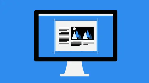
Grid-Based Design
now one of the things that makes it super easy to create these symmetrical and balanced designs is working with a grid based system, and there are tons of grids out there. A lot of people have their own way of doing it. I have my own personal way of doing, and you should probably work with your own or find one that suits your needs the best. But in essence, what we're talking about here is using a grid that's horizontal and vertical lines to help you lay things out. This helps with measurements. This helps with alignment. This helps with spacing and all that good stuff. You can buy grid paper sketchbooks, and I actually recommend that you do so you can find these in any local art stored and feel like that, and they've already got pre built grids. You can select the different types of grids that you have. Some of them have different number for columns and rows totally up to you what you use. I actually like one that's kind of a medium sized grid. I don't like big wide grids or tiny smal...
l grids just too much to keep up with, and so When I'm talking about a medium sized grade, I'll show you exactly kind of what I'm talking about. And you can do this an illustrator or Photoshopped as well. So I create a brand new document here, and then you can go and illustrate and go to the view menu and you can go down and you can actually show the grid cause Illustrator does have a grid automatically built into it. And so this is something that is extremely helpful for people who are using Illustrator Now, One of the things that bothers me about it is the fact that it's not centered by default. So you have, like these areas that fall off to the side, which is somewhat unfortunate. So if you don't like that, you can always create your own grid inside of illustrator as well. So if I just go to the view menu and hide the grid, we can come over here and in the tool section, not the perspective grid. We don't want that. It's close that up there we go get rid of that guy, and we'll come over here and inside of the shapes. We had the rectangular grid tool and so the grid tool here. As I draw with this, you can see you can increase the number of rows by tapping the up arrow key on your keyboard. You can increase the number of columns by pressing the right arrow key on your keyboard. And so there you can almost make your own grid paper, in essence. And so I'll just do this. And then I'll kind of increase the number of rows in the number of columns until I'm happy with the look, something like that. And then when I finished release. No, the thing about this is it's very dark, right. The lines are very thick, very dark, and not exactly what I want. So go to the View menu and go down the guides and select make guides. And when that is invoked, it automatically makes these into guides as opposed to shapes. Which means that these air just part of the background, essentially, and if you have locked guides turned on which I do, that means that you're not gonna be able to move them around or select them or damage your grid at all. And so my recommendation is to figure out what grid works best for you, create it using the rectangular grid tool and then turned those into guides. What you can then do is go to the file menu and you save as template. When you do that, it's going to put this in the template fuller. And so I'll just call this grid paper and it's safe now. I have that save so I can go back to it any time I want. And if I close this up and then go to the file menu and choose new from template, there's my grid paper template. I opened that up. It's a brand new document. I'm not working on the original. You see there says Untitled eight. And now I have my full grid ready to use. And so I use grids for lots of things. So remember earlier, when we were talking about laying out the balance of our document, let's say that we bring this out. Let's go grab this guy, place that there and then let's grab these two photos in place. Those in there as well every year, and I just kind of move everything off to the signs. It's gonna make it super easy for us to lay this out. So I'm going to make sure that this kind of snaps to the grid, something kind of like that. And then it's get rid of that and we'll extend this down till it meets that into the grid. And then I'll move this over. Notice how I can use this to space it out neatly. I'm using smart guides here to my meaning to zoom in a little bit so I can snap this little better. Sometimes if you're zoomed out, it's a little bit harder. Tow line things up to the grid. So let's do that now. You'll notice here that the size actually extends off the side of my grid. I have the option here to increase the size to meet the edge or decrease they side to meet the grid itself. And I'll go over here and I'll take a look. I'm one square in over here on the left hand side, so I want to be equal to that over here on the right. So I'll just resize this until it meets that grid line. Just like so. And I can also increase the size of the frame of this so If I do this, let's undo that. It's escape and grab the direct selection tool for the reason that I'm not letting me do that. Basically, what you would do is create a frame and extend the frame and make the content fit the frame. But in this case, we don't worry about that will just kind of leave it as is, and then we'll move this in. Same thing. I want to make sure this is evenly spaced. Were using that one grid line space to help us line everything up here. And you'll notice when I do that that everything kind of fits just right, which is good. And we don't worry about lining things up because it's automatically a line thanks to the grid. And then I need probably one more to finish this off, so we'll just go to final place. I'll find one more image that I can use, so we'll just use something like the portrait, maybe, and come down here and extend this down something like that. And then maybe I need another one. We don't have a image to put in there yet, but something kind of like that. There we go So now we've balanced this out. We've put our content in. Everything is laid out nice and neat. We can move these around any time we want. So let's say, for instance, I need a little bit more space at the top. I can move these down one grid section, and then I could use my type tool to come appear created text box that follows the great up at the top and then say something like Headline line that up. Increase the size just a little bit And there again. And so that's how I use a grid based design. I do this all the time when I'm laying out pages, especially because it makes it so simple to make sure that everything is completely spaced out correctly, that I'm using the right size that everything matches up without me having to guess or remember numbers or do math. That's certainly not my favorite thing to do math, so I use this almost like a cheat sheet, if you will. So my recommendation is to use that grid tool. Make sure that you are comfortable with the grid size with the grid spacing everything like that, you can even use precise measurements. If you want it, it's all dependent on what you want to do and then use that as a template to jump start your next design project. Our composition that we had before, for instance, the visual hierarchy here is that this is our main point Over here on the left, This this section over here, this is our main point. This is where you start and then we're going to use this to give down and then OK, we use this to come back over and leads us back up to the top because we want to continue with this. This is a continuation. So because these hold the same weight there, the same look, everything like that we know to go here. Then we have some more heavily weighted things that bring us back down to the bottom. And then that leads us right over here to the left, excuse me to the right and creates the same thing. So not only does visual hierarchy help you in determining which elements to look at first or which things might be more important than others, but it also helps in that rhythm and repetition principle that we talked about earlier. So what you need to do when you're creating your designs, its figure out, What are the focal points? What are the main things that you want to emphasize and then come up with, almost like a priority list? So the heading that's the number one priority subheading, body text, accents, quotes. All of that stuff needs to be considered and then your type, which will talk about when I do my typography section a little bit later on.
Ratings and Reviews
Student Work
Related Classes
Design Projects