Demo: Explore with Gouache
Lesson 13 from: Getting Started with Watercolor & Gouache PaintsMary Jane Begin
Demo: Explore with Gouache
Lesson 13 from: Getting Started with Watercolor & Gouache PaintsMary Jane Begin
Lesson Info
13. Demo: Explore with Gouache
Lessons
Class Introduction
06:26 2Materials For Watercolor and Gouache Paintings
14:06 3Opacity and Transparency of Color
08:48 4Natural Man Made Synthetic Sponges
07:34 5Demo
07:40 6Brushes and Other Tools For Watercolors
15:34 7Watercolor Tools and Supplies Q&A
14:25 8Soaking and Stretching Watercolor Paper
07:08Lesson Info
Demo: Explore with Gouache
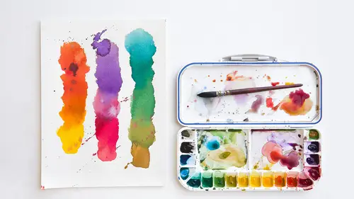
So the last thing I just want to show is I do make homemade gouache and I want to show you basically how I do that. But I also want to walk through my process. And this is if you are interested in illustration, or you like to do a pretty detailed drawing beforehand, I thought it might be fun to see the technique that I use. And so we just... And again, if I'm not sure about a color and I want to figure out what my palette will be, I'll probably go to the chart. But for this, I was thinking we would use our zowie purple that we like so much, just for fun. I'm again gonna block this off. I'm gonna press it down. I could save the white of the panda's fur, but I think I'll do it the way I usually do it, which is all subtracted out. So, the techniques that you use with watercolor, there's lots of ways that it can be used. I won't say there's right ways or wrong ways to use any material, but there are property reactions for materials. As I showed you, if a piece of watercolor isn't totally w...
et and you go back in with it with another color, you're gonna tend to make this mark. It's just a property of the medium. So you want to take advantage of the properties of any medium that you use. And the only way to do that is to understand how they function. And I've shown you dry brush. I've shown you wet into wet. I've shown you how to do a gradient. I've shown you how the different types of brushes react to the surface, and how you have different surfaces. You have rough, you have smooth. This is a hot press so it's really, really smooth. I would tend to us, again, colored pencils and pastels on top of my watercolor. But once you get to know how the surfaces, the tools, and the color itself reacts, it's easier to understand how you might want to use it. So think of it that way. There's no right or wrong way. But the materials themselves are like people. They have personalities. You can push watercolor to do certain things. You can try and make it act like acrylics or oils. But it may not cooperate with you. And I have had students try to make a medium go in a direction that it doesn't wanna go, and usually it fights you every step of the way. So I encourage you to get to know what watercolor wants to do. My tape isn't tight. And then do it. Oh, wait. I hadn't put my white tape on. I'm not following my own advice. Yeah, I would never paint with just the blue. These two characters are Ping and Pang. They're from a story that I wrote, and that I would like to turn into a picture book. Yes, my characters are based on real people. Ping is actually based on someone here at CreativeLive. I won't tell who. But, you know, for me it's fun to not only paint those things that you observe in life, but also things from your imagination. I would encourage you, however, if you're a beginner and you haven't really played with these materials, starting with observation, I think, is one of the most important things to do because it's right there in front of you. It's something that you're looking at. It's something that you can observe. I did some geometric shapes, and that... You know, anybody can draw a ball, or a cube. But beyond those simple geometric shapes, observing something right in front of you in a still life. Faces are tough. I would start with a simple, an object, a food, a toy, a cup, and paint from life. But in addition to doing that, once you've experimented with painting from life, I do recommend you try things from your imagination and utilize what you've observed from life. And that's how you learn. That's the basic thing of how you learn. I also would encourage people to have a sketchbook. Wow, this water is really purple now. But it's a good thing we're using purple, so that's okay. I would encourage you to have a sketchbook and a watercolor sketchbook, which means something that you can watercolor on the surface of the paper and it won't get all yucky. It's firm enough, the paper and the sketchbook is firm enough to do some painting. I think people who learn about watercolor learn best when they do what's called plein air painting, which means they go outside, and they observe the world, and they document it using the colors that they have. And I've shown you some tools to do that, the little Koi watercolor set and that beautiful little brush that you can put water into is fabulous. So, if you're thinking of doing this and you want to really have a good time with it, start with observation, go outside, set up still lives, and just start documenting. The other thing you can start to do, which I think is a fun exercise, and I showed the gouache samples in the beginning, is to deconstruct the colors that make up something that you're looking it. It could be a photograph. It could be a painting. It could be a still life. But literally say, what is that orange, how would I make that, how would I do that. Use your charts as a way to what I call deconstruct the color. And color deconstruction teaches you about color and it teaches you about the materials as well. So I've wet this whole surface. This is actually the gouache purple. I'm gonna use another one of these cups, and I'm gonna go to the cobalt violet, which is now gonna be called Kenna violet, in my mind, when I use it in studio. I'm not going to grab a thick chunk of this. If I stick this brush in here and drag it across the surface it's gonna be like a wad of color. So I am going to use another brush, to kind of... Oh, that had some color on that. To thin it out a little bit and make it almost like more of a, not a soup exactly, but just not a thick patch of color. I want it to be a little bit more like a soup, I guess would be the best way to say, like pea soup. So this is how I would normally make this picture. I'm gonna show you exactly what my technique is. And this is how I did the sparkling sea pictures that I showed you. I start this way. I start with watercolor, and I start with a wash. So we'll just do this whole. We can almost go a little deeper. I'm tempted to use... I'm tempted to grab that color from the gouache, because I've never done it before. Okay, this is where, you know, all bets are off. I've never done this, so I don't know how this is going to look. But I'm gonna mix it right in here and see what happens. It pulls off just like watercolor does, so in theory this should work just the way my normal materials would. It lays a little more smoothly than the watercolor because it's a little more dense. Oh, it's delicious. But the test will be does it subtract as well as watercolor does. And I'm hoping it does. Because if it doesn't, this test won't work very well. But, you know, like I said before, this brush has hairs. This is not an expensive brush. I would recommend maybe something with a little more, a little nicer brush, because I'm getting too much little, like, extra splatter on the side. So, the shape and size, perfect. But it is a synthetic brush, not a sable brush. Now, you can see there's a certain amount of streak to the color. That's okay because I bury all my watercolor color. You don't really see it underneath the opacity of the way I use it. I use it very wash-like. So here's Ping and Pang under purple. Now, what I am gonna do while it's really wet, let's imagine this is a night sky. So I'm gonna pull another color into this. Sort of a gradient that I'm going to make. And I think I'll use, I'm gonna go with a purple-y blue, which is ultramarine. I'd also use potentially, maybe I'd use cobalt blue, if I can find it here. Cobalt is a very... This does not show what the color really is, as you can see. Like, this and this are two different blues. So whoever makes the labels on most pigments, they're not matching it. You don't want to use that as your guideline for what the color is. I just try to go by my color chart. That's why you should make a color chart. But let's just use this. This is watercolor. And I'm gonna use it really densely. And we're gonna imagine that Ping and Pang are sitting in a night sky. Maybe it's sunset, with a little bit of a gradient. Now, even though I'm covering them up, I can still see them pretty well. So, you know, I would try to make any drawing, if you paint over a drawing, and it's too light, the pencil is too light, you won't be able to see your drawing. I actually printed my drawing onto the surface and kicked up the contrast so you can see it underneath all this color. So I'm doing what's now a wet into wet gradient. The color is still wet enough for this to work. If this were too dry, this wouldn't work. I'd be picking up the color that's underneath. But right now, I'm just pushing it around and it's kind of holding on, and mixing, and blending on the surface. Okay, so there you go. Kind of a nice color. Now, the only issue. We don't have a blow dryer and it takes a little time for this to dry. Can you go back a couple days later to finish or retouch a watercolor painting? So tell us about timing. So, a watercolor painting, you can... You can't... How should I say this? You can't mush the color around once it's dry on the surface. It's set there. You can lift it, but you can't, like, move it in a liquid fashion easily. So, that part of it, like what I'm doing right now, once this dries, it dries. And if I go back into it I'm either layering on top of it or lifting the color off. But, in every other term, you can build a watercolor painting over an extensive period of time because you're adding to the color, or you're subtracting off. But the color is still workable. And there's no time limit in terms of watercolor. You could take a year to do a watercolor if you wanted to. The caveat is that watercolor is such an immediate medium. You can see that, you know, how quickly this stuff moves around. It tends to be used as a medium for speedy pictures, or for preliminary pictures for something that's more complex, like oils and acrylics. It tends to be something where, like the pictures I showed you, you can do a lot of gestural work. So it is a very immediate tool but if you want to build a complex watercolor painting over a period time, you absolutely can. And, the beautiful thing is you can reactivate watercolor, even after like a year. I have had watercolors sitting on a palette for a year. And I go back, just add water, you wake them back up again. Not true for acrylics. Not true for oils. So the beauty of this medium is that flexibility of the palette color, the pigments, and that you can build tonal color, and build color, on a surface for as long as you like. I hope that answers the question. Definitely. And, another question from Sunny. Could you explain more what you mean by "burring" the colors underneath, burying the colors underneath? Burying? Okay. So, if I put... I'm gonna try and see if I can subtract this out right now. I don't know if I can. And I'm actually gonna try a little test with my paper towels also while it's still damp. But when I say bury the color, it means you're using color that's opaque on top of what's underneath so you can no longer see what's underneath. And I can show that. But I did it to a certain degree with the ball and the cube. You can't really see much of the purple. It's almost a little translucent, but it's pretty opaque. You can't see the purple underneath that patch right there. You can for this. It's translucent. We're looking past the green to see the purple. Here we're burying it. We're literally, I call it like burying the body. When you can't see what's underneath. You can bury mistakes that way, which means you're covering up the paint so what's underneath is completely invisible. It's easier to do that kind of painting with acrylics and oils because they get so densely opaque that you can put a patch of color on top of what's there and you can't see through it. You could literally bury a mistake. And that media is actually good for that reason because you can make mistakes in acrylics and oils and cover them up, bury them. So that's when I say bury. It's not a particularly artistic term. It's just that I like to think about, oh, just cover that up, and I don't have to see it. So I'm gonna go in and do a little bit of the stuff we talked about before. That's sort of crunchy looking. But maybe I'll wet it and pull up some of this color, just to see what it looks like while it's drying. Make some textural marks. Imagine, maybe there's a bush behind them. It has that texture. So again, I'm trying to utilize some of the stuff that I talked about before. They're sitting in a yard, or who knows where. Now, I'm gonna also try to pull up some of the color... Pang is a panda, so, we know that his fur is really, really white. But see how beautifully that comes up and goes back to the white of the page. And this is still pretty damp. Usually I try to wait until the surface is a little bit drier before I do what I'm doing right now. Because what can happen is, as the color is drying, when it's still a little wet, the color can still move around a lot. As it's drying a little bit more, it's a little stiffer. You can use a stiff bristle brush to pick up color no matter what stage the color is there. Subtractive color, you can subtract the color anytime. It can be fully dry and you can still subtract the color. But you can see I'm trying to make... I'm imagining there's a moon hitting Ping and Pang from the right side. So I'm trying to create a modulation, sort of like what I did with the ball. And they have big round-y heads, sop that's why his head is a really fun shape. And I'm reducing the amount of pressure as I drag it across the surface of his big, round head. I'll go back in, pull up more. This is where the moonlight will hit the most, that part of Ping's head. The white of his eyes well. Pull that up a little bit. And so this is really, I mean, this is how I build a picture because I'm also focused on light and shadow. Not everyone is. And that's another thing I want to mention is, with watercolor, like with any medium, you have a million different styles of ways of working. You can use this material to do entirely shape-based, like the illuminated manuscript, the person who asked about that. Flat shapes of color. Absolutely. And you can use it to model color the way that I'm doing it now. And when I say model, I mean to create something that has modulation from light, to middle tone, to shadow. And I tend to like to work that way because I'm absolutely obsessed with light. Obsessed is the word. I'm fascinated by it because our world is lit. And for me, it's how I can create a mood or emotional space with both color and light. So that's the reason why I have this obsession. So you can see Pang is starting to come to life a little bit here. Again, I'm dragging this brush very gently across his belly. And I'm just trying to create a sense of... Also, he has fur, so I can get more creative with the texture of this brush. I don't have to worry about it being, it's not a ball. He's a furry ball, so I can let that happen a little more freely than maybe with the round, smooth ball I was making before. And I probably would leave his, you know, his brown, or black-ish brown shapes, because I could pull it up a little bit to see where the light is, but I do like the value of this color here. It kind of informs me about, you know, there's black on this panda, and there's white. It depends on the picture. I call this a guideline. This is an underpinning guideline for understanding where the light and the shadow is. This was just to get texture so when this fully dries I can lay green-ish on top of that. But it has to be dry before I do that. And that will, because all this purple blue ground, that surface is there, it's still gonna look like night time because the blue-ish color is gonna reduce the vibrancy of the green. So after this thing dries... And I can do little Ping. We don't want to leave Ping out. But it is like instant light. I'm telling you, this is so satisfying. I can't even say. It really is. It's one of my favorite parts of the whole picture, the part where I get to find the light. I might also do something where I use the stroke of this brush, or I could use a different brush. I might use a bigger brush, or a longer brush, to get like grass stroke, to pull up the light so it's a different kind of subtraction. It's a little bit more dry brush. And it's a different kind of texture than what I did on his belly. But I could do that too. And it's a different texture, still then, what I would call the bushes will be. But this is sort of underpinning mark making and it's a guideline for what happens on top. But it's one way of painting with watercolor. It's my weird way. And the other thing I do want to say, because I think... I think it's important for people to understand that the rules that people make about things, you know, this is exactly how you do a picture. You start and you do this first, then you do that. I'm not a huge fan of the kind of thinking in terms of using a medium that there's this one rigid way that you do this. A lot of this stuff I just experimented with, and played with, and found things, and discovered things. This is gouache. I've never done this with gouache before. And I love the color. It's really dense. I want to do more of it. You can't, what is it? You can't have excitement without a little terror. I am a firm believer in playing, goofing around, trying things that you don't know if it's going to work, and experimenting. And that's my whole notion about art. That's what art is. Art is exploration, experimentation. It's the act of play. And by doing that, you're engaging in something that's always kind of going to give you, maybe there's a surprise. I think that's what makes it fun for me. If I knew exactly how everything would turn out every time, I probably wouldn't do it. So I have my rules, I know basically how things function, but when I have an accident, I try to make it a happy accident, hopefully. Now again, I can't really do much more than this because it needs to fully dry. We're not gonna use a blow dryer. It's too loud. But what I will do, because if I'm painting all this texture on the edge, it drives me crazy. I can no longer see the edges of my composition, so I'm just going to cover it up. And it doesn't matter if the paint is wet. This doesn't have to be fancy. I'm just trying to make sure that I'm seeing what I want to see, and that's my basic composition. Now I can see my edges again. I know where I am, and it's all good. And so the next layer of what I would do for this is I would lock in my shapes of color. The bush, the grass. Ping is actually red. I would continue to build my lights and shadows. And I think I have on the back of this another picture which actually shows... I'll flip it this way, but I won't lay it down so I don't mess up the painting on the other side. This is where I blocked in using opaque and transparent watercolor. The opaque watercolor is very much like gouache. It's a homemade gouache. Chinese white, just the white, plus like a turquoise blue. I block in all of this color so that you can actually see where is the light, where is the shadow. The underpinning color is the paper color. This is Canson paper. It's pastel paper. Now, I did talk about that for watercolor paper because it can be a little bit challenging to use if you haven't used watercolor at all. But, another surface that you can work on for watercolor is Canson pastel paper. And, it's the best. Canson pastel paper is the best. I use the smooth side, the opposite side, not the textured side, because again, I like to use a lot of colored pencil on top. But this color the paper created the ground tonality for this picture. And so I don't have to put a ground down, which is really kind of fun. I blocked in all the shapes of color, the bush, the water, the shapes of the shirts, and their head, and the grass, and then went back over with a little opacity to start to pop out, you know, light and texture. And it's not complete. But this would be the next stage after creating a sort of ground, and a base of light and shadow, and getting my surface color down. I would do the color blocking, which is this. And what I mean by that, blocking means you're literally blocking in shape. Water, grass, sky. What is the overall color of that thing. Then go in with the noodle-y little details, and that's the most opaque color. It's gonna be the thing on the top. Transparency tends to be on the bottom. Opacity tends to land on the top. Because that opaque color is sitting right on the surface. You try to wash over that, you're gonna pick it up. So, another thing I want to talk about, and it's not typically something that you think about with watercolor, but if I wanted to do acrylics on top of this, or some other medium, I spray it with spray fixative to hold everything that's on there down there, and then use glazes, and activate, and do more things on top. And you can always do that. You can do acrylics, or oils, or anything on top of this. You just have to seal it first and protect what's here so it doesn't move. We can't do too much more with this. I might noodle with it later. But I wanted you to see the basic process for how I used the watercolor part before I make my homemade acrylics and all kinds of other things. But, I think that's all that I want to talk about today with watercolor. Do we have any more questions, or how we doing? We are doing great. So much fun. The question from Laura is, do you always do your painting over a copy of the original illustration sketch, or is that just for this class? Her question is are there smudging issues with the ink or the pencil. That's a great question. Is it Laura? Yes. So, Laura, excellent question. I'm so glad you asked that, because it is a big deal. The reason why I tend to print my drawings onto another surface, there's two reasons. One is that I like to save my drawing as a separate piece from the final painting. Because if I don't like how the painting came out I can reprint it on another sheet of paper and do it again. That's one thing. The second thing is, the reason why I like to print it is that the pencil, the graphite, which is what I tend to use, will move across the surface. It will pick up and blend in with the watercolor on top of it. And that's gonna neutralize your color like crazy, because graphite is gray, gray to black. So, I would never paint right on the pencil drawing unless the pencil drawing was a very thin graphite line that was not soft pencil, that was a really firm, like an H lead, a really hard pencil line that isn't gonna move too much. In those cases I have painted over it. But I tend to like to print for the two reasons that I just mentioned. Because I don't want to have interaction between the graphite or any other kind of penciling material and the color. And the second is I get to save that pencil drawing separately from my original. This is typically how I work. And you can print over waterproof inks. Let's say you have a drawing and it's all a waterproof ink or waterproof pen. You can do watercolor on top of it because it's waterproof. But you would want to test that first. If you're using pen and then painting color on top of it, you want to make sure that that pen mark isn't going to move and it will not move if it's waterproof.
Ratings and Reviews
shoney
I really enjoy Mary Jane Begin's style of teaching--I have a degree in Fine Art and have been painting for years, but think she does such a good job of building on the basics and encouraging play. Get your supplies ready ahead of time, if like me you want to play along. Thank you!
Bunny Korman
Adore this teacher. She is so cute and relatable. I would definitely take more classes of hers. Great info for beginners, love the Q&A as well.
Kelly LaFrance
Awesome class! Awesome instructor! Exactly what I was looking for, and highly recommended. :-)
Student Work
Related Classes
Design Inspiration