Opacity and Transparency of Color
Lesson 3 from: Getting Started with Watercolor & Gouache PaintsMary Jane Begin
Opacity and Transparency of Color
Lesson 3 from: Getting Started with Watercolor & Gouache PaintsMary Jane Begin
Lessons
Class Introduction
06:26 2Materials For Watercolor and Gouache Paintings
14:06 3Opacity and Transparency of Color
08:48 4Natural Man Made Synthetic Sponges
07:34 5Demo
07:40 6Brushes and Other Tools For Watercolors
15:34 7Watercolor Tools and Supplies Q&A
14:25 8Soaking and Stretching Watercolor Paper
07:08Lesson Info
Opacity and Transparency of Color
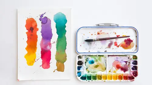
I would like to talk a little bit about opacity versus transparency of watercolor. And I have here a sort of pre-made bit of color. I'm gonna move this pad. And, basically, as you can see, I have the tape on the edges of these two patches of color, and this is a blue tape that a lot of people use for painting. It's nice because the watercolor doesn't seep under the edge. One way to make sure is you press your tape down. I've drawn in pencil a rectangle before I put this down, but the tape keeps a really clean edge, and when I'm finished, I'll pull this tape off. Now the only problem when you're using blue tape, or even if you're using masking tape, is it's a color, so when you're painting you don't want to be influenced by the colors of your tape. So what I do, and I always do this, and I highly recommend my students to do this... I have a little paint on my hand... Is that I cover the blue with white tape, and this is called artist tape, the white tape is called artist tape. And the r...
eason why I do this is because I don't want to look at that dark blue. It's influencing how I see the color that I'm working with. What I'll do, if I cover this with tape and it gets a lot of paint on it, I'll just throw more white tape on top of the paint that's on... You know, if I get paint all over this white tape, I'll just cover it again. And it keeps the surface super clean. Let's start with that. I wanted to make sure I talked to you a little bit about tape. I do feel that taping your edges is a nice thing to do because it gives you a rigid clean space and you understand the proportions or the composition and where the color ends. If you paint right to the edge of your surface, sometimes you can lose picture when you have to cut that paper off of, let's say, a watercolor block. And I'll talk about that a little bit later, but right now I am painting on a watercolor block, and so I don't have to stretch this paper. But let's demonstrate, let's just look at what happens when you use... On this tone I'm going to use some Chinese white, which is opaque, and I'm going to mix it with... So if I mix a little of this very beautiful green, which is called emerald green, and I mix it with some of my Chinese white... Now I'm gonna do something that I have to do, and if I don't do this I literally can't, I can't paint. I have to have a security blanket, and my security blanket is paper towel. It's for dabbing. As I paint, I dab into the paper towel. But I also just think it feels good in my hand, so I have to have it. So what I'm gonna do is mix a little of this emerald green with this white, Chinese white, and I want you to see what happens on the surface of this. This is just a gradation of watercolor. I wet the whole surface, and I'll show you how to do that, but I wet the whole surface with water and then I laid the red, this is cadmium red, on top of it. But let's just see what happens when I throw this color. Sort of... Semi-opaquely, pretty opaque. I'm trying to make it as dense as possible. What I'm doing here is I'm basically utilizing the oppositeness of these two colors, but the opacity of the color creates a certain pop. That's how you can create some forms, sort of dimensionality or gradation of forms. I'll do it a little translucently so you can see a little bit of the color underneath the red. That's where the two colors, they're layered but they're starting to work together. This color's sitting very much on top, and this one you can kind of see the red underneath. Even with opaque color, you can use it transparently, you don't have to use it solely opaquely. But it gives you a nice range. I'm gonna use it as thinly as I can over here. And this is, in your repertoire of paints, Chinese white is your friend, because it gives you an option beyond pure transparency of color and I think that's really a wonderful thing. You can kind of see the difference. The opaque color really jumps off that red surface and then it becomes more neutralized as I thin it out. But that's a beautiful thing to have in your range of options. The Naples yellow... I'll just pop that down here too. This is basically the same kind of thing only the Naples yellow is yellow, it's not white. It's one of the few opaque colors. Maybe I'll mix that with a little bit of this emerald green. We'll see how that looks. We'll test that too. Yeah, and you can see there's a lot of yellow in this color. There are few other opaque colors in watercolor. Turquoise is a very opaque tone. Some of the cadmium's can be a little more densely opaque. But for the most part, most watercolors are fairly transparent. These are your few exceptions. Now if I thin this out, you can again see it starts to mingle with a color underneath. You can also see this is fully dry. What's on top is wet. I'm not moving the color underneath at all. It's perfectly stationary, it's not moving. It's because it's dry. If this were wet or damp and I was painting on top of it like this, they'd merge in a way that would become more neutralized. That's why I say let your watercolors dry before you layer the next color on top of it. Okay, and that's just an example right there of a really thin, what we call translucent color, because you can sort of see through it. Okay. So one of the things I want to show you, I've got a couple different things I want to sort of walk through, which is, I like to show you how to use kosher salts. I've got an example here. I pre-did this with kosher salts. Now I'd like to test this again, and I want to test it two ways. I want to test it on a fully dry paper that I reawaken with water and see if the salt reacts to it, and then I'll do it where the color's literally very wet, and throw the salts on top, and I want you to see the difference between those two things. So I'm not gonna use... And I'll talk about brushes in a little bit, I'm starting with the color and then we'll shift to brushes. But what I want you to see is I'm using a big square brush because I'm trying to create more coverage. That brush I had before had a point. It's not gonna give you the same kind of coverage. I'm trying to see if I can move this color. It comes up a little bit. But we'll see what happens. Yeah, I don't think it's gonna move on this one, so I think what I'll do... And you can see as I wet this, you probably can see this texture down here. That was created by throwing this, it's just salt, onto the surface, and it creates this weirdness. So since I don't have the kosher salt right on hand at this second, I'm gonna show you another thing which is called, it's glazing. I'm gonna layer another color on top of this blue and show you what that looks like. Glazing, or layering of color, allows you to create a pigment and then let it dry, and then put another color on top and so you're sort of seeing through a window of color to the color underneath. It's a really nice way if you want to shift... Let's say you want this piece to be a lot less blue, we're gonna shift it to a yellow. The vibrancy of the color is really amazing. And the vibrancy happens because I'm glazing, or layering, one color on top of the other. You can still see some of this kosher salt action on the bottom underneath. It almost looks like the sea, which I think is really cool. There. And what I'm also doing is I'm moving, and this is a gradient, and I'll show you on another surface you can see it really, really clearly, is I'm moving from a dense quantity of color all the way to almost no yellow at all. This is called a gradient. And the way to make a gradient is to wet your surface fully. If the surface isn't entirely wet the color can't loosely merge across the surface. It's gonna create an edge wherever that water has stopped. So to create a gradient you want the whole surface to be really wet.
Ratings and Reviews
shoney
I really enjoy Mary Jane Begin's style of teaching--I have a degree in Fine Art and have been painting for years, but think she does such a good job of building on the basics and encouraging play. Get your supplies ready ahead of time, if like me you want to play along. Thank you!
Bunny Korman
Adore this teacher. She is so cute and relatable. I would definitely take more classes of hers. Great info for beginners, love the Q&A as well.
Kelly LaFrance
Awesome class! Awesome instructor! Exactly what I was looking for, and highly recommended. :-)
Student Work
Related Classes
Design Inspiration