Preparing Digital Files: Hill Valley Poster
Lesson 7 from: Poster Design and the Screen Printing ProcessMama's Sauce, Clark Orr
Preparing Digital Files: Hill Valley Poster
Lesson 7 from: Poster Design and the Screen Printing ProcessMama's Sauce, Clark Orr
Lesson Info
7. Preparing Digital Files: Hill Valley Poster
Lessons
Studio Tour
09:59 2Introduction to Screen Printing
07:26 3Choosing Paper: Deciding Which is Best
10:05 4Selecting Ink Color: Using the Pantone System
11:16 5Designing the Poster: The Process
09:40 6Preparing digital files: CreativeLive Poster
09:20 7Preparing Digital Files: Hill Valley Poster
06:20 8Halftone Hacks in Illustrator
07:34Lesson Info
Preparing Digital Files: Hill Valley Poster
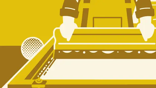
So we're going. Teoh, open up a file here. And this is a two color separation for a poster. And you can see I have my crop marks in my registration works. Ah, so this would be the lighter color. It's gonna be orange, and then this one is going to be like a, uh, more of like an awkward color. A little more, um, or greenish blue. Um, and we're gonna look at what the fire looks like together. So we can we can actually look at what the trapping would look like. So you can see I have the lighter color here orange and in the darker color, the greenish blue. And we'll go ahead and zoom in here and look at its grab this color and make it say green, so it's a little easier to see. Okay, so you can see that I trapped the orange so that when the blue the British blue overlaps it, there's no slight, uh, the hairlines and the gap or a gap in the color. Um, and I did this to the entire print, so sometimes this can take as long as actually designing the poster, which is a little crazy. But as I menti...
oned before, you kind of have to do it if you wanted to look perfect so you can see the orange underneath all this green blue cross the entire thing. So there's certain pork parts in a poster where it's a little easier Teoh to trap than others, for example, like long straight lines. That's easy, because this was originally this this orange, you know, what about been down down here? And, you know, if there is a slight movement, you'd get a gap. Um, but to travel, all you have to do is drag the orange. I've just a little bit like that, and that's pretty. That's pretty quick to edit. When you get Teoh ports like this, the highlight in the lettering of Hill Valley, you can see that it's completely surrounded by blue. There's an easy way to do this, Um, and I'll show you so you would select it and create an outline. So let's bring it over here so you can actually see what that would look like. So we'll add the stroke weight to about there, and you can see that that covers over the orange, and I'll dio a quick overlay here so you can see what this would look like. So you can actually see that when we make the darker color lighter all the overlays, which would be the darker orange color. So that's how you know the trapping is, um, is underway to get printed, so I'll show you ah example of where it gets a little trickier and takes a little bit more effort than just adding a stroke or an outline, sometimes doing type where it's actually a darker color. Over the lighter color can be a little tricky. Um, and you Sometimes I'll do it by hand. Sometimes all select a color and, uh, and give it an outline like this for an example. Let's give this, let's say, like a white outline. I'll expand that go over to the Pathfinder, and then I can create a shape that's a little bit smaller. So let's see what this looks like when you bring it over here. So this would be just under the shape of the out one so you can create shapes. Um, well, easier. By doing that, a lot of times you'll just have to go in there by hand. You can see that these are, Ah, a little more like dragged in and around by hand, and it might be just a little quicker in certain places. When it starts to butt into another color straight on like this, it's a little easier. You just need to take your time and make sure your bases are covered so you don't get any surprises and print. Sometimes it's gonna be a little more important that you trapped than others. Um, but you just got to kind of get in there and try it yourself. Um, one last thing I'll go over is registration and crop marks. So when a printer is printing, uh, they'll have registration marks on each color, so I'll get rid of the greenish blue seek and see what the first color looks like when it goes down so it will be printed. And you can see this is the trim work right here. This is where, um, your final poster size comes down to in 18 by 24 in this case. So the trimmer knows where where to cut. Um, when the printer is pruning, they'll use this registration mark, um, as a ah, a reference to where tow line up the secondary color and so on. If you get multiple colors so you can see that if we just move it a little bit, you know to the bottom into the left that it's not on alignment, and you can kind of see I'll exaggerated a little more. You can see where registration can be a problem, especially if you don't trap. You get these awkward gaps and your alignment is off so you you can set these up often. A screen shop screen printing shop will actually do that for you unless they ask you to do it. It's pretty simple to do. You just need to isolate your your colors for separations and then just create lines and make sure that these end up being 18 by 24 all created 18 by 24 shapes. You can see how it aligns to the trim marks so you can see right there that it's going to trim exactly at 18 by 24. So there you have it. That's trapping and registration and trim marks
Class Materials
Bonus Materials with Purchase
Ratings and Reviews
AJ Estrada
Man, I've been waiting for a class/tutorial like this for years. You've both cleared up a lot of confusion that I've had about the this process. Love the final design and colors you went with. More classes please!
Mjose Mab
Hi, I'm Spanish. I would like to know some company that works with silkscreen paper in Europe.Me You can say some european brand. Thank you.