Lessons
Class Introduction
03:54 2Use Channel Masks to Create a Black & White Image
09:35 3Use Channel Masks to Clean Up Backgrounds
10:27 4Use Channel Masks to Highlight Skin Tones
04:54 5Use Luminance Masks to Alter Shadows & Highlights
13:25 6Use Luminance Masks to Color Grade
08:38 7Target Tonal Ranges with Blend If
13:25Lesson Info
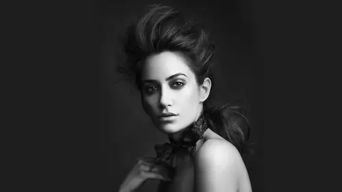
Use Luminance Masks to Color Grade
Now we're gonna take that same technique, and we're gonna use it in color grading. Same general idea, but we're gonna use colors in our application. Now. There are many ways and what you can add color, and in truth, it does not matter. You want had a solid color curve levels. Vibrance, hue, saturation, color balance, black and white. You could do that to ed color photo filter channel like there are many ways to add color. That's actually not what's important. Just like it's not important if you pick levels or curves to brighten the image. It's actually all about the colors you pick and how strong or heavy or not you're using them and how foreign to the image they go. Okay, so let's say you want to come in and you want to add a little bit of blue. A little bit of yellow to this image combination is used a lot in color, grading blue and yellow because blue is a complement of the warm tones that skin usually is, and so the skin usually pops off a little bit better. It's why you see blue a...
nd orange and movies over and over again. It's the same idea. So we're gonna use a little bit of blue, and we're gonna use a little bit of yellow in colored rating this image. And in truth, if color grading is is largely about finesse, it's largely about subtlety, its not necessarily about hammering your your color, clobbering over the image. It's also about bringing out the colors that are already there. And you tend to not want to fight the colors. They're there. So the colors you pick are important. It's actually very, very important. But I'm just gonna be using blue and yellow as a nice little base. I'm gonna show you how to put it on and refine it in the image. So I'm gonna create too solid color fill layers. I'm going to do one for the shadows and I'm going to do one for the highlights. I'm gonna do a blue and a yellow And like I said, you know, curves doesn't matter photo filters. But what I'm gonna do is I'm gonna use to solid color fills, and I'm going to set the blending mode to color because obviously there's no tone here on. I just want the color to apply. I don't want any of the luminosity to apply. And so I've got this blue and I've got this yellow. Okay, now the great thing about using yellow orange the great thing about using um, solid color fills is that it's very easy to adjust the colors in the image. So any time I want to come back and I want to change intensity, I want to change the color itself. I can easily do so. My preferred method of using the color picker is the H because you'll notice As you start clicking around through here. You got a lot of different ways to to pick color. I like the age because for me, the H lays out color very logically. Basically, here's what it is, Hugh. You'll notice it starts at zero. Quickly goes to 3 59 Let it all the way. It goes to zero count. Zero is the number zero plus 1 59 3 60 It's the color wheel, so linear representation of the color wheel. That's what we're looking at here. That's why the same color is at the top in the bottom. Very logical, very straightforward. Next left to right control saturation. You'll notice the s number goes from 0 to 100 left to right. And then finally, the vertical move is luminosity. That's not really gonna be affecting us right now, because we have luminosity turned off. But, Jonah, does it go 0 to 100. And so I find this is a very logical way for me to lay out the way I pick color. So if I want to change the huge just kind of manipulated a little bit here, if I want to change my saturation, I go left and right. Generally, what I do in this particular stage is I put it mostly all the way to the right. And then I used the opacity to dial down just a personal preference. That's why you'll usually see me move it all the way to the right hand side. I like to work with the pure color and then dial it back. I always start with too much and dial it back. It's harder to make it stronger. It's easier to make it less so. Obviously very heavy handed, very heavy handed. Okay, So what I'm gonna do is I'm gonna go to image. I'm gonna go to apply image, and I'm gonna do invert for the shadows and I'm going to do apply image. Turn off invert for the highlights. Now already it's better, but not great. Better, but not great. I could option click on the layer, go right into it and use contrast to decide where it's gonna go. I could also just look at the image and again let it dictate where it's gonna go. Okay, this is obviously still too strong, but you can see that it's leaving the skin in the mid tones alone. It's affecting the shadow tones in the background. Looks pretty untouched. Okay, so it really depends on how you want to go about this. How much you want to use in your image? I was gonna hit. Okay? And then I just lowered the opacity until I'm happy again. It's about subtlety. If you want to come in and you want to change the color, you can do that. Sometimes you have to readjust, all right, so maybe that color needs to be a little bit more aggressive. But you can do it and you'll leave certain things alone. I talked about memory colors. Memory colors are colors that we need to associate in our mind to be a certain thing, and when you see certain colors is wrong, it doesn't sell the color. Grading is successfully so specifically skin tones. We want to make sure the skin tones air rendered as accurately or relatively realistically as possible, so so we can come in and we can make these blue shadow adjustments without affecting the skin tone. If you take a look at that skin not selected now, we're gonna do the same thing on the yellows for the highlights, which is obviously too strong, and we just start by dialing it down. And I mean, that's not terrible, but let's say we want to refine this a little bit more little command. L bring it up, and what you have is this and again, it's largely about how much you want to go into this amount. But here's the before. Here's the after I think it's your nice, subtle colored rating, so about hitting your viewer over the head with the color. It's just about giving it a little bit of but with something extra now for May. If you want to use the actions, which is very, very helpful. Here. Do this exactly again, but much quicker. Pick a little bit warmer color there. Change this to color. Big fan of blend modes. You can actually leave, though. These actions designed to turn the layer off for you before running apply image so you can actually leave them on. So I'm just gonna hit shadow and play. And the cool thing is, you just keep it in play and it'll keep refining it for you, and then you can dial it down. That looks pretty good. And then I'm gonna do it for highlights. Keep dialing it down, and then we lower the capacity a little bit. That's basically how you get to the same place pretty quickly. And so it's a combination of these color effects and the tonal luminous effects that are going to really push your color. Grading your cup color. Toning too, the next. The next level. I am a big fan of both of these two methods I use. I use both of them all the time. It's a little bit complicated to wrap my head around the first time you do it. You just have to do it over and over again, and it starts toe to make a little bit more sense.
Ratings and Reviews
Rob Giersch
I think this is a great example of a class that would benefit from a star versus a thumbs up or down rating. Chris is obviously a master at these concepts but not necessarily the best at walking students through exactly what he does. There are many moments when he moves through 3-4 steps so fast that the Creative Live team can't keep up with the steps on screen, so you have to go back and somewhat de-construct the words and visuals to piece together what actually happened in photoshop. Bottom line, fantastic resource and process for learning the finer art of masking, but not the easiest instructor to follow,
Joseph Parry
Chris is a superbly accomplished photographer. If you're not familiar with masking, this is a great class to add some excellent options to your toolkit for everything from grading to cleaning. For $19, a total gem.
Mike Hardie
Covers all the important areas with enough detail for you to figure out how to apply the techniques to your own work. Some useful tips thrown in for good measure. Decent class. Worth the price.