Compositing Process of Hi-Fi Image
Lesson 23 from: Make A Fine-Art Bestseller On A Fashion ShootMiss Aniela
Compositing Process of Hi-Fi Image
Lesson 23 from: Make A Fine-Art Bestseller On A Fashion ShootMiss Aniela
Lesson Info
23. Compositing Process of Hi-Fi Image
Lessons
Day 1
1Defining Fine Art & Fashion Photography
33:54 2Why & How to Channel Your Passion
29:26 3When Passion Meets Business
22:44 4Method in Madness of the Right Brain Photographer
26:01 5Right Brain Needs a Left Brain/Shooting Planning
43:26 6Gear Overview
15:55 7Test Shoot Setup: Location, Lighting, Styling
43:35Simple Test Shoot vs Couture Test Shoot
24:19 9Inspiration vs Imitation & Having Moodboards
33:41 10Creating a Pitch
45:48Day 2
11What Makes it Fashion or Fine Art
47:17 12Sourcing Locations On a Limited Budget
16:59 13Submitting Work to Magazines
15:18 14Lo-Fi (Small Production) Shoot
21:26 15Lo-Fi Shoot Continued
40:05 16Couture Fashion Shoot - Part 1
34:30 17Couture Fashion Shoot - Part 2
30:30 18Couture Fashion Shoot - Part 3
34:01 19Team Q & A
49:39 20Reviewing Images from Shoots
12:03Day 3
21Tackling Anti-Photoshop Debates
30:23 22Image Selection & Simple Editing
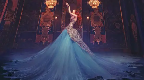
49:17 23Compositing Process of Hi-Fi Image
37:23 24Possibilities for Surreal Storytelling in Images
35:09 25The Purpose of Finding Your Style
40:07 26Acknowledging Your Photography Journey
47:15 27Marketing & Social Media Audience
35:21 28Preparing for Job Offers & Dream Job
32:44Lesson Info
Compositing Process of Hi-Fi Image
Okay, so go back to my pictures I want to carry on from where I left off talking about the the high production, the kids you're set up, we were shooting yesterday on dh. I was looking at some of the final pictures off the model standing in the room just gonna flip back to the beginning. So I've been going through a marking images I like now there's loads of images I like I'm liking them based on pose on liking them based on the dress shape as well. I'm thinking what's the best foundation shot I could potentially building maybe some dress from another shop. I don't necessarily want to do that. I just wanna do what's appropriate. So, um, well, here we have some images, uh, for example, quite like this one. So let's, let's, go ahead and open up this image. Let's, just start somewhere, sometimes is a case of just starting process pictures, and then you get a feel for their mileage, and sometimes you like the look of a picture, but it doesn't necessarily work out that that's going to be the...
most dramatic when you get so it's nice just to get in there and make a start on dh to compare pictures, sometimes it's a bit annoying sometimes that you can't but you have to maybe go for the process halfway with some of them, but that's, when you really sometimes get a feel for whether they're the best you've got from the shoot so let's, just start with this one. Got her in the kind of swung pose. Maybe it's not the best one pose weaken. Get mitch, just let's. Just go back in and see whether there's one where her arms and well separated also got ones with folks. I want to work the one without fault to start with because I want to just make things right. Simple. So let's, just take these filters off. This one, for example, has got this nice separation of hands. The fingers aren't sticking out oddly at the top there. So I quite like the look of this one. Just zoom into that. This is one of the key things I'm gonna do is just zoom in and check that she looks in focus and good in the image that's very important. If I'm gonna be doing any work all in the image, I want to make sure I would like the shape of dress in this in this as well. So let's, uh, let's, let's go with this one from it, so in terms of my role settings, because I know I'm gonna be and we'll be doing a few compositing bits to this I'm going to be taking the boom arm out on I'm gonna be stitching the area to the left so I know that I don't wantto play around too much with my picture in raw also because the lighting is achieved how I wanted to look pretty much I start playing I'm really creatively in here and I've gotta make the other pictures exactly the same when I bring them in which I can do but because when I shot the image without the boom arm and I don't want to putting together very tongues and picture with picture that's not quite as tungsten toa mask the boom on that I just wanna make life simple for myself so I'm not gonna do too much working raw to them because I want to also just get images together and see what I think of them and if I really wanted to go back in and re do the roll files I could so I'm gonna bring the shadows up just a little bit that's one of the few things I'm gonna do because that means that I'm not generally not generally affecting the this part of her buy it by as I would with exposure I want to keep the exposure putting up sure it is I just wanna bring the shadows up a bit because that gives a gentle lift look better than nice flattering left as I was giving the pictures earlier fall break so we could also prove temperature a little bit well, I kind of feel like it's pretty much they're already it's the coolness of the blue of her dress cooled us of this tongues than of this going either way I think it's just gonna be a bit too much at least for now and then we'll play around without later so let's just set that like that on dh open that up okay, so first thing I want to do is I want to get rid of the boom um I want to get rid of that for obvious reasons but I also want to get straight ways I could just get onto clean palate and I really feel like I'm heading in the right direction and feel motivated for what the next thing is gonna be so let's just do that now so I'm gonna do is just find my shot where eyes shut without that so here we are this one here um I took a few different exposures if you there and you saw obviously the exposure that was taking I don't necessarily need them they're just they're they're in the bag if I want them if I want to fill in all the details but let's just take one that's closest to looking exposure wise like the picture I just opened just for simplicity for now and let's just say two previous conversion and that's pretty much there even though it was shot without flash the young bin light for this part the room is gonna be the same as it was in that image so hopefully they're gonna be pretty consistent enough not to have any miss much so what I'm gonna be doing I can either I could do it either way I can put one on top off the other I'm gonna put this one on top of this one just because it happens to be open first opened in front of me so I'm going to do that so what I've done there is I basically got my move toe and I just clicked inside this image and dragged over into the middle of this one so make sure you actually click in there rather than up here on on the actual tiles and I'm held down shift so itjust plunks itself on top of the picture like so now I've done it so that it's gone over the model rather than the other way around I could say it doesn't really matter I quite like the idea that if this one does have a little bit more ambiance in it then I can keep hold of more of that on just basically mask out where she is so but lay mask on that layer my paintbrush on black hundred percent and just bring her back and that's hundred percent flow as well, just completely hundred percent make sure I've got all of her back so that we have you could see those there is a slight difference between one picture in the other, but that's quite nice extra ambience coming through. That isn't a big deal in terms of the the continuation between one on the other, because I've raised with a very soft brush that's quite important to note it's on its softest, its on its lowest hard level from not present. So if I were to and change that on my king, keep keys, I would you sift square bracket to the left, so for example, if I just go back to that brush, he watched my brush khun get harder and softer like that. So I make sure it's very soft, so that means I haven't got any giveaway cutting lines between one color temperature and the other, but the color temperature differences so subtle anyway, so now I've got this as a complete picture without the boom on. Now, before I do a photo emerge, I need to save this because folk merge demands that the files are not in the middle of being worked on before it stitches them, so I'm gonna do is I'm just going to flatten this so it's one and it's pretty much don't really worry too much about saving the psd file because it's so quick to do and then I'm going to save that as a tiff in the same folder we're going to select this could it just kind of harvey's the file size without compressing the quality compresses the file size, but all the quality? Um, okay, and we'll leave that open, but when I close the other one down, just get out the way now because I've been it with it, and then I'm going to go and find my image. I'm gonna stitch to the left, which is, uh, this one here, so again, going to start by going to previous conversion that's a little bit warmer, for whatever reason than the other ones, so I'm just going to adjust that by I a little bit not too worried about there being the mismatch, but it's just so so subtle, so bring the temperature down a little bit on that shadows up, just like in the last conversion and then let's open that. So now I've got these two images I want to stitch together so in same way that I did stitching earlier gonna go into automate photo merge, add my open files on tick blend images together so that I can take care of any overlaps myself. I'm not too big a deal if I do select that it's just that in some situations I found I've been able to recover detail that folks shot misunderstood so as a habit now I just take that sometimes it doesn't mean extra bit of masking where there is an overlap but that's okay, I will leave on auto for now and see if that makes sense of it. I can always go in what I'd really love is and if it gave me a preview of what they all looked like, that would save time and speculation, but hopefully that's gonna appear somewhere in photo shops future so let's just okay, that just shouldn't be too long, there's only two pictures, so I'm thinking, you know this extra detail to one side, how is it going to play in my image here? What? What is the use of it? Why do I want it? We're not gonna use it for is it just for decoration? So the result looks pretty good it's kind of think it's made her look a bit like longer. Well, maybe not, but that's okay, I sometimes I mean, you are going to get some kind of distortions when your folk emerging in some part of picture, otherwise you or if you don't get distortions, we're going to get, you know bits and pieces crowd depending on how many shots you did for me I this is enough for me this is enough to work with and I don't mind too much for the distortions you can see that the lines are going all this way because you got the model centered here it's well so you got the lines going pushing all this way which I will probably be inclined to correct myself um perhaps uh obviously I'm looking at this part here I don't really need anything too high this for me has gotten off space going on here so when I was saying earlier about warping we're going to be doing possibly they have thought in a minute but let's just take care of this overlap here I want to spend too much time going over these little details I just want to give you the gist of one doing obviously don't want to lose that part that bring that back back to black and just kind of taking care of the overlook myself. Um okay so I'm gonna merge alter one layers who got shift command e that very complicated thing that basically just puts everything in one layer which is the equivalent of flattering accept that I'm just keeping hold of these two below that layer andi I'm thinking now how much do I need do I really want a warp? I feel like this chandeliers maybe off to one side so I could make an attempt at warping. I have been very ambitious warping before on my on my images, so I don't feel too scared of doing it. Doing it live to the world is a little bit different, but that's okay, so let's, just have a little go at this very wary of basically, the more you're gonna be warping than the morrises are gonna have. If you're if you're talking something a little bit, you're basically the whole image is at your mercy, too, to be moved around us. You see fit and it's nice because you can get you could really get in there and move the image around as you want it to be, and it can be quite empowering to do that. Other times it could be a complete mess that just recover which side of the spectrum you end up on that so I'm basically my instinct is to pull us over first of all, so I have to lose this she's on the very edge of the image here we've got this lamppost in, I don't want to lose that. Also, it means that you're just pushing whole image over. So your I feel like it's straightened when you're pulling up like this. It's less of a risky thing because you're pulling in the direction of the lines so it's not too much of an issue on then I want to just stretched south so I don't have to crop away the top of that chandelier that I really like ana I have you know I think I did actually take a few more details shot for the ceiling so I can actually do a more multi layered photo emerge if I wanted to really get more detail of a ceiling in this particular case I'm no two bullet I'm still on a journey of discovery with these pictures so by no means am I saying that I know exactly what I'm doing with this scene it's just that I'm as I go along I'm I'm I'm thinking these things I'm thinking instinctively that she's down here she's got hands in the head in the air she got the chandelier above her do we need any more than that always this enough for this scene I'm not saying yes this is harry yet it's just how I'm feeling this could be something I can clone out so I'm going not stretch that anymore and then uh this is something cloners wells did not have to stretch that and then I might just take care of that little bit there and I'm looking at the lines here out something you can do is goingto apply that sometimes I do this um just to help myself when it comes to straightening pictures when I am doing these thes and adventurous warping escapade let's just go before and after that's why I've done it sometimes I put the ruler on on then just kind of see why I'm with thes lines by just dragging out a guide very briefly just teo just to get an idea of how much our I wass on dh then I can get rid of those guides a swell and get rid of the ruler so it's something I just do to check on things now there is a little bit one can is there, but I'm gonna take care of that a little bit later as I progressed so let's now move on to just get rid of these bits bottom just very simple cloning really? I mean the reason I've left these to be able to be cloned is because they're very simple areas they're not complicated patent areas they're just areas where I can pretty much hit fault that it's just going flow hundred percent capacity hundred percent on then just also I really like how you can just click then if you shift, click you khun draw a line with your brush I wasn't completely done that's ok it's only a little bit I just go in there and you've also got some up here which is pretty easily taken care off sometimes I don't do these details straight away anyway, because I'm I'm not bored about details before I'm bothered about making sure that this is a picture I want to spend my time on. However, sometimes you need to do some things to help yourself see the kind of testing part, so sometimes you want to jump ahead and actually see if I get rid of this and apply this detail, is that going to inspire me to then move on and on and on with his picture? I would I want to ditch it and try another show off because we've got some of the shots of her that we're able to try, you know, not so combinations I don't I want the strongest pose I can get from her one the strongest combination of those elements. Um, I've also noticed you've got a bit of space on this side I'm gonna walk that I'm not gonna clone it because it's a little bit, uh more it's probably I probably could clone it, but let's just, uh let's just pull that out a little bit because it's just a tiny bit. So at this point I'm thinking no, there is space for or additional aspect it's also just a nice breathing space around it shows this beautiful room we've got these lampposts in the image I really like them can we do more with, um can we maybe exaggerate the effect coming from them? Er we've got this beautiful chandeliers that are punctuating the image I'm also gonna just go in now on dh basically crop that job because we don't really need what was going on there could clone it but it's just generally not what we need so it's different bits and pieces going on here just get rid of all of them like that okay some just save this to save your desktop again just off convenience come say that is appear steve fellas this is what I do whenever I've done those initial stages it's always good to save because then you have them all um secured I just say the initial thing is appears defiles often I end up with lots of psd files because I want to start afresh that helps me not only in keeping each file size manageable which also means that sometimes I get, uh re motivated by flattening a picture and thinking ok that's done what next is not necessarily technical necessity is just a workflow that I find technically and artistically pleasing to go through another life is obviously easier the less pierced the files you have floating around but I keep them all in the same place and keep them all ordered as well, right? So no, I'm looking at his picture on dh you know she's at the side of the image is that is that interesting you know should there be some on this side as well or is it enough to have her there what is what is the point of her being there way she looking at the camera what was going on and I don't know the answers to these questions it's just a case of feeling my way and and usually what I do at this point is I experiment with a bit of um curves adjustment it's curved adjustment is usually overall color adjustments or something you generally want to do with the end of compositing because when you're composing things on top of one another than going to get these myths matches and you want to make you all unified but I find it inspiring to be trying out curves adjustments because I personally want to see where this picture's going on because occurred adjustment is that final thing you ad I want almost jump ahead to the final thing and imagine is this a good enough palette for that? Where is a color identity going? You know she's wearing a blue dress and very kind of tungsten room with these paintings that have you know these mint greens and oranges and blues as well but how was his picture coming together as a schism with a color unification in it so I just literally take a trip through my curves adjustments and just you know cut quite like this one quite like how this is bringing some purple fringing to address a little bit and bringing out the purple edge to the blues in the picture the blues might be quite boring in the room a little bit but this is thrown them off a little bit making a bit more mr cool quite like that all these names that I curved adjustment got legis from different situations that I've done and saved them off of something vaguely memorable um so let's just go back to that one that I liked and I might go back in and just back in actually to that coach adjustment and play more with that just figuring out whether I want more red in the picture whether this is supposed to be a warm picture whether it's a cool picture you know what what kind of color tone do I feel like I'm going to just ruin the picture I put too much on I do I'm gonna be careful with my curves adjustments because you know we spent so long getting the light right on her the last thing I wanna do is just blow her out with a load of curves adjustments and sometimes that can happen like you know and you gotta be really careful that you just bring that back and bring about the strength of the image in the quality of the image that you've strived so much to obtain. So, like things like that, for example, just I mean, it might even look nice from a distance, but it's just getting rid of all the detail that you want to be your treat very delicately. So it's a fine balance and it only comes we've just playing around, and sometimes, you know, you might go overboard and then you turn it down a bit, but like I say, I'm just literally testing the water with his picture feeling where it's going. This is all part of the decision making for when you are putting things into images in the way that I do anyway, in terms of experimenting with things. Um, and I was tuggle preview on and off because it might be that I once joked that, you know, you can spend so long tweaking, and then you preview and you realize you barely done anything to the picture, and actually you don't even need it, so that has happened, you know, there is this tendency to want to vote shocking picture on dh I fall victim to that. You want to do something to it because you feel like you have to do something to it, and you've overlooked fact you've already got a nice balance there in the image already. Azam going when I'm thinking how do I want to treat the move address do I want it to be nice cool shocking blue or do I wanted to kind of warm and fade and become yellow and romantic you know I don't want to brewin lian is vision in terms of his blue dress that power the blue appeal of it but then again I also want to bring it to life as well in a way that only post production might be able to do in terms of giving it that final embellishment ahs well as all of the effects onda posing that we played within the shoot itself so I like the look of that so because I like that I'm not necessarily saying I'm going to use our plight but I'm going to just save it because it's part of my journey of processing this so I'm just gonna um call it loons and then it will be there in my presets there at hand if I want to just you that woman is someone dying to click that one but yeah okay so you know I like it a cz a simple image it's the simple things at dawn it shows how simple it is just itching to get rid of that boom armand have that nice lighting on her within a situation like this where I've got a lot of possible combinations on my end up with a few pierced e files were I've stitched and I've done all the necessary things, and then I've put it into my bank, and then I've looked at another one, and so okay, is this more of a palette for something weirder? More kind of interesting? Not that this is an interesting, but in terms of my surreal directions, often I've done that. I've done one image that just doesn't need anything, and then another image I found art's great palette for trying this business on, so when we were shooting at the ruins, there was this horse outside the doors. This is kind of paper mushy, papier mache, a horse on dh that's kind of covered in butterflies and flowers, I think a gold color holes that we just go and find that so when I arrived at the ruins in the test, you, I was doing all of this, taking pictures off the murals. In my experience, I don't think it's likely that I'm going to use a lot of thes because the room, when the room is anonymous in itself, got painting on the wall, sometimes that's good enough it's in the image to bring it to life is very special circumstances, if you want to start bringing the deer out his picture important next to it because you've got this danger of just ruining it, you can exchange of just obscuring the strengths that you've captured and it's such a such a difficult balance I'm not saying it's easy is something that takes time and just perseverance to know you know when a picture is just not going to be better by adding something into it but I took these pictures speculatively even him I don't know where he's gonna go up I think he's gonna be disappointed to be honest but but this he's the horse even a pumpkin battle from one end of using that it's just too much glare on the frame of the image but bird's eye views birds a lot and he's a nice because they can kind of perch in places but then again sometimes you feel like you're just perching within a picture for the sake of it so where's the balance you know, between a small detail and things that you might not even bother putting their because they just they just put that for the sake of it but I'm covering my options again like I have done with the choice of shots I'm trying to find the right kind of combination between them so this horse and we're going back to this horse on this something pictures of it at the end we wanted to take the horse into the room and shoot with it but unfortunately it's bean mistreated in the past so it's not allowed to move from its spot so we didn't wanna push on that one? So I just thought I'd take some pictures off it there is potential for using it maybe not even in this image maybe in another image I don't know, but but looking at the space in this one, I'm kind of thinking, is it worth bringing in? Is it just gonna be like, completely daughter mismatch? Is it going to be too much? Because he's already got so much going on on the walls is probably already too much like there's a lot going on in the hospital? You just let me just show you what I mean by the detail because it's not just any old horse it's got all this stuff all over it's very kind of you two more caressing, I think team one has got a picture of some kind of gold horse in one of his fashion editorials, and this reminds me a lot off it, but with an extra element of hand painted flowers and details um on the lighting I wouldn't shoot with lighting, I shot it with a mixture of open aperture and high I so kind of alternating between them, so I'm not even sure whether I've got the best quality I can this one looks half decent if I were to put it in a dark picture, it wouldn't be such an issue but a brighter picture it probably would but to be honest, you know, if I was at home just playing with my pictures, which I was last night and will be when I get home, I'd want to just stick it in I want to just stick it in and not not spend, they just cutting it out, I just want to see, you know, is this completely stupid idea to put the horse in the picture, so I might as well to show you like how I work, which is to do that on dh when you see them, other things I've stuck into pictures, this is this is like the way I work, I like to just feel it, I don't want to know it sometimes I just don't want to know whether it's going to work, I want to just see so I'll just put it in like this on what I would do is I would just sometimes change, uh sometimes make it smaller. Justo so it's actually that's somewhere near the dimensions, it would be, um on dh I would change the opacity just so I can see through it just so I can feel like is this is this where this horse belongs? Or is this just stupid idea make it gets smaller again because maybe about the, um and if I can't tell that I might then leia blending modes a bit funny when it comes to compulsive anchor sometimes, when you've got something at this has got so many things going on in it in terms of cholera in tone, and then the room behind it's got so much going on in it, layer blending modes are not always going toe bring you an appropriate kind of vision. I just want to see how this horse would look if it wants out. Um, I'm looking also the space of the floor, like when I was putting the giraffe in the picture I showed you before, you know, I was really thankful that its feet kind of like I had someone to stand in the image because otherwise it won't work, you know, that has to be some sense of perspective, some sense of space. So whatever the object is that you're bringing in, this is all stuff that if you were kind of shooting really intentionally as possible, you would be looking at these issues lighting, perspective, color, synergy you'd be looking at them when you're shooting your stock in your objects intentionally and that's. I'm kind of a bit of both I'm a bit of right and left brain when it comes to shooting stock, because sometimes I will be like, and, uh, like, I was saying earlier about being spontaneous and being in the moment, but then also when I was shooting this horse, I made sure I got lots of angles off it, so I had a choice of perspectives to use in any number of given situations, so you also want to be technically prepared on a certain level, but I ultimately want to be led by the moment when it comes to the final decisions, so I don't actually know whether this is a completely bad idea. I think I'm also thinking about her in our arms. What relationship of what relationship? If she got to this horse, does it look like they don't belong together, or did they look like they belong together? However, I think as a shape it works, but I don't know all whether this the actual color and pattern of the horse is going to work well in this room, because once I call all this off and it's just the horse, andre, I don't want to attempt to do this in front of you, but let's, just say I did it really quickly. This is what I'd be doing in fine detail if I was to cut this horse out for riel just going obviously round it very closely, much closer than I would be here, but my fear would be that. I don't know this is the best picture of the horse got slightly clipped but I've got other ones on but this again like I say is just for an idea um they just wanted to see my uh pass so if I click on this on dh make selection well I could feather it but it doesn't really matter because it's not really a thing that's just and they can you layer and cut me out so that's just the rough copy now already on worrying that this is not gonna work probably not gonna work because once I get rid of all this the horse is is going to lose it in the background like it's it's too it's not light enough eyes too dark and it's got its working up to it and I'm not sure whether people will appreciate a detail off the horse unless they saw it very close up so I'm not saying one hundred percent not gonna work but I'm not really feeling at this point at this point probably what I would do if I was on shore is just going very quickly and change the color balance of the horse so that it's more like going towards the room color ballots like red and blue rather than green yellow and just you know I'm thinking all the time you know is this is it worth it or is this horse just like not lit in the right way to complement this scene is it just going to like get in the way of a picture that combat without it? So I'm not sure I'm just at this stage probably what I would do I'd be mostly no but not completely no so I'd probably just hide it on then this would be compartment come part of my kind of experimental pierced a file that I probably confined to my archives forever but it's just showing the the different things I've tried like the picture I showed you the day weevil the paintings of the burden in sex just splattered over the picture that's all the layers just basically turned on so I thought maybe it might be interesting moment now to go in tonight stock images from home that I've brought along for your enjoyment slash education s so I've just got right of things that I've plucked out from mike I've prepared especially for this just just kind of there's some red herrings in there but don't let them sit there let him scare you so just kind of odd things I've taken from my own pictures on dh also just things that I'd probably never used but I've just thrown in there as an example of what a folder like look like if you're you know collecting things that you might use in pictures pictures from museums, those pictures I showed you the day we have taken parts of the mist um uh c bro wearing hot, huh? On then we'll go also clouds out of planes and that's super recognize up to confirm my picture. And then um frings from the museum quite like revisiting this museum folder because you've got these things that tend to work very well with the whole vocabulary of fantasy and fashion, ethereal and kind of feminine weird's things like this wings and creatures I don't know if I'm ever gonna use that, but it's in there, so I just kind of looked through for inspiration, and it might be that none of them apply and some of them kind of annoying me because I kind of want to use him somewhere, but I just feel like they're never gonna work and most of them won't work. So it's it's not unease e process, but it's this kind of fun if you open yourself up to the possibilities and not the frustration element, I'm getting more into using quite organic and stock images rather than really kind of over the top paintings because the good thing about organic ones is there less prescriptives in the way they come across, and also it means that people don't look at them and get confused to think that you're trying to make it look like you've got really got painted bird in there, that's just something I enjoyed because I liked the the surrealism of bringing a photon painting together, and sometimes I still lose paintings, but I also like to use just very vague effects, like the fog of the sea, coming in on the girl on the picture I showed you yesterday on dh pictures like this very esoteric, they're not gonna work in many places, they also even if it's a great, even if your picture is set up for the lighting that this has been shot for. You just don't know whether it's going to go with the whole look of it as well. I mean, what what relevance would have to this picture? What does it really feel like it goes? Uh, so in terms of this one, I am not entirely sure whether I want to have an effect like cloud, maybe play with foggy medusa I've taken of her. One of the issues with the fog images is not necessarily the best shots to use for a panoramic stitched image, because when you're stitching folk than it's going, going to get these inconsistencies between obviously the flow of folks, so you're gonna have to composite it in a little bit and embellish it, which is something I want to play around with. If I put the fog in there, would that be enough? Would it be enough to just have fox swirling round her or should there be something else in this image? Should maybe there'd be I could lie emanating from this lamppost, perhaps. Would that be enough? Why? Why our hands in the air. So all these questions are coming up in my mind. So what I'm gonna do is I'm just going toe save that and have a look at my other pictures, because this is what I would be doing. I'd be thinking. Well, I will, sure exactly where it's going? Is there another picture in my selection of her that has more of an answer, has a different pose, perhaps, um, where can I is so different foundation I can play with before I get really hung up over what to put in that image. So then I wanted to flick to my other images I taken towards the end. Um, so the pictures, the wider pictures off her. Natalie, can I just ask a quick question? Do you? As I look at this, I'm wondering, do you doesn't matter what mood you're in? I mean, when you start to go through all of these other elements that you're thinking about putting into this image, you have tio think about that, or put yourself in a certain mood for particular image, um, not sure, actually, I think I think the moment might well be some of that, but I don't think that I'm aware of it, I think it's, matt, my when I'm when I'm working a picture, my concentration is on that image and trying to make that image the best it can be, but like, I don't know who is photographer said it, but I remember the quote, is that something to do with when you take a portrayed? Every portrait you take is a portrait of yourself so it's something that naturally comes through when you're making an image is your own personality and it's part of that is going to be part of your moods and what you're going through in your own life. So I think those things can come through subconsciously and I think that's part of the right brain nous of image creation, which I find fascinating because I think it would be a bit boring if you're like, okay and angry, so I'm gonna make this image looked really angry, so you kind of really intend to make it that way. I think it's better if you let yourself just flow a little bit more organically and let yourself just feel in the moment of it, and I think that's, how you can produce some of your best work is by being like that and how you can come through, I think, and sadness has come through a lot. My pictures before, when I've been going through difficult times and that's really fascinating to see that that came through without me, really realizing it until the people may have pointed it out, and then the other way around as well. But I think, to be honest, weirdly enough, I think. And when you are going through difficult times, you find that you can be more creative because you've got so much you wantto put out there that you're frustrated inside you and you're letting more of out. So I find out may have produced most of my work, or maybe my best work during difficult times and that's. Why? I've noticed. So that's interesting to think about, I think.
Class Materials
bonus material with purchase
Ratings and Reviews
Charlotte Madsen
I find this class truly inspiring and fascinating. To me, it was not so much the parts of photography, but all the thoughts behind it she talks about. The thoughts, the planning, all the what, where and how questions you can/should ask yourself as a photographer. Especially about your own journey and what you want to do with your photography. This class made me realise that I am actually not on the right track as where to my dreams are, but more on a track of one idea taking the next and then time just passes by. Miss Aniela has made me stop and reconsider what photography is for me and why it is important to me. And to me, knowing what is in your heart and why you are doing what you are, is just as important to know as the skills you need to take good pictures. I think there are many other classes here on Creative Live that get more into the technical stuff. But what is good photography skills if you don't know what you want to say with it? It is true, she talks a lot. But I enjoyed every word she said. I find there are a deeper meaning in all she says, and I am actually really sad its over. I could go on listening to her for hours :D
Roberta
I LOVED this course!!! Very informative, I thoroughly enjoyed it!!! I realize I probably won't get to shoot the 'hi-fi' shoots, especially in such grandiose locations, but I loved looking in, behind the scenes, and what all goes into these shoots. Miss Aniela was a fantastic instructor. Thank you for this course!
Student Work
Related Classes
Commercial