Lessons
Introduction to Workshop
07:56 2What Makes Up a Brand?
09:39 3Why Are Brands So Important?
13:06 4Consistency & Setting Up Standards
17:51 5What Makes a Great Brand
07:34 6Your Brand Book: Story & Content Strategy
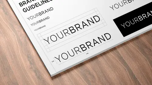
40:52 7Your Brand Book: Logos & Visuals
09:36 8No Brand Lives in a Vacuum
34:47Lesson Info
Increase Brand Visibility
So my buddy, jeremy has has really done a lot for for bringing aesthetics into the world, bringing beauty into the world. I think that's, one of my favorite parts of, uh, of his work, I think he's driven by beauty if you follow him on instagram, which many of you should where, if you see any of his work? It's just gorgeous, it's like dripping with aesthetic consideration. He was a founding member of the nazi brand studio, which meant that he was in house, working out at sea, helping at sea with their design needs and there their methods of executing on top of their brand. And he was recently brought in house that pepsi to relaunch seven up. But I saw the opportunity to help pepsi, the global brand, figure out how to buildout it's team to sort of police the brand internally. So I'm gonna let jeremy tell his story. Please welcome jeremy. Hi, jeremy. Thanks for the very, very kind introduction. I'm goingto task you for writing all of my biographies from here on out, sold. Yeah so is josh ...
had mentioned I'm jeremy I'm currently working as a senior brand design manager pepsico and specifically I'm working on global beverages so that's basically everything that's not north america and so pepsico's not surprisingly a really huge company there's four hundred fifty thousand employees and it's much more than just beverages I think a lot of people think of pepsi is pepsi but pepsico's actually many many many brands and we actually have twenty one individual billion dollar brands so as you can imagine that's a lot of money and a lot of rain equity 00:01:58.909 --> 00:02:04. tio to manage and not only that but we're truly a 00:02:04.19 --> 00:02:09. global company and so being global has all sorts of 00:02:09.04 --> 00:02:13. other inherent challenges and one of those beings 00:02:13.65 --> 00:02:17. that are operating model currently is that we kind 00:02:17.08 --> 00:02:21. of create and manage everything from new york pepsi 00:02:21.79 --> 00:02:24. corporate is actually in westchester and they have 00:02:24.09 --> 00:02:28. a very large campus on dh then the design studio is 00:02:28.0 --> 00:02:30. in west soho in manhattan 00:02:31.82 --> 00:02:34. and that's where we kind of conceptualize all this 00:02:34.1 --> 00:02:36. stuff and then push it out to the world 00:02:37.82 --> 00:02:39. so within the world 00:02:41.22 --> 00:02:44. we have several different markets but in each of the 00:02:44.22 --> 00:02:48. markets they have their own basic production studio 00:02:48.92 --> 00:02:51. and the production studios task is to kind of take 00:02:51.91 --> 00:02:54. what we put out there and develop it for the local 00:02:54.54 --> 00:02:58. market and blow it out tio different systems and sizes 00:02:58.07 --> 00:03:02. and all of that sort of stuff and as you can see from 00:03:02.72 --> 00:03:06. from the map upon this light deck right now pepsi 00:03:06.41 --> 00:03:11. looked very different in every market because up until 00:03:11.36 --> 00:03:14. two and a half years ago there was no internal design 00:03:14.65 --> 00:03:18. team or management team so every market kind of did 00:03:18.53 --> 00:03:21. their own thing to a certain degree which seems crazy 00:03:21.58 --> 00:03:25. for a pepsi being a two hundred year old company to 00:03:25.08 --> 00:03:28. not have really really firm standards in place but 00:03:28.42 --> 00:03:30. it was kind of up to the individual markets to decide 00:03:30.83 --> 00:03:35. what was best for each market no so in order to tackle 00:03:35.39 --> 00:03:39. that when the design studios started at pepsico we 00:03:40.29 --> 00:03:42. introduce our first visual identities system which 00:03:44.12 --> 00:03:47. knowing what justice courses about you have probably 00:03:47.63 --> 00:03:49. seen quite a bit of this stuff 00:03:50.22 --> 00:03:52. so far and I'm scared jesse has shown you some really 00:03:52.99 --> 00:03:53. amazing work 00:03:54.72 --> 00:03:56. but what the visual identity system allowed us to 00:03:56.75 --> 00:04:02. do was convert pepsi from a a very different brand in every region toe like a globally recognized singular entity which is pretty bold task on dh we've pretty much accomplished it in less than two years while using the brain guidelines which I think it's pretty cool right? So one of the things that we start with with any brand and I'm goingto specifically focus on pepsi just because it was the first one we did and it's really well recognized and pretty flushed out at this point we had a chance to live in the identity system and like any system it's a living breathing thing that changes over time and adapts based on the needs it's a loose set of structures that we then build upon which I think is really important specifically with new brands but also with brands as the world the walls kind of come down and the internet makes things kind of seamless there's not markets in the traditional way that there used to be anyone could buy anything or see an ad online for any other market um but we start with basically words and we'll do these brand wheels and will start very broad and we'll try to figure out you know how do we describe the product you know what what is the product do for people and we go from the inside out from like a very interior iconic standpoint and build out and from there the brain will moves into a visual identity system where we actually attribute specific items each segments of just wheel and from there after we've kind of done a top level analysis we do our key brand identifiers which is a collection of um words that uniquely described the brand when combined together 00:05:58.755 --> 00:06:01. and so here's some of the pepsi tough dynamic authentic 00:06:01.99 --> 00:06:06. dramatic unexpected focus clear and strategic and 00:06:06.96 --> 00:06:09. to make that stuff more tangible for for the local 00:06:09.74 --> 00:06:11. markets in the brain marketers and people who are 00:06:11.72 --> 00:06:14. less familiar with kind of brand and the emotional 00:06:14.81 --> 00:06:17. context we've given a couple examples here on this 00:06:17.71 --> 00:06:21. page to kind of show what we mean by by those words 00:06:21.96 --> 00:06:24. and how they can be applied to the brand in a visual 00:06:24.0 --> 00:06:24. way 00:06:26.13 --> 00:06:29. so I'm not gonna go through every page of our grand 00:06:29.78 --> 00:06:32. guidelines because it's hundreds and hundreds of pages 00:06:32.88 --> 00:06:37. long bye I am going to go through the key pillars 00:06:37.44 --> 00:06:40. that we use and this is the structure that we use 00:06:40.15 --> 00:06:42. for every single brand that pepsico 00:06:43.83 --> 00:06:47. and it's these kind of four pillars there's iconic 00:06:47.56 --> 00:06:50. intrinsic which is like a physical close in thing 00:06:50.38 --> 00:06:53. extrinsic which is more expressive a little bit farther 00:06:53.36 --> 00:06:58. out and shared and on the slide you can see some examples 00:06:58.36 --> 00:07:02. which are fairly true but again it's living and breathing 00:07:02.27 --> 00:07:05. and flexible and it's not hard lines a lot of this 00:07:05.99 --> 00:07:08. stuff kind of there's a gray area in between and it 00:07:08.98 --> 00:07:11. can float in different segments as you'll see in some 00:07:11.12 --> 00:07:14. of the examples that I show. But another important 00:07:14.22 --> 00:07:16. thing to see is that at the bottom there's almost 00:07:16.2 --> 00:07:19. a timeline where things air more permanent purses 00:07:19.93 --> 00:07:23. more temporary and that's how kind of expands out 00:07:23.17 --> 00:07:23. from there 00:07:25.66 --> 00:07:26. s o 00:07:28.36 --> 00:07:32. pepsico is obviously but the company and pepsi is 00:07:32.4 --> 00:07:35. a huge brand and you can kind of see how it plays 00:07:35.5 --> 00:07:38. out into a few different fields and oh, 00:07:40.16 --> 00:07:42. it touches basically everything you can think of in 00:07:42.52 --> 00:07:46. the world. So these thieves different segments air, 00:07:46.09 --> 00:07:48. super helpful and help you better understand them 00:07:48.96 --> 00:07:51. I'll just walk through some of the pillars of the 00:07:51.63 --> 00:07:54. brand so iconic is kind of what we start with her 00:07:54.55 --> 00:07:58. everything and really what iconic isas the kit of 00:07:58.56 --> 00:08:02. parts that everything else is built out of on dh and 00:08:02.68 --> 00:08:06. in this instance it's you know trademarks icon's photography 00:08:06.94 --> 00:08:12. color shapes logo's typography symbols illustrations, 00:08:12.05 --> 00:08:15. patterns forms and this is kind of the overview of 00:08:15.42 --> 00:08:18. the toolkit here so each of these individual pieces 00:08:18.99 --> 00:08:22. and the iconic segment is basically those things in 00:08:22.45 --> 00:08:24. their purest form ever and this is stuff that has 00:08:24.67 --> 00:08:27. a lot of longevity so like the paper cup may seem 00:08:27.98 --> 00:08:31. like a very like short term thing but at the scale 00:08:31.27 --> 00:08:33. that we produce this stuff and this goes out to all 00:08:33.33 --> 00:08:36. of our food vending partners that stuff lasts a long 00:08:36.41 --> 00:08:38. time and even you know locker in new york and I'll 00:08:38.72 --> 00:08:42. see some some old pepsi cups even today after near 00:08:42.15 --> 00:08:44. it was one of the first market so it's been a solid 00:08:44.87 --> 00:08:48. two two and a half years and they have been going 00:08:48.02 --> 00:08:50. through some of those paper goods and of course the 00:08:50.37 --> 00:08:54. packaging is probably the most iconic portion of of 00:08:54.87 --> 00:08:59. the pepsi brand on other things like fleet so we talk 00:08:59.06 --> 00:09:02. about the the permanence versus temporary and something 00:09:02.72 --> 00:09:07. like painting a truck something huge and expensive 00:09:07.66 --> 00:09:11. to do it's not something that many markets are going 00:09:11.01 --> 00:09:14. to do regularly so we view this is a very core iconic 00:09:14.75 --> 00:09:18. piece of the brand because it's a very permanent thing 00:09:18.88 --> 00:09:22. goes for preventing with bending is a big part of 00:09:22.03 --> 00:09:24. it and this stuff doesn't get changed super often 00:09:24.76 --> 00:09:27. although we're actively working on a completely new 00:09:27.56 --> 00:09:30. vending system that's been designed lead which I'll 00:09:30.04 --> 00:09:31. show you a little bit leader 00:09:32.38 --> 00:09:36. so that's it the top comic peace there's I don't know 00:09:36.51 --> 00:09:38. if I should ask for questions now are 00:09:40.37 --> 00:09:43. okay questions here feel free to jump in come yeah 00:09:43.63 --> 00:09:47. I feel like with coke they've had the same logo forever 00:09:47.5 --> 00:09:49. and that's sort of like helps with the iconic thing 00:09:49.49 --> 00:09:51. was it like a tough decision to get away from like 00:09:51.5 --> 00:09:56. the union the logo like that was there forever uh 00:09:56.4 --> 00:10:01. no because pepsi is is very much a now brand being in the moment the brand kind of tag is live for now and if you look there's a I've seen him around there's the's images where it shows like coax a little overtime versus pepsi's logo over time you can see the pepsi logo changes pretty frequently and that's because pepsi isn't a heritage brand it's definitely like a youthful in the moment brand so the fact that the logo's changed over the years it's sort of part of the pepsi brand however were certainly like very settled in on our current global oration and much like the beloved seventies and eighties adoration that was the longest running pepsi logo we've we've locked in on a nice version of the current glove and we're certainly trying to make it much more iconic and longer last thing and we can use the kit of parts around it influence the sort of now nous of pepsi pepsi the brand great go ahead another question on the slide where you were showing the pillars and you had kind of that spectrum on the bottom of permanence versus more temporary yeah I think this is really fascinating because you know I like you look at the the nfl friends breast cancer awareness month it's like they have really strict brand guides but now you know they incorporate the paint for these things so you like you have events exhibits and I guess it's also a question for josh what you know when you're coming up with your brand guides and you wanted to be recognizable and you wanted teo you know be something that people really resonate with but then you also want to allow for it to be flexible and relevant I didn't even look through your your thing yeah but what stage would you kind of allow for this spectrum it's a great question so if I'm understanding correctly you like what point do you have the parts with which to make a kid around? Well yeah, I mean because I've done a lot of brand work for clients and it's something I always thought about, but I never thought of defining it on a spectrum saying these are the things you absolutely never change and here are the ways in which you can fluctuate a little degree to the right or the left and I decided that I don't know I've just never seen that that was fascinating so I don't know when do you personally kind of think about that and implemented when in your work probably a a couple of years in when there's traction when there's stuff that has been in the world long enough for it to be iconic takes a long time to make an icon not like an app icon but like something sorry I should say it takes a long time to make something iconic to have enough eyeballs on it that it becomes so recognizable that you shouldn't mess with it anymore at that point ship like I mentioned earlier is different because they're relatively new I don't know that they're more than like a year or two old so they could more easily change but even even to jeremy's deck like pepsi being the brand of now like if there's now and then there's now and then there's now so you're going toe constantly evolved with the times yeah it was really cool yeah seeing it on the continuous actually really is really nice no question about localization we were kind of talking when we were having a break earlier about how people's attitudes to food and drink are different all over the world as well a cz you know color and things like that and so I'm just wondering what sort of concessions do you make in the style guide based on a geographic disparities because recognizing what you said to about the global market I mean we do a lot a lot of research for something kind of teo get to market is a really really really long process whether that be for a completely new brand even more so for a new brand but also for you know kind of these longer standing brands for pepsi blue is a very iconic piece of the pepsi heritage for many years and blue is a very natural refreshment q so for us it was kind of easy to say jin tau tau own blue obviously we have a competitor that owns red so it's it's it was kind of a no brainer in the shelf presidents particularly we did a lot of research around this particular color blue and what signals refreshment what stands out I mean everything there's quantitative and qualitative testing um so yeah there is a lot that goes into like choosing a color surprisingly like it's we look for the best case best use scenario there's like that middle ground of what works best most places andan some cases something won't work as well as it possibly can in every single instance but in truly being a global brand way think it's really important that as you travel from region to region and as I mentioned before like as the world gets much smaller seeing that consistency and the brand everywhere you goes is a consolation that we're willing to make on on something like a color if it's slightly different than a local preference and in some cases there is a strong aversion to something and then in some instances of it doesn't exist in that market we sometimes won't launch it in that market so what intrinsic is is kind of like the next step up in permanent so this's actually a page out of the guidelines to kind of show you how we bill some of these pieces and like why things exists where they are a lot of this has to do is hate using the term idiot proof but it's more we need to put in a strict set of guidelines so that depending on the level of expertise some of these local studios and production houses have that they can follow it with some level of certainty so that when we get it back for approval we kind of know what to expect and we can point to something as that they can look at to fix maybe something that's not right so I thought this might be helpful to see and it's particularly like intrinsic is the biggest bulk I think of of collateral that's produced for pepsi and for a lot of our friends so it's like important to have this section b very specific and so you can see some of the intrinsic pieces here a lot of it is a point of sale you can see some banner ads there's a lot of beverage pairings and food service we have a huge we call it away from home it's anything from you know kfc toe taco bell etcetera theirs super bowl pieces there's some events based things so like what you see in the bottom left is the metlife stadium where we took some of our core typefaces and made like a pattern wall out of it and then you can see the it's going to be cold sort of outside it's advertising but it's very intrinsic advertising and that breaks down to things like push and pull stickers for doors and then of course attending and these air the news vending machines that we designed in house at the design studio we have industrial design team is working on this stuff which the sub's really incredible and so the intrinsic stuff is kind of very very safe there's a lot of it it needs to be produced quickly I need teo be localized very specifically but it's tony's look consistent whereas extrinsic is where a lot of the funding comes in um there are rules an extrinsic but it's much looser and it's more of our advertising space and then a lot of partnership space and programming and that sort of stuff so on here you can see we did a we paired with grammys and we also did a music program called out of the blue with live nation so you can see where it still feels very much like pepsi but it has some love should have work in it that kind of breaks out of it it has some hand drawn typography hey on dh then with the world cup work the big image square image lots of illustration with soccer players like photography and then the hype for half time which is something that pepsi his own halftime for the past handful of years again uses some of the core typefaces from pepsi but then there's some illustration and three d work and some animation that happens there here's a little bit more from our halftime ad that we had run these this is just a storyboard from from the commercial and then that even like leans more in tow this sort of partnership with some of our celebrity endorsers so here's a beyonce ad when she announced for the super bowl on dh some limited edition cans for bruno mars and you can see the pepsi halftime banner behind him and then shared is the stuff that's very, very short term into certain extent and a lot of that is events exhibition spaces, premium offerings, certain licensing advertising and that sort of stuff so metlife stadium is kind of again as I mentioned, something straddle the lines metlife stadium is certainly one of those things that trouble lines it's very intrinsic and at times iconic but pepsi doesn't own the stadium pepsi just has a portion of the city of the pepsi gate so you can kind of see how it exists in this shared space where there's other branding around and other pieces of a brain that needs to be communicated alongside pepsi same goes for the fiftieth anniversary of pepsico with vogue we did a serious a capsule collection but a serious elimination cans and put on a party and you can see it's not blue but it does use some of the iconic elements of pepsi but this is a one time thing you'll probably never see it again we didn't capsule collections so you see some of the pepsi colors and a lot of the pepsi spirit here but not necessarily a logo or typography on dh then we do a lot of licensing in this sort of shared space so here some sunglasses that we had license the pepsi globe for in like pop ups and events is a huge part of this and we have a whole team at the design center that specifically works on real life experiences so this is from milan design week we do this cola house papa which is basically boozy polo lounge so you can see some of the way that the pepsi logo has been reduced to one color here. But a lot of the feeling about pepsi is still intact and that's kind of like a very quick walkthrough of the system. Some more questions coming anything from you guys before we get to the online go ahead I had a question about how you take something like say back to the future you guys just released the back to the future perhaps see something that was in a movie many years ago and then keeping it with the brand that you have today to relaunch it as a nostalgia factor yeah absolutely that's actually an awesome question so pepsi perfect which was from back to the future too was a design studio initiated project like no one it helps he asked us for it necessarily but there was a couple of people in the studio particularly adam wah hoo hoo is a huge back to the future fan who just started designing it and when we first started designing it we made it much closer to today's pepsi brand the big bold blue visual identity system and then in order to match the nostalgia factor we kind of backed away from it and there was all sorts of like with modelers and you have to have very specific bottle forms with a certain amount of radius and straight straight walls to make it through the system s so we have to take into the kind of lot of another hers off but I think what we did was we interpret it in a way that it's what pepsi would release if they really released it today so we kept some of the nostalgia factor is such of the typography but we refined that we put it through a little bit of a design lens and updated it a little bit so it's not exactly what was from the movie but we think that it kind of touches both on the current pepsi brand by using blue for the cap the current pepsi blue and using some of the times a tomography and then within a solid riff after by redrawing the pepsi perfect logo and and some of the shape of the model great I got a question that they came in from our chat room hear this question comes from jim and he wants to know what happens if there's a focus group for a reaction for a new design that maybe gets negative public reaction has this happened before he says I seem to remember there being some negative reaction with the new pepsi logo and have you have you seen any of this come up in your work and is it just somewhat unavoidable when when doing these he's huge brand initiatives how do you deal with something like that? Yeah that's why I wasn't at pepsi in fact the pepsi design studio didn't exist during the I think arnold had done the initial re brander on that time and that's part of working on these giant billion dollar brands is that everyone has an opinion about it. They're very loved properties and the internet has created this very gut reaction response to that stuff so I think the seven after rebrand who we worked with sterling brands on was my first project there and I was so soaked when it went up on brain knew and it was like my first project I've ever done that showed up there and I've been reading speak up and all the under consideration stuff forever yeah and there's like I read the first few comments then I stopped you know I think it's good to take in the design critique particularly with large brands there's so many moving pieces and such a large organization in so many levels of approval and testing that I know I'm certainly guilty of it but you see something and you have a reaction of well I would have done something better than that but there's so many factors particularly on large brands that it's hard to really say what you would have done without really experiencing it so we take the feedback with grain assault and again it's a living system we try toe try to grow it and and make it better over time and now we have an in house team that can really foster design thinking and be stewards of program now you have a slide in your presentation that showed all of the different logos of sort of the sub brands of pepsico and we had a question that came up just just kind of knowing how did all of those different brands work together you know if something pepsi the software the actual drink does something differently how does that affect any of the other brands that are within the whole catalog? It really depends so we have a team that specifically manages how everything kind of works together I think it's the I think it's brand design team where's where global beverage brand design but they do these we have better together initiative which basically pair different pepsico products whether it be snacks and beverage or different beverages or health and nutrition and they've actually over the past year developed a system specifically for placing all this stuff together whether it's just two brands or whether it's five friends so they've done a really amazing job in that and obviously each brand lives in its own sort of spear and as they progress and evolve their going to slightly affect the better together proposition and the like pepsico grouping but they kind of live on their own I mean some some there's some outliers like mountain dew and doritos has like this super close tie and they do so much stuff the other a lot of it is around the gaming culture and extreme sports culture but I think those two brands look at each other a little bit more but way kind of have guardrails in place the better understand that stuff particularly when people are working on those specific brands I think I've got one more question here from and I'm sure you've got somewhere coming but let's get one more from the online audience now it's been great to get this look at you know huge brand like pepsi but we have a lot of people watching who our starting small companies there solo preneurs and this question comes from haman who says if you were starting a product based business now if you were going off on your own starting your own your own brand what types of things have you learned from working with a brand like pepsi thatyou would implement right away if your scratch so I think about this stuff a lot because I have like I'm a huge fan of the food and beverage space that's part of the reason why they were kept pepsico's that leak eating and drinking and that whole experience is like very near and dear to me so I think a lot about either launching my own brands or like helping brains that I really love who are at a small scale on there's a there's a lot of learning I think you know the strategic framework that pepsi uses and the operating model is is really useful pepsi works at scale which makes things very difficult so for instance if you wantto do a test of a new product in real life um it's easy for a smaller brand teo be in one location and just see how it goes whereas I think the minimum line run for a pepsi product is something like three million units or something so it's hard to kind of iterated and innovate a smaller scale because everything is on a big scale but at the same time we can like save a ton of money and make all this stuff really quickly mom so I think there's there's pros and cons to being small and we can take some of the learnings of a giant company in a play it's a smaller businesses and I think there's a lot of really awesome stuff happen but in the smaller space particularly in like beverages and even so does and cola's that that are a lot harder teo roll into a much larger company we actually launched a product last year called caleb's which is the first thing we've launched in a very small roll out and it's just like a a natural ingredient cola so it's just got kola nut brown spices cane sugar and sparkling water and it's a really really great products I don't drink a lot of soda to be honest and it's one of the things that I actually really love it's a good brand that pepsico puts out that I have is a treat pretty frequently and that's where we took the learnings from smaller companies and tried toe roll it into like this massive corporation I don't know that really answers the question I think that's just more kind of a pro and cons on howto work in that space. But I think I think, understanding, framework, brain framework, which isn't necessarily exclusive to giant brands. It's excessive. It works for any brand, to be honest. And some of my learnings that I brought from working on very small brains that working on start ups like, etc. I brought to pepsico, and I think the same will be true if and when I go somewhere else or launch my own brand, that I would take the learnings from pepsico and apply it to that. All right, josh. Any any final words? Absolutely. Who designed the visual style guide? Specifically for big ball blue in general, no, at pepsi, the one that you didn't have after you started the the company in house. How did you figure out the need to have a guide was? It was an easy decision. And then who designed the actual book that you showed us spreads from? Yeah. Well like maura specifically on the beverage team hi she's the v p of beverage designed pepsi and she has a long history of like working for amazing cos from she worked a cocotte one point and hershey's and hallmark and brands air something that she does very well particularly big brands on guy know that she had the need for it ah lot of this work started before I came to pepsico on the book itself and this is like the thing that I always struggle with like I I've been trying to put up a new portfolio for like the past year to just because you want to show new work but accreditation is such a difficult aspect when so you kind of get too you know a manager director level because there's so many hands in it and I can't say specifically for big bold blue I know that we worked with a couple of partners and a handful of people in house touched it and freelancers and it was certainly developed over time and we use that as a framework for all over other brand books so yeah I mean it's kind of this thing that has like the brand itself evolved over time and I don't I don't think I could attribute toe one specific person but certainly the structure is something that we are now managing I mean global beverages were like a six person team and we rely on a lot of different partners who do really amazing work of in new york and all over the world. So I can't say one specific person to decide. But the need certainly came about as we address the issues of, like a very fractured brand globally and ways toe bring it together in a cohesive and understandable way away. That would be easy to digest for designers of all sorts of levels. Are you on version one of the visual standards now, or have you all right, I rated on it. Now. I think the people blues on version three and seven up, is on version, too home, and I'm working on two new ones 00:32:07.128 --> 00:32:08. currently, and and 00:32:09.79 --> 00:32:12. I know that there's at least three other active ones 00:32:12.3 --> 00:32:15. in the in the system right now, just for beverage. 00:32:15.59 --> 00:32:19. Plus, I just got a preview of the the co branding 00:32:19.37 --> 00:32:21. visual identity system yesterday, which is looking 00:32:21.32 --> 00:32:22. really awesome. 00:32:25.03 --> 00:32:27. All right, well, thanks for spending so much now. 00:32:27.33 --> 00:32:28. Time with us. 00:32:29.73 --> 00:32:32. Yeah, absolutely. It's, it's been a real treat. I 00:32:32.37 --> 00:32:36. appreciate the invitation, and hopefully this gave 00:32:36.12 --> 00:32:38. you a quick overview of how we do things over here. 00:32:39.29 --> 00:32:42. It's such an incredibly complex system. I'm I'm I'm 00:32:42.4 --> 00:32:45. grateful for that insight, so thank you. Yeah, absolutely. 00:32:45.84 --> 00:32:47. Thank you guys, and remind us where we can find more 00:32:47.89 --> 00:32:49. info about you. Jeremy, if people want to see more 00:32:49.83 --> 00:32:53. your work, absolutely. I'm at sleeping planes on pretty 00:32:53.86 --> 00:32:57. much all social media and jeremy press cruise, dot 00:32:57.48 --> 00:33:00. com or sleeping planes. Dot com, you confined, basically 00:33:00.98 --> 00:33:03. a bio and no work whatsoever, 00:33:04.77 --> 00:33:06. except for your wonderful instagram feed, which is 00:33:06.66 --> 00:33:09. just changing all the time. Yeah, I mean, I take a 00:33:09.52 --> 00:33:13. lot of hate, all right, thank you so much. Thank you.
Class Materials
Bonus Materials with Purchase
Ratings and Reviews
David
This class has potential, but misses the mark for me. The first thing that I noticed was the fact that the video and the sound do not sync with each other. It feels like you are watching a foreign move with English dubbed over the lip movements of another language. It is often hard to hear the audience questions as they do not hand around the usual 'creative live wireless audience microphone' and I think that was a mistake. The topic is a good one and the speaker is appears to understand his craft but a lot of the 'talk' in the first few videos could be removed by a clear definition of terms in the very very beginning of the class. If feels like it is flowing on an off the cuff manner and is lacking the structure that Creative Live known for. Instead of spending so much time asking the students about their understanding of what brand identity is and way to many quotes... I would like to see some practical how to advice early on in the class. I would love to see more classes covering this topic from people like Sean Adams or Alina Wheeler :) I am sure this class will get better the further I get into it and I normally do not write a review before I have listened to the entire class. Also I purchased it at a deeply discounted rate so even with those issues factored it is is still work what I payed for it. :)
Yi Ji
WOW, really worth the money, information is real, up to date, the quality of audient also good, they ask really real question, not those kind of 'performance' course. Thanks!
Rifter
Absolutely relevant and interesting content, made through example classes. The way the material is exposed is very good. One single critic, since the headline is really precise on the topic I expected more on the "how" but the course doesn't really teach a "system" to create a brandbook, like choosing wich documents are to be included and how to make and expose them depending with the client needs. The course is all about the why explained through case studies, which is good but partly neglect the headline promise. Anyway this is still an excellent course but I thought it would be useful to point out this aspect.