General LR Base Tone Recipes and Batch Processing
Lesson 7 from: From Shoot Through Photo Editing: Wedding Portrait Retouch in Lightroom and PhotoshopPye Jirsa
General LR Base Tone Recipes and Batch Processing
Lesson 7 from: From Shoot Through Photo Editing: Wedding Portrait Retouch in Lightroom and PhotoshopPye Jirsa
Lesson Info
7. General LR Base Tone Recipes and Batch Processing
Lessons
Class Introduction
02:07 210 Tips and Techniques for Shooting Wedding Portraits
22:14 3Shoot: Groom Portraits
21:28 4Shoot: Bride Portraits
25:07 5Shoot: Wedding Couple
10:58 6Post Processing Workflow Tips
11:51 7General LR Base Tone Recipes and Batch Processing
27:42 8Cloning and Simple Compositing in Photoshop
13:17Lesson Info
General LR Base Tone Recipes and Batch Processing
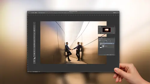
I want you all to think of Lightroom. Let's pull up an image right here. Let's grab this guy. I want you guys to think of Lightroom in kind of a layered format. This is probably one of the biggest tips I could give you guys, is when you're working-- I don't think this guy is gonna-- It's kind of working. Let's see. It's working. When you're working inside of Lightroom, every one of these panels, so all of these panels, they essentially layer. And so what I've done is I've created a slide. Let's actually show them this. Oh, we already are. These are general Lightroom base tone recipes. And I've given you this just because I want you guys to see this is one piece of your recipe, one major piece of that recipe. The next slide, this guy, is another major piece of your recipe. I'm gonna explain both of these and what these different things do. But with combining, if you just think of this as like, okay, I want an image that has like a soccer look to it, I'm gonna select this recipe and comb...
ine it with higher contrast, or combine it with a matte finish, or combine it with whatever. This is the way that I want you guys to approach developing. That's the way that we've designed the Lightroom present system is that layered approach. So let's go back for one sec. I'm gonna show this. For example, what's happening here, for softening, the highlights on skin tones. Those highlights, like where the brighter areas of our skin are, they register in Lightroom as highlights. So in Lightroom we have blacks, shadows, midtones, which is controlled by exposure, and then you have highlights, and whites. This highlight on my skin, like the brighter areas of our skin, those are all in the highlight region. So what's happening is if we pulled down a little bit of the highlights, and pulled down a little bit of the whites, while raising a little bit of the shadows and keeping blacks relatively where they're at, maybe dropping a little bit, we pull down those highlights on skin tone just a bit, we raise the shadow just a bit, and we soften the overall look of somebody's skin. That combined with a little bit of adjustment in the lower clarity creates a soft and flattering look. Go into the enhance. If we start adding contrast, we do the same thing. We're preserving a little bit of the highlights and whites. We're adding a bit of shadows and reducing blacks. But now we're adding clarity, we're adding vibrance, and saturation, and contrast. This is what we refer to as enhancing because we're taking things and we're strengthening the color. HDR, we're pulling the highlights and the whites down, bringing the shadows and the blacks up. Flare silhouettes we're pulling the highlights and the whites down and we bring down the shadows to make it look like a silhouette, or for example flare images, they have a loss of blacks because whenever you have a flare it washes out contrast. So we add it back with that. So I want you to think of these as kind of different recipes to deal with different situations. And then we have the curve side. Let's click over to Lightroom and we're gonna do exactly what we just talked through. Lightroom is so powerful and I've seen so many kind of people using Photoshop, and even teaching with Photoshop, doing things that you could actually do just inside of Lightroom. So incredibly powerful. So I want you guys to all master Lightroom and then move to Photoshop afterwards. So for example for this image, if I pull the highlights down a little bit, do you see how highlights just control-- Do you see how it's controlling the highlight on his skin right here? See that's where that's targeted. We have the whites. The whites are gonna primarily be in this area that's very bright. There's highlights and whites mixed into these windows. Shadows are kind of the shadow region of the face. So we're controlling that. Blacks are these deep, dark areas down here. So here's where we're controlling those deep, dark areas. So, for him, well I'm gonna go with something that's a little bit more of an enhanced look. So I'm gonna pull down the highlights a bit, bring down the whites. I'm gonna lift the shadows just a little bit while dropping the blacks. Raise my exposure a bit. Add a bit of clarity. That clarity adds midtone contrast. So what you can see actually is if you look in the histogram, the histogram is pulling apart as it's adding more contrast in the midtones. So we're gonna add some midtone contrast. I'm gonna go ahead and we're gonna shift vibrance down a bit. So it's just a little bit more neutral. The white balance actually looks pretty good. White balance is pretty solid where it was in camera. Tone curve. This is the second piece of that magic. Thank of the tone curve as the exact same thing as what we just described. Blacks, shadows, midtones, highlights, whites. Same exact thing, it just looks different. Blacks are down to the left, shadows, midtones, highlights, and whites. All this curve represents is do I want to pull those tones in those areas brighter or darker. Do I want to make my midtones brighter or darker? That's it. That's as simple as a tone curve actually is. But they're incredibly powerful because now we have a second layer of adjustment on top of what we just did. So watch this. Let's say I want more contrast to this image. We get contrast by increasing highlights, dropping shadows. It doesn't matter what image you're working on. Contrast is created, have you heard of the S curve? It's just an S-shaped tone curve. You're boosting highlights, you're pulling shadows down. That creates contrast. You want to flatten an image, you go the opposite way. You flatten it out. Let's look at the tone curve. Oh my gosh, this thing is so powerful. What I want you to do is make sure that when you're editing the tone curve you're editing in custom without this region thing. If you click that little button it opens up the regions. When we edit in regions we don't have as much control. We can't add points as we want. We're editing with these regions. So if you're not seeing the point curve you click that button and it goes to the point curve. Don't ever use the region curve. That's like using the sliders up here, and we want more refinement to the tone curve. I rarely say don't ever do this. But I'm gonna say that. So for this let's create this version of the image. What we do is press control apostrophe, or command apostrophe if you're on a Mac. We're gonna create a virtual copy because I'm gonna show you how different these can look. Let's go to the second recipe in our curve. I don't know if it actually is the second recipe. But we're gonna create a matte look now. So now I'm pulling up. So what I did is I'm grabbing on the shadow point, pulling it up, so anything that drops below this range darkens out to a dark gray. We're clipping detail. Anything that goes above the highlight range goes to a bright gray. We're clipping highlight detail. There's another version. Let's do a version of this where we wash it out. All I'm doing is I'm muting contrast and I'm flattening out the curve more. Control apostrophe. Let's do another version. Now I'm gonna do a dark wash. Watch this. This is becoming very, very popular for that dark kind of filmic look. We're pulling everything below the line, bringing down the highlights significantly, bring up the shadows a little bit, and pull in the blacks. Are you guys seeing this? So watch this. In one little swoop those are all just tone curve adjustments to get to every one of those different looks. (mimics explosion sound) Mind blown. That was my mind blown sound. Did it sound good on the mic? It felt like it sounded good. Now looking back to the recipes. Let's go back to those sliders. Sorry, let's go back to the keynote. They're so good. They know exactly what I'm talking about even when I don't use English. I can create an image that has a high dynamic range and I can combine it with a matte finish, or I can combine it with a bright wash. I can create a softened look to an image and combine this with a wash, or a matte, or a punch. Does that kind of make sense? So the way that we designed our workflow presets is exactly that. I'm gonna take a different image. Let's go down... These images are really cute. Let's find one of these that we like. That one's adorable. Adorable. Sounds like a doorbell, doesn't it? I'm sure people are like, "Why is he so weird?" I don't know, guys. I've been asking myself this question for a long time. Okay, so all I did was, this was one of our presets. If you look over here, this is the Lightroom preset system. What this did was it just dialed in. We gave the recipe, so if you guys don't have them, and you don't want them, that's totally fine. You have the recipe. So it's literally that softening thing we just did. So it softened, it dropped clarity, adds a bit of sharpening. What I'm gonna do is just brighten up the exposure. So all we do is one click for a preset. Exposure, white balance. If we need a radial filter, fine. That's it, done. Check this out. This looks pretty good right now, right? Remember how we just talked about separating Lightroom out in the term of these different pieces are recipes that you add together. That's how we did it with the presets. So now I can modify this curve to a bright wash. I can modify the curve to a bright matte, neutral wash, neutral punch, neutral matte, dark wash, dark matte. So if we flip over to the right side you're gonna see every one of these curves. You see that tone curve just flipping? Is that not cool? So you can now mix and match these effects. The cool thing about Lightroom is this is a tiny piece of what it can do. We have how many panels that we can do that with? We have the basic and the tone curve panel will both help you to control tonality of an image, so you can stack those two. You can control color with the tone curve by flipping to the red channel, green channel, blue channel, and adjust those independently. You can control color with your basic vibrance and saturation. You can control color with split toning. You can control color with effects. We have so many tools. We can even go and add in brushes to control these different pieces. So when you think about it that way, Lightroom becomes much, much more powerful because now you start realizing I'm gonna use my base curves to recover, I'm gonna use my tone curve to stylize. I'm gonna use this to do that, and you kind of separate that out. That all makes sense? Cool. Let's talk about this. Let's do this here. I'm gonna do... We're gonna do one example. So if we go back to the slide for a second, tip number six is to create a signature or master preset. What that means is a lot of times we'll go and we'll do custom shoots. Like this was a personal shoot of mine where we did a James Dean stylized kind of wedding portrait session. It was really fun. It was out in Palm Springs. The thing was is that I wanted to build a custom preset specifically for this shoot. And that's what we designed the preset system for, is to build custom presets. So you layer and stack to get to what you want to do. But whether you're using that or not, that's totally fine. I'm gonna show you guys how to build a custom preset and create what you'd call a master preset that you'd apply to everything in the entire shoot and then you simply work back and adjust as you go, as you edit. So let's do this. I want to go to my previous import. Or actually, let's just see if we have... We should have everything in here. There we go. Okay. For example, let's use... And I actually created DNG versions of these. I wasn't sure how fast this computer would run. Because this is a 50 megapixel file. If you look at the resolution, it's massive. Let's try to edit on it and see how it works. We're gonna create a custom preset here. Watch this. We're gonna use that same process. I'm gonna jump into the Develop module. What I want to do is first I'm gonna adjust my exposure. I'm gonna work from large adjustments to small adjustments. I'm gonna bring my shadows up because the shadow side of her skin is a little bit too dark. I'm gonna bring my blacks up. I'm gonna reduce overall contrast. I want this thing to have a flattened, more bright and commercial feel to it so I'm reducing contrast a bit. I'm also gonna reduce a little bit of that clarity. Hopefully that beeping sound is not too loud. They're doing construction or something. Let's knock out a little bit of the blacks by bringing it down. Let's remove a little bit of the highlights by pulling the highlights down so we kind of soften up her skin but also retain more of the sky. Pull some of the whites down a little bit. One of the big mistakes that we make in Lightroom is we pull the whites down too far. Do you notice how if we pull the whites down, her dress that's naturally white becomes gray? So careful. Pull the highlights. You can pull the highlights as far as you want. It's not really affecting the whites. Pull your highlights. Trim the whites. Do you like that? Yeah, pull your highlights, trim the-- I just came up with that right now, this second. I'm actually gonna raise the whites just a little bit. Perfect. Look, from there to there, already. Now let's start layering. Now I'm gonna go down. What I'm gonna do here is I'm actually gonna cool down the image a little bit. Let's go down to tone curve. I want to soften up the highlights by clipping anything that goes above this point. I'm gonna add a matte to this. Brightening the highlight point. Pulling down towards the midtones. Down towards the shadows. Then lifting the shadow clipping. So now this is adding contrast while matting out the image. Do you see the turning on and off? You can turn off any one of these sections by using these little sliders right there. Now watch this. I'm gonna go into reds. I'm gonna customize this a little bit. I'm gonna pull out the reds from the shadows while retaining it in the highlights. So all I'm doing now is I'm telling Lightroom I want less reds. I'm adding reds to the highlights, I'm pulling it out to the shadows. Just adding less. Does that make sense? Like you're pulling down the red luminosity, basically. Same thing with the greens. I want less greens in the entire image. I want more blues in the shadows. But I still want the highlights to have their warmth so I'm gonna add blues in the shadows and pull down the highlights. Now look at this tone curve. It not only modified the contrast but now we also added color tones into it. Now watch this. Let's go to HSL. This is your next layer of coloring. Under Hue, I want to pull the blues more towards a green. So I'm gonna bring it more towards the aqua side. Saturation wise I want to lift a little bit of the saturation out of the blues so it's a little bit more just... I don't want it too look so contrast-y, like so modern. I want it to have a little bit more of a soft feel to it. With the reds I'm gonna pump them up a little bit. I'm gonna pump up the oranges a little bit. Let's go to plus five. Luminance. This is a really cool trick. This is a sub mini tip here. You guys can use your luminance to increase brightness of skin tones. So if you want the skin to pop a little bit, watch this. See how it's controlling skin? Now we don't want to go up too high but I can actually raise it up a little bit and it will actually brighten just the skin. All of a sudden your people will pop just a little bit. Let's darken the blues a bit. Let's go into split toning. I'm gonna add some oranges. We're gonna put in about 50. Let's go actually five for the saturation. Let's go into the shadows. I'm gonna add some teals. 200 at 10. Whoops, I don't know where that flipped to. Let's go back down. I'm gonna balance this towards the highlight side. So what we just told Lightroom is I want you to add some oranges to the highlights, add some blues to the shadows, and I want you to balance it towards the highlights side. So if I want more in the highlights I just bump this up a little bit. If I want it to be more yellow versus more orange I just adjust the hue of the color. I'm gonna say-- We can zoom in. By the way, look at the detail on this. This is that 50 megapixel shot. You can see it's ridiculous. It's insane detail on this camera. I'm gonna warm this up a little bit. There's the before and the after for our image. Now this is what we could call the signature preset, or the master preset, for this shoot. You can save this out. If you want to save it, hit plus over here on the left side. Press tab to bring up the left and right panels. Screenshot this. What you're gonna do when you want to save out a preset, you're gonna select check all, deselect white balance, exposure, deselect graduated filters, radial filters, deselect lens corrections, add back in chromatic, add back in lens vignetting. And this is what you save out. Why? Because you should be adjusting white balance and exposure individually on your images. Graduated filters and radial filters, generally, again, those are local adjustments. We need to adjust those individually. So don't do those in your preset. Lens profile, again, if I need it, I add it. It can warp faces if it add it across all of your images. The profile corrections will bend the image and it can warp a face. So if you want it, add it on that image, but don't apply it to everything. So these are the settings we use to create a master preset. And actually if you get the course, I've included several of our signature presets, and that stylized preset that we used for this shoot is saved into the download. So it actually is the James Dean style shoot preset, which hopefully we got fairly close. Eh, not really. Whatever. It's always different every single time. Kai? Yes. Kai, I was just wondering, since you mentioned it, could you talk a little bit about all of those-- Not all of them, but the presets and the actions, the bonus materials that you are including? Because it's phenomenal. We include like six of our signature color and black and white presets, the James Dean styled one, and also some of our favorite brush presets just as bonus material. Also the raw DNGs, so you guys can work with the exercise files. Everything is included for you. Plus the slides and everything. So we have a lot of awesome stuff in here. Let me real quick show you... Now once we've created that master preset for everything we would save it out. We're gonna select all of our images for the shoot. So this was all in that same shoot. Control shift S, or command shift S. Now if I wanted to sync everything, I can do this. Or I can just use the preset. Either way. Control shift S brings up the same settings. I can deselect white balance and exposure if I want to and do the exact same thing, or I can just press the preset button. But just select everything, and we're just gonna say apply everything. I know I don't have any local adjustments. I haven't done any lens corrections. The exposure and contrast I think will be fine. We'll just test it. Now watch what just happens. Every image in your shoot now takes on the exact same tone that you just created. This is why we call this a master preset. So look at these. All we would do from here is, on an image by image basis, we're gonna select an image and just adjust a little bit the exposure and the temperature to get it where you need. But now the color tone, the curves, everything matches across the board. Cool? So this is that consistency, cohesive look. Now when we look at a set of images what we should be able to do is go, "Hey, I'm gonna select these images "and put them side by side." I pressed N to bring up the survey view. And look at that. We get this beautiful, consistent look across all of them. So when these go into an album, or they go into a spread, or when they go anywhere, we have that look. Cool? Create a master preset with each shoot. Make your preset names, name that makes sense goes here. Don't call it like, red Corvette, and flashy sunset, and all these kind of things. Name it something that actually makes sense where you went, and if you saw that, you would know what it does. Okay, so we create our master preset and then we select our master image. We create the master preset. We apply it to all images and we adjust white balance and exposure as needed as we go. That's how you batch process all of the images from that shoot. You're done. You're good to go. The power of local area adjustment presets, or LAAPs. I made that up. LAAPs. This is what's cool, guys. Everything that we just did, or not everything, but a lot of the stuff that we just did. Let's select out this image. A lot of the stuff that we just did we can apply locally via brushes, graduated filters, and radial filters. These are the same tool that work different ways. That was super confusing. This is the same tool that works different. So the way a graduated filter works is all we're doing is we're pulling an effect. We're pulling an effect down and it graduates. So it's more effect to less effect. How long we pull the edge is how much it feathers. Radial filter, exact same thing. We pull it out from the edge. This is where it's affecting, down to the center where it's not. Or you can invert this. And by the way, if you press O with this turned on it tells you. Anything that's red is knocked out. Anything that's red is being affected. Anything that's white is not being affected, anything that's clear. So if I invert this it flips the mask. Last, adjustment brush. You just paint this on. Anywhere that's red is being affected. Anywhere that's not is not being affected. So what's cool is that we can do things like let's say I just want the detail of her dress to pop. And I don't want my Lightroom to freak out, guys, so I'm gonna use the DNG. Actually, hopefully it won't freak out. Let's give it the benefit of the doubt. And by the way, here's another little sub mini tip If you are working and you click this and it goes red, just know that you need to press O to turn off the mask. What if you try and click it and you can't find your pin? So I know I have this selected, but I can't find any pins. Pressing H on the keyboard hides or reveals pins. So if you can't find a pin it's just probably because it's hidden. So reveal it. I'm gonna press I just to turn off my information so I don't have that bugging me. So now what's going on here is if I want a burn, let's say I just want a burn to bring in attention into her. I just grab the radial filter and I drop the exposure by a little bit. We can control this as much as we want. What I always say, my rule of thumb for burns, is if you can notice it from a thumbnail view you've gone too far. You've created a vignette. I don't like that. I like it to burn. So just go back. So you can press G to go to that thumbnail view, look at it, and go back right here. Now watch this. What if I want her dress to pop? And this is one of the ones that we include. This general all purpose detail (mumbling), look at what it does. It adds contrast, it adds highlights. I'm gonna actually update this preset to make it add whites too. It adds clarity, it adds saturation, it adds sharpness. So what I'm gonna do with this is paint this right over her awesome dress. Do you see that? Can you guys see that effect? Okay, watch. Do you see how we get the whites back? We get that pop back in the dress. Okay, so let's turn that on and off. Here's with the adjustment on. This is off. Pretty big difference? Now watch, what we're gonna do is just refine that a little bit by holding down alt, pressing O. I'm not gonna zoom in, actually. There's too much resolution to see. I'm gonna hold down alt or option and we're gonna remove the brush from areas of skin. We don't want to cover skin. Don't necessarily want to cover the hair because I'm gonna do that separate. So I'm gonna remove it off the hair. I use a weighted mouse for Lightroom. I will zoom in right here, and let me go fill. You don't need to get this precise. I'm kind of anal retentive like that. Sorry. Let's shrink up the left panel. All right, so press O to turn off your highlight, or that little alert right there. And let's look at that. Is that cool? We just did that. So what if I want her hair to pop? Well, I actually have a preset for that. And if you don't have the presets guys, don't worry. Just pause the video. That's one big thing. When you want to create a new brush, click New. See how this is selected right here? If I flip to a different preset right now it will automatically switch the effect to that preset. That was a blacken brush. I'm just gonna press control Z to undo that. Command Z if you're on a Mac. So press New first, and then once you press New you can select a new brush. And I have a preset specifically for hair and lashes. I just want to get more red in the hair. I'm gonna make the hair pop a little bit. I'm gonna go fairly quick so that we're not spending too much time on this because there is a lot of things I want to get to. Here's the other cool part. I can actually add color. This is kind of cheating, right? What if I want the hair to be a little more red? I can click, drag, and bring it right over her hair, or simulate whatever color. So I just clicked on the palette. I went off, and then just pulled it right to here. I can select the color of her hair. And then all I do from that point is pull down to reduce saturation. Cool? So this is zeroed out. Now we're just gonna add a little bit of extra saturation to the hair. Isn't that nifty? We can target, and do these local adjustments, and do retouches directly inside of Lightroom like this. I was saying I use this mouse. This is the mouse I use. It's a gaming mouse actually, and I use it because it has this little weighted feel to it. If you guys are in the class you can come feel it after. It's a Logitech G500. It's a heavy mouse. So that way when I'm in Lightroom I don't need to use a pen. When I'm in Photoshop I use my Wacom tablet because Photoshop is built for it, it can handle it. It loves the pressure, the sensitivity. This guy is all I need for Lightroom. Was that cool? Cool. Any questions that we can get to? If we go back to the slides, so for those that have the course, this is some of my favorite stuff. This is the general, all purpose detail enhancer. This is the sky, cloud, ocean. So like we'll paint this over clouds, and skies, and oceans, and things like that to make it really pop. You can do it on landscape. You can do it on wedding pictures, whatever it is, for the cloud and sky. There's a lot of those. There's a lot of clouds out there, guys. Shoot them. And then the skin softening one, we have that too.
Class Materials
Bonus Materials with Purchase
Ratings and Reviews
Pamela Richardson
I would absolutely recommend this class. I watched this class by chance on the rebroadcast, since I am not a wedding photographer. However, I learned so much that I was amazed. I do take many many photographs of friends, family, and at events, although my professional speciality is landscape. I will be able to improve my photographs of people substantially thanks to Pye's course, because I learned so much about how to pose subjects, how to work with a variety of backgrounds, lighting, and then the photo editing. I can apply the photo editing to all of my photographs, not just portraits. I really liked Pye's comprehensive explanations of each step that he was demonstrating, for both the portrait session and the photo editing. I really appreciated Pye's clear demonstrations of how images of people can be improved, and am eager to apply his examples to my own work. I appreciated Pye's absolutely outstanding presentation skills, as he had slide show already prepared, with the list of tips and associated mini tips for every step of the process. I learned so much about equipment (such as lighting and flashes), additional software, printing and publishing services, and more. Pye's presentation pace allowed me to make notes and absorb what he was saying. My friends and family will also appreciate my increased skills at retouching photos of them!!!
user-a2f1eb
loved this class! lots of good info and it was great to see a small version of his normal shooting process. He presents it in a very fun and entertaining way making it not just educational but also enjoyable to watch!
Sean
A+ Fantastic course. Quick work flow is a real weakness of mine. Pye did a terrific job. I must admit, sometimes I fail to appreciate the top caliber of talent CreativeLive gets. There are a log of great Instagram photographers that don't make money. CreativeLive gets top tiered working photographers, which is key. I know I'll need to re-watch so I can implement what Pye taught.