Lessons
Day 1
1Class Introduction
19:28 2Language and Properties of Light
39:26 3Position of Light
18:40 4Science of Light
39:28 5Dynamic Range
16:12 6Circle of Confusion
16:14 7Working with Natural Light
32:45Light Modifiers
15:35 9Understanding your TTL Meter
35:03 10Finding the Light
36:29 11Open Shade
27:49 12Working with Constant Light in a Studio
21:25 13Shoot: Constant Light
12:49 14Light Modifiers
27:55 15Shoot: Portrait Lighting
28:16 16Intro to Flash Photography
47:49 17Balancing Color Temperatures
12:54 18Bouncing Speedlites
13:36 19Light Modifiers for Speedlites
37:24 20Dragging the Shutter and High Speed Sync
30:05 21Metering Basics for Studio Strobes
27:01 22Studio Strobe Science
22:46 23Mark's Secret Canon Setup
15:35 24Light Ratio Metering
16:58 25Three Light Setup
45:51 26Working with Multiple Lights
24:48 27Law of Reflection
12:41 28Zone Lighting Part 1
33:15 29Zone Lighting Part 2
24:33 30Shoot: Studio Strobes on Location Part 1
25:25 31Shoot: Studio Strobes on Location Part 2
44:51 32Understanding Histograms Part 1
25:47 33Understanding Histograms Part 2
34:52 34Clarifying Questions
16:41Day 2
Day 3
Lesson Info
Understanding Histograms Part 1
It was cold by the way for you guys at home. It was cold up on the roof was it not? You guys were like, we're from Seattle. It's summer here. I think in Phoenix it's about 50 degrees warmer, something like that. Yeah, it was cold. So we're going to star by talking about tonality and histograms so-- We've talked a lot about shooting in the studio and shooting on location in natural light and all that kind of stuff. Bu what we haven't really talked about is are the tools that we use to measure what we've shot and the tools that we can use to tweak what we've shot to better represent what our creative vision was. And so, one of the things that I like to tell photographers when they're doing portrait work specifically is you don't want to take a photo of somebody and make them look like they actually look. Nobody wants that. That's a mirror. Right? What they want is they want a photo of themselves in the way they see themselves or a photo of the way that they wished they looked. Right? The...
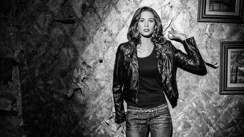
re is always a little bit of flattery involved in portraiture work, unless it's photo journalism or something like that. But the same is true of all types of photography. And sometimes, our cameras can't quite get there. Can't quite get things-- They can't capture them in the way that we see them in our minds or the way that we want to present them to the public and so we need to change those things specific to our tonality. And tonality, when I say that what I mean is, when we see something that's black in real life and we take a picture of it, when we show that on a screen, or we print that, is it actually black? Usually it's not. It's a light gray. And if something is white in real life, when we print out or show it on a screen, is it actually white? And usually it's not. It's a light gray. So we're going to talk about, where are the boundaries and can we push those and how do we map what we see with our eyes and capture with our camera, to what we present to the world. And so we can do some of those things. I'm a big proponent of post-production and I don't think you should shy away from it. And some of the-- This is an argument that's been going on for as long as art has existed. How much manipulation should you do in post production. In Ansel Adams' time, he founded the f/64 group and he was all bout it has to be natural and you have to show everything in maximum depth of field and you can't manipulate anything. It has to be all natural and you have other guys that were manipulating things in the dark. And they had big fights, big, big fights. And so, now we have Photoshop and get it right in camera and the fight is still going on so it's been going on for a long, long, long time Salvador Dali and Picasso were those guys that were manipulating stuff in the early 19th century or 20th century. And so anyway, I'm with them. I say let's manipulate and make it what we want. I don't think there is a right or wrong answer to that it's just my opinion. Let's manipulate. So we're going to talk about how we can do that. So, we're going to have Lex come out just for a second and we are going to, we brand down from the ceiling or the rooftop and set everything up really fast. And so I'm hoping we have everything actually set up the way we need it. So John what we need to do is, if we could just set up this light, with no modifier, or no grid I'm sorry. Just no grid. And just turn it on and we'll meter it and all we need is on on access light. It doesn't matter, the quality of light doesn't matter. So Lex is going to be here. And, I'm going to get my camera all set up. So I'm shooting at ISO 100. I'm shooting at, we're going to shoot at about 5. I think or maybe even 10. We'll see what the meters do. Okay, and when I get that we'll get the tethered capture started. Start, tethered capture. Okay. There we go. Alright yeah. That's good. Something like that. Let's turn this guy one. That's about right. Good. Sorry, we're about to blast you with light. Okay. Close your eyes just for a second. Perfect. We're going to do that one more time. There it goes. Okay. Make sure this guy is on. And then John, if you could just meter this for me. Nothing. What channels? This guy is on 17. It should be on 17. 17 is this on? Yeah, let me make sure if you hold that. I'll check that. This is on. That's on transmitting and receive. Yep. The channels. It's alright I'll just check this. Channel 17, and it's just. There it goes. It is low on batteries, so what we'll do is we'll just do this little number here. We just push that and I'll trigger it. Yeah. And then take that to Lex if you will. 3.6. 3.6. I'm going to give you a little bit more light here. Okay, try that one more time. Ready. 10. Okay. I suspect that there is not-- That is not right. But maybe it is. Yeah, okay. 10 it is. The reason this didn't flash by the way John, is the pocket, none of the zones we're turned on. So let's just see if that's the case. Let's run and do this one more time. So it was at 10, is that right? Yeah, 10. Okay, so Lex, I want you to hold that just right up close to your face. And we're going to use this to map out our tonal range. And so we'll look at this. There we go and that was at F10. 200. Yeah, I'm tethered there. It looks like my ISO or something was off. Something is off here just significantly. Because it's so overexposed. Try it one more time. Yeah, so we've got something that's not correct, this is. Yeah. I know what it was. I know exactly what it is. You have your ISO way down? No, no. That's fine. Here we compensated for the neutral density filter. So let me fix that. This is what happens when you run down from a ceiling and set up really fast. So now, I was like man that F10. This thing is all the way up. To full blast. Okay. Oops sorry. Alright, now we're there. Sorry. Two years. Alright, 10. 10, now we're at 10. Let's try it one more time. This is going to be fun. Alright, you can see how this is going already. There we go. My shutter speed is a little too fast. There we go. One more time. We'll get it. Alright, that's it. Thank you. Yeah, yeah. I feel like we need applause after that. Yey. Okay. So. I think we're done with this for a little bit. Alright, so I'm going to just be working from Lightroom here for just a second. And I think, this is my spot I'm suppose to be in. What were doing here, is we want to look at this photo. This is just a very technical photo, and what we have is we have a reference card in this. And this is going to show us, what should be white, what should be middle gray, and what should be black, and how that works. And so, first I haven't explained really how a histogram works. So I need to explain that because we're going to be using that as our reference for all of this. And the histogram, is this guy right up here. And that's in Lightroom. You also see that on the back of your camera. Also we're going to set our white balance really fast just by clicking on this middle gray here. So that's all set. Alright, so a histogram works like this. I'm going to zoom this in, so you cans see it. And then we'll explain what these different levels are over here on the TV. So, a histogram measures out-- And a histogram by the way is not something that is specific to photography. A histogram is something that's specific to statistics. So if you've ever take a statistics class you've probably had to create a histogram of a distribution of values over a range. Right? You all remember that from statistics? And so, it works like this let's say that, you guys we're in a third grade class, okay? Now you're third graders and we wanted to figure out what the distribution of grays were. And let's say this class is 30 people. So there is many more people. What I would do is I would say. Alright, we're going to chart this out and over here, we're going to have everybody that has an A and over we're going to have everybody that has an B, And a C and a D and an F. That's our scale. A,B,C,D,F. And so, raise your hand if you got an A. So you'd raise your hand. And we could count. Okay we have ten people that have an A. And so we would put on this chart a line that says 10 people. So out of 30, 10 people got an A. And this many people got a B. And this many people got a C. And one person got an F. And we would just have lines showing how many people we're represented at different grade levels. So it's a distribution of values. A,B,C,D,F over a range which is 30 students. Does that make sense? So far? Alright, so a histogram in photography is the same thing. Except for we're not measuring grades, what we're measuring are the luminosity at different levels-- or the intensity of luminosity at different levels. So in other words, over here this represents absolute black. And this represents absolute white. And this represents middle gray. And we're saying. Alright pixels, so all the little dots in our camera. We're saying how many of you are absolutely black? How many of those? And so, we scale those. This many are absolutely black. Let me say, okay, how many of you are just one shade above absolute black? And we chart that. And we keep going until we're in the middle grays until we're in the highlights and until we're in the absolute whites. And then we get a distribution of all those values. That's all a histogram is. An so, some people tend to think that there is a good histogram and a bad histogram. There isn't. A histogram is a measurement of the values in our image just like a thermometer measures temperature or a tape measure measures distance. It's just a measurement tool. This can be a bad histogram. For example, if we were shooting something that had-- Let's say we were shooting a polar bear in white snow and this was the histogram that showed up. We would know that something went terribly wrong because we shouldn't have anything in the shadows and in the blacks. Unless it was maybe like, the blacks of the polar bear's eyes. And in that case we should be just like one little tiny dot down here. And that's it. Everything else should be showing up over here, right? Or if we were shooting, the moon at midnight, we should have a ton of dark values here. And just a little smudgeon of where the moon is a little bit bright gray over here. But the majority, of the image is dark. That makes sense? Okay. So that's how a histogram works. We have a measurement tool we can actually measure the values in our scene and show those on a histogram. So the good thing is, we do have a measurement tool. We have-- We happen to have this little chart right here. And I want to try something really fast. We're going to crop this. So we just take this way in. I'm going to make this custom. Take that way in. Take this way in. That. Now when we're only showing this. Check out how our histogram changed. Now I can see, that we have three values that are showing up. We have what should be black. But guess what? It's not black. Right? It's a dark gray. And what should be gray but is not gray, it's a little bit brighter than gray, and what should be white, and it's pretty bright, but it's not absolute white. And this is what happens almost always, in a-- In fact, I have not ever seen it not happen. I've never seen a DSLR camera capture absolute black and absolute white and absolute middle gray correctly any time. Okay, so what we have to do is we have to in post production remap these values, according to where they should be. And we do that, with the controls in either Adobe Camera Raw or the controls in Lightroom. And they work like this. So exposure, this little slider right here. What exposure does is that's what you use to set middle gray. So if, the middle gray is too bright, which it is right here, I'll drag this to the left. If it's underexposed, you drag it to the right. The middle gray should be middle gray. Right there in the center. And then, once you have that. You can start adjusting the blacks and the whites. And this is actually broken up on a gray-- on the scale here into several sections. So blacks are down here. And you'll see that it actually says blacks right there. This next section are the shadows or the dark shadows fall. Here is, it says exposure, but this is where all the gray's should be. The midtones, or what these are usually referred to. These are all the midtones. These are the highlights. And then way over here on the right, those are the whites. Okay. So we have all those different tonal values. And so, what we can do, if we adjust contrast, it's going to stretch the blacks and the whites out to each side. See that. But it stretches everything. It takes all those tones and it stretches them out on the histogram. And what that does is it makes things brighter and darker across the whole scale. And that give us higher contrast. What I like to do, is to manipulate these individually. So I'm going to take these blacks and see if I can shift them down by going into my blacks slider. And what I'll do is I will shift that down. Notice when I do that, it shifts the midtones a bit. It shifts the midtones a bit. And that's going to happen. And so, it's very difficult to just say you stay here, everything else shifts. So the whole-- All the values are going to shift. But now what's happening is this is absolutely black. Now, on my screen. And then, I can go in here to the whites and shift those over, and that's going to shift those midtowns back. Now I got whites all the way over where they should be and blacks all the way over where they should be, and we can check these values, which is sort of cool. So watch this. Here is a little trick for you. If you're working in Lightroom. You can use this white balance tool. This white balance picker. So it's the whiteness says white balance selector, this little guy. If you click it, when you hover over something, you can actually see the values. The RGB values. So you see this as 52, 52, 52. So we've got a balance, a white balance, image because we did that. I clicked this. But we can also see that's about 50% gray. So an 18% gray card should be in the middle. So 18% gray equals on the histogram 50%. Just go with me on that one. That's going to be too long to explain. And then this here, you can see that the values are down in the 4% range. If it was absolutely black it would be down at zero. And so we can see that yeah. We've adjusted things. And then, our whites are up here at the 99%, 98% range. And so we've absolutely plotted those. But watch what happens, when we do that. So that, scientifically is pretty close to being correct right? But let's see what happens to our what happens to Lex when we have that. So we'll go back here, we'll reset this. And what happens is she doesn't look so fantastic. I mean the contrast, is pretty amazing there. And it looks pretty good, but it looks like we need to adjust her white balance just a bit because she looks a little bit orange. We sort of have to see that. That's some of the things that we would use, to color check her passport for. Because it has these black, middle gray, and white tones. And so you can adjust the tonality of your-- Think of it in gray scale. You can adjust that, get it correct and then you can use some of the colors on that palette to adjust the scene in her face to make sure that her skin tones, are correct. And, that--all of the color is represented accurately. That's why I love that tool. The other thing I'm noticing here though is that when we look in the hair on Lex, we're seeing some areas here, where there is just no detail. It's just been lost. And the reason for that is we've taken those values and made them scientific. What we've done is we've lost some of the detail, in areas that we don't want to lose detail. And also, you have to correct that. But here is the before and after. So you can see that the one on the left hand side is the color is off it has not been color corrected. The one on the right, we've set the white balance. But you can see things like, and the one on the left you can actually see the folds of her shirt. An then the one on the right, you can't. Even though we've set it technically correctly, we've lost that. So let's compare these two when we go down. You can see the one on the left. You can actually see this fold, the one on the right, there is no detail there. So, it doesn't mean that you necessarily need to set this correctly. It just means that we have to. We get to choose, what we think is black and what we think is white in our own images. We can choose that in post production and make that happen. There are some things though-- This might be a case of-- There are details here, because we know there are, but it might be that the monitor that we're using. I can't see these on my screen. And we can't see them on this screen, it might be that our monitors aren't capable of displaying those blacks values. So that is also a reason why there are some monitors that are extremely expensive. Because they dynamic range of the actual monitor is greater and it can show details like that to match if it's going to go to a fine art print or something that can also display those. And so, that's why you build these things. Again I'm, sort of venturing into color management and that stuff. But you build these things called color profiles and monitor profiles, and printer profiles. So that you can load those into Photoshop or Lightroom and do some soft proofing and say what this actually print or not. And you get sort of a preview. So I'm getting way into territory that we shouldn't be into. Th point of this is to say, we can, when we're doing metering-- we're going to be using an advanced meter that I think is in my bag, the 758. So we're going to use that. We can use something called spot metering to look at a scene and do some things. So Lex is going to come out here in a little bit. She's going to be wearing a dark shirt and do you have your jacket or just the dark shirt? Just the dark shirt? Yeah. So she's wearing a black shirt and so what were going to do is we're going to shoot her very close to this white background and we're going to look at that and we're going to tell our meter. We're going to say, you know what, we want this to be black and we want, that to be white. And let us know, where the midtone is, and it's going to tell us if that's within the dynamic range of our camera. And so, some of the things I told you that we can calibrate a meter to our camera. I've got a meter, that's calibrated to my camera. And we can do all this stuff, before we ever take the picture. And we can see, if we're going to have problems with something like this, that we're seeing on the right here where this right here. These blacks are falling out. They're falling out of detail. The other thing we can do. There is this little triangle on the left here. And it's called shadow clipping. And when I click that anything that has no detail shows up as blue. So if there is anything that falls below the threshold of being able to show up, it will show up as blue. So even though that card this is black on the card, it's darker than black on her shirt. And the reason for that is this is a different material as her shirt and so her shirt absorbed more light than the card did. And this is something that you'll find when you're shooting really dark things. Different surfaces have different reflectivity and so one surface that's suppose to be calibrated as black actually turns out to be brighter than black an the actual black is going to be lost. And so we can use that to say, you know what? We've gone too far. And we can bring that back. Bring it back. There we go. So we brought it back, and we actually boosted. You can see that, we actually boosted the blacks. Now when we take a look here. Look. Now we can see the detail in her sleeve again. It's returned. So we can do some of those things, and the same thing is true of the whites. We can do this and if we've over exposed anything that's lost details shows up in as red. So that's how that works. Okay, we need to put this into practice, with actual metering. Any questions before we go on. I feel like you guys have over eaten, oh we just had turkey dinner. Yeah. The new Sekonic meter that you mentioned, the touchscreen one, does it do spot metering? It has a spot meter attachment. And so, what these guys do-- It's similar to this right here. And what happen is, you can take these off, and then you can put a different attachment on there and then you can do spot metering with that. So it doesn't do the spot metering. It doesn't look like the one I have, but you can attach and do a spot metering with an attachment on there. Yeah. So this guy also you can get a spot meter, so the sensor is actually this little tiny thing right there. That's what it is. And so this is the Lumisphere. It's pretty cool. Yes. Between camera brands, is there a difference in the way that the camera picks up blacks and midtones. Within the same camera there is. Oh okay. Yeah, in fact. Let me show you this. Again, we're bleeding over into color stuff and profiles and those types of things. But, we might as well see it. So we have two things. We have the process, which is the way that the software uses to interpret the image. And you should always be using the latest. But we also have a profile. And this profile, is how the camera interprets the color. And these are created so you might want to-- if you're a landscape photographer, you might want to have your greens and browns. be a little bit more pronounced. If you are a portrait photographer you might want to have some control over the reds and the oranges. So these are created to sort of flavor our photos in certain directions. And the ColorChecker Passport is actually something that is sued to create custom profiles. And so, I want you to see. Let's see if I can find the ColorChecker Passport. Really fast. The picture we took because it will become very apparent. Very, very apparent. Let's see where that was. What was that, day 1? We've taken a lot of pictures. Here it is. Okay, here is our color checker. There we go, let's use this one right here. Go to develop module. And we will look at these colors right down here okay? So when I change my profile from Adobe standard, I'm going to go to camera portrait, see all those colors change? Significant change right? I go to landscape. They change again. If I go to faithful, they change again. An so, the important take away from that is we have to have some way when we see red and our camera captures that red, when it shows up on our screen, is this the red that we see on our screen, the red that we see in real life. And so, to manage that that's color management. And so, color when you do conversions to black and white will impact those black and white conversions and tonality. We're going to do that in a second. We're going to show you how things of different color translate to different gray scales values. It's sort of cool. We're doing a little more color than we planned on but I don't see how you can understand light without having at least some basic understanding of color because color is just light at different frequencies. It's all it is.
Class Materials
bonus material with purchase
Ratings and Reviews
Claudia Ochsner
This is an excellent course. I recommend this course to every photographer, of any level who want to put money into lighting stuff. Mark Wallace has a gift to teach and to truly enlighten his audience about complex issues in photography. The money for this course is well spent, the time is more valuable than hanging around in forums and ask questions to others who don't have a clue as well. The products used ( partly promoted ) are very "American" - I have to say that as Swiss. Because you know there are two other brands which could compete at the top level of studio lights as well. Just kidding - But seriously - many thanks to Mark, John, Lex ( Gosh - you are so beautiful ) , CL and their team to help me to reach out for a new level in my photography. I am now going to push my boundaries, well knowing that understanding light is science, but for sure not rocket science.
Rose-Marie Gallagher
This was an outstanding course! Mark presented TONS of quality information, starting at the very basic concepts and working up from there. He is interesting to listen to and very understandable. Great examples that expand the learning. Highly recommended! Thanks for bringing Mark's class to CL...I hope there will be more.
J GRANT
As comprehensive, easy to digest, and beautifully paced a course on Light and Photography as you could ever want or need. Mark intuitively understands the best way to deliver his know-how, be it scientific, creative or practical, resulting in an easy-to-digest and quick-to-retain course. I was particularly drawn in by his wonderfully fluid teaching style that seamlessly moves from one area to the next, never too fast and never too slow. Regardless of the course's focus on Light, if you aspire to take your photography to the next level in terms of your technical understanding of how light impacts photography and practical skill in dealing with it, this is a must-watch course for you.