Lessons
Day 1
1Class Introduction
19:28 2Language and Properties of Light
39:26 3Position of Light
18:40 4Science of Light
39:28 5Dynamic Range
16:12 6Circle of Confusion
16:14 7Working with Natural Light
32:45Light Modifiers
15:35 9Understanding your TTL Meter
35:03 10Finding the Light
36:29 11Open Shade
27:49 12Working with Constant Light in a Studio
21:25 13Shoot: Constant Light
12:49 14Light Modifiers
27:55 15Shoot: Portrait Lighting
28:16 16Intro to Flash Photography
47:49 17Balancing Color Temperatures
12:54 18Bouncing Speedlites
13:36 19Light Modifiers for Speedlites
37:24 20Dragging the Shutter and High Speed Sync
30:05 21Metering Basics for Studio Strobes
27:01 22Studio Strobe Science
22:46 23Mark's Secret Canon Setup
15:35 24Light Ratio Metering
16:58 25Three Light Setup
45:51 26Working with Multiple Lights
24:48 27Law of Reflection
12:41 28Zone Lighting Part 1
33:15 29Zone Lighting Part 2
24:33 30Shoot: Studio Strobes on Location Part 1
25:25 31Shoot: Studio Strobes on Location Part 2
44:51 32Understanding Histograms Part 1
25:47 33Understanding Histograms Part 2
34:52 34Clarifying Questions
16:41Day 2
Day 3
Lesson Info
Science of Light
I want to give you a refresher, in about four minutes, using a really cool video that I created. And so we're gonna see this, and we're gonna light somebody on fire. It's gonna be fun. (laughter) Here we go. Without much further ado, here we are going to review. There are lots of words that photographers use to describe light. Let's start by talking about two of the most common terms in studio lighting, hard light and soft light. The best way to tell if light is hard or soft is by looking at the shadows it casts. Hard light casts a very clearly-defined shadow. Its edges are hard. Soft light casts a shadow that's hard to tell where it starts and stops. Its edges are soft. On a day where the sky is clear, the sun will throw a concentrated beam of light that will produce deep sharp shadows on the subject. This is hard light. But if the clouds come out, then the light becomes diffused. Instead of the light traveling in the same direction, it is cast in different directions, and the sourc...
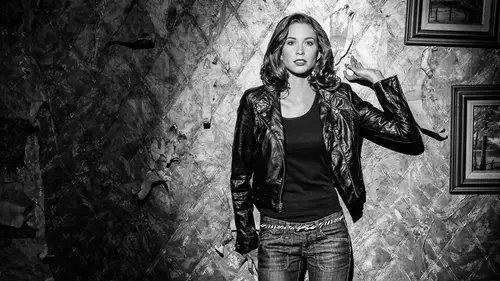
e of the light becomes much larger. A larger light source will throw a wider beam of light, with shadows that are more open, because light is bouncing around and spilling into the shadows. This is soft light. An important term is effective size. The effective size of a light is based both on the physical size of the light and its position in relation to the subject. In other words, the closer a light is to the subject, the larger its effective size, and the softer the light will be. The farther away a light is from the subject, the smaller the effective size, and the harder the light will be. To illustrate this point, let's look at the sun. Although the sun is 100 times the width of the earth, it looks like a tiny speck in the sky. That's because it's 93 million miles from the earth. This makes the sun's effective size very small, and therefore, it gives off very hard light. Now if we were able to move the sun very close to the earth, its effective size would be much larger, and the light it casts would be much softer. We can change the quality of light by changing the effective size of our light source. Since moving the sun closer to the earth would be impossible, and a really bad idea, there is another way to modify our light source. We can use modifiers. Now let's bring back the clouds. In this scenario, the sun would be the light source, and the clouds would be a light modifier. The sun lights up the clouds, and the clouds become a huge light over the earth. Now our illumination is the entire sky, not just the tiny dot of the sun. The effective size of the light is much larger, and the light is much softer. Sometimes soft light is called diffused light, and hard light is called harsh light. Contrast is the difference between the darkest and lightest areas in an image. The greater the difference, the higher the contrast. In much the same way you can change how hard or soft a light is by moving a light closer or further from the subject, you can also change the contrast of your image by changing the position of the light. When you position a light in front of your subject, you'll get a low-contrast lighting. If you move your light to the side of the subject, you'll get a much higher-contrast lighting. Okay. I've seen this video a million times now. I always wanna tell this girl, "Breathe, just breathe." So funny. She's a terrific model. Her name is Theresa. But that was one of her very first jobs that we shot, and she was so nervous, and she just held her breath the whole time. It's like, "You can't move," and she's like, "Okay." (laughter) So funny. So yeah, after we got done, she's like (gasping). It's cool. All right, so that actually is a video that I created for studio lighting, but it doesn't matter. Light is light. And so, when we talked originally about the language of light, I mentioned that it's not very complicated. And it's not. We've already learned as much as we really need to know for the basics. We know how to create soft light now. We have a large light source that's diffused, so clouds, big softbox, great. We know about hard light, and what creates that. It's a small light source that's far away from our subject. We know that soft light works great for color. We know that hard light works great for black and white images. We know that hard light is great for creating shape. We know all these things. We know about specular highlights. We're gonna start diving into that stuff. So already, we have a good foundation to build on. Need to talk about some of this sciencey stuff. And the first thing we wanna do is to remember that light travels at different wavelengths, and because of that, different light sources have different colors, and that is actually called color temperature. So let me talk through this for a second. Say you have a piece of white paper, and you're in the studio here, or maybe you're at home, and you have one of these lamps, and you're reading. That piece of white paper, to you, is going to be white. You're gonna see that as white. If you go outside into an overcast day, where we have lots of clouds, you're gonna look at that piece of white paper, it's still gonna look white to you. Anywhere you go, that piece of paper is going to look white. But the truth is, our cameras don't see light the same way, cause our brains are doing all kinds of crazy things that even scientists don't understand to adjust for the different colors that lights emit. Some lights have a little bit more blue in them, some have a little bit more amber in them. And it's based on the actual physical temperature of the light, unless you're talking about fluorescents, and that's all crazy science that we're not gonna get into. But let's just say it's all a physical temperature. That will help us baseline things. To help understand this, I actually have a little diagram that I've created, and I'm gonna confuse you a little bit more, because there's some color theory that we don't have time to go into, but I'm gonna give you a taste of color theory. Maybe I'll do another CreativeLive, three days on color theory. That would be awesome. But normally, when you think of things that are blue, you think of cool. When you describe blue, you think cool. And when you think orange or red, you think warm, correct? Well, that is called an emotional color. I just told you about Disney movies and all those guys, and we said the good guys are blue, and the bad guys are red. Those are emotional colors, and they do not correspond to color temperature. Color temperature's the exact opposite, actually. And so what we have here is, we have this little scale. And if we plotted a scale here, from left to right, lamps that have a cold temperature start at a low kelvin value. Kelvin is sort of like a degree, Fahrenheit or Celsius. It's kelvin, and it's called kelvin because the guy who invented it was Mr. Kelvin, Dr. Kelvin. And what he did was, he took this piece of metal, a very specific kind of metal, and he heated it up. And based on the temperature of that piece of metal, it changed colors. And when he found out that when it was cool, it was in this amber range, and as it got hotter and hotter and hotter, it became more blue. And you can see this if you take a match, strike the match, and take a look at it. It goes from white, to blue, to orange. As the temperature cools down, the color actually changes. You see this with a blowtorch, or anything. So get a match and look at it tonight, and you'll see, "Oh, cool, yeah." Things that are really, really hot are blue, and things that are cooler are orange. And so we put this here. This is a cold color temperature, but a warm emotional color. And this is a hot color temperature, but a cold, or cool, emotional color. Okay? Does that make sense? They're two different things. All right. So in nature, and in artificial light, we have some standards. A candlelight is down here on this low end. It's about 1500 kelvin. It's a very cold light source, and so that's why it's so warm and ambery and orange. In fact, if you look at a fire, you'll see, again, blue goes to orange as it's cooling off. You'll see those things. The next thing we have here is this little thing here. This is 3200 kelvin, and that is a standard. 3200 kelvin is a standard of color temperature, and it's normally what tungsten lights are. Tungsten lights are going out of style, and they're not being sold anymore in great quantities. But these lights here are tungsten lights. They're normal house lamps. And those are almost all at 3200 kelvin. And so the softboxes and the hot lights that we were using in the previous section, that were really bright, those are tungsten lights, and they are exactly 3200 kelvin. They are calibrated to be that. And so, when you're renting lights, or purchasing lights, generally, you're gonna ask for daylight or tungsten. Tungsten is 3200 kelvin, and it mimics this. It's sort of like sunrise, it's a very warm light, it's really cool. Or very warm. Very cool, I guess, in groovy. It's a very groovy, warm light, how's that? And then daylight, sunny daylight, right here in the middle, is when you have an almost equal proportion of red, or amber, and blue. That's about 5500 kelvin, it's about that. And studio strobes, and the lights that we have shining around us right here in our studio... I don't know if the cameras can show these lights up here, but these lights that are making me light up right now, these are daylight lights. They're balanced to about 5500 kelvin. So depending on the manufacturer, some speedlights will be about 5200, some will be about 5500, some are 5600. That's why I'm saying around there. But generally, 5500 is daylight, 5500 kelvin. And so when you're mixing light sources, there are these gels, that we're gonna talk about tomorrow, that will convert tungsten to daylight, or daylight to tungsten. There are standards that you can get... If you've ever seen a photographer with an orange thing on their light, what they're doing is, they're trying to make their daylight light mimic tungsten. They're taking some blue out of the light to make those things match. Yes? You put that relative to the types of bulbs that are commercially available? Yeah, so this is a crazy thing. In fact, NPR just did a huge story on this, and... Sorry, I'm an NPR junkie. The problem is, commercially available lights that are in houses and stuff... It used to be pretty simple. They were tungsten lights, maybe halogen lights, there might be fluorescent lights, and so there were basically three different types of lights, and you could get kits to adjust for those types. Now we have CFLs and LEDs and all those types of things. The probably with them is they don't emulate sunlight in the same way that tungsten lights do. So if you-- And I didn't-- I should have brought this. If you look at the spectrum of colors across from ultraviolet, to what we can visibly see, and infrared, and all that stuff in between... Remember from 8th grade science class, that little thing... From infrared to ultraviolet, there are all these colors that the sun projects, and we get all of those. In a tungsten light, you get all of those colors. With a fluorescent light, and with lights that are from LEDs and CFLs, from those different lights, you don't actually get all of the colors that are in that spectrum. And so to correct it, sometimes, it's hard, because there are gaps in the spectrum of light. And we are getting way off topic, but we need to go into color theory, cause I'd love to talk about that. And so the moral of this story is, modern day lights have some new significant challenges, that honestly haven't been met by color meters and light meters, yet. And so, architectural photography... In fact, John, can you bring me this? I'm gonna jump the gun here, just, in fact... Yeah, the color meter. Yes. Architectural photographers, a lot of them use a device like this. What this is, this is a color meter. And it actually measures color temperature. And so I'm gonna actually do this. I'm gonna go up here and measure this light real fast. I'm gonna just click it, and it's going to tell me right here... I don't know if you can see this. It says 5570. So this is 5570 degrees kelvin. And I can go over here, and I can measure this light right here, and it tells me it's 2630. And so that lamp is cooler than normal tungsten, and so we would have to go in and measure different light sources in a house or environment, and see what are they. What this thing will do is, I can measure this light, and this light, and it will tell me what filter I need to use to make this light match that light. This is $1000. And it's highly impractical for most applications, unless you're a high-dollar shooter. Ready, John? There you go. (banging) Ahh! (laughter) I knew that was gonna happen. It's very strong. It's insured. I was hoping you can catch it, that'd be cool, but I hope it's broken. It's not even mine, so I don't care. (laughter) It's John's. No, but the moral of the story is, if you're in an environment that has crazy lights, and you'll know, because you'll start seeing variations in color temperature, what you need to do is either standardize all of those lights by putting gels, or replacing all the lamps, or doing something that's totally impractical, or bring your own light, and control all your own light with speedlights or studio strobes, or just use daylight. So there are some challenges there. But yeah, the architectural photographers that are charging bucket loads of money, they'll actually go in and black out an entire house, they'll standardize all of the lights with different gels. They'll spend a day or two, sometimes, to make all the light perfectly white, and then they'll go into post-production and warm it up. So, wow. That was a lot. Okay, are we still with us on this color temperature thing? Okay. There's a term that we need to know about, and that's called white balance. And what we're doing is this. I'm gonna draw this out here. And what we'll have is, if we have this same little chart here... So this is, as we're warming up, we're getting more and more blue. And as we're cooling off, here, we're getting more and more amber. And so what we wanna do is, we wanna have an equal balance of amber to blue. Where they're equally balanced, our camera mixes those, and it sees white, so that's what we want. And so, if this if off, we're gonna have something that's a little bit too orange. If you've ever shot in low light and everything's all orangey, that's why. Because the camera thinks that the color temperature's up here, when it's actually down here, and there's way too much orange in the picture. And so what happens is, if we put a line across this, we want an equal mix, an equal mix of blue and amber. When our color temperature is lower, what we're doing is, we're actually adding blue. We're adding, or pulling in, blue, so that the amber and the blue match. And then, when we are doing the opposite, when we wanna have a nice color temperature over here, we're actually adding in amber to make that match. And the reason that's important to know is, if you just look at this diagram here, and you see that color temperature, when it's really warm, is blue, and you go into Lightroom or Photoshop, and you adjust the white balance slider. Well, when you go to the right, it gets more red, right? Gets more amber. So a lot of people, when they see this, they're like, "Oh no, Mark, you're wrong, because..." And you move the slider, it gets red over here. The reason it's getting red is because we're adding in red to balance that out. And when you're pulling it down, we're adding in blue to balance that out. Make sense so far? Shweet. Okay. So what we need to do is, we need to do a demo. And I'm going to show you several ways to set your white balance in your camera. Now this happens in two different ways. On a Nikon it happens one way, on a Canon it happens a different way, on a Sony it happens a different way, on a FuJi it happens a different way. So there's no way we could go through every single camera manufacturer out there. So how many are Nikon shooters? Nikon? Two? Okay. Nikons are by far the easiest to set white balance. There's a little pre button you click, that you go to custom white balance, you hit pre, hold it down, it starts flashing pre, you take a picture, boom, you're done. It's really cool. All other cameras work very similar to the way that the Canon is gonna work, that I'm gonna show you today. There are certain steps. You have to first tell your camera, "I'm using a custom white balance." That's the first thing you do. "Hey camera, I'm using a custom white balance." And I'll show you, with my camera, how that works. The second thing you have to do is, you have to tell your camera what that white balance is. And we have to have some kind of device that tells the camera how to adjust that. And so we're gonna use three things today. We're gonna use an expo disc, which I have, we're gonna use a white card, but you can use these things that are called gray cards, that are calibrated to be 18% gray. We're gonna find out why it's 18%. There's some that are 15%. We're gonna find out. And then, the one that I prefer and I use almost exclusively is this thing called a ColorChecker Passport, and we're gonna show you how that works. But before I do that, let me first explain to you some color theory, so you can understand how these things work. So the primary colors are red, green, and blue, right? Some people are like, "No, it's red and yellow, right? "There's a yellow in there." We'll find out why. There's both. So red, yes, blue, green. And so when these three colors are mixed equally, when we have 18% of red, and 18% of blue, and 18% of green, or whatever, when they're equal, the camera can go, "Oh, okay, "that is where white should be." When they're mixed equally, you get white. And so all of these targets, what they have is, they have an equal mix of red, green, and blue. And it will come out actually 18% gray, because of another reason we'll find out later on, but it's gonna look gray, if it's an absolutely equal mix of red, green, and blue. And that's why gray cards, if you use a gray card to do calibration, you need to replace it about every two years, because the surface is going to fade, and that calibration is going to be out of sync. So you need to keep those things fresh. And then... We're gonna also talk about tint, but we're gonna come back to this. So just have this in your mind, and we're gonna come back to this chart, and we're gonna talk about the color wheel, and we're gonna talk about tint, as far as some stuff you're gonna see in Lightroom, and it'll start to make sense to you. Right? So red, green, and blue, equal proportions. Here's how we get that. All right, so what I'm gonna do here is, I'm going to actually take some photos, and we're gonna take some photos of these lamps over here. And I asked to have these lamps here because they are clearly not the same color temperature as the lights we have out here. So in a second, I'm gonna have Lex come out here, and we're gonna have her stand here, we're gonna have her stand over here, and we're gonna start doing some different things, so you can see how we get some color temperature problems. But what I wanna do is, I wanna take a picture of these lamps and see how we do. Now, what I can do right off the bat is, I'm just gonna keep my color temperature on my camera set. So I'm pushing my white balance, and I just have it on auto white balance, so it's just on auto. And for most scenarios, auto white balance works okay. Sometimes not so okay. So when we shot over there, I'll bring up some pictures, Lex was extremely orange. I don't know if you noticed that. Cause the color temperature was off, and so we got that. Maybe, John, you can help me with this thing, and I'll take the (mumbles) from you. I'm all tangled up. Tangled up. So I'm just gonna use auto white balance to start with, and I'm gonna take a picture of these lamps. Okay, these are tungsten lamps. (clicking) Now we're gonna get this picture, and it's exposed, for the lamps, and here is what we get. We get this. Lamps. All right. And that looks, hm, pretty good, wouldn't you think? We can look next to the lamps, we can look at the screen, and it looks pretty close to what that should be. But let's say I have my white balance set to... I'm gonna set this to flash. So it's at... Flash is 5500 kelvin on this camera. So I'm gonna take another picture, where my white balance is not set correctly. (clicking) And we'll take a picture. And this is what you get a lot when you're shooting in a low-light situation. So watch what happens. Now, that's much more orange, right? And we can show these things side by side. I'll just go here and select this guy. Chnk. And let me put this on screen. There we go. So now we can see that the one on the left is not as warm as this one. So this one here, we intentionally said, "Hey, this is a flash," which added more orange to it, and we get a very orangey thing. Or we could do some other things. But you get the idea. So how do you get accurate color temperature, where it's absolutely accurate? So what we're gonna do here is, the first thing I'm gonna do is, I'm gonna set my camera to custom white balance. So on a Canon camera, there's a little, when you hit the white balance button, there are these two little wedges. And the wedges, by the way, why did they use wedges to illustrate custom white balance? Well, look at this chart right here. If you took these wedges and put them side by side, they'd look a lot like the custom white balance icon. So more blue, more amber, and we want what's right in the middle, the good center. So that's easy to remember. That's what that icon is. On a Nikon... And other brands, look and see what it is, but on a Nikon, it's a pre, it's called preset white balance. And you'll set that. So I've got that, but now I have to tell my camera what is the proper white balance. I need a target. So what I'm gonna do is, I'm gonna use something that is phenomenally awesome for shooters of weddings and portrait kind of stuff. What I'm gonna do is, I'm gonna put my camera in manual mode, and I'm gonna set my exposure. So I'm gonna look through here, and my exposure is set. It's all good. So it's set at about a hundred. Let's check and make sure... Yup. Still set. And when this pops in here, you'll see that the white balance is way off. See how that just changed that color? Radically changed. Okay, so what I'm gonna do here is, I'm gonna take this thing, and I'm going to put it on the end of my lens. This is called an expo disc. And these things are awesome. Cause all you have to do is, once I have my exposure set, I'm just gonna point this at that, and I have my focus set to manual focus, cause it can't focus with this on the lens. And I'm just gonna take a picture. (clicking) Bam! And that's gonna come in. We'll see if it comes in. It should be a neutral gray. There it is. And then what I can do is, I can set that as my exposure. And I think I was too far away. Let me just check really fast. So I've got that. It's pretty good. Stick this on here. I'm even gonna put this in (mumbles) mode. (clicking) Bammo! There we go. There we go. So, I said the wrong thing. I should not have set the exposure first, cause when I did and I put this on there, it messed up the exposure. So I put on aperture priority mode. And there we go. Now we have this. This is a neutral gray. Okay? It doesn't look neutral gray, because the color balance is off, but this is an equal amount of red, green, and blue, at an 18% exposure. All I did was, I put this on my lens, and I snapped a picture of my light source. Then I can do this. I go into my menu, and in my custom white balance, there's a little custom white balance thing here, and it says, "What is the custom white balance?" And it says, "Only compatible images are displayed. "Do you wanna use this image?" It's asking me, do I wanna use this image as my white balance? And I'll say, "Yes." Okay. So what I did was, I said, "Hey, camera, "I'm using a custom white balance, "and that custom white balance "should be calibrated from this shot. "Use it." And now it's set. I'm gonna take a picture with my custom white balance set. (clicking) Bammo. And now these are going to show up as white, because, check that out. So that's proper white balance, because it's saying this should be white, and look at that, it is white. It's all good. A lot of times what you'll do is, you don't wanna have a white balance that is so clinical and clean all the time. Sometimes you'll get in a portrait like this, where the white balance is actually white, but that's not what you really want. You want it to be warmer. You don't want it to be actually white, cause it's bland and boring. So this is correct color temperature, but we might wanna cheat a little bit to make it something else. So Lex, I'm gonna have you come out here, and we're gonna shoot a couple of portraits. And John, I'm gonna see if you can help me out just a second. Lex, I want you to stand close to these things, as close as you can get. Get in there, and then look this way at me. Yes. And then, even scootch down a little bit. So, we're having some weird shadowy issues here. (clicking) Boomo. Okay, so this first picture here is horrible lighting, but we're looking at the color. This is the color. And it's a very blurry image, cause I didn't increase-- But look at her skin tone. It's correct. Her skin is that color. If I put this on auto white balance... We're gonna do the same thing. So, scootch down there. I'm gonna take a picture with this. (clicking) Blammy. Watch what happens in auto white balance. Her skin is going to immediately go to much more orangey. You can even see the different orangeys in that. But the comparison between these two... Let's see if I can show you these again, side by side. Notice the one on the right has more orange in it than the one on the left. So we can see this. And this monitor, by the way, is not color calibrated. If you saw it on this screen over here, it's distinct. So the point is, if you're shooting something like lamps and interiors, and you wanna fudge it and make it a little bit more warm than it actually is, you can actually use an incorrect color setting. But when you're shooting something that needs to be color correct, like a person's face, you need to make sure you have a good white balance set. All right, we're gonna do one more thing. So, John, let's get the ColorChecker Passport. This is my favorite way to set white balance, because you have so much control in post-production. Yeah, let me grab this really fast, and I'll let you have this. Got it. (mumbles) got it. I know, I know. (laughing) I'm in trouble, because I... Never mind. I'll tell you later. It's fun to drop stuff once in a while. I'll drop this right now. So what this is, this is a much more advanced tool for post-production. And this is used for when you're in a situation where you're shooting raw, so raw files. I'm sold on raw. And we're gonna talk a little bit about why raw files really impact dynamic range and all kinds of things, tonality, and the darks, and the shadows, and if you're doing fine art, you need to be shooting raw! But anyway. This tool will only work when we're shooting it raw. And what we can do with this is, this not only tells us about the color temperature, but it also helps us understand the color in the photo, and we can see if we're over-saturating, de-saturating, if we're making adjustments to the wrong thing, and you'll see that these colors here actually line up to the color sliders in Lightroom. So this and Lightroom were born to work together, and it is really awesome. So I'm gonna take a picture with Lex, and then we're gonna go in and we're gonna start modifying our color temperature. So for this, Lex, I want you to come out a little bit, and we're gonna use this light right here as our key light. And I'm gonna have you hold this, and you're gonna hold it right next to your face. And I'm gonna take a photo. And I'm shooting in aperture priority mode here, and I'm in auto white balance for this. Cause when you shoot raw, you can set your white balance in post-production, and it's exactly the same as setting your white balance in the camera when you shoot. There is no difference. So that's one of the only things that you can do in post-production that's the same as doing it in camera. That's one of the reasons I shoot raw. So we're gonna shoot auto white balance, and then we're gonna fix it in post. So the expo disc, we fixed white balance in the camera, and that's great for wedding shooters, sports shooters, people that have to get it right in the camera, and can't do post-production. This is for people that have the leisure of fixing things in post-production. So I'm gonna go where they told me I can't go, and shoot over here. And there we go. Actually, scootch over this way just a bit. There you go. Thank you. So I'm gonna get really close here, and I'm gonna focus on the color checker. (clicking) And we got that. Perfect. Thank you. And you can have a seat now for a little bit. And John, I'm gonna give you this. Thank you. And I'm gonna have this. All right, let's talk about this color checker, and how it works, and why it's so amazing. And then we're gonna move on pretty quickly to some other sciencey stuff. So in Lightroom, when we have this image... I'm gonna go into the develop module. On the right hand side, you can see that we have this color checker. The top part up here, these squares here, are calibrated for controlling tonality and color. The bottom half is for calibrating color, and I don't think we're gonna have enough time to talk about the bottom half too much. It's for building color profiles, and, again, stuff that should be in a color management workshop. But if you'll notice on the top here, we have a little icon of a person, and we have a little cutout right there. And then, as we go, you'll see plus, plus, plus. And on the bottom, you'll see we have a little photo of a little mountain, and on this side it's iciclely, and on this side it's sunshiny, and in the middle we have a cutout. And so what that means is, this square on the left right here, this guy right here, is a neutral white balance for portrait photography, and this is a neutral white balance for scenic photography. Normally, in portrait photography, you only wanna warm up the photo. Very rarely do you ever wanna cool off somebody, and make them look freezy and cold and deadish. But in scenic photography, you'll sometimes wanna warm up the scene, or cool off the scene, and so we have the choice of both. And here's how this works. In Lightroom, and, by the way, in Adobe camera raw, you get the same thing. It's the same engine. You have a white balance color picker. So if you'll see right here, there's this little guy right there, and that is to select the white balance in post. So I'll click on that, and I'm gonna hover over this. Let's see if I can zoom in to show you. And the thing that's important to note here are these numbers. Look at these numbers right here. 86.1, 88.6, 89.8. And what it's saying is, there isn't an exact same percentage of red, green, and blue, but there should be. So when we click on it, click, instantly we saw the shot of Lex, she got much much more colorful. Let me get this color picker here again. Now I'm gonna hover over this one more time. Now look at this. Now that we've corrected the color... All I did was, I just clicked on it. 88.8, 88.8, 88.7. So now, the mix between red, green, and blue is scientifically, they're identical. So we have perfect color temperature. And if we go down here to this... See if I can make this show up. You can see there, we have 86.4, 86.5, 86.4. So both of those are equal. And then, we can see here we're getting more and more... See if I can make this scootch over. We're getting the green value and the blue values to change, the reds to change a little bit. So that is more pleasing, warming, for a portrait. See how her skin tone's just changed? We'll do that again here. Donk. These down here are for scenic photos. And you can see that nothing really changed when I cooled there, because the scenics are more pleasing to greens and blues, to increase the saturation and the color of scenic photography, and the top line is more specific to portraits, so it deals mainly with the reds. That's the difference. We don't have time to go into all the other awesome things that the ColorChecker Passport does, but I'll just show you really fast, just so you can play with it later. Notice that all of these things, hue, saturation, and luminance, which we'll talk about later... Red, orange, yellow, green, aqua, blue, purple, magenta. These colors right here are exactly the same as these colors right here. They match identically. And so what you can do is, if you need to change the red, you can just grab this little slider here, and you can start messing around with the reds there, or any of the other colors. Or if you're making changes, you can see how that works. But we don't have time to go into all the ColorChecker Passport awesomeness, but I love this tool for managing color and color temperature, to do those things. All right. The last thing I wanna show you for setting color temperature is the one I probably should've started with. It's the one that everybody uses all the time. This is actually a white balance card made by X-Rite, and it's a fancy one. This is a really expensive, fancy one. And usually you use either something that's white or gray. This is a calibrated white card. Or you can get... Just zip down to Adorama, or Glazer's, or wherever you wanna go. You can get a gray card. I think they run about $6, is about what they run. And you'll wanna use one of those for setting white balance, and we're gonna learn about setting exposure, as well. You want that. Mark, can I ask a question, please? Yes. We had a question earlier, asking about if you could talk about the shape of a gray card, or a white balance card. Yes. Our person that heard that, potentially, round is better, but could you talk about how the shape might affect? Yeah. So what you wanna do when you take your white balance shot is, you need to have, the majority of the scene needs to be the calibrated target. If it's a card, round, or square, or whatever, it needs to be that. The problem with some of the cards is, if they're highly reflective-- A lot of the cardboard gray cards are really reflective-- And so what will happen is, you'll get a specular highlight off that card, and it'll throw off the white balance. So the shape, so much... I prefer rectangulars to fill up the entire scene, but the round stuff... I think mainly, that is to try to get something that doesn't cast a specular highlight, and so you get different textures. I think that's more than likely what the thing is, but I don't think the shape matters much, except that you need to fill up the majority of the screen to set in-camera white balance, so I prefer this. The other thing that's really important, whatever you're using to calibrate your color, it has to be where the actual light is falling. So I couldn't put this here, and take a picture of this, and say, "This is the correct color temperature "for this light," because the light that this is seeing is coming from a different... It's this light up here, lighting... So it would have to be back here, and we'd have to shoot it... So it has to see the light that the camera is seeing. That's one of the reasons I love the expo disc, cause the expo disc, you stick it on the lens, and you just shoot it at the light, cause the light is coming, zoop, through the lens, and you get that perfect thing. So these can be a little bit tricky if you don't do them perfectly. Have more questions? Yes, sir. Can you use that the same way as the Passport, though, just have it-- You can. Next to your model and-- Absolutely. Do it in post? Yeah. The difference is you can do this, and... The reason I had Lex put it right next to her face is because you want it to be as close as possible to where the light is falling. And it works here cause we have this light coming, and so it was the same, the light here is exactly the same here. The difference, though, is this, you could use the white balance picker, and you could say, "Hey, this is neutral," and then, that's it. You don't get all the other benefits, that I wasn't able to show you, of warming things up, cooling them off, adjusting colors, creating color profiles, and all that goodness. But yeah, essentially the same. I think we have another question in our studio audience. Yes? Hi. You said that you love the Color Passport. You also say that you love the expo disc. I do. If you were stranded on a desert island, you could only pick one, as a portrait photographer, what would you pick? Well, if I was stranded on a desert island with a studio-- (laughter) Then I would choose the ColorChecker Passport, because it allows for so much post-production flexibility. If I was stranded on a desert island, and they had the Olympics, or weddings, I would choose the expo disc, because in that scenario, you don't have time to do post-production. You need to get your white balance set immediately, have it be accurate, and then just shoot. Especially if you're shooting in jpeg mode. Sports shooters, and a lot of wedding photographers, they need to have their color accurate right out of the camera. There is no post-production. And the expo disc is made for that. So they're different tools for different scenarios. That's why I have both of them. So, yes. (mumbles) Okay. If you're taking your photography, but then you're also repurposing for quick video, so photography and video, do you have to make any quick alterations between the two? No. No. There are tools that are on their way specifically for DSLR white balance for video, from some company, I don't know who. Yeah. Video, the black and white levels are measured a little bit differently in eye-ree, as opposed to the way that cameras measure that, and so... I'm gonna show you a target here, in a little bit, that shows you the black and white levels. And so, those two things are a little bit different.
Class Materials
bonus material with purchase
Ratings and Reviews
Claudia Ochsner
This is an excellent course. I recommend this course to every photographer, of any level who want to put money into lighting stuff. Mark Wallace has a gift to teach and to truly enlighten his audience about complex issues in photography. The money for this course is well spent, the time is more valuable than hanging around in forums and ask questions to others who don't have a clue as well. The products used ( partly promoted ) are very "American" - I have to say that as Swiss. Because you know there are two other brands which could compete at the top level of studio lights as well. Just kidding - But seriously - many thanks to Mark, John, Lex ( Gosh - you are so beautiful ) , CL and their team to help me to reach out for a new level in my photography. I am now going to push my boundaries, well knowing that understanding light is science, but for sure not rocket science.
Rose-Marie Gallagher
This was an outstanding course! Mark presented TONS of quality information, starting at the very basic concepts and working up from there. He is interesting to listen to and very understandable. Great examples that expand the learning. Highly recommended! Thanks for bringing Mark's class to CL...I hope there will be more.
J GRANT
As comprehensive, easy to digest, and beautifully paced a course on Light and Photography as you could ever want or need. Mark intuitively understands the best way to deliver his know-how, be it scientific, creative or practical, resulting in an easy-to-digest and quick-to-retain course. I was particularly drawn in by his wonderfully fluid teaching style that seamlessly moves from one area to the next, never too fast and never too slow. Regardless of the course's focus on Light, if you aspire to take your photography to the next level in terms of your technical understanding of how light impacts photography and practical skill in dealing with it, this is a must-watch course for you.