Custom Letterforms with Gerard Huerta
Lesson 12 from: Advanced Typography: Fine Tuning and FinessingIlene Strizver
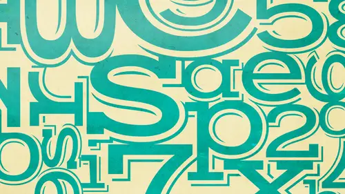
Custom Letterforms with Gerard Huerta
Lesson 12 from: Advanced Typography: Fine Tuning and FinessingIlene Strizver
Lesson Info
12. Custom Letterforms with Gerard Huerta
Lessons
Formatting Your Type
30:16 2Format: Hyphens, Alignment, & Separators
25:19 3Initial Letter Alignment & Figures
27:37 4Finessing Your Type - Part 1
36:38 5Finessing Your Type - Part 2
31:49 6Spacing Considerations
19:10 7Advanced Spacing
26:19 8What's a Good Typeface?
30:49Lesson Info
Custom Letterforms with Gerard Huerta
Hello everyone and thanks for joining us today for our typecast webinar entitled drawn quartered and executed custom letter forms with our guest presenter gerard huerta my name is klaus I'm a creative director and a visual storyteller and I'm going to be your co host today I'm pleased to introduce today our presenter gerard huerta gerard is an incredibly talented designer and typography who has designed a ton off logo's brands magazine covers books and even banned identities that you're all sure to recognize he's going to walk us through his process which I think is going to be amazingly insightful and inspiring and I hope you find it that way as well welcome everyone to drawn quartered and executed it's a good thing for the multiple meeting of words or this would be a very different kind of women are the first thing I'd like to show you is a piece from there we go a piece that was done before I work digitally on part of this is to show you the process of how I work how we work then an...
d how it relates to how we work now this is a book jacket that was done for harpercollins for jim downey and tom connor and it's significant for me because it was one of the last pieces that I ain't before going digital now you can see here we have three designs that are based on cigar bands and then sort of a victorian designed with a bunch of different kinds lettering in it, which was the one that was chosen here? You see the final sketch from left to right, it's, about sixteen inches across here. We come to see it up a little bit closer now. What we did back then is we would always draw our lettering as tightly as possible on the tissue. And the reason for this is you would do your tissue. You would secure a piece of vellum of den riel, some kind of translucent material that you've been gone. And the only thing you wanted to worry about is how that week went down onto the piece of paper. Here we see a portion of the thinking now. Back then, good lettering was made up of three different components. The first was good design, a drawing, the spacing of the letter forms and the correct waiting of the letter forms. The second thing was clean edges. We wanted to make sure that all of the edges were very, very smooth. That was kind of the mark of a good lettering designer. The third thing is equal stroke wait were necessary, for example, on the stems of a letter and then on the hair lines of script, for example, or the airlines of dhoni serif. Okay now if you look at how things are done now those last two components we really don't have to worry about we don't have to worry about clean edges because illustrated for example you have vector artwork unequal stroke is just you know whatever you want to make this trump you just type it in but the important thing is that the design and the drawing is always going to be important allows you drawing with clean edges and consistent strokes is still gonna be a lousy drawing and there is stamped on the book cover and then I color this so I could be able to use it in print and win this is a mask had I chosen this mass hit because a lot of the mass hits that I've drawn over the years like time people money us we're very few characters and this one happened to be the one that had the most character twenty four plus of illustration so let's take a look at it now you can see what I work digitally I can work a lot looser this is probably looser than I usually do a scanned sketch but you get an idea you could tell kind with the letter forms gonna look like now here's what I call my part for my art for it is where I do all of my cops put guidelines in my stand is in there my lettering is drawn over confident and here you see all the different variations without the scan on top of it. This is a qualifying it was again drawn an illustrator to have an engraving type of field it's really kind of the symbol for the papacy. This tiara the stole, the cross keys and you'll fight over history actually, every polk has their own logo. It's it's, thes combined elements, but they're also drawn slightly differently. And then you here you see the entire logo incompletion let's, talk a little about reference. The art director was abie suspects came up with this idea for a band called blackjack that we use the tally ho packaging as an idea for the album cover. So it became a package of cards. Black jack happened to be a band whose lead singer was michael bolton back in the eighties. And here we see the tight pencil sketch for the cover. Now, if you look closely, you can see my guidelines, you can see forty five degree angles, all my lines, lineup center lines for little circles. What else we have here is a compass point little compass hole. For all of these curves up here, you can actually see I had a a triangular design appear that I raised the replacement with this decide and then of course, here on the sides we have lettering in perspective then on the top we have again lettering in perspective and the spade drawn in perspective and then straight on down here here's the thinking for that piece it was exciting size twelve and a half by twelve five days which is albums eyes you can see here I have lettering and positive I've drawn it in negative zero drawn it in negative in perspective and I look at this and I think boy, we made things difficult back then and here you see the actual package in color with the reference next to it this is another piece I wanted to show you the reference for but I love the book out years ago and it was never returned so be careful about loving your books out. This was done for bill gold advertising and I did it in conjunction with an old office mate roger hyson who's an illustrator we shared an office for about twenty five years and we were schoolmates also now roger isa great airbrush illustrator he now works in photo shop and achieves the same result. This job was interesting for a number reasons. One is that we had to work on this together but we figured out a way of working on it separately and that is I eat everything it's brown here was eight we sent that to a source meter had imprint the brown and then print the red or the negatives slightly offset to give us a little highlights here then all of this was airbrushed color within the letters. Now roger, he painted this on a separate sheet of strathmore paper. The reason is that we produced the first piece of art that's said bronco billy wild west show with this image pasted onto it. That was done actually, before the movie was shot so they could paint up big posters for the show and use the lettering on the trucks of the clint eastwood drove in the film and then we had to peel that off. In the middle of this we had to peel off that original illustration and then pasted onto this illustration for this final. Another piece I worked on with roger is this piece for movie called cuba. Now again, we silk screen all of the gold on here that was done as to making as was the lettering, and it created a big piece big framework for all of the illustration inside of it that roger unfortunately, this piece was never used. This is more typical of my drawings now when they get scanned. If I don't have to show client there's enough information here for me to do my finishes, this is a piece for american custom this's for my friend bruce, mark and bruce has a company where you go to his website and you have all of these harley davidson sounds that you can listen to tailpipe sounds and what you do is remove you tell why you send it over to bruce he does some hocus focus to it sends it back to you and it now sounds like the sound we picked on the website so this was done for a t shirt design and then the side of a trailer here you see my illustrator file over my scan and I'm going to take you through the printing process because this was done as a silk screen. The background gray would be a t shirt gray t shirt this white is the first printer or the opaque white inc now I'm not showing you the trap version now explain about trapping in a minute there's the white printer there's the black ranger and the red klinger and you can see here in this area have used some of the great to bleed in to create part of the tailpipe. Now this is trap what that means is what's white here actually gets expanded just slightly so when the red prince it will overlap it and that's very key because if there's any registration or off registration the grave will leak through that's whyyou trap for a flat so screen color like this and of course instructions for the printer you have to tell him what order if you're trapping this is a job for the wet it was done for nat trapeze on mackenzie christoph and james r g a it was done for johnson and johnson and it was a serious of icons and a logo and what I'm showing you here is the rough drawing it's done you know, with a sharpie market or just sort of single stroke and I'm showing you the the finish here and then we're gonna backtrack these were little icons that we use for the web and this logo which was given to me in a general form like this which I had to then re draw and six for the web now let's, take a close look if you look here these intersections, you'll see some notching taking place I'm removing parts of the letter here, here and over here the reason for that is when you reproduce it on the screen you'll see that it becomes very sharp by removing that because what you're I wants to do your eye wants to fill this in and rounded out so I take by using this process of redrawing we could get a really sharp image I used to use this technique still dio for doing watch tiles and we'll take a look at those a little later now here the icons blown up you can see the same use of notching here thes icons are in a couple of weights because you don't want the inside to be a ce heavy is the outside because this will start to get too heavy same way here, same way in this area you can see all of the notching that goes on and then finally, the final piece sharp and clear recently the type directors club sells celebrated its sixty fifth anniversary. Now what they decided to do is produce a book on. They gave sixty five designers sixty five numbers to produce eight and a half by theo four plus for the infinity sign square root of sixty four, maybe a beetle's week and after thinking about it for a while since I really have the freedom to do pretty much anything I wanted, I decided that I would pay homage to the lettering artist that I study people like com carne aids tony kristina, my friend doyle young my lettering teachers work leech drunk assad on shut schmidt now if you look at these little post it notes, I usually keep a posted note pad near my computer. I have entire computer set up an entire drawing set up on the other side of the room. So when I met my computer said, I'll do a little sketches when I'm working on another job and as you see here here's a completely failed attempt drawing where aid with the eight interlocking totally alleged ble but this appear started to intrigue me. I started thinking about these artists, how a couple of were in new york were very good to spend syrian lettering on the others were in southern california, and I thought this could be an opportunity to do something where I takes, then syrian and southern california car pin striping and do some kind of crazy combination of that. So it started kind of here and here, here's, another rough sketch where I've actually put this all together, and I'm kind of liking what's happening. The fix and thins all of the space is starting to work, so I do a little pen tell drawing here. No, I don't I'm not having a leading money around this just happens to show you for scale. This is about three inches across, and I worked out all of these little spaces. So now, it's time to scan this case into the computer. Here you see my line drawing, which is a single stroke over the drawing, and of course, we're only doing half of this because we're gonna flop it to create the other house. Now, let's, see it without the scare. Once I have this done, I want to go in and start creating the fix and fence what I call sort of giving it a musicality, the strokes will start to swell and slow down and speed up it becomes a hairline so I print out the piece and I take a pen tell it start to draw on top of it to create the weights that I want to create being very careful not to have a heavy stroke cover another heavy stroke also you see my guidelines here I have a center line. I also have guidelines around the outside. If you notice it's not a circle, I remain true to my original sketch which was really slightly elliptical, maybe about a seventy five degree of lips. Part of the reason for that is it feels a little more humanistic. Circles tend to be very mechanical. I loved to use circles sometimes, but it's a drawing like this off, you know, trust my judgment on using what my hand does and create this okay from this point on, looking at all these lines and wondering what can I do to make this more interesting? So I decided to give this a basket weaving effect the idea here being that where you have a line that goes over a line, it'll go under the next one, it'll go over the next one under over and all the way around and then on the opposite side to make this less symmetrical will do the reverse. If the line here goes under, it will go over now bear in mind I probably added a full day to the job just coming up with a stupid idea because I'm gonna have to subtract all these shapes from the other ones being careful not to delete any pieces to complete this now because this is on a square I've decided I want to anchor this to the corners of the square so I start drawing some corner pieces that looks sort of pinstripe e that might go well with my original design so here's some corner pieces the bottom ones are finished this one will simply be flopped over to hear this one will be flopped over here and we'll have the complete design here it is in color I've used a light yellow for the eight to bring it out and then slowly step back each part of it with a little bit darker color. So there it is a homage to those I learned from there's a logo type of national guitar museum and the national guitar museum was started by a friend rv newquist it originally was a facebook page in a website, but over time harvey has acquired many guitars from vendor gets his martin johnny winner and he's even acquired a forty five foot flying v and the national guitar museum has become a reality and become a traveling exhibit it started at the discovery museum the french port it's gone to the orlando science and industry museum louisville science museum and then excuse from louisville science and interesting museum where currently is held and we'll move on to richmond, virginia to the carnegie museum smothers so let's go through the process here's some drawings, rough drawings, pencil drawings on dh if you just kind of glanced through them, you'll see that we ended up really in this area but we have to achieve a lot here to get to that point. So this is my art board again it's very messy I draw things, I move him over the side this should be very telling to you over here in the corner that's actually one serif multiplied by four to give me an eye then that I could be used for the other sprayed strokes for these letters and some experimentation over here with angles and just playing around and then here we're getting closer. We're still experimenting with some different things like down here, how about using consistent line actually used a typeface here unbelievable and it turns out harvey likes blue guitar so this actually was a good thing because by making the tar blue we could then make the acoustic guitar a little bit more of an orange color so we get a nice complimentary thing going here and the variations and then finally he finished logos I did a lot of work for fairfield university for the theater department I do about four posters a year for them, and they're fun to do because they leave me lonely let me kind of do anything I want I think this has a lot to do with the fact that students used to do them and they're just happy to have somebody I think he knows what you're doing do that. So these always start out with a little sketch, some little image in this case, I'm using the lettering, it sort of highlights it's in the hair again. I'll use some coins here to show you how small the sketches, just very tidy sketch it's scan and this is my line art an illustrator, little bit of color and then final piece, and then here's, just a few more of them. Okay, next, we'll talk a little bit about alternate characters. This is the old logo for architectural digest. I was asked by hopkins battlement to redesign it, rework it, and I came up with this sarah, if sort of bracketed serif looking thing, which related a little bit to the original one, but something about alternate characters. One thing about doing lettering is a letter could be whatever it wants to be you, because it's always going to be in a fix situation, as opposed to type which a letter has to work in every situation, so I decided with this particular letter the sea that when we had the tail or return, that should have a little bit of wait because I had this unfortunate combination of c t and a lot of negative space here where I could take that and slightly make it swell a bit more to create a little bit of a wait there. Now if you look at the total logo, you'll also see that the arts are different. This art has a very angle leg is what is more vertical because of the space in the nature of the spacing and it has a ligature and there you see the two logos together. I got a note from john langdon of anagrams fame that said that they have now redesigned logo for january of two thousand twelve and they have not used alternative characters. So if you get a chance, take a look at it, see what you think this is not a lettering job. This is actually a monster typesetting job. Now the concept here the art director, came up with this. They were describing four different computer systems ibm, sideways, microsoft and he wanted to represent them by animals and what would be in this curved area? This represents where type is going to be set and that type will be in code. Let me show you the type on the scan so you see all of these are words tight code and I was given a big list of of code and was also given very specific typefaces system typefaces that I had to use to create this artwork so we had a couple of challenges one is that you had include the entire word so if the word fell short we have to find another one to replace it and if that didn't work it was child care to get something to sit the other thing that happened is that you wanted to create some drawing here so you would be able to get a turn for instance on the legs some shadowing here and that that was worked out with using boldface and lightweight faces for st middles of letters as in here so let's let's take that scan out so see if you switch your eyes you start to get a little bit highlighting and a little bit of play this arm goes service late goes over the rest of the body they're shadowing here and the alligator and then about six months later we added a kangaroo and here is the type setting up close so you could you can see what happens we also did a robot and did a series of interlocking hands again you can see how the shadowing starts to work in these areas where you have gold phase a little bit a highlight well we use a lighter weight okay so we've drawn we've executed what's this quarter thing we're going to talk a little bit about that along with some other stuff like layers you can see here is my layers palate you can see that all of them are shut off but the template layer here and let's look at the piece of artwork this was done for a magazine called men's journal they did a fashion spread of a bunch of guys hanging around motorcycles that this was a iittle piece for that so if you look at the layers you can see about sixteen of these layers air turned on for the artwork there other layers out of the twenty eight layers that are shut off now what these lawyers represent is any time I do any work on a piece of artwork I will copy it and work on a different layer saving that original one and the reason is that you may want to use something from there later so you always say something into a different layer and hang on to it okay let's talk about korda rains if you look over here in my layers palate you'll see here this highlighted one says top bevel then left battle than right bevel on bottom double those represent these sections of the letter form which is the bell and they are colored in a different fashion to create this rendering now how do I do this it's? Pretty simple you copy your letter, your original letter, which is here you take it and put it another layer, copy it onto another layer and then you outlined the past out here. This is maybe six points, I guess you outlined the path to create a separate line around it. You've got to make sure in areas like this that you fixed that because illustrators going mechanically give you an outline here and you want this to work for your bevel, so you have to fix their you've gotta fix these curves here because illustrated will give you a curb and then a straight and you want to get rid of the strait and make that one complete curve. So this there's a lot of little bit of extra work, I guess that you have goes into maybe fixing some of your outlines. Once that's done, we're going to make these shapes it's the way you make the shape is you take this maced made part of your word this path you send it to the back, you highlight both and then used to attract or minus the back that gives you this wide area going around here. Once that's done, you're going to take and draw a shape across here, you could see where that line is across here and then around here you're going to select both those shapes and you going to divide them and then you're gonna ungroomed that and you're gonna throw away these shapes on the outside keeping this middle shape you now have one belt you now go over here and do the same thing and you highlight it and you divide it and ewan grouping you now have one, two three shapes you do that to you go all the way around and break this all up once you've completed that you start throwing all of the top devils into its own layer you throw the left devils in layer the white devils in the bottom well, nobody said of easy now you khun you can put color in them to get your rendering that you want and if you look at the top level here you'll see over here that that is the coloring for the top bevel so you apply it and then you may have to change some angles of this heat. This happens to be zero on this particular one but you can see on the top of the l the angle has been changed. Okay, so that's what I call quarter right now when I was at art center, I was what was called an advertising illustration major we learned about rendering lettering perspective had drawing life, drawing all these disciplines you need the truth to be a good artist way learn how to use really pan squash acrylic we learned print production and all of that contributes now to me doing pieces like this and like the last place you saw because I'm always thinking about what instructors told me about, for instance cool highlights war my lights shadows how shadows affect areas that they're going in and july you see a little bit of edge lighted here. I wanted to show you this because this particular piece has thirty laters now this is a piece for google. It was done for garrett jones calling kim and mckinsey christoph that rg et it was for a campaign called google wallet, and this was the main image and google partner with people like ninety and macy's and subway s o I was able to use that advertising illustration knowledge to create these okay, take a little side step here with these guitars I've been doing a bunch of vintage guitar renderings like I've got about eighteen of them done, and they're they're really very specific to a certain your efforts to fifty two telly sixty five precision base sixty to tell a stratocaster and I've now managed to have eight of these is hanging in the national guitar museum as the decade sort of the golden decade or renaissance decade of nineteen fifty one two, nineteen, sixty one where the telly the straps at three thirty five les paul, the jazz based the precision based all of these were designed and are still pretty much in use in the same way they were designed back then in fact ate a printed these up from the full size twenty four by forty eight inches and the guitars are pierre actual size on those prints okay, back to letter a friend of mine danny see who is a local luthier designs and builds guitars wanted eh monogram for the head stock of on his guitars it's called d p n custom guitarist so here you see a siri's of rough pencil drawings monograms and here you see those put into illustrator put onto head stock to see what they would look like and dan selected this one. So this is mother pearl that's going to be inlaid into a veneer on the top of the head stock because these air really worked out with a sort of computer ah driven router there's a radius here it has to happen and it happens all you imagine a drill bit going around that's what you're gonna get us you're gonna get a little little circle partial circle there so we drew the artwork that way in order for it to be exactly the way that we want it now the thickness of this is the same as the thickness of the veneer so he could cut around this shape. This is why he chose this because the shape of simple easy to cut around it's inlaid and in the middle is filled with a black epoxy and then here is his love of the craft so once we did this I decided I wanted to decide a guitar so I designed this guitar did this rendering an illustrator of the guitar with features that I wanted and then blew it up to actual size here to give to dance so that he could cut this out and I gave it to him with the rendering so he could get the carving on the top and dan did a beautiful job of this guitar love the guitar while this was being made though if you remember harvey nucleus the national entire museum harvey went in to see dan and he happens see my drawings and he wanted me to design a multi neck, fully playable string instrument so this is where the fans refuse it's supposed to happen and here's the guitar we came up with it has eight next it has a ukulele neck it has a man limb neck six string bass a friendless based twelve string, a baritone and a seven string and it was originally called the paragon octagon but now is known as the rock cock so I did full size drawing and here you see the rock cock being assembled loose stride that again and dan had to make some modifications to it for practical reasons if you can call this practical now, after its completion hardly decided to do a video. So we got together the rock band and we did this video you could simply search rock cock in youtube and you can see eight gentlemen making fools of themselves. Well, we've got seventy thousand hits on youtube already. Well, this got shipped to louisville to be in the show in the national guitar museum show and we got a little bit of publicity from new york magazine huffington post and after that used tv saw it decided to do a segment called qin biohazard cock of the rock so here's a good biohazard from new york there's four guys inari see one guy here, one guy here still no speaking out there on dh, then here so you can find this on the fuse tv website if you take a look at it and of course we have darth vader played rock star is the bass player, of course, and here he is playing in e flat for all you metal has that dropped down a half step when you play guitar, no position and of course, the vato wall of sound. I've had a long association with swiss army, and I've done a lot of dials for them. This was the original one, and it was done for myron pollen berg, who designed to watch my new myron no mind for many years back from back in the record business through advertising admitting that the different jobs for him and my own called me he designed this watch it was a result of doing packaging for the fortunate group which swiss army branch used to be named and this was the original dial that we did and it was before we were digital. So here you can see the artwork for the hands and artwork for the numbers that go around and guidelines of course and then here's a kind of a prototypical calendar try dividing a circle and thirty one pieces and then if you note here the twenty one the two is much wider than the twenty or the twenty two this is because you have a calendar window and each number is revealed on ly through that calendar window so we can make the nine and the eight wider when they're alone and then when they have a one next to it and here's an aching now in ink and you see a little bit this notching upset which I'll show you a little bit a little later typically this is how it started how it started you would do a sketch about five to one five times the size of the actual printed dial I would do them in pen tell so I could sacks them over for them to look at here's another dial one tissue over another and here's another dial that I'll take you through a process this is a finished drawing of the dial you can see there's a track on the outside and we have military numbers out here in the military numbers if you look carefully you'll see that they're fan the accesses fromthe center of watch this is important because otherwise they won't look proper e I want to explain this that you can measure all you want you can do whatever you want and in the end visually it has to work so you've got to make those alterations visually to make things work whether they measure out right or not let's take one more close up you can see a real notching effect here this has a different reason than the web because we're talking about physical inc as a thickness and ankle tend to round out these areas so by taking away if this stills in then we have the correct waiting us the letter now here are some actual printed dials and here's a recent dial from december I did about four of these that you could see here with color breaks you can see different back frowns white black silver and an olive color and the appropriate pms colors that go with it and these air renderings that were used for catalog now again I used that advertising illustration major here to get leather and webbing metal that little bit of velcro here ah, a little bit of ah sort of nylon vinyl scrap okay, what is this? Well, this is my lettering one class from art center right before starting art center I had spent an entire summer drawing signs for a store and that's what I did day in and day out so I was kind of into the whole thing of lettering before I started art center but I didn't didn't really know that and we were given assignments in work leeches class and the assignment assignments went like this we were to do a phrase in castle on a phrasing but tony a phrase in news gothic in a phrase and spend syrian script and what would happen is we would do a tissue filled in pencil tissue and mort leach would come around and anywhere needed to be opened up people a little d anywhere you'd be closed up he put an x and then you could another tissue on top of that injury and we draw with the appropriate sixes some people it took three or four to issue some people with twenty tissues it just depended on where you got it or not this happens to be on inking and the way this has done is we would take that final tissue put graphite on the back of it we carefully traced down the outline of the lettering we would then use aja lot once one fifty pen point excuse me just one seventy men point and we would carefully go around and do our careful anqing of this and then use a ruling pen to do our straits. You could see here what a where I've corrected we'd use whitewashed to make the correction now what I didn't understand at the time I love letter in class it had to have been the most hated class at art center everybody hated letter and I didn't understand why this was lettering to where we would do actual type indication in pencil and we would take again take a phrase I think it's under here, says torino capitals, which I think were first to this using using that idea this is a current job I can tell you a lot about it because it's really not finished, but thie idea here is to take a genre of music and creative in lettering create the style of lettering for that you can see here's my rough sketches, which I scanned him and here the pieces not quite finished, but I'll give you an idea and you can see these air, not typefaces I mean you can't find these things you have to create these things you know it's typically with an are you okay? Did you make the same way? Well, doing a different take on that and making the city look like they are here latin that certainly is not a typeface because everything is kind of interlocking and these air truly drawn quartered and executed we have some cornering here here here like this is a cover from wired magazine I did for a bob siano I'd work with bob for many years andi needed this very quickly and that's why I could give him a sketch this rough I don't usually show sketches this rough but because it's rough there's a lot of notes along with it and here you see I do it in the photo shop through some color into it just to get an idea of how this is gonna look and then approved we're beginning our tissue you see the tissue here a little bit tighter of all this r o r o r o needs red, orange, red or orange and you could see the lettering there theory have the guidelines for the lettering you see the image is reduced also you can see these fan lines out here which look consistent but you can see they have a different point from where they emanate on the reason is if they all came from the same coin, I wouldn't get this nice of a color changes that went around so again reacting visually to something that mechanically doesn't quite work okay, so thinking that this was the final which it wasn't because we then had a copy change on here's, the copy change, I just did a mental drawing and threw it in here to see what happened and that's a good thing, because the copy changed again, come to the final at the very last minute thiss was dropped is the cover for a lego our article, but this was used as a full page illustration on the inside of the magazine. A few years back, a friend of my wife's, cathy got cancer and got very sick, and my wife, debbie, went out to be with her and kind of your bedside nurse until she passed away. They're very close friends from childhood, and when daddy came back after that, she decided you want to get a tattoo to come commemorate kathy. So I did this little sketch and she liked it, and so we did an illustrator do the drawing. Here you can see it with my guidelines and then the final tattoo, which was done by stephanie to mess on debbie's upper back. Now, since we're talking about art on bodies, I wanted to show you this piece from back in the record business. When I worked at cvs alvin lee who was with a group called ten years after you can see him in the woodstock movie and elderly during this incredible guitar solo album leaders solo album called vampire and john bird my boss came up with an idea that we should put a bodybuilder on a really tight shirt and it sort of morphed into this idea of actually just painting the logo and the shirt onto the body so roger hi said to myself we went down to the photographer studio the bottle was there and the model just happened to be lou ferrigno of the incredible home serious and this was before blue is famous so we came armed with our pre cut acid tates and frisky paper and airbrush can dare paintbrushes and we're trying to figure out how to do this and loose and well just sit on my knees so I sat on one knee roger sat on the other name and we began blue and created his artwork even down to you can see the airbrush shadows here down here so it looked like a shirt well and we finish him about lunchtime and the rep asked us out to lunch so we went luca knockoff because lou was all painted up and decided to see it six huge cans of tuna is after lunch so we had a nice glass of wine a cobb salad with no eggs and we came back and lewis sitting there with six empty cans of tuna and paint is dripping down his body lu is a good sport so he went took a shower we repainted lou we got him under the hot lights and got a few shots off before the pain started dripping okay, so here I am fresh face twenty two years old just graduated from art center just got married just moved to new york after never going farther eastern las vegas new york was going broke on dh I pounded the pavement for about two months and finally landed. Probably the best job in art school graduate could get album's id at cbs records my bosses were john bird and and leave and I can't tell you what great fun thatjob wass all these albums have lettering on them lettering that I drew or illustration that I do and lettering at that time was just a give you just did lettering you there? What there was no you know, maur things have lettering on him than andi was a very great wonderful on experimental time and these represent l'm covers from different companies cbs atlantic polly door heiress stuff over here you see the first a cdc album here in the united states the second one over here you see this blue oyster cult heavy metal lettering as faras I know it's the first instance of heavy metal lettering done and even spinal tap parity with their logo here's the first boston l'm done with roger ice and for polish here from pentagram here's a chicago album. I didn't design this lettering. This lettering was designed by nick fosse yano my job was to create a thumbprint here's a full painting that I did on going on here is a nice piece that I tissue dup and next asciano put it in mother pearl rosewood and staying the steals and if the engraving this dictators think I ripped off ring magazine their letterhead here's, the first foreigner album um, this is one of my favorites, illegal stills. Jobber came up with this idea of putting a beautiful label on a mason jar photographing it, and here we have a front and back illustrated album cover. I did it was a collection of groups, so what I'm saying is you could pretty much do anything you want. It was really, really a great time. Here is a ten nugent albums. I think theresa alfieri was the art director on this and I did about five ten nugent albums with this style of rhetoric you can see here a similarity between the really nelson album and the ted nugent albums, but the lettering really sets it off is a completely different tone because of the style of it always like doing the classical albums I don't mean any any disrespect by this but it was always good to do classical album because usually the client was dead so you could do a great job do whatever you wanted okay and people don't do this this is a collection of tattoos I found on the web of love and you know if you're gonna do this didn't design something cool just something nice and fluid that fits with your body straight lines don't stay straight lines they turn into cur blinds on your body just doesn't doesn't really work on doll so I want to make sure you guys check your spelling thank you marks all bird for sending me this I think it's hilarious make sure your spelling is correct thea other thing I want to mention is our inability to draw is unique toe all of plus I think it's what always gives us that kind of special solution weigh all of the computers very democratic any you know anyone these days can assemble existing bonds pictures illustrations so you need let's draw let's let's draw we've got a couple of good questions and how do you know how much of a shape uh how how much and what shape to make the notch? Well it's it's sort of trial by air originally started with the swiss army stuff when we would get actual little printed dials and I could see through a loop where you have some problems that we would do a little test and finally I came up with you know, at the scale about the size of that now in terms of the web you could check yourself because simply reduces j back look at the screen you can see where you need to fix it yeah so on screen you can you can do your own tests on dh in most cases with four color process printing ifyou're in print it really isn't necessary because printing it is pretty exact it's in those things where the ice starts to fool you with these gets so tiny or you know when you're looking for instance a zoo I'm looking at my model I'm looking at light feeding it to be not reflected but actual light feeding to pay so it's again it's child error I mean I've been doing this for a long time and you know when you do things for a long time eventually you just kind of figured some things out and you you you know you work in that in that way uh you know my answer e yeah I think you have it mean it's pretty much you take a notch out and then you like push just to take a look at it are you printed or whatever so right and then if someone wanted to know what technique ah what technique you used to remove the notch areas um and they said are those removed areas template id or do you do them one by one on an individual basis? Well, this happens to be digital so what what I usually do is I draw the letter then I'll place a point here and I'll turn this point into two points and then pull the handles tau like it that nice little curve it's all it's drawing you know, it's really drawing and reacting to it one thing you've probably learned by looking at this presentation is I'm not afraid of too many things I mean well, if I haven't done it before, I'll take a chance and do it and then I'll add that to my kind of my repertoire you know, most lettering people I think in general and these traditional energy people work in black and white being able to work in the record business is the beginning allowed and having the advertising sort of illustration thing they're allowed me to throw that away and pretty much whatever I wanted to dream up I think withdraw, I would work so on dh then of course there's you know, the rock cock and all these guitar things it's really it's really about just, you know, being open to situations and designing for them, I really enjoy the process and I enjoyed doing things I'm enjoying doing these guitar renderings because it's just something something different it's exciting well, I think you've got a lot of us excited with the guitar renderings some someone asked charles nix wanted to know if we can see the layers in the strat drawing or or any of the vintage fenders you know, basically gerard, can you just post the aye aye file so we could all just yeah um well, basically I mean it's all described you know, if you could read this but you know it's because I don't have illustrator open and you guys were all sharing a screen I can't really I can't really show it because I'm sharing the screen with you but if you look at the layers I have a guitar shadowed here well, that's this little thing here I have my signature that's on a layer where the tuners which are out of ranger are there let's go here to body edge like that's basically what's black here what has this little kind of great blend? Then we have the burst the color verse I have wood grain texture I have this one selection is on a layer picard's picard channels non skirts not jesse the knobs or bunch of lately they have shadows throwing shadows frets on a layer it's, it's all crazy in ze crazy stuff and you're I would imagine you're using transparencies on like on those body edge light and you're just use this that it's not that actually is not this is just a very simple blend there's nothing to that this actually is transparent here I just created a basically a white shape and made it transparent it just lighten that up feel like a reflection but these this is just a hard and simple grady it there's nothing to that just a drawn shake with a grady in't same way up here the picard is just it's just they're just shades this is this all this is is a hot dog shaped with the shadow it's really pretty simple it's it's it's the effect that you're trying to get in the context of the piece that you render for like any painter would s o surprisingly a lot of these things are very simple I mean this this whole quarter inch flood thing you know it's just a simple blend a little white highlight and then I just drew some shapes in here and with the right value using all those you know, those old teachers they're talking to me when I'm drawing this and telling me you know, lighter, darker, warmer cooler you're just kind of reacting to that as you would any kind of painting so I so I enjoy doing this an illustrator I thinkit's a great time right on the yeah there's a couple of things you've touched on aah and you said earlier that you'll try anything someone yeah ah, nikita wanted to know how do you how do you stay inspired? And where do you gain your inspiration? I think the questions started with with the notion that there's a lot of hand letters out there where, you know, and how do you get inspiration and things that kind of thing diversify your style. All of that, I think, comes from the assignment. Generally someone will say, jay, you know, I need you to do this, and what I might do is throw in some twisted thing I might think of, and they'll accept it. And now I have a new, you know, a new piece staying inspired. I mean, this is just who I am and what I do. I you know, I realized for a long time that when I'm not working, I'm depressed. You know? I really like to do this. I really enjoyed doing this. It's it's something there's just such a big part of me. I've done it since I was a child and my normal talk I talk about jon nee used to have a tv show back in the late fifties, and I used to watch that show religiously and drawn I got is this set and and drew an oil painting, you know, it's just a part of um it's a part of who I am I can I can take the most boring job have a good time I really can't I it's just you know it's it's about getting from point a to point b in going through the process and and making it work so is there any particular web destination or o r any kind of resource online that you could you could say hey here's one one or two great resource is for inspiration for typographer tze and hand letters um don't don't mean to put you on the spot I think it's you know it's interesting because I think it's where I am in my career is that I view it differently when I was very young I would you know, I would collect cigar labels and books and all these things that I would look at and I found a million books up here I mean, old old books and all kinds of books on you know, you know, george becomes book universal penman for all kinds of scripts and but the thing is after after a certain amount of time all this stuff in your head you don't really need to look at it, you kind of look into your brain and think about it the reference now is is kind of in my head it's not you know, it's not something I goto go look at it it's fire I yeah I mean I get inspired by things like that you know dexter breaking bad and and shameless that's my inspiration and just crazy tv shows that you know people keep pushing uh they all into me to me in the end this guitar and everything I do in the end it's all the same thing it's just about drawing it's about sitting down and drawing and and you guys if you sit down and draw a little bit and try to execute those things you'll see that that you know that's that's where the inspiration is is putting pencil to paper because one thing that happens when you put pencil to paper and you scan that thing in about ninety percent of it is done that's the way I do it because I know what I'm going after and I unfortunately I'm not one of these people they can go straight to the computer and start doing a drawing it's two foreign today the computer for me is an execution the drawing is the creative great well that kind of leads me to one of the question one other question steven pay tranny wanted to know do you use tools to create those curves or do you do it all freehand anything if I needed a circle on the plate a plate was the right size and trace around a plate you know I would use anything I have you know, full sense of lips guys I have uh you know, french curves I mean, if you look at these this is made out of pieces of the lips guy do you know there's probably a piece there there's a piece there there's a piece there there's a piece there you know and what you have to you have to link all those up and you're thinking it's very tedious very time consuming but I guess I have a lot of patients I think that's probably the key anything my career is just you know, a lot a lot of patients for doing it and then again like you to do it so so I mean yeah, you know, to do this kind of turn him and get that right you know, it's it's takes patients takes time right on well gerard, I think we're out of time now but you know, it seems like everyone just we just got a comment saying, um you are legit and I think I really man you know, I think we're all kind of feeling that way, you know, people who use type and we've you know, as designers we we play with type sure, but you yeah, this is a great it's so inspiring to see that you're not just taking digital typefaces and manipulating them you're starting from from scratch in many cases the just the troop purist and it's really incredible to get insight into how you work and in the process that you go through so thank you so much for that aaron perry wanted to know um well actually just two questions that are kind of related how much time do you typically get tau execute and on our kind of related note how many hours does a masthead lettering job take these days okay well all of those air difficult to answer because every job is different if somebody wants to see three variation of mass it's it's going to take a certain amount of time that somebody wants to see twenty you you know you have much more of a compound timeframe um trying to relate that teo you know to say say money for example you've been a job it doesn't matter how long the job takes once once you've you know agreed on a price because the job is only done when it's done and it's only going to be is good as you make it and you're gonna have to live with it. One thing that I've always felt good about is that when I've done a job completed it and I felt good about it I knew in the future I would be looking back at that and I would have to you know have to live with it and I'm not really answer your question but I'm trying to answer the question about is how much time something takes is really not important, because it's going to take a much time as it needs to be finished and be correct and be right, and solved the problem for client some jobs take a day, some jobs take ten days. I mean, it just it just depends on the complexity. If you had asked me about a mast and obviously something that's, four letters is a lot quicker than the one I showed you with the national catholic register, which has all those letters and illustration, you know, time is just time bond. You know, we we I spent a lot of time sitting down. You're doing this stuff on bottom line is it's, where problems offered, we have to solve the problem for a client. Clients, I have a problem. They wanted to go away and we make it go away that's the whole day there.
Class Materials
bonus material with purchase
bonus material with Purchase
Ratings and Reviews
a Creativelive Student
Ilene's courses on Typography are jam-packed with excellent information that will elevate the quality of your work in print. She knows what';s current, but also what's important in long-time standards, and why. Just an incredible amount of information! you will enjoy watching, but you will want to purchase because of the sheer amount of useful content.
Nelson Mueller
Wonderful course! I enjoyed it from the beginning until the end, just like the fundamentals course. I wish there was even more of her. Hopefully in the future.
Samuel Bertoldi
I loved every lesson, they are very useful, well explained and not boring at all (including the one with Gerard Huerta). The materials are also really interesting!