Using Curves for Targeted Color Adjustment
Lesson 11 from: Transform Your Images with Color GradingLindsay Adler
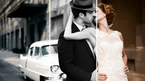
Using Curves for Targeted Color Adjustment
Lesson 11 from: Transform Your Images with Color GradingLindsay Adler
Lessons
Introduction to Color Grading: Preparing for the Shoot
18:35 2Shooting for Color Grading: Clean Timeless Beauty
37:56 3Shooting for Color Grading: Simple but Dramatic Look
15:44 4Shooting for Color Grading: Gold Elegant Look
05:33 5Intstructor intro - Toning Intent
08:29 6Basic Color and Toning in Lightroom
09:03 7Toning with Selective Color Photoshop
07:51 8Color Look Up Tables in Photoshop
06:24Lesson Info
Using Curves for Targeted Color Adjustment
This one's probably a little bit more complicated, but it gives you a lot of control. And this is actually changing colors in curves. Okay, so I'm gonna open up a curves adjustment layer, so little half moon cookie adjustment layer go over to curves on. What I'm going to dio is I am going to go into each and every color tone. So I've got reds, greens and blues. Let me see if I can bring up info pellet. Okay, if you don't know what the equipment with the opposite of red, green and blue is, and he was like, You can't remember a good way of doing this. And if you go to a window and you go to your info palette, it will say red, green, blue, and then sigh in magenta and yellow. Whatever is opposite is what it's the opposite of red opposite green opposite in blue. So if you're trying to remember how they correlate to one another, the reason it matters for this one is if I bring up my curves option and I go into the Red Channel. What I can do is I can start manipulating this curve to add or t...
ake away more red. The reason I was saying it matters about the info panel is if you don't know what the opposite of red is, you don't know what you're changing. So that's why if you just write it down R G B C M. Why? And then that's you know, that's how I do it so that I can remember what I'm actually playing around with. I don't My brain doesn't member remember it. Naturally, I have to write it down, so don't worry. All right, so anyway, all right. So if I go into here, watch what happens if I drag up on the reds, The drug up on the Red Channel in curves it adds more red. And if I go the opposite direction, it adds more science, OK? And so what it really is doing is it's taking out red when it takes out, right it Scion causes a little right. It's this. The reason that this can give you a lot of control is because you've got a curve. The reason you've got a curve. Here's what I can do is I'm gonna I'm gonna hit a little little point on the middle. I'm gonna lock the middle in place. I don't want the middle. The move. I'm gonna put a little dot there. But what this lets me do is I can say, OK, lock that middle in place. I just want to affect the shadows and in the shadows. I want to take out red. Or in this case, it would mean adding scion, like giving more science looks. So now I can go down here and I could just add sigh into the shadows. So the reason that this gives you a lot of control is I can add multiple points and basically lock different areas of my curve in place and just say, in the darkest shadows, give me a little bit of science. And in the brightest highlights, give me a little bit of yellow. So, for example, if I want to add some yellow to the highlights looking at my little thing here, Okay, I'm gonna go into my blues when a lock in the middle. So I want the middle to move because that basically, it means that I can see there say just do the shadows or just do the highlights. And now I can come over here and I can mess with just the highlights. So now, in this case, dragging. So this is taking out blue from the highlights, which means I'm adding yellow. And so what I did here is I added yellow the height. So watch before and after what I did in my curves, I added my scion to the shadows and my yellow to the highlights. So many, many people that do color grading or color correction like to do it here, cause you can get really specific on the areas of the photo that you're targeting, and you cannot add more out less now. One thing that you may notice is sometimes, when you do this, if you lets you add a lot of color to the shadows, sometimes it'll make the shadows brighter because you're messing with the curve like you're adding more light. It just happens to be more blue or more red light. You don't even you're adding more. The problem is, maybe you didn't want the shadows to get brighter, and you wanted them to stay the same. So this is going to be a blend mode, and so I've got the class on blend modes. But what we're gonna do is I only want this to effect, um the color and not affect the lightness and darkness so I can actually change the blend mode from normal to color. And so it actually didn't shift the lightness and darkness of the photo. So typically, what I prefer to do is if I were going to use curves. To do this, I would change the color shift to the color with a blend mode of color cause watch the material one more time. When it's normal, my little shifts it. It darkened things down a little bit, so when I change it to color, it keeps it the same. But if I were then going to go in and make things lighter or darker, let me do that with curves. Let's say I just say, Oh, I want a pop contrast notice when I just popped contrast there. If you watch, see how the blues get richer and the yellows, yellows and oranges in her chest gets richer. This is what happens when you increase contrast to increase saturation. We said the opposite before, When you decrease saturation, it looks like you decrease contrast like they're tied together. Saturation contrast. Work together. So the problem is I'm like, Oh, man, I went in. I toned this and then I added a curve at the end to make it darker color grading it. But now the colors aren't what I intended. So this is where blend modes come in again. Because I can tell this curve that's going lighter or darker in this case, darker. Just go darker, don't affect color. I got my color, how I wanted it. Now you're messing it up. So what I can do is I can go into my blend modes again. And I changed this one to luminosity. So what that says is only affect the lightness and darkness do not affect the color. And so it keeps them separate. So I can actually do one curve just for the color and one curve for the lightness and darkness. And so that's what blend modes alighted do blend modes air, allowing you to target more specifically what your change should actually be affecting. Instead of what happens by default, it affects everything saturation and tone, and and, uh, all of that so so one more time just to summarize that before you move on, you go to your half moon cookie, go to curves and then I can go into my individual channels Red, green and blue. What I do is I write down the RGB seemed like a so I can see what I'm doing. How one move will affect the other so I can lock the middle in place. And let's say I'm gonna go to the Reds, blocked the middle in place. And if I pull out the Reds in the shadows and actually adding science, so it's pretty easy to make these changes and some wanna go into the blues and I'm going to break it up. Just the top highlights with some yellow. At the moment you're using one of the colors. So out of the rid green and blue for the shadows or the highlights Um, would you ever use two different ones? And if you do, would you keep them on separate liars, or would you combine them in the one adjustment? Lyle, Good question. OK, so right now I actually did a little change in the blue and a little change in the red. So I did do two of them so, But here's it's actually if you want more control for blending, I'd put them in separate curves layer because then I could do the blend if thing like if it's affecting some area that I don't want it to, or I want to just mask off the highlights in this one. So I'd rather have multiple than doing many changes in one because I can go back and change my mind and do them independently of one another. All right, so, of course. Thank you. Um, I recently shot a concert, but it wasn't under controlled lighting. And there were three soloists. One was African American, one was of Italian origin, and one was Caucasian with very brights. Light skin and the skin tones were really poor in some pictures and not others and very different. Can you offer any suggestions to how to deal with that? Sure. Um, I'm just gonna open up another file real quick. Uh, which one is it in? Is it in this one? Um, for example. Hold on. It'll be fast. Okay? Okay. This is not the best example, but it's close ish. Um, I'm actually gonna demo this in the next section. so I'll just do this real fast. Basically accused how different the color of her skin er like crazy, different. She's yellow on her face and really pink on the lower part of her body, plus look at the makeup on her nose like a totally different color. So what I usually do is if you create a new layer and then you select the color that you want things to look like. So, in this case, let's say that I think her skin actually should be the yellow on her face. I can select that color, and I can paint on that color, and then I change the blend mode to color. So if you've got everybody's shifting in different ways, you can actually pick a color that kind of shifts that may be in towards the middle or closer together. Um, and you can also multiple process them them in light room. So if there's several people in a shot, you could do one where you get the color right from the first person, and then you create another, um so, like this one say I did another one where I shifted it where I warmed it up for that person's skin tone, and then the next person they were a little bit bright, so I darken it down. What you can do in light room is you console are You can select these three photos, and then you do photo at it in open as layers and photo shop and opens those three on top of each other in a single file so that you can blend them together. Yeah, um, and that's usually what I have to dio. If district summaries and things were totally different as a multiple process, it depending on the person in the skin tone.
Ratings and Reviews
Sean
Fantastic course. Lindsay Adler is a such a photography Rock Star. She can do it all, shooting in and out of study, lighting, posing, teaching and very amazing, Photoshop guru. Thanks for getting Lindsay, in the beginning I never knew that she was so skilled in all these aspects. As you progress in your photography, you learn lighting, skin tones and white balance, then skin retouching, then you learn color grading and analogous colors, complimentary colors, color triads, etc. Color Grading is so key to that final polished and "expensive" look. Lindsay did a terrific job teaching this course. I watched it 3 to 4 times to really pick up how to use these tools. Lindsay is a phenomenal teacher and photographer. Thanks for getting her Creativelive.
Elizabeth Haen
This is a great class to learn many options for color grading images. Lindsay gives comprehensive options for use in both LIghtroom and Photoshop. She has a style of teaching that is easy to follow and does an excellent job of summarizing each technique after introducing it to help the process sink in fully before she moves on. I love how she goes over everything she does thoroughly in a way that clearly explains each step without assuming everyone knows what she is doing. There is never a time when I thought "wait, what did she just do there?!:". Just really great information that is well taught.
David Babcock
Awesome class - Lindsay is a wonderful teacher. It might be nice to have a list of the equipment used, I had to go back a couple of times to find all of what Lindsay was using. Excellent and well done!!
Student Work
Related Classes
Portrait Photography