Lesson Info
18. Example: Resume Design
Lessons
Class Introduction
09:43 2Why Design Matters
09:34 3Design vs. Aesthetic
09:46 4Impact of Design
11:01 5The Design Process: Understand Your Audience
10:07 6The Design Process: Understand Your Content
12:22 7Design Principle: Alignment, Grids, and Spacing
14:30 8Design Principles: Contrast
06:13Design Principles: Repetition
08:25 10Design Principle: Hierarchy & Proximity
13:44 11Principle Scale and Balance
03:54 12Design Principles: Typography
08:32 13Design Principles: White Space
05:22 14Design Principles: Color
08:48 15Design Principles: Graphics, Icons, and Photos
05:56 16Design Principles: Layouts and Focal Points
04:08 17Design Principles: Color-Blind Accessibility in Design
02:32 18Example: Resume Design
26:18 19Example: Social Media Post Design
14:20 20Example: Presentation Design
23:55 21Example: Charts and Spreadsheets Design
16:02 22Example: Email Signature Design
14:18Lesson Info
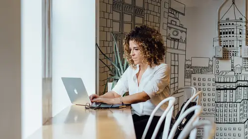
Example: Resume Design
Now that we understand a lot of these principals that we talked about, we saw alignment and contrast and balance and things like that, and we saw typography in action, things like line height, centering text, bullets, color, white space, and all these things. Now I wanna pull it together and go through some more practical examples that could apply to your career or to your personal life, whatever it might be. But I feel like so much of our lives are impacted by visual design and trying to put messages out there that people are gonna understand, hopefully act on. So, let's jump in some of this design in action, and this is all real-time design. Some of it's pre-made but the resume, which we're going to start with, we're gonna jump over to my laptop here and see how this plays out. So there might be some surprises, I don't know, but that's, that's the reality of this. So, we have this resume initially, and looking at this resume, it's got a lot of normal information. We have her name, Me...
lanie Jackson. So let's set it up, 'cause Melanie is just out of college. Maybe the last two years or so, she's been working. She's really into outdoor stuff, and she studied marketing and things, and now she's trying to get into kind of the marketing department at ski resorts. So she lives in Utah, 'cause I went to Utah a few times this year, and I was thinking of Utah. So we're modeling this after this fake Melanie. And at the top, we have her contact information. Then we have kind of a statement about who she is. So the top's looking okay. But if I were critiquing this, I would get down into this section, and now that you have trained designer eyes, hopefully, you're thinking some of the same things that I'm thinking. For example, does this have a lot of white space? Yes, over at the left over here, but the rest of it, it's very cramped together. It's claustrophobic. There is not a lot of balance to me. It's a large chunk, to use our fancy terminology, just a huge chunk of information at the right. Another problem that stands out to me, we think of the readability and scanability of this. We have to think of the person who is looking at this, the potential hiring manager or the recruiter. Whoever that is that's looking at this, is it easy for them to quickly look at this, and we're talking in seconds, because people are truly looking at the resume for seconds in the beginning. Can someone look at this quickly and see that she's had three different positions, and in a glance, in an instant, see, okay, she's worked at Vail, Snowbird, and some place called Gearheads. No, not without doing a lot of work, because the design of this needs some work. It's cluttered, claustrophobic, and it's not making use of our principles of white spaces, balance, things like that line spacing, if you remember back to typography and things. So let's keep going a little more. Oh, she actually had a fourth one, fourth job. She was a ski instructor. And then we get into some education. This is okay. It's pretty basic. And then we get into her skills and interests. Okay, so she doesn't have a very big resume, because she's just starting out. But, the designer in me is also looking at a few other things here. First of all, I'm seeing not a lot of visual consistency when it comes to fonts and things. You may not notice this, but there's I think at least three different fonts going on. There's this one at the top, this one. There's this body font, and then this font and this font are even different than kind of the text below. So we've got kind of a lot of distraction happening there. What I didn't include on this kind of poor version of a resume, because it looked so horrible, was sometimes people like to put a watermark on their resume, and if you're not familiar with a watermark, it's kind of like a faint graphic in the background, or they put a photo of themself, or they put an icon or logo that they've made for themselves. And sometimes, this can be helpful. You know, if you are a branding designer or a graphic designer, then maybe it makes sense to have some type of photo or logo of yourself. But a lot of people do this, and it kind of just looks junky. Again, not a super fancy terminology. It just doesn't look professional. So when we think of the audience of this resume, if I were going to be working with Melanie and give her some tips of how to make this resume better, I would first of all sit down and say, okay, we have to think of the user. Who's the user of this resume? The person is looking at this in seconds. So what does that mean? What is the goal? The goal is that they can quickly see all of our experience and all of our education and relevant background in a glance without having to do work. So, I would work with Melanie to suggest, how do we use layout, use different typography and line height and things like that to achieve this. The other thing to think about with resumes, and this is a little beyond, but I want to point it out, the user of your resume is not just a person today. Sometimes, it is a software. So you know when you apply for a job, sometimes, you're uploading your PDF of your resume with that application, and you may or may not notice, but sometimes, the computer is taking a first read at that, and so, if your resume is cluttered with a lot of extra things, it makes it hard for that computer to extract that information. And I'm not an expert in that, but if you want to learn more about that, there's tons of resources out there to help you figure out how to optimize your resume so that it gets through these kind of computer, computer reviews of the resume. But, let's assume that we're optimizing for the person reading this. So, I wanted to jump over to a few versions. I kind of got a head start on these, just so we didn't spend too much time looking at resumes. So I'm gonna pull up demo one. So, as I was starting to think, how are we going to fix this, the first thing that I wanted to address was the top section just a little bit. If you remember too what we started with, we had Melanie, let's just, maybe we can do it side by side here, let's see. Yes, look at this, okay. Well, bear with me as I adjust these things. Okay, so, at the top of the old version, which is up here, we have a lot of information. Remember the zones we were talking about. So there's really three zones: about Melanie, her contact information, and about her. The problem that I see is that the about her stuff is kind of getting lost, because it doesn't really have a headline. It's not jumping out. There's nothing in the hierarchy to really draw us in and say, oh, this is about Melanie. So, the first thing that I wanted to address was kind of adjusting the layout a little bit so that it's really consistent, and we have this very simple header area with Melanie's name, title, contact information, and then all of the stuff that's related to her is below, and every one of those sections has a title. So, I've achieved that through laying it out with these two different columns. One column is for all the titles, and one column is for the bulk of the content related to that section. So, instantly, it's a lot easier to scan, to read, 'cause in this case, people are probably reading your resume after they scan it first, and if it piques their interest after they scan it, then they'll read it. So, as we're going through this, we can quickly see about me, experience, et cetera, whereas in the other one, we don't see an about me headline. Experience. It's there, but it doesn't stand out as much as I feel like it does on this example. So, we've adjusted the layout to help us have these two columns. Now everything has a clear title. But what we've also done is talk about headlines first. We've made these headlines a lot clearer through, they were capitals before. Now we're making them black. I think they were a different color of gray. So we're making these black to help them pop out, to stand out more, to contrast with the other things on the page, and to draw people in and cue them to, okay, now we're in about, now we're in experience. The really important part of this, though, is when we get over to the right hand section under experience. So, if you remember, let's just flip back to the other example, this whole section where my mouse is going right now, that's everything related to that one job that she had at Vail Resorts. But you could easily not know where that starts and stops, because it kind of runs into the extra information below. Hopefully you can kind of see that now. So, the goal is that we separate out all these different jobs she's had in the past so that it's clearer, now we're in job one, now we're in job two, et cetera. So, I've done that, and there's many ways you can do that. But I've done that through first of all, bolding that job title and that place where she worked. So now, as we're going through, and I've only done one so far, but we're gonna add another one just so we can see the difference. So, we have social media manager, Vail Resorts, and then we have where she, or the dates, italicized, just, again, to help them stand out, and so, people are realizing, okay, date, and then when they go down to the next one, maybe they're remembering, date's italicized. Maybe they're not thinking that, but they're starting to make those connections. Then we have a little summary of maybe what she did or talking about the size of her team, depending on what you wanna put there, but the important thing is, let's do a jump back to these bullet points. So what is wrong with all these bullet points? They're cramped together. There's no space. It's hard to read. And just by adding, a lot of people don't do this, and I don't know why, but just by adding height, like spacing in between your bullet points, inside a bulleted list, which a lot of people don't do, you can just, you know, add space before, add space after, and that's kind of what it looked like before, versus this. To me, it's just so much easier to read, especially if you're spending literally seconds taking a first pass at something like this. So, like I said, I wanted to get a head start on this one, but here's all the junky version of her resume. So let's add in the second one, just so we can see how this really starts to play out when we see multiple. Because when you're designing something, especially when there's a repeating list of things, like in this resume, it's great that we made this one look good, but we have to see, how does the whole thing look good? Will this little snippet of one past job experience look good when we have a list of four or five past job experiences? So, you could set up columns. I'm just using a giant table for now, just so our columns did not mess up on us for this demo. But, okay. We're going to grab this, grab this, and, 'cause we wanna see how this is going to look when we get the second job item in here. So, let's go down, and then we're just gonna shove all the content in here first, and then we'll focus on the layout. So it looks a little crazy right now. So, back, this is what we originally had, though. So, the problem was the job titles really weren't standing out. So we're using contrast or color, black, not technically a color, but there we go. Now, as we go through and we want to also, let's take the colors off of this row if we can really quickly just to, there we go. See it in real life. So, now, we can see, as we're quickly looking at this, we'll deal with this little table that's in the background. But as we're looking at this, now it's a lot easier to pull out, okay, social media manager. Social media manager at Snowbird. And if we look at that before and after, can you see the difference? Hopefully you're nodding your head if you're watching this. Everyone's nodding their heads here. But we can start to see that difference for sure. So, let's just continue on, and we want to fix these bullet points. They're somehow really indented. But we are going to pull them all back, and hopefully, here we go, whoops, we're going to move these. They're not moving for some reason, but that's okay. Let's roll with it. So, they're really close right now, these bullet points. That's making it very hard to read. So what we wanna do is space it out a little more. We can imagine this is not having an issue. But you kinda get the point that we're trying to make, that now, it's becoming a lot easier to see as we're scrolling down. Imagine we've spend the time to really flush out this whole resume. We're seeing the difference now. It's so much better than that first one that we had created. But I wanted to do a few other examples, just because there's different ways we could solve this problem, because that's the beauty of design. So, let's pull up the second one. Let me find it here, demo two. Okay. So here's a different take on it. We started, if you remember, with Melanie here at the top, all her contact information, that big intro sentence about her, and all of her work experience over in that column that was really, really jammed together. So, another way that I might do this is make use of columns and have a main section at the top, so creating this hierarchy. Melanie Jackson, social media manager, graphic designer. Boom, no questions about what she does. And then, what we're doing is we are having this column at the left to really kind of be the grouping area for the extra stuff, let's call it. So not her job experience, not her educational experience, but about me, contact information, things like that. So people aren't needing to jump all over the page and try and find where information is. By having columns, we're indicating there's these two zones, and so, also, if you think the size of the columns could indicate where the user, where the reader should focus their attention, and of course there's very important information in the left column, and even though it's small, it doesn't mean it's not important. But at the beginning, we really think, my hypothesis would be, I want people to jump and look at that experience column, because that's the evidence of why I might be qualified for this job. So, grouping all that important but maybe not important in the first 60 seconds, grouping that information over at the left and then having all this information over at the right could be another way to approach taking this resume, making it more scannable, more readable, et cetera. And if we were to really go through and add a second one, just so we can see how that looks, let's do that. Let's go up. Okay, so we're gonna add in that. And then we need to add in the date. Actually, let's grab all of them. I think that will work. And then, we're going to go here, there. And my columns kind of went funny. We can fix that, move our bullets over, and okay. Now we're getting somewhere. This guy's kind of off. I don't know what his deal is. Okay. 'Cause we want to, remember, we wanna see what this looks like, not just when there's one, but how it looks when there's many. Oftentimes in design, especially true of web design, we kind of design something that looks good just when there's one. But you have to think of the edge cases of, what if there are, what if she had seven jobs? We need to make sure that this is going to work with a lot of jobs as well. So, we look here, and we see that once we fix these bullet points, after I fix this issue here, bear with me, I love live designing, (Sarah laughs) and designing with a mouse that is backwards from mine, but that's okay. Cool, we gotta move this column here. See, design is not easy. And if I had started with a template, this would be a lot easier. But, I want you to see this in action, and these are not, you know, I would not be sending these off if it was my resume. I would take a lot more time to get this. But I really wanna focus on showing you how these principles really help us create something that's a lot more readable and a lot more scannable. And even on this one, I mean, it's a ton, ton better, but one thing that you could do, I might use color to even call out these sections even more. So experience, and then maybe I would make, let's say we're going down, and we're doing, say we had all our experience there. Education. Education, like, infinitely better now, just by introducing that one color. Now, we don't wanna have five colors, but you can see how simple tweaks like that. So, when you're working on things, you need to be thinking of, are the sections clear? Can people immediately, quickly find experience, education, et cetera? Is it clear where one job listing starts and one stops? I'm not really feeling this right now. I feel like these need to be even darker to make it stand out a lot, a lot more. Maybe I might even add in, I'm not sure how this will look, but let's see; maybe I might even add in a line, if it's gonna let us do it, between each, this is not how I imagined, but, you see where we're going here. So I think if we move this up a little bit, come on, well, you can imagine there's a line there, and it's going to create that white space, right? We can all imagine that. So another way to just create these zones, make it more readable, and if we just go back to that first one, which was not bad, but if I'm looking at two resumes and one of them looks like this, and one of them is something like this, or like this, you know, and we'd really finish these, one of them is really going to stand out as cleaner, easier to read, maybe someone who's a little bit more detail oriented, and you are going to judge it. That resume is either going to go into the yes or the no, or whatever document you are designing. So, that's it for resumes, but I would really encourage you. Go look at your own resume, and ask yourself, is it easy to see my experience? Is it easy to see my education? If I have five different jobs in the past, is it clear that there's five, or do they all get jammed together and it's not clear where one starts and one stops here. Another thing on this one, if you notice, if we think of hierarchy, so, there's really three pieces of information, just on this line here. We have social media manager, the title of her past job, Vail Resorts, the place she worked, and the dates. And none of those really seem to be emphasized as what is the most important. Honestly, what really stands out to me is the date, 'cause it's off to the right. But we want, I think, I would want if I was kind of ordering out the information and which is the most important, I think it's important to see the job title first, 'cause that often tells the story of your job history and any progression you've made. So even if Melanie was a stubborn person and didn't want to make any changes, even if she just made these changes, I mean, this is still not very good, but it's so much better than what it was 15 seconds ago. And then if we keep making small tweaks like that, it could be a lot better if we just didn't make this bold, we made it regular italic. We're only going to do it for one, 'cause it's just simple. Simple, simple, simple little changes like that. So go look at your own resume and see if maybe you could tweak it even just for 10 or 15 minutes and make it easier to scan, easier to read. The job sections are clearly defined, and all the important information is grouped together. So we are gonna move onto more examples, but I think we're gonna jump to Kenna first of all. We have a question from Britt, kind of a comment who said he finds that a lot of people try or are trying to squeeze their resume into one page, and that's where they lose sort of the white space and that ability to breathe. What are your recommendations on that front? I am so glad this question came up, because I meant to cover this. So, part of what I do in my role is I help other designers with their kind of like job search process. And so I've been seeing a lot of resumes recently, and I keep hearing from people, well, I put it on two pages 'cause it has to be two pages, and I don't know where this idea that your resume has to fit on one or two pages came up, but I think it's ridiculous. I don't know where this, who is propagating this message, but I wanna stop it right now, because if it is not usable, then it just is doing a disservice to your work. I would rather that your resume be three pages long and I can spend 30 seconds getting a gist of your experience than having it all be on one page, and having to look at it on my resume or on my laptop, zoom in so I can actually read the fonts 'cause you've used like seven point font or something, and I, I just don't know where this is coming from. So I would say, don't be afraid to make it two or three pages. It's that balance of aesthetic versus usability. How usable is it if your resume is all on one page? So, I need to write an article about that or something, but I don't know where that came from, but I hear it all the time. So, let the resume, long live the long resume. Thank you for that. And I apologize, Britt is a she, not a he. I don't know why I said he. Got it. (both laughing) Cool. So, yeah. Go do a little audit of your resumes, and I promise you, there are probably little tweaks you can do to make it be more readable and more scannable for sure.
Class Materials
Bonus Materials with Purchase
Free Bonus Material
Ratings and Reviews
Natalie Brown
I wish more people knew, appreciated, and respected the content Sarah covers in this course. Design is such a critical piece of the functionality of the tools we use every day but its often disregarded as "fluff" or just "aesthetic". Sarah does an outstanding job of establishing the importance and methodology of design for beginners. I would recommend this course to literally everyone.
Britt
Definitely recommend! This course is aimed towards people who don't make a living as a designer but are exposed to it in everyday life—even if they're unaware. Your resume? Design. Your social media posts? Design. Your spreadsheets? Yep, design. Sarah does an awesome job giving an overview about what design is and actionable things you can do to improve. The "live design" portion is awesome and it's where she re-designs/improves documents, mostly on the fly. She goes through her thought process so viewers can learn to think like a visual designer. I would definitely enroll in another class, especially if she chose to focus more in-depth on a few design principles for the entire class.
Jorge Martinez
Awesome Class! highly recommend.