Lessons
Lesson Info
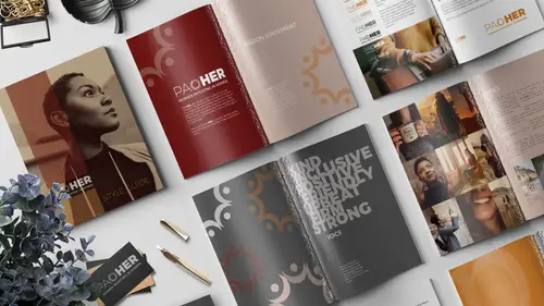
Mission Statement and Story
Now this is the page with the mission statement. All right, so this spread has the mission statement, we'll come to this in a moment. But over here, oh look at this, there's stuff here that we can't even see yet, so let's learn about stacking order and figure out what this is. And we're gonna place some copy in here and start setting this all up nicely, okay. So on this side we have our story but we can't even see it because it's white and this is white, and we're gonna add a fill behind this, so let's press F to grab our frame tool again. And I'm just gonna click and drag and draw out this frame. I'll switch to my selection tool to adjust it, 'cause I have a knack for always missing the edges. Oh my gosh, and just like dragging things around, there we are. Okay and now we wanna add a fill to this so with that box selected, I'm gonna come over to the swatches panel and make sure fill is targeted. And I'm gonna fill it with this burgundy reddish color, like that. And now it's covering u...
p everything so we don't know what else is going on. I can see that there's some other things here, 'cause when I roll my cursor around they light up and I know they're there. So we wanna move this to the back. So with this selected, I'm gonna come up to object, arrange, send to back. And the keyboard shortcut to move this whole thing to behind everything else, kind of like layers in Photoshop, but not, we're not yet working with layers here. We can just stack stuff. So we're gonna send it to back. The keyboard shortcut is shift and command or control, left bracket. And when we do that, it reveals that the logo is here, and then there's another recurring instance of the logo, of just, I forget what I called this. The logo element or something. Something very technical like that. This is just a little logo element. So let's add the story of Poaher here. So let's grab our type tool, and instead of typing this all out, it's in a Word doc so that's nice. So we're just gonna click and drag out this file, or this frame with the type tools. So type tool, draw out a frame, and then we're gonna place the Word doc the same way we placed a graphic, so we'll press command or control D to drop in a Word doc, and we gotta get up outta this folder 'cause this is our images and graphics, and we conveniently have a docs folder, so let's double-click to get in there. And we have here the Paoher Story, we'll select that one and click open. It's just a short little thing. It's not some huge piece. This has to be digestible for people, they don't wanna read a dissertation, so keep it short. So now we have this here and we're going to style it the way that we want to make this look. So first thing we're gonna do is, change the type to Montserrat Light, so I'll press command or control A to, highlight all of this. And I'm gonna come up in here and start typing Montserrat Light. And if you download this font which is free, I've got a link to it in the resource guide. Just make sure, there's also this alternates, which just has slightly different characters. But usually that would be something you might want to mix in using your glyphs panel and we'll, we can talk about that, but right now just make sure we're selecting the regular Montserrat Light. And we wanna make this white, because we need greater contrast between the color of the type and this red background here. So in the swatches panel with the type selected, I'm gonna click paper. There is no white in InDesign, so it's just called paper. So we'll click that and, make that 12 points for the size, so up here in the control panel with the type tool active and the font selected, we're gonna set the size to 12. And we are going to go to our paragraph settings, so with the type tool selected, up here we call this the control panel and right now because that type tool's selected we're looking at type tool options, okay, so these are different settings to control things related to type. And there's so many things you can change and tweak and edit, that they don't all fit in one control bar. So over here on the left we have this button here, this gives us access to character formatting controls. And this gives us access to paragraph formatting controls. So what we want to effect right now is actually a paragraph formatting option, so I'm gonna, or attribute we could say, I'm gonna select that paragraph category, and then we're looking for something called space after, so in your word processing life, when you are typing like a book report or whatever we did in school, when you want an extra space, and I do this in Google Docs 'cause, it's Google Docs. But when you want more space, you just hit like a double return, right? But in the world of layout, that's not great. 'Cause it can mess up stuff, so a professional layout designer would run a script and take out all of your double returns. There's a little automated way to do that because it's considered a no no. So instead of coming in here and hitting another return to separate these paragraphs, instead what we do is we create what's called, or we change the setting for the space after. Or you could do the space before, but in this case we want space after so, with the paragraph controls, we're gonna come over here and there's all these things, there are so many things it's really can be overwhelming. We want this one so if you could zoom in and see this, you would see it's like line, line, line of type, and then there's this box at the bottom, so that represents space after. And as I click on this, nothing's happening because why, hold on. 'Cause we have to highlight the type. Okay, obviously. So we've got this highlighted. With this highlighted, we wanna come in here and change this to a quarter inch. So that means that when you hit return, you're gonna get the line break, yes. And it will automatically be a quarter inch of space between paragraphs. Okay, so you don't need double returns. Now let's look down here and, if I return back to this type box. This is all real text by the way, too. I wrote this whole thing. So with like actual stuff, so what I mean by that is that when you are working at home and you open up these files you can actually read like what is this example of how you tell your story, so it's all there for you. This little red thing here means that we've got more story than we have box, so we can click here and just drag this out to extend the box. So let's look how we're shaping up here. So I'm pressing control minus to scoot back a little bit. And I can also scooch around my document like this by holding down the space bar and dragging. So this is giving me the hand tool when I hold the space bar. You don't wanna get in the habit of using the scroll bars because, well for me personally, it makes me like seasick to do that, but also they often are covered by panels so it's just not very efficient. So space bar, drag around. Okay so, we've got this type, I'm gonna move it up to where we might want it. So I'll adjust the box so it's about as wide as the logo here. And then to keep us from having to reformat every piece of text throughout this whole document, which if you were a really huge company, that could be really huge. To keep us from having to do that, we're gonna create what's called a paragraph style. With this type selected here, I'm gonna open my paragraph style panel by going to window, styles, paragraph styles. Look at all those different styles you can have. Okay, I just want to point out, character styles you might think, "Well these are characters, this is type." Yes, but that's used differently. So what we want is styles, paragraph styles, because we are talking about these attributes for this whole multi-paragraphs of text. So, with this highlighted, we've got our paragraph styles open, we're gonna hold down alt or option and click the new button right here. Alt or option just allows, saves us a step, so we can click this button and simultaneously create a new paragraph style and also pop up this window so we can format it, and name it, and all those things. So we're gonna call this body. And we're going to base this style on nothing, no paragraph style because it's just one standalone style. This just allows you to nest styles, so you could have something else that's based on your body style, down the road, and that way if you ever change your body style, that other style would change in turn. But we don't need that right now. Okay so we just wanna give it a name basically and the other thing we wanna do is click here, to make sure that this style is being applied to the currently selected text. In other words, we wanna be able to tag this text with the style, so just like you tag people on Facebook or Instagram you can tag text in InDesign with a certain style. And that way you can edit the style and it will update all of the text in your document, that's tagged that way at once. So it saves you a ton of work. So we'll go ahead and click OK. And this is now our body, copy, which means if want this text over here to be applied the same way we can just click anywhere in the text, I don't even have to highlight it 'cause it's just a paragraph, so I can just click to just put my cursor in there, and then I say body. Boom. And it takes on the same attributes, so that's really exciting. If we zoom in, so I'm deselecting that type, you can press the ESC key or you can press V to get the move tool. And I zoom in by pressing command or control space bar, and then you drag. That gives you the zoom tool, and then you can click and drag a box to zoom in on something. So if we wanted to get in here and change for example, in my fictitious brand here I would want the second part of the name, to always be bold. And there is something called GREP that we're not gonna do today. But you can ask Erica about it. Erica Gabbott, she's a GREP gal, she can tell you all about it, but GREP allows us to find and change things so if we had a big document and we had this certain word or the name of a company or something repeated over and over and over again, you could just set it so InDesign knows to take any instance of that word and style it a certain way. But in this case we're gonna just manually do it. So I'm gonna highlight the her in Paoher, and I'm gonna come up to, with the type tool active, I'm gonna switch back to my character attributes, and I'm gonna make this bold. And there was one other thing I was gonna do to this somewhere. Oh, down here also bold, or actually I think I made it black. So that's like even bolder than bold, is a treatment called black. That is seriously bold, okay. That's for when you are not messing around with bold. Okay, that's looking good. Okay, that is it for this spread. So we made this color fill, we made and placed a Word document, styled the type, and then added a paragraph style. The easiest way to work with the paragraph styles is put some text out, style it the way you want, and then with that type highlighted, then you add the new paragraph style. Otherwise, you have to do it all in that little paragraph style box and I don't know, I would make mistakes, so this is how I like to do it this way. I will point out that by going in and locally manually boldening some of the characters, we have created what InDesign calls an override. And that just means that when we look at our paragraph style for this text we see that this text is tagged with the body paragraph, but then it has a plus. So the little plus means like, it's got something extra. So it's body plus. And if we hover over this, it should pop up and tell us, if we wait long enough. Anyway it would pop up and say, "Hey, this is an override, it's got bold or whatever." And that's okay. We manually did that, and it's what we want so we're okay with it. That's just a little way of letting you know that there's something extra going on, so that if you didn't want it, you could address it. All right, then we came over here and we applied that same style. So just to show you how styles work, let's say we decide we wanna change the color of the type that's tagged for the body tag. So before we edit a style we'd wanna make sure we unselect everything, 'cause otherwise you're just gonna mess up and it's not great, so deselect everything and the way to do that is command or control shift A, or you can just click away onto the pasteboard here someplace, out of the way. So just make sure nothing's selected. Then we can click the body style and double-click it, to pop up the options for it. Within these options, over here on the left-hand side, this is like the salad bar of all the different options for this style so, let's go down and what did I say we were gonna change? Let's say color 'cause that easy to mess with. So I'll select the color attributes and then let's say we wanna make this gold instead, so you'll notice I can just change the color here, and because this text has been tagged with the body tag it will automatically update. And because I have the preview turned on down here, I can see it happening. And then I would just click OK and then anything that's tagged with this body style now, would just look like this. But we're not gonna do that so I'll hit cancel, but now you know how you could do that. Let's scroll down. Moving on. Oh look, here's some more type, we better style this, let's just select it and hit body. Bam, done. Piece of cake. Okay, now we're going to place another document here, and we're gonna be talking about voice, so voice, when we talk about voice in a brand and what does that mean, we're talking about the words that are used to describe things. It's the words that are used, or not used, and the tone of voice that is being used when you are communicating on behalf of the brand. So I thought, let's put some words here that would communicate and let's make them styled interestingly so, you know, they get read and people absorb this information. So we're gonna make another text frame, so we'll press T for text frame. And click, drag, draw out a box. And this is also a Word doc, so let's place it, we'll drop it in by pressing command or control D. And this time, we're going to select it, it's called Paoher Voice, and we click open. And it looks like this. Can you imagine if we were like, done, this is good. We're gonna style this and make it as attractive as it is functional. So I'm gonna press command or control A to select all of this, and we're going to change this to again, Montserrat. This time black, so as bold as bold can be. And I want it to be all caps. I can't even see it. It's definitely not all caps so we're gonna change it to all caps by coming up here in the control panel with the type tool, and this double T right here, means all caps. So I can just click that and it just becomes all caps. Okay we're gonna change the size to something around 85 points. So now I'm zooming out with command or control minus. And I'm realizing my box is not big enough and I know that because the text is missing and because there's a little red plus here that's telling me, "Hey, you need a bigger box." so I'll make the box bigger. And now I thought it would be interesting if we reduced the leading of this type. 'Cause I don't know why, when I was thinking voice, I was thinking like words, like a word cloud, but I didn't want to make a word cloud. And then I thought we'll just have them kind of floating on top of each other, but in a way that you can still read it. So we're gonna change the leading. The leading is the space between lines of type, so that means we need the type tool, so I've got the box selected. I'll press T for the type tool. I'll click to insert my cursor, I'll press command A or control A to highlight everything. And then I'm going to come up to here, to the control panel with the character attributes. And this option right below the font size, the point size for the type itself, underneath that is what's called leading, or line-spacing. And it's shown here with the stacked pair of A's. So when you see the number that's in parenthesis, that is the auto value. So for a font, this font, for this font at 85 points the automatic leading value would be 97.75 points. But I wanna override that. And I'm actually gonna change this to, we're gonna actually decrease it by a lot. So how do you know what it should be? You just guess and screw around with it. You can come in here and just pick a number and see like, what does 60 look like? Okay, that's kind of good. It tightened it up, that's what I want. You could also use your keyboard, and I always screw this up so, yay, I did it right. It's alt or option and up arrow to tighten things up. Or alt, option, down arrow to increase it. So that's really nice. You just kind of fiddle with it and whatever you think looks good. I think I went with something that was like 52 points. There we go, something like this. Okay, and then what I did was I went and put my cursor at the beginning of every other line, and I just put a space. And that's probably not a best practice, but this is like one instance of text, this is not a practice that I'm repeating throughout the document. It's just like one graphical instance of text so, I am okay with it. And I don't remember what color I made this. I think just white, so let's select it all and we'll go to the swatches panel. Choose paper. And then I'm gonna press the ESC key to just get back to having this selected like with the move tool. And we'll reduce the opacity a little bit. And I can move it up. So it's aligned with the top. So something about like this. So kind, inclusive, positive, friendly, upbeat, firm, strong, these are all words that you could use to describe the voice for the Poaher brand. And I think it's nice to do it this way because maybe someone doesn't even read down here, but you can still kinda get a feeling of like what it's all about and how to do it by just looking, looking up here.
Class Materials
Bonus Materials with Purchase
Ratings and Reviews
Jo Sparrow
I'm reasonably new to InDesign and i found this class easy to follow and it also helped me get a basic idea of the tools and settings needed to use InDesign for other projects too.
Radiya
Khara, I can't thank you enough, I needed a quick InDesign lesson to complete a company brochure immediately after I was hired and your course made it possible! Thank you!!
Student Work
Related Classes
Adobe InDesign