Lessons
Lesson Info
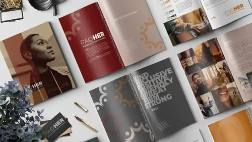
Logo Dos and Don'ts
Here's a bunch of rules about logos dos and don'ts. So here's the other ways that the logo could appear, depending on what it's in. There's all these rules about, I mean, what did I make here, I'm kind of suddenly a little bit like, I went way into this. Here's rules about all of that, oh my goodness. Here's logos don't. So don't ever set the logo in anything other than brand colors. Guess what, this pink is not on brand, so don't even think about it. Don't set any logo version other than white, with less than 100% opacity. No logo should ever appear less than, I mean, what was I, I was really serious about this. I don't know, there's a bunch of rules there. You can read them later. Then down here we talk about size. Talking about, okay the minimum size that it should ever appear is 1.25 inches for this. So when I click on this, if we wanted to make this to scale, if I click on this and I'm looking like, oh, well, it's already appearing bigger than 1.25 inches, so if I wanted to show s...
omebody what's 1.25 inches, we need to scale this. So I'm gonna come up, we'll turn on this link, and up here in the control panel, with the move tool selected and the object selected, I can come in and say, okay I need the width to be 1.25. When I hit Tab, the height scales proportionally and now we have an example of how the logo should never appear smaller than this actual size. Okay? Then we have rules over here about spacing. I went all in on this. So here we have rules about the margins that should surround the logo. Okay, so it should never be over close to the edge like this. There should always be a certain amount of space around it and an easy way to do that is to use the little logo element here as sort of an imaginary spacer. So the way that we're gonna communicate that, I don't know why this is so low opacity. For some reason I had it at 5%, let's raise it up so people can see it. Maybe 25% or so. And we're gonna duplicate this to sort of illustrate that point. So I'll select this, I'm gonna hold down Alt or Option and Shift and I'm gonna drag it straight down. Then I'm gonna hold Alt or Option again, and not Shift this time, 'cause I want it here. The smart guides are gonna help me align it. Alt or Option again, now we can use Shift again, 'cause we're keeping it in alignment like this. So we're sort of saying, hey, there should always be this buffer surrounding the logo. To help even drill that point home even more, let's create another stroke, another line. So let's set up our colors. We'll grab the line tool. We want no fill, and an orange stroke. So I'm selecting the stroke, choosing orange. Or no, gray, we'll do it with gray. I'm gonna go to the stroke panel and say I want this to be a one point stroke, a solid line, but check this out. We can actually tell it to have a triangle at the start or the end. So this is the start, so we don't want the triangle at the start. This box here is when we want at the end of the line. And I love this little simple wide arrow. So check this out, now I can come over here and I can say click, and I'm holding Shift to make it perfectly straight. If I click away so you can see that, I get a perfect little arrow with a head at the top. The smart guides helped me a align it perfectly with this. So I can go back to my align tool, and do it again. This time I'll drag from here out, like that. And we'll just duplicate this then. I can select this, Option, drag down. Then I can flip it by selecting this, and if we come up to the options bar we see a vertical flip right here, or flip vertical. In the control panel, excuse me, I keep calling it an options bar, I mean control panel. Same with this, so we'll select this one, Alt+Shift, drag to copy it and keep it in alignment, and this time I'm gonna flip it horizontally. I'll use my arrow keys to nudge it over a little. There we go. So let's see how this looks, if I press W for wonderful mode, ta da! So that just soft of visually indicates, okay we need to have a certain amount of spacing around our logo.
Class Materials
Bonus Materials with Purchase
Ratings and Reviews
Jo Sparrow
I'm reasonably new to InDesign and i found this class easy to follow and it also helped me get a basic idea of the tools and settings needed to use InDesign for other projects too.
Radiya
Khara, I can't thank you enough, I needed a quick InDesign lesson to complete a company brochure immediately after I was hired and your course made it possible! Thank you!!
Student Work
Related Classes
Adobe InDesign