Class Introduction - Project Overview
Lesson 1 from: Style Guides with Adobe InDesignKhara Plicanic
Class Introduction - Project Overview
Lesson 1 from: Style Guides with Adobe InDesignKhara Plicanic
Lessons
Lesson Info
Class Introduction - Project Overview
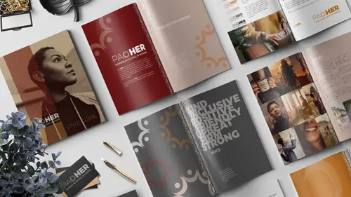
We are gonna have some fun today learning some InDesign basics. And what does that mean, that means we're gonna be learning how to manipulate type and images, all in one single document. In this case, the course project that we're going to be creating is a style guide. So this is what we're gonna be making, what you see here. And, what is a style guide? Well a style guide is a set of rules and how-tos for creating, representing, and maintaining your brand in a variety of formats. So that could be everything from print, to web, to broadcast to you name it. A whole bunch of different formats. Now you might just think, okay, but I'm not a Fortune 500 company, I don't need a brand guide, but, you know what, it's a really valuable exercise to do. I mean, I found it so valuable, even doing it for a fake organization, which I'm gonna share with you. So it's a really great exercise that can help you clarify how your brand is communicated, and, you know, whether you're using that just internall...
y amongst yourself, if you are a solopreneur, it helps you be consistent. So once you have to actually name all these different things and break down the aspects of your brand, it helps you be consistent. So it's good, even if you're just a solopreneur. But it's also great if you want to use it externally. Maybe you wanna hire somebody to do some projects for you, or delegate some of your work, and a style guide is gonna help them know how to best represent your brand. So it's a really important thing. So this is again, the example that we're going to be using. So this is for a fictitious women's investment group that I made up, and it's women investing in women and it's called power, but it's spelled P-A-O-H-E-R, pao her, Paoher. And I just was pretty psyched about that, so yay. What is a style guide then? What are the different components that make it up? Well of course we have the story. We wanna be able to tell the story briefly in a style guide of your brand, just so everyone's on the same page and they can have an understanding of what your story is and how you like to tell it. You also want to explain and communicate your mission. So what is your brand about, why do you exist? One of my favorites, the favorite section here is voice. So that would mean like, what are the words that you use when you are your brand? And even possibly more importantly, are there words that you don't use when you are acting as your brand? What is the tone that you use when you're communicating with customers on the phone, is there a tone a tone that you want your representatives to have? What about with email correspondence, how do you sign off? You know, one of the brands that I was thinking of, Monkey Bars, is a fitness brand. And I bought one of their things recently and I love their brand voice and all of the emails I get and all of their stuff, they do a really good job with that. So you might think, like, I don't need to worry about email correspondence, it makes a huge difference. So copyrighting in all different aspects, all different marketing pieces. Another thing is you wanna be able to communicate your color and logo, so what are the colors that you use? How are they defined in different color formats, like CMYK or RGB or Pantone colors. On the screen, what hex colors, hex codes would be used? And what are the rules about how and when those are applied? Is your logo gonna be appearing differently in different formats? What kind of margins and spacing rules need to be applied around your logo? Do you have minimum size requirements, and if so, maybe your logo changes. That's kind of a new trend that's happening, is responsive logos, so if the logo is appearing below a certain size maybe you use a different version of a logo. So there's all kinds of different rules you can put in place. And obviously, for a style guide, it's different for every brand and company. What you create, the different components and rules that are for your brand are completely different than those of another brand. So even these sections that I'm kind of touching on, yours could be different, you could have less, or more or completely different ones. So this is kind of just a starting point. We're also gonna talk about type, we'll have a section on type. Where we communicate the fonts that are being used, what fonts are used for body copy, is it gonna be the same fonts whether the communications are appearing on posters as they are on web banners? You know, are there restrictions? Do you have rules about, do we use bold, is italic okay? All of those things, they sound like really specific and very literal questions and they are, so. The nice thing is, it's kind of simple that way. So that's nice, I find that refreshing. Okay, my other favorite one is images. What type of photos and graphics and images are going to be representing your brand? What are the subjects in those photos, how are they presented? Is there any specific post-processing that is applied to them? So, for example if I think of Nike, they often have, their images have a very specific post-production that gets applied to them, so they all kind of have this Nike look. So that might be something that's part of your brand as well. Another question is, who needs a style guide? And I would say, like, everyone practically. I mean, even if you are not running a business, and you're not a freelancer or a solopreneur or whatever, even if you're just like hey, I'm my own person and I'm gonna work somewhere else, you are still your own brand. And especially of course since social media, I think that's true more than ever. So, I think this would a really great exercise even just to do it for yourself, and be like, how do I represent myself when I'm in a professional capacity? So, I think you'd be surprised what you would learn about yourself and or your business by just building a document like this. So let's talk about what we have as far as resources with the bonus files. In addition to getting the finished files of everything that you'll see here today, so you can reverse engineer it and pick it apart, or edit it and whatever, you'll get all the real files. You'll get all of the images, you'll get links to all the fonts et cetera, but also in the resource guide I also included a link to 21 different samples of style guides from companies like Jamie Oliver, Medium, I Love New York, Netflix, NASA, and I feel like that's just so good to read through and think about all the different things that designers and the marketing people are thinking about when they're thinking about a brand and what that means. I mean I think it's just truly fascinating. So that's really exciting. So in this class we'll be walking through all this stuff. Our focus of course is not so much on the actual content of what is exactly in your brand guide, we will be learning some of that, but our focus of course is the basics of InDesign and how to work with text and work with images and put it all together in a project like the style guide to be the most useful for you. So, again, the bonuses also include all the color swatches as well and everything. So that is that, and this is where you can find me, if you wanna pop over and say hello. Share your work on social media and tag me so I can see what you're making. And if you're following along at home, can download all this stuff, get it on your system. Install the fonts, create a project folder and we'll be ready to rock. So, before we get started, we've got the software open. I have a document open but at home when you're doing this, I want you to do this part with no documents open, 'cause we're gonna change a couple of preferences. And if you had a document open, those preferences are only gonna apply to that document, so. They're already my preferences, so it's okay that I've got this open, but you at home don't have anything open yet. So you're going to go to your InDesign preferences. If you're on a Mac, it's InDesign preferences. If you're on a PC it's under edit, and I think it's way at the bottom, preferences. And we'll choose units and increments. And we'll leave this set to inches. So by default this is set to picas. So if you've never changed this, you might wanna set it to inches. Or if you work in another part of the world, and you have some other or a different format, you wanna use some other things, that's cool too, I'm gonna be in inches. And the other thing we wanna do is change what's called object fitting, and you'll see why that's important in a minute. But we're gonna go to object, fitting, frame fitting options, and you're gonna choose fill frame proportionally, and out of this square grid we wanna click the little center, the center one right there. Okay, so now we're gonna get started. Here's what we're working with, okay? So in the files, you have the complete file. What we're gonna do is start from scratch, we'll start setting it up, and then we'll just move into this one, cause we don't have time to build the entire thing from scratch. So I'm gonna show you how to build the things, (light chuckle) all the things. And then we're just gonna kinda go through and add and adjust and do some work on each of these different spreads. So just to save a little bit of time I've got those prepped for us. But we're gonna start from scratch so you can see how that works. So, first thing is we need to create that new document. So we're gonna go up to file, new, document. And we're going to make this be, it should be in inches, the width is gonna be eight and a half inches, with a height of 11. So that's a pretty standard size. You may even see it come up here some place, pre-populated. If I click on the print option, that's just a standard letter size. We are going to leave the facing pages on, because we are wanting this to be like a magazine, so it's gonna have a left page and a right page, versus like a multi-page memo or a resume would just be multiple separate pages. This is gonna, just by our choice, you could make this any format you want, but in this example, we're gonna have this have facing pages, so we'll leave this check on. We are also going to come down to the bleed, and a bleed is the trim area that gets cut off in production, if you are printing this. We're gonna add a little bleed, just so we have it as an option if we ever wanted to print this with the bleed. So we'll come down here, if you don't see this open, we'll just pop the bleed and slug options open and click the up arrow with this link turned on. So we should have .125 inches for the top, bottom, inside and outside bleed edge, and we'll click create, alright. So here we are, and right now it's just a single page. So just like the cover of a magazine is just one cover, you don't see the left and the right page until you open it, that's what we've got going on here. So in this point, we could create, just to show you how the facing pages work, as I add more pages to this, from the pages panel which if you don't have it on your screen you can find by choosing window, pages, and as you add more pages to this by clicking down here, this new page button, you'll see that it adds them in left and right pages, right? So that's how that works. If you didn't want your document to have bleeds, if you thought, you know, I'm only gonna have this set up for on-screen printing, or just as like a reference, I'm not worried about having it professionally printed, then you could leave the bleeds off. And that's actually how this document is set up. But I just wanted to mention it, so that if you wanted to actually print this and be able to hand it out for some reason. Maybe you do work for a Fortune 500 company and this is something you really need a lot of so you can hand it out all over the place to your partners that you work with, then you might wanna have bleeds. Okay, so this is what the bleeds look like. And you would just make sure that any design elements that you put on your page, that they would reach all the way to the edge here, okay? So let's pop over now to our existing document that's already created, and you can just see. I've left the cover blank, 'cause we're gonna design it together. And then here's all of the pages that I've already created some of the work on. But we're gonna walk through and do bit-by-bit together.
Class Materials
Bonus Materials with Purchase
Ratings and Reviews
Jo Sparrow
I'm reasonably new to InDesign and i found this class easy to follow and it also helped me get a basic idea of the tools and settings needed to use InDesign for other projects too.
Radiya
Khara, I can't thank you enough, I needed a quick InDesign lesson to complete a company brochure immediately after I was hired and your course made it possible! Thank you!!
Student Work
Related Classes
Adobe InDesign