Photoshop® Workflow: HDR Portrait with Stitching
Lesson 31 from: Strobe Lighting on LocationJoel Grimes
Photoshop® Workflow: HDR Portrait with Stitching
Lesson 31 from: Strobe Lighting on LocationJoel Grimes
Lesson Info
31. Photoshop® Workflow: HDR Portrait with Stitching
Lessons
Class Introduction
06:48 2Develop your Artistic Vision
20:22 3Learn Strobe Basics
19:21 4Which Strobe Is Best For You?
17:36 5Strobe Questions Answered
15:33 6Balance Strobes with Ambient Light
14:27 7The Sunny 16 Rule
16:12 8Choose the Right Modifier for Strobes
28:02On Location Shoot: Overpower Sunlight with Strobes
24:01 10Create Shallow Depth of Field Using Strobes Outdoors
23:49 11On Location Shoot: Portrait in the Shade with ND Filter
21:19 12On Location Shoot: Portrait with Sun on the Shoulder with ND Filter
17:48 13On Location Shoot: Portrait Using Strobes & Wide Angle Lens
14:41 14Shoot: Use Strobes with Props
17:07 15Shoot: Shooting into Sun with Strobes
22:27 16Shoot: Increase Strobe Power while Shooting in Sunlight
10:46 17Understand 32 Bit Depth
20:03 18HDR Bit Depth with Strobes
16:36 19How to Use the CamRanger for HDR Portraits
33:35 20On Location Shoot: Setting Up the Lights in Boxing Gym
13:55 21On Location Shoot: 3 Light Edge Portrait with Strobes
21:45 22On Location Shoot: Portrait Using Top Light with Strobes
18:10 23On Location Shoot: Create a Dramatic Portrait with Strobes
19:26 24Strobes & Textured Background for Character Portraits
09:44 25Shoot: Set-up the Gear for Portrait
16:07 26Shoot: One Strobe Portrait with Gray Backdrop
26:30 27Shoot: One Strobe Portrait with Textured Background
13:32 28Shoot: Using HDR for One Strobe Portrait
08:55 29Setting up Post Production Workflow
16:02 30Photoshop® Workflow: HDR Boxing Gym Portrait Shoot
14:35 31Photoshop® Workflow: HDR Portrait with Stitching
37:51Lesson Info
Photoshop® Workflow: HDR Portrait with Stitching
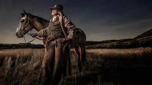
Let's go to Ryan. And we're gonna hit. I already picked one. Actually there's two series here, but let's pick. This is gonna take a little longer because it's got nine images. So here we go. There's my first three images. Command-R. You better know this by the time I get done. Command-S. That's select all. Right click, hit the control. We want to merge to HDR. It's gonna do its magic. It's processing it. And it's gonna take me to that dialog box that asks me a question whether or not I want to register it, and freeze the motion, if there's any motion on him. He did a pretty good job. And these are three 50 megapixel files, so that's a lot of crunching here, folks. And it's taking its time. But, we're gonna do this three times, so you better have this down by the time I get done. And then we're gonna add that texture to the background. So, the good news is that we've got lots of noise out here, don't we? I feel like I'm in the real world. In the studio over there it's kind of quiet. Any...
questions as this thing is processing? I don't do Camera Raw. I do Lightroom. I know you don't. But the smart object thing looks like it was between Photoshop and Lightroom, back and forth-- Camera Raw and back and forth. Is it gonna be the same with Lightroom, do you know? Yes. Same exact thing. Absolutely. You can go back and forth between Lightroom and Photoshop. It just gives you, like I said, more options. And here you see-- Yeah, question. It's actually not a question. It doesn't go back into Lightroom. It goes from Lightroom to Photoshop, and when you go back it goes back into Camera Raw instead. But it's the same engine, so it doesn't matter. Look at, he had a little bit of movement here. It's gonna register all of that. By hitting align image and deghost low. Ready? Hit Merge. And we're gonna drop it in. Are we in Ryan? Yeah, we're gonna drop it right here. We're gonna call this top, so I'll just put a T. Top, it doesn't matter. We'll know. Save. And what we want to do here is we want to make our adjustments. And then we're gonna go back to previous on each one so they're all the same. So let's do this. Shadow detail. Lots of shadow detail. Highlight detail down. Let's do a little grunge. Not too much. Contrast looks pretty good. Let's flatten it just a tad. That all looks good so we're gonna say Done. So that's done. Now we go to the second set, row. Command-R, command-A, right click, merge to HDR. And we'll do the same process. So I'm gonna do this three times. And we're gonna then go into photo merge. So did you see there was an option to photo merge there too? So we're gonna merge 3 DNGs to make one big DNG. That's incredible! If you understand DNGs, this is like a big deal. Is there a reason that we should merge the HDR before we do the stitching together? Yes. Because I'm doing that in 32-bit. Now I'm gonna end up in 16-bit. So you definitely want to go and do it in 32-bit first, and then it's gonna get the damage. Which there's not a lot there. That's why I only went one stop each way, because there's not a lot of latitude that I need in this scenario, because it's very controlled. All right, so there's number two. Say Merge. We're gonna call this middle. And say okay, Save down here. Yep, Save. There we go. And then we're gonna go over here to the little pull down on the far right, previous conversion. And it takes me back to that same setting, and I say Done. So I don't have to remember those settings. And now we go on to the last row. So, what is it? Command what? R. Command what? A. And then control right click. Merge to HDR. And you can see it's kind of like, it's slowing down because it's still processing the one before. So that's why it's gonna take a little longer now, because it's kind of like now doing multiple processings behind the scenes at one time, so it's gonna be even slower. Let's go back to what I said yesterday, and that is this. Build a workflow from taking pictures to processing pictures that fit your personality, and time, attention span. If you say, "Joel, this is way too much for me," then don't do it. But if you go, "Wow, this is kind of cool. "I'm willing to take the time to do this," then this probably fits your personality. That's why I say, this is not for everyone. Does that make sense? Let's bring it back around to where we were earlier in you class. Like you said, the importance, remind us of the importance of that 32-bit, and what you're gonna be able to get out of that in the end. It gives you more tones, more values, more transitions in your image. In a portrait like this, probably not-- Like I've shot a Harley rider type with a leather jacket. Oh my goodness does that make all the difference in the world. There are some scenarios that probably is not as big of a jump, leap, going from your 14-bit to 32-bit. You wouldn't notice it that much. But in certain scenarios, you bet. It's huge. Okay, so we're gonna put, I guess this is B, bottom. And it's gonna process that. We go over here. Smoke is coming out of the back of my machine. Previous conversion. Hit Done. And now we're gonna end up with the three parts. It's gonna take a second to get the third one to come up here. And then I'm gonna grab all three and put them together. And maybe what I should have not done is I should have done one, two, three. That might be better, instead of M. So two. In terms of sequence, on my... One, there it went. So come on. It's still working. Smoke's coming here. I can hear it. The squirrels are still spinning the wheels. Okay, another question. While we're waiting, could you give any tips about what you do use at home? You're on your laptop now, but in terms of having to have enough RAM and such to be working like this regularly. What was the question? The question was what kind of setup you would suggest somebody has at home to be able to process this type of work? I have an iMac with it loaded. 32 megs of rams, the 7i, whatever you get the best of the best, and with the upgraded graphics card. The only other step is going to the big tower pro thing. That's like 12 grand. My son's got one. 12 grand he's got into it. But definitely the RAM. The RAM is probably-- And then of course the graphics card if you're doing any video. I don't do a lot of video, but... Yes. These are not bad. These laptops are not bad. But this is two years old, so... I ended up dropping that DNG, or this last one, in the wrong folder. It was in the RAW. And I just kind of caught that the last second. All right, so here we go. All three are selected. Command what? R. It's gonna go and pick up all three. And then command what? A. We've got all selected. And then right click, only now instead of merge to HDR, merge to panorama. And let's see if we did it right. Drum roll please. And if I did it wrong, I'm gonna have egg on my face. I think I got my nodal point in the right spot. Like I say, when you're teaching some things you just kind of forget, like, you know, simple things like that. So it's gonna merge these together. It's gonna give me three options, three or four options. I think it defaults to perspective, at least it did. So look at that. He looks a little thin, maybe. I don't know. Let's see what sense cylindrical does. That went the wrong way. That's interesting. I've never seen it do that. Spherical, let's see what that does. So these gives you a couple of options in terms of the stitching. Well, that's interesting. It flipped on its side. Well, I think this is good. And so I have auto-crop. Let's see what auto-crop, when you take it off, what does it do. It's gonna be like maybe some jagged sides to it. Yeah, like that. And sometimes that's okay. I just leave it. But we'll just auto crop it. We're gonna say Merge. And now we still end up with a DNG. Pano. We're gonna make sure it's there. Yes. Save. So, that's pretty cool. So now let's go back, take it into Photoshop, and we're gonna do the texture on the wall. And it's still saying one remaining. Let's let it do its thing. I hit done, right? I think I hit done. That's what I want. Come on. And I'm gonna find my textures while I'm waiting here. My textures I threw on to my... Oh. Oh. That wasn't good. It crashed. I have talked to the most amazing Photoshop, I'd guess you call them-- I call them not users, but Photoshop finishers, in the world. And you know what they tell you? Get a workflow that minimizes destruction. That's the number one thing you need to learn when you're in Photoshop. That is, by working in... I can't type here. Working in smart objects, adjustment layers, things like that. So get your workflow that minimizes destruction. So that's why you work with RAW, and all these little things. Because Photoshop is a destructive force. Now, another little side thing. People ask me all the time, "What about third--" Third-party plugins. It crashed again. Here's what I'm gonna do. I'm going to... I'm going to lower the resolution, because it's a 130 megapixel file. I have never had this happen. I say that. I've never had it crash. But because we're setting up here, let me just see what I can do here. If we go back to-- Wrong one. Back to Rod. No, no. Where's Ryan? Here he is. Ryan. We're gonna go back to here. I'm gonna pick these, and if I'm gonna see if-- command-R-- if it will give me-- It doesn't give me an option to go smaller. Resize to fit. I've never seen that. Oh, so now I can change... That's a lot smaller, isn't it, right there? 1000 each way? Seven megapixels. Oh, we don't want... And pick like 3000. That's six megapixels. That's pretty small, isn't it? 24, let's try that one. That's half the size. Say Okay. Select all. Let's see what happens if I just make the files a little smaller. So again, this is the challenge of teaching Photoshop in front of a group of people. I'm telling you. How many times has this happened in Creative Live? A lot. It's just the way it is. I mean, I've got these huge files, and I'm trying to do magic. I'm pulling a rabbit-- No. I always say it's easier to pull a rabbit out of a hat, but it's really difficult to pull a hat out of a rabbit. And right now I'm trying to pull a hat out of the rabbit. So let's merge. And I'm just gonna say Ryan here. Let's please, let it do its thing. It's going a little faster here. But, yeah, Photoshop, computers... But I will say, when it comes to a third-party like Nik software, ON1... What's another one? Topaz, all these. People ask me, "Do you ever use those?" And I say, "Yes, I use them on occasion." But here's what I have to ask these, all these third-party software developers. When I go and do a treatment, they say, okay-- I am having all sorts of problems today. Let's just try to restart her. When I have the third-party software, and I'm working in 16-bit, and I say, "Give me the nice sunset filter," and I apply the Topaz sunset filter, does it take it over to 8-bit, crunch it, and then send it back to 16-bit? Because you don't know that. And just like when you send your image to the lab, they're printing from 8-bit. And I've told people, I go, "You know labs print 8-bit," and they go... These labs I'm talking about, the ones that do wedding photographers and whatever. They go, "Oh, no, no, no." And I go, "Just make a phone call," and they call me back and go, "You're right." So you've gotta find out what's going on behind the curtain, so to speak. So when you go and apply a Topaz, or whatever, make sure that it's not degrading your image by going to 8-bit and then back to 16-bit. So I ask some of these questions, and a lot of people don't understand why I'm asking the question, what does it matter. Well, it matters to me. And so let's go back to Bridge. I don't think I've restarted this in a long time, so that could be part of the problem. I did do a spring cleaning. I'm gonna open Photoshop right away here too. Let it go open. So let's go back. And this is why we have a little extra time on the Photoshopping side, just in case all this happened. Okay, so we've got to go to Ryan. We're gonna grab our three pictures. Photoshop is still bouncing here. So let's make sure... Oh, it's asking me something. Close. Let's go back to our-- Let's grab all three. Command-R, command-A, right click, merge to panorama. Now there's one other program that I use on occasion. It's called PTGui. PTGui is a panorama stitching program. It also does some processing with HDR all in one. My son Ben uses it all the time. We could try that right here in just a second. Oh, I can't even type. My fingers are all... Ryan, it's all caps. It doesn't matter. Here we go. Drop it in there. If there's a problem, stitched image, image is having problems stitching, I take it over to PTGui, just like that it fixes it. So it's a much more robust stitching program than Photomerge. But most of what I do is Photomerge. And it crashed. Okay, so now, we have TIFF, TIFF. We need number-- The middle one. So let's go here. Middle one. Save as, TIFF. And where did it end up? Who knows. There it is. We're gonna drag it back over here. Now we've got hopefully three TIFFs. There we go. Ready? Let's see if this will merge. Let's just see what happens. Select all, merge. Come on, baby. Just give me some love. We say Okay. And we're gonna call this HOPE. (laughter) It's processing. It must be because it's a hip hop artist. No. Something is there. Come on. Just process this thing. Did it do it? Yay! (applause) So we're gonna open this up, get it over to Photoshop. Come on. And I don't want it as a smart-- Oh yeah, I do. Let's just say smart object. Because I'm preaching smart objects on you. Let's close all this other stuff down. So this is the top one. We don't want that one. We don't want that one. We don't want that one. And this one we don't want. So now, let's go back and do really quick the Joel Grimes grungy look to get him prepped. Here we go. New smart object via copy. Double click. We're gonna convert this to black and white. Let's grunge him up a little bit here. Whoops, I'm under orange. A little bit there. What does blue do? Blue gives me a little bit lighter background. That brings the beard out just a little bit. Say Okay. We're gonna go to luminosity. Command-J gives me a duplicate copy and we turn that to soft light. Now, we're gonna pull the opacity back a little bit. Let's bring this up a little bit bigger. So about 50%. That looks pretty darn cool. We're gonna say Flatten. I have a shortcut I made before. Let's make the canvas size just a little bit bigger so our width is-- let's go to 27, 26. Let's see what happens. Yeah, good enough. I'm gonna grab this, because he's a little off center. I'm gonna show you how I do this. I grab this. Command-T. I pull that over. Whoops. Pull it over, right there. Let's see what happens. Deselect. Okay, now we're gonna center-- Oh, I can't go to square. Let's go to original. What I'm gonna do is I'm gonna try to center him in this little box here. Just a little wider. Hold down my control. I go right about there. Say Okay. That looks pretty darn good. All right, so now let's bring in our layers of texture. I've got them on my desktop, so let's just go over here real quick. We don't need this. We don't need this. We don't need that. Here's number one. We're gonna open that up. Actually just drag it over here. It's not wanting to open it up. There's the first one. And I've got another one around here somewhere. Here it is, number two. I've got two PSDs of backgrounds. We don't care about that. We're not cropping yet. I named it HOPE, and that did it all, right? So I'm gonna drag this over. Go to my layer. And then let go. So this is a little bit bigger file. Eh, not too much bigger. So let's pull it over here. Let's bring it down to here. Say Okay. That's number one. Let's go to the blue one. I do these in blues-- cools and warms because it gives me more control. So let's go over here. We're gonna bring this down. Command-T, bring it down here. Bring it over here. And these are the same file. I just warmed on up, cooled one down. So I'm gonna flip this. Command-T. I'm gonna flip it vertical, so we can blend the two together. All right, F. We are going to now have a couple options. If I apply-- Let's turn this one off. If I apply a blending mode of overlay, look at my texture. Ooh, ah. Come on. That's cool. Isn't that cool? Yeah. Wow. And I'm gonna do the same here. So let's go to overlay. Or I go to soft light. One of the two. I can kind of mix the two together here, but let's just stick with overlay for a minute. Now we've got a little bit of texture on him. Fine. No worries. I'm not gonna worry about that right now. I'm gonna add a mask. And I'm gonna take a black brush with about 50-ish overlay and flow. Kind of 50/50. And I've got my caps on, so that's not good. I want to right click so I have a really soft brush. We know that's good. And now I don't have to knock him out in terms of an extract. All I have to do is just do this. I come along here and I just paint him, paint a little bit here. And I'm just taking that texture off of him a little bit here. See that? I'm gonna look at my mask over here. And then all I do here is I'm gonna take this mask, and duplicate it. Now I've got two of them, and there's my background on him. I can go in here-- let's make sure-- and take a look. I've got a little bit of a problem with his ear here. So I go in my mask here, and I say let's just clean up his ear a little bit. Looks good. Maybe I'm a little tight there. But really, I don't have to go in here and spend hours masking him out. I call it the 30-second knockout. That's if I was a boxer, and I went in the ring, I'd get knocked out in 30 seconds. So I've got a little bit of texture on here. I can probably do that on both here. But you can see where I'm coming from here. There's my texture of him. Now I'm not done yet, but that texture, now I can go and do a couple of things to it. So I can go and change the opacity. So I can go here. Or I can also tag a levels to it. So watch this. Levels. Now if I don't create a clipping path, right now, whatever I change here changes everything below. But I'm gonna take my little alt button, alt/option, and take my cursor between the two, and go click. Now I've created a clipping path that when I change this, it only changes this level, or this layer. So now I can kind of fine tune the contrast, or how much I want this to show up. So I'll do another one here. Levels. Clip it. And then I can fine tune that one too. So here's what I do. I'm gonna sit here as an artist. And I can feather that texture to get the way I like it. I can also take the opacity down a little bit. So that's why I work with two layers of colors. I'm still not done yet. Let's take and do my desaturation. It's always desaturated a little bit here. Go to reds. Yellows. And then I'm gonna go, let's take a warming filter. Let's add a little warmth to him. Let's see. We've got that, that, that. Let's do a vignette. So I want levels. Go to my gradient, circular. Pull it. There's my gradient. Pull it down. Hopefully he pops a little bit more. That screen looks pretty bright, doesn't it? Does it look too light to you? A little bit. On my screen. And then we go... That looks good, so I go shift-option-command-E. I'm gonna make a snapshot. And now here's where I go to Nik. I do their color effects pro. I'm showing you exactly how I did that other guy with the beard. So that's what I'm doing right now. And then we're gonna give you a little bit of grunge. We don't want that one. Sorry, I was testing something the other day. We want detail extractor. I set it to 25, 25. Let's go over here to 25. No saturation. Zero, where's zero? And then I go to fine. And I take my highlights and shadows to the left. That looks good. I say Okay. And we now get to-- I'll feather this grunge a little bit. Usually I don't want too much grunge on the background. I'm building this, just kind of the look I like. And this is gonna be-- It takes a little while because it's crunching a lot of stuff here. And because it's on a separate layer, I can fine tune it by making a mask. If you don't want to use masks you've got to really get up to speed on using masks. So here we go. Ready. There's my detail extractor. Way too much for my taste. I'm gonna make a mask. So let's blow it up a little bit here. Let's get rid of this. And I don't like the grunginess on the background so much so I'm gonna watch his face. So that's zero. Let's pull it up a little bit. I like it right there. And here's what I normally do. Take that mask. Go command-I, which inverts it to black. That blocks everything. Get a white brush. Go 50/50ish, and start painting the grunge back in on him. Maybe on his forearm, his shirt a little bit here. And I'm just bringing back a little bit of that grunge, I'm just not gonna hit the background. So that background is still kind of a little softer feel. There we go. Maybe I run it on the beard a little bit more. And here, and here, and here. Whatever. I kind of missed a few spots down there when I did my first original mask. Did you see that? So now we hit tab. Well, there's my look. There's my texture on the background. He was on a gray background. I can shoot subjects all day long on a gray background and then put them in different backgrounds, mix it up, for an ad campaign, or whatever. So I can put them against a brick wall, a stucco, a bale of hay. You name it, I can put him against. I think a bale of hay would really fit him. (laughter) But that's kind of the grunge thing. There's a few things I can do. I usually merge these two down. Once I like them, I merge these two down because I'm good to go. But I can add a little bit of a high pass, or a little bit of something-something there. Dodge and burn a little bit. I didn't do that on him. Maybe the shirt, I might fix that little shirt, the little white down at the bottom there. But there you have it. The texture on the background. I got it through two retouches, right? Kind of had a little problem there. So how much time do we have? Some more questions? You were talking about the Nik software. I recently heard they were acquired and it's free now? Can you talk about that? Well, they actually gave it away a couple of years ago at a Photoshop World. I've had it for a while. I'm not sure exactly the steps to go, but Google. I guess Google. Is it Google that owns it? Yeah, Google owns it. The only bad thing about that is that they're probably not gonna add anything to it. They're not gonna update it, add to it. Who knows, maybe they will. But it's for free. And it does a lot of stuff. I mean there's a lot of things in there that you can get. So I use almost only the detail extractor. That's kind of my only third-party plugin that I use. So if you don't have Nik, and you saw me work in it, you can go out and purchase. Now, that detail extractor that I just did, I have played around with the RAW, going back to filter RAW, going back to RAW filter, then going over to clarity, push the clarity a little bit, and then push the contrast a little bit, and then add a little grain, and it almost looks exactly the same. So you don't have to go to Nik. So, there's an option there to avoid having to go-- if you only want to just work in Photoshop. If you're a Photoshop purist. Some of your pictures are so sharp and crisp, and I didn't see you add any sharpness except for maybe in original RAW. I never, ever add sharpness in Photoshop. I don't know why that is, but years ago there was a book that thick just on Photoshop sharpness. So there's a lot of people that are smarter than me that figured out how to do this in Photoshop. What I do is I add it in the RAW. Remember I said in RAW it's a greater-- Less destruction in RAW, smoother. Whatever you do in RAW, it's gonna be smoother. Remember I went from 25 to 50, whatever, radius or percent, what they call that. That's the only time I ever add it. I have friends that are engineer-minded type people that literally tell you that the only time-- You don't add sharpness until you're ready to print. When you print you do this percentage, and this. And it depends on what paper you use, and all this stuff. They get really into it. That's not me. That's not my personality. But I do add a little sharpness. This will bring us to another thing. Because I do a lot of workshops, people show up with Nikon, Canon, obviously, Sony, whatever, and every file looks a little different. And one of the things I noticed about the Canon files, and I read an article years ago, early, early, early days of Canon, that Canon said, "We made a decision early on "to bring in our files in RAW "a little bit softer, less contrast, "and that it's more native to the RAW environment. "And then you as an artist "apply the degree of sharpness, "or the degree of contrast to it." Nikon always seemed to be a little bit contrastier, and a little bit sharper. They apply it right away. And so, like the Canon, when you go from Nikon to Canon, the first thing you go, "Whoa. Why is this so flat?" It's almost a shocker. I'm used to it. I apply it later. I build it up a little bit later. So a lot of times it depends on what camera you're using and how they treat their files. On the back of your camera, when you look at that monitor, it's revealing a JPEG. It's not revealing the RAW. And you have a bunch of options in there to adjust the JPEG the way you want to look, like contrasting, vivid, neutral, all those things. I keep my JPEG options to the simplest, neutral all the way across, and then when it brings it into RAW I believe it saves that basic setting. So if you hit vivid, I think it brings it-- I'm not really 100% sure, but it brings it over as a vivid punch. I'm not really 100% sure. But I do know the back of the monitor is a JPEG. And usually they look a little contrastier, like whoa, and then you bring them into RAW, it's a little softer. It's like, what's going on here? I guess I'm just saying, these are little things you kind of work through. I've gotten to where I'm just kind of... I bang it out. I don't even really think about it. But you might want to think about your workflow, and see if there's maybe a step that you want to change to make it look a little softer. Do you use Canon or Nikon? Nikon. Nikon, okay. So, as I was saying. Nikons are a little warmer too. A little bit warmer in temperature than the Canon files. It's just, again, do you know in the end nobody cares? It's the final image on the wall that people look at. Does it work, or does it not work. And so when I was doing composites, people said, "Oh, you're a cheater. "You're no longer a purist." And, "You've sold your soul to the devil." Of course, now we all do composites, or most of us do. But the point is, nobody cares whether it's a composite, or if it's done in camera. Nobody cares if it's HDR, or if it's applied sharpness or not. When you hang it on the wall, does it work. Does it fulfill your vision as an artist. That is what's most important.
Class Materials
Free Download
Bonus Materials with Purchase
Ratings and Reviews
Christopher Langford
I love Joel, even though I'm not a big fan of his style. He's a great teacher, really down to earth, and best of all, humble. He's a true professional and knows the business. Even if you're a seasoned photographer, I believe you will pick up some great tips throughout this course. What I enjoyed most from this course was learning Joel's thought processes and how he takes on challenges.
Gilbert Wu
I did enjoy the class despite not being used to the American product placement culture. The British say “the proof is in the pudding”, Joel’s pictures are fantastic and create drama. He has the eye. I like his very down to earth approach which is far better than many youtube photographic charlatans. Apart from the techniques he shared, one very important thing I learned from this class is “Be an artist and not a technician”. If you want to learn from people who can take better pictures and more confident and experienced in his/her work than you, Joel is one of those people.
Dana Niemeier
After seeing Joel at Shutterfest 2016, I am a fan. He is intense, but that is inspiring. I especially like the segment using ND filters as I live in Florida where bright sun can be an issue! His teaching method sets the student at ease. You see him make mistakes and then figure them out! Makes us believe there is HOPE for us in the learning process! I also bought his commercial photography class as an add on. Great to see him work and think on his feet. Thanks CreativeLive for giving artists this platform that reaches out to artists around the globe.