Adjustment Brush Part 2
Lesson 19 from: Post-Processing for Outdoor and Travel PhotographersBen Willmore
Adjustment Brush Part 2
Lesson 19 from: Post-Processing for Outdoor and Travel PhotographersBen Willmore
Lessons
Day 1
1Workflow Overview
26:55 2Shooting Tips for Ideal Post-Processing
19:57 3Backing Up and Importing to Lightroom
42:57 4Lightroom Interface Overview Part 1
21:58 5Lightroom Interface Overview Part 2
23:33 6Culling Images
26:45 7Filtering and Stacking Images
27:33Cropping
20:12 9Dust Spot Removal
13:59 10Processing Images: Basic Adjustments
16:50 11Collections
21:50 12Processing Images: Image Optimization
30:30 13Catalog and Metadata Settings
28:41Day 2
14Folder Status Plug-in
17:33 15Keywording Part 1
39:06 16Keywording Part 2
33:41 17Keywording Part 3
19:58 18Adjustment Brush Part 1
23:57 19Adjustment Brush Part 2
26:41 20Adjustment Brush Part 3
30:05 21Graduated and Radial Tools
15:15 22Photoshop Essentials: Set-Up
45:22 23Adjusting In Photoshop
25:09 24Panoramas
17:29 25Adaptive Wide Angle Filter
25:08Day 3
26Export Presets
25:21 27Watermarks
22:34 28Publish Services with Facebook and HD
11:39 29Lightroom Mobile
35:41 30Map Module and Geotag from iPhone
23:41 31Editing HDR in Photoshop
31:33 32Timelapse in Photoshop
23:37 33File Formats
19:15 34Lens Corrections Tab
17:14 35Split Toning
34:32 36Detail Tab
17:27 37Simple Retouching Techniques
42:48 38Printing in Lightroom
14:53Lesson Info
Adjustment Brush Part 2
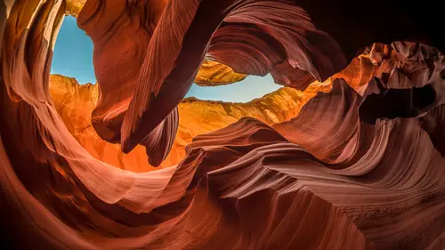
let's look at some images where I've used this and we can look at before and afters of where I might have found it to be useful and then let's just look at some images where I haven't used it and apply it so in this particular case this is a slot canyon picture and if you want to see what the original looked like I could hit the reset button down here there's my original kind of snores vill there uh but if you look at the original can you see that the area up in this part is a little bit more blue then the area down here and this is a little bit more reddish maybe than what's over here well if we have those subtle variations in color choose undo here vibrance is what takes mellow colors things that are not all that colorful it makes them more colorful so cranking up the vibrance especially if it's on something where your brain doesn't know what colors he's supposed to be this doesn't look good on skin tones you know that kind of stuff because your brain knows instantly when a skin tone...
is off but if you weren't standing there you don't know what this looks like and so your brain doesn't I care so much that it will accept those colors the other thing is the white balance setting if I go to as shot which means what my camera came up with you see it's a bit different and so what I ended up doing is I moved the white balance these two sliders around until I found the setting that really made the color separate the most and I just randomly kind of moved it this way and I'm like no that looks overly yellow everywhere moved away this is no it's overly blue but somewhere in between is where you get the most separation in the colors and I tried to find that and then I did the same for the one below over here way to magenta be here probably not quite way too green but it's getting there and somewhere in between is where the colors just separated the most where I could see the biggest difference between this blue and that yellow and that's how it could have dialed in what was there other than that in bringing up the vibrance it's the general adjustment to make the image look good I boosted contrast a little bit and the one other thing that could be very helpful is not sure if you remember when I talked about it but under camera calibration there was this little menu here where we could switch through things and what I mentioned yesterday when we talked about it is I created preset and so over here I have bins calibration process and I just hover over here and watch this because it affects the overall color rendering and I figured out which one really made the color sing camera portrait isn't bad or I ended up with cameron neutral but after doing those kinds of adjustments let's see what it looked like before I painted with this brush all right here's what it looked like after doing just the basic sliders and then let's see what it looks like after I painted on the image in selected areas so here's before brushing there's after to see how your attention in the after at least mine goes to the little what is a tumbleweed like thing that's in there because it's a bright area colorful and also at the top do you see how in the before compared to the after I toned it down a bit it was getting to be a bit too bright up in here and so I usually try to keep your attention away from the edges of the photo if there's something overly bright on the edge where I might go looking for it and so here's before theirs after they're not necessarily dramatic changes but I think it helps the image so if you want to see what they are I'll just move my mouth's on top of the image and here's how you can evaluate an image you've already adjust just mouse over one of the um pins and you'll see the red overlay to see how much of the image is being affected and you could see I was sloppy there it's got over spray all over the place but it's good enough if I click on it I can see what kind of adjustments being applied it looks to me like I'm just brightened my highlights make a little brighter then up here if I mouse over it you see the overlay working on that whole area and I click on it and that's bringing my highlights down doctrine in them the opposite of what's happening to the tumbleweed go over here and you see how this is affecting not only the upper left area the photograph but also the lower left and the lower right and everything this is what I might call vignette ing which just means darkening the edge of the picture and so if I click on all it's doing is making the shadows through the dark part of my image even darker and it's painting it in around there if you've ever applied one of these adjustments with the brush and you decide later that you don't like it just make sure that it's pin is active you've clicked on it little black dots in there and they hit the delete key it'll go away so if I choose on do you see that so just a little refinement sometimes that's really could make an image singh is the difference between just a generic and adjustment and just a little bit help in selected areas have some other slot canyon images let's take a look and see if I've anything with these and pretty sure I have yep see if my mouse over with the brush first let's see what the original looked like without anything there's our original some people probably prefer that you know that there's everybody has a different idea of hundred process of pictures do what what turns you on on if you don't like what I do great smile we all have our own eye so and here again my vibrance was cranked up and then clarity brings out the little textures and your image so I brought out a lot of the little texture in the sandstone that's here but bringing up clarity mother not as the normal adjustment just to optimize the brightness and contrast but now let's go to the adjustment brush and let's see how much of the effect came from that brush I'll turn off a little light switch at the bottom to disable what's been done with the brush so you see before my I would wander around the image a bit more because there is brightness all over the place where is after my knows where to go a little bit more because it's pulled into your eyes usually drawn to areas that are very colorful or very bright in so if I change where that is and make it so the very colorful and bright isn't here in the central portion keeps you in there a little bit more makes it so you wander less so here was before there's after you see I'm trying to get you to look at that tumbleweed thing by brightening it up and I'm toning down this area up here where it looks like it's almost you know too bright just disappearing uh detail wise and then darkening the edge so if you look at it it's one two three four adjustments they're probably gonna be pretty obvious ones this one painted on the bush and what did it do it brought up the highlights and clarity uh this one here that whole area and is springing up clarity to make the fine details come out more that's just that small area it's hard to see but it's up there at the top and that's just bringing down the highlights and it was so colorful in there that the saturation was brought down and it was made a little bit less yellow see that moving this away from yellow it doesn't mean make a look blue blue is the opposite of yellow so if you have an over abundance of this moving it this way simply means less yellow less yellow and on lee once all the yellows has been absorbed does it start looking blue so that's what's going on up here and then I can guess that this has been yelling yeah it's dark in all those areas by click on it it's just bring in the exposure down slightly I could bring it down even more if I want now remember when you work in life and you got a full history what you did so on the left side over here if I get rid of presets I can look at history and here I was enabling and disabling the brush over and over again you can see that and it looks like I exported this on these particular dates to like give this file to other people I think I submitted this image for some marking related stuff and the other things so this is me when I did that I made some prints that even tells me when I did that uh and if I want to make a print that looks just like the print that I made on this day even if I messed with the picture I click right here it brings me back to what the picture looked like at the time the print was made pretty darn nice and I can see other times have done things and with this is well I can see how the image was built up from the beginning with the history if I go to the very bottom of it and I open this little navigator thing up here this is a preview in all I need to dio is get to it here start with import there's my original and here is how the image built up just watched that previous you can see me experimenting to try to figure out what would really make it sing and what I did there and I could just see it build up in any time if I liked the previous version of it one click on the previous step gets me back there and that's one thing that I love about light room you could just experiment to your heart's content if you ever do get to a point where you're like this is it but I can't help it play then if you're worried you can create a snapshot right here is a snapshot it's exactly the same as a history step that's here but you can name it and it won't be cluttered in with all the others so a snapshot of hit the plus sign I could just say in all that is is that just like the step in the history that I would be on right now and I just could give it a name and it's separated up here into this area where it won't be confused with the others I can create us many of those as I want and therefore I can have different versions of the picture it's kind of like a virtual copy but only one version of the picture shows up you don't see multiple versions all right sometimes I used the adjustment brush to transform an image quite a bit in this particular case I might just make this image a little bit more colorful because I want the colors of the outfits the kids are wearing the monks many monks are wearing to come up and I might make the image just a little bit warmer to make their skin look a little different I think they just look a little better going that way but then what I really want is for your eye to be drawn to them and right now I find the surroundings around this are a little bit distracting and so I might transform that using the adjustment brush reason I have to use the adjustment brush is their skin is way too similar to this so most adjustments that I would apply to try to darken this using just the sliders would also dark in their skin so I grabbed my adjustment brush you know I'm just going to guess at what setting I want I'm going to bring down my highlights all the way down and make you my exposure down a little bit I'm just guessing and then I'm just gonna paint on the others and see what happens yeah actually kind of like that it might be that I don't want the highlights to get down quite a sfar but I'm just going to paint it like this just experimenting and I'll clean it up afterwards because I can always a race with the auto mask turned on and it can get it off of them let's see I don't like that I can see yellowish up here at the top so I'll bring down my saturation you see it becoming less yellow as they do that tom I don't like that this just became dull around here and I think that's because of my highlights all the way down think I need some highlights in there so bring that back up and I'll just bring exposure down mess of my highlights see if I can keep him in there and maybe it's contrast that also helps bring clarity up if I wanted emphasize the detail there or you can actually bring it to negative it will soften the image they could feel soft if you bring it down just a little bit won't be all that noticeable but if I do that to the surroundings they're going to pop out more because this will feel softer so I kind of like that now I want to get it off of them because I got a lot of over spray if I click here look his starting the whole picture so I'm going to choose the erase choice and I'm going to turn on auto mask and I'll click where the kids are here and I'll just try to make sure that little mark in the middle of my brush never hits the really deep shadow like right here I don't have a mouse held down right now because that's too similar to what's out here I keep it on the more vivid areas and see if I get it off of them see if I can get it on their arm maybe right there click and you can always zoom up on the picture to be more precise I'm just being quick about this usually a much more precise I'm zooming up and I'm really being careful here I'll go quite a bit faster than usual as faras uh just checking my work because who wants to spend all day watching somebody paint you might spend all day doing it at some point if you have a really critical image but I might turn on the overlay to see where else I need to get it off of them and I don't have to get rid of it all I just need to look at where to evaluate the picture where there's most likely a lot of over spray turn off okay let's see what that just did I'm going to turn off the brush a little switch check box here before my eye goes all over the place in this picture and I know if yours does or not mind us after this is what I actually wish that place would look like in order to get this to look this way would usually get a hose and water and add water down the place and it would darken this just like when you host on your driveway gets nice and dark in a reflection and things the other thing that I might do in this case is just some cropping and it looks to me like this image is already cropped I didn't know that I already had the cropping in there so this is the full image come in here just tighten up my cropping but the brush is doing that much of it then if I needed to come in and paint on their faces if I needed to to brighten them up or do anything else I don't think they need it right now I don't think that looks to back the one thing I don't like is upper left corner bright spot right up in the upper left just the hint and just a hint of bright stuff so it created new adjustment and there I'll bring down my highlights and just take my brush see about painting right there in a might paint start outside the image and just kind of get in the top there and if you can tell but watch the top of the image that's you see the difference so I did a little darkening there I just hate it when somebody's attention is near the edge of my picture I'm afraid somebody else's picture is going to be hanging on the wall and they go oh look at that one I want him stuck in mine here's a shot from iceland let's look at what the original looked like I'll just hit reset quite dramatic difference and oftentimes it is uh just so you know your camera captures mohr information in the brighter part of your image captured less and less information because it gets into the darker areas I wouldn't make that dramatically influenced the way you shoot but it's better to be on the brighter side then all the real dark side when it comes to uh if you need to make changes to your image but in this case it might have been so bright that I probably lost in detail over in here but there's my after image quite a bit different if you take a look at the sliders that air here the main thing in this particular case is the highlights were brought all the way down to say darken up the uh bright part of the image shadows air brought all the way up which means brighten up the shadowy part exposure is down to darken the entire picture in fact let me just reset this I don't know if I'll get anywhere close to where it wass but here would be my mindset I look at it and I say entire picture too bright any time that's the case exposures where you want to start I get to about here and I went dark part of picture too dark right so you grab shadows crank her up and then you might have just contrast just to see what do you get highlights see what you get it still feels too dark so I might bring my exposure back up and just go for the highlights going dark okay getting somewhere then I'll wanted mess with color so for color I'll take vibrance and I'll start cranking it up to see what colors start coming out and I noticed um yellowish in here in this got a lot of blue in here if you look at the way color works the colors on the ends of these white balance sliders are the opposites of each other which means that if you have a lot of blue in your image we can lessen the blue by moving this away from blue and wherever we don't have a lot of blue wherever it looks like just a graze or normal it's going to move also in this direction is just going to push it in towards the yellow's so watch I'll move my temperature towards the right it will make it so the iceberg becomes less and less blue but everything else is becoming more and more yellow so the way I'm thinking about that because I just look at the picture and I say well we got this big blue thing and all this kind of neutral ish stuff well we're going to push everything towards yellow in on ly the areas that have an abundance of blue you are goingto just be lessened where you don't notice the yellow going in so much but anything that didn't already have an abundance of blue it's gonna be shoved that way so and then I can try tent to see what happens then I might come in and bring up my clarity clarity brings out the fine details that'll bring out some of the texture in the water and an iceberg but now I might wanna mess with it by painting so let's go to the brush we'll double click on the word of fact to reset it and I'm just looking at it saying well what the heck would I want to do this well maybe I want on ly the iceberg I like some of the blue I had on the iceberg don't if you did or not well one of the things I could do is say remember that white balance that's what was taken the blew away I'm going to push it back towards blue and I'm going to turn on auto mask because the icebergs got a relatively well defined edge it's different than its surroundings and I'm going to come over here and just paint on the iceberg and never let that cross here touch anything but iceberg or the reflection of the iceberg down here to get the reflection as well and I think it's too blue so either back off on my white balance just fine tune it to control how blue it is and then I could adjust saturation for how intense that blue is great view is wondering convention owe more on the color option on the adjustment brush especially how to paint in something like black or white or just painting in a color that doesn't exist show me images that something you would plan to cover it'll still right here perfect all right I want to make the sky more yellow in one way I could do that I'm gonna choose new up here it's it's a new paint and just for now I'm going to paint where the sky is I haven't even thought of what sliders are being applied I'm just going to paint so that then I could go back and find tune what the sliders are so right now I think it's going to make it more blue because that's what is dialed in but I don't care I'm just gonna paint up here so that whatever change I end up making affects this area I didn't actually want to make it more blue because that's what's dialed in right now so I'll double click now on the effect to reset it and I could shift this towards yellow by doing white balance to say force it over there but then I don't have that much control because I'm only getting whatever yellow this things seems to decide I want I could always move the ten slaughter to control it a little more get to be reddish or something but what if I wanted to look like what's in my head I have a certain color in my head well I've already painted across the sky that's where whatever I'm going to do is going to apply and down here at the bottom is a choice called color and there's a little rectangle next to with an accident the ex indicates that no color is currently chosen if I click on that this comes up and I can pick whatever color I want to force into that area so I can click in here and as I go it the very bottom that's where there's not very much color at all and so that won't push it in very aggressively but as I pushed up and up and up it's going to become much more aggressive and I could put green in there I put red in there blue and there whatever color I choose and just move up or down to control how intense it is and let's say what I really want in there is you see this color over here that would look appropriate wouldn't it so let's click within this and let's see if we can fake out light room I'll click in here and it thinks I'm going to drag around in here to get the color let'sjust drag outside of there and pick it right out of the picture you have to first clique within this I don't think you could just come out here and do it you have to have your mouse first preston here that drag on your picture can you do that just on your desktop could you match something if your if your website open and you want teo color I see if I could move this over and see if I can get a colorado my icon over here I'm not sure I goes beyond the interface looks like it you want to steal a color out of somebody's website or something be inspired and I actually do that with black and whites I go to somebody's website and they have an amazing looking toned black and white where it's got this certain color to it where I'm just like oh that's beautiful if I let up their website I'll do a tinted black and white and white room and there's a way you could just drag over there and steal our color well actually that was a good point that you just made with a black how do you do black I see white on the color picture I don't see black well white in this case means no color black would also mean no color because this is not trying to change the brightness all that much so there's black is the absence of color so is white so we're all shades of gray and so this is designed for shoving color into your picture if I want black that just means dark in your picture and if you really want it black darken and lower the saturation of nothing and you have black coming in but this particular features designed for pushing coloring there is a choice here at the bottom it's well has a letter s it stands or saturation and so if you have too much color you could lower that it all it's going to do is move the little dot that's in here that represents a color you have upper down up means the most colorful down means no change and so you khun dial it down once you've chosen what you want and when you're done there's a little x in the corner here you can close it out let's see what we've done with this brush so far before after and I can still dial in other changes maybe I want to bring the highlights down in the sky a little clarity bring up or maybe some contrast ah there so we just took this image from this to this
Class Materials
bonus material with purchase
Ratings and Reviews
Photoracer
After catching parts of each of the three days, I knew that I would need to have access to this wealth of information. What is great about the program is the ability to stop and go back over something that is not fully understood...and be able to do that until confident enough to move on. I saw no "fluff" in the course, just great information imparted with a style that is makes it easy to understand. CreativeLive scored a big hit with this course! The bonus material is SO valuable, especially the presets. That saves an enormous amount of time for me. My appreciation of the power behind the software is becoming ever clearer. Thanks, Ben, for another outstanding presentation!
Shannon Beelman Photography
Ben has been amazing! He is a wealth of information on organizing images as well as great tips to make your travel images pop just a little more. I came into this class feeling like I had a good handle on lightroom and have come out with a better understanding of the power of the software to make artistic life easier. He covers tips, tricks and little known options that help make workflow smother. I have sat here watching as much of the free broadcast as I can and in this last week I have gotten control over years of images in my lightroom. This is one I know I will be buying soon.
johninblackhawk
Great class! Somehow, it was enjoyable not having Ben default to "curves for everything"! I don't think the title for this course did it justice, tho. This class was 90% Light Room and 10% Photoshop. I was very happy to discover that dynamic and equally as happy to purchase this course! If you are new to Light Room, this class is a MUST. Creative Live offers several LR classes but this is the one to own. Ben is working on his new book about Light Room Mastery - can't wait! In the meanwhile, I'll be watching Ben's thorough approach to LR in this video. So, don't let the title throw you a curve ball, if you are new to Light Room or a seasoned user, there's plenty of great information - delivered as only Ben can! Thanks CL for this great class!