Lesson Info
7. Posing Guide Contact Sheet Examples
Lessons
Introduction to Posing
15:20 2Expression and Interaction Posing Tips
19:28 3Posing Guidelines
46:37 4Basic Posing Demo
14:28 5Posing Parts: Shoulders, Chin, Eyes & Hands
26:29 6Posing Parts: Men, Feet, Elbows and Nose
22:57 7Posing Guide Contact Sheet Examples
14:17 8Posing for Body Types
27:54Posing and Shooting Flaws
16:15 10Male Posing Guidelines
17:06 11Essential Male Poses
21:38 12Essential Female Posing: Standing Poses
35:11 13Couples Posing Guidelines
25:40 14Shoot: Female High School Senior Poses
46:17 15Shoot: Male High School Senior Poses
26:11 16Shoot: Mature Male Poses
10:55 17Shoot: Mature Female Poses
12:31 18Shoot: Boudoir Poses
28:55 19Shoot: Plus Size Poses
15:38 20Shoot: Wedding Photography Bridal Poses
14:46 21Shoot: Mature Couple Poses
11:29 22Shoot: Uneven Height Couple Poses
16:51 23Shoot: Bridal Couple Poses
26:39 24Shoot: Group Poses
25:44 25Shoot: Bridal Party Poses
30:33 26Shoot: Family Poses
11:58 27Shoot: Mother with Children Poses
24:11 28Shoot: Father with Children Poses
28:00 29Shoot: Single Child Poses
20:23 30Shoot: Multiple Children Poses
37:10 31Shoot: Maternity Poses
24:39 32Shoot: Maternity Couple Poses
27:37 33Shoot: Same Sex Couple Poses
28:57 34Shoot: Fashion Female Poses
36:50 35Shoot: Beauty Poses
30:22Lesson Info
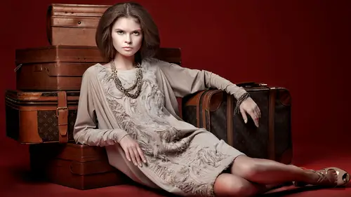
Posing Guide Contact Sheet Examples
So what we're going to do right now, I'm breaking my rule of everything being boring backgrounds and poorly lit. I'm going to show you a couple images 100% raw out of camera from a couple shoots that I did and showing, well first of all, models don't necessarily know how to pose. But then why I chose the images that I did out of that selection. And that doesn't mean they're perfect. I don't look at a pose and go, oh it's perfect. That's the one. It's what's the least not good (laughs) Which one is the strongest and we'll take a look at a couple of them. I'm going to start off with one that's beauty. Then we're gonna do some fashion ones. If you guys have any questions on that, let me know if you think I'm wrong, if you disagree because you definitely could. So let's take a look at this one for example. These poses were, when I instructed her, I asked her to put both her hands near her face. Something like this. This is what I instructed. And then this is kind of what I got because I wa...
sn't being specific and she was just trying to move with the camera. Alright, so how I feel. The very first image I find it so heavy right here. This is where my eye goes. So the pose, and this can translate to your work as well, is you can have a pose be too visually heavy to one side. If you have a leg out and an arm out on one side, this side has nothing going on and this side has everything going on so it's visually unbalanced and it plays a role here as well. For this next photo over, just, I don't know, the hands were just awkward to me. Remember how I was saying people really do that with their fingers, they do. She's doing that. This last one, too much palm. Maybe if she's trying to something a little more graphic and the palm was hidden. This one. The general rule for photography is you don't want to photograph up somebody's nose. That's a general photo rule. In fashion we break the rules and sometimes that looks like the model's being snotty and saying I'm better than you are so it's okay. I don't know, we make up rules in fashion photography. So this is the least not bad for me. And so I picked that one because I saw pinkies, pinkies, leading line and it was kind of the C curve thing going up her face and more or less soft hands. So that would by my pick out of those. Let's take a look at another one. Alright, so I know this is a little small guys, but you can kinda see body type. Obviously, and these are all poses she did. I didn't direct her to do bad poses. These are poses as I was trying to direct her to do good a one. First pose, obviously. So when you look at that, remember, where's your eye going? If it is going up and down or straight across, your eye doesn't explore it so it's not like eye candy. You're not appreciating it. So sometimes when you look at a photo, the reason you love a pose is cause your eye is just wander around it. Here, it goes voop and straight out. This one I liked. Because she's wearing a big baggy outfit, it's okay in this case to have negative space, or to not have negative space, cause to really get the negative space, I'd have to have her like... It doesn't even work with that piece of clothing. So if you look, I have some triangles here. Kind of a triangle there. It's pretty good. My eye kind of leads up through the photo. So I was okay with that one. I felt that between these two, I liked this one better because this one made her look wider. It's actually kind of cupping the outside of her thigh there so it makes her look a little bit wider. Instead, this is a nicer curve and your eye follows it a little bit better. This one's also fine. Nice negative space. Decent C curve there. Last one, bad posture. I told her to kind of lean towards the camera and she hunched towards the camera instead of leaned. So that's why the ones that I would be okay with would be these three. And this was shooting a clothing catalog ad. So I wanted it to be not too edgy in fashion but also not too commercial. Okay, how about these? Picture number one is like my favorite fashion pose which is what I told you cause it actually can work in fashion, the kind of flat foot. That's why I didn't say it's bad. It's not great but there's times when it's appropriate. This next one, I felt that this looked a little weird. Can you actually see? Her hand's like... claw hand. Because it wasn't having her do an easy pose so you can tell that in the shot. This one, same thing. Everything's down, there's not that much movement. This one is just, it's boxy. I feel like I'm stuck in a rectangle there. This one, I'm kind of following up this way. So this one if the hand wasn't messed up would be okay with me. This one is the most dynamic and the other reason I like it is the foot. See the difference? I think it makes a huge difference. That one foot is at the camera. There's no continued movement. This one to the side really adds a lot for me there. So that's what I would pick out of that particular shoot. Like I said, there's not really any definite answers. Okay, then here's another one. So this is an example of where I was saying that foreshortening with the elbows going back. It's not that it's terrible, but doesn't she look like she has really little arms? They're foreshortened because she has her elbows back so it looks like she has shorter forearms and biceps there. It doesn't personally work for me. This first one is just so, it's just blah. Looking at this, this worked for me cause I can kind of follow the line of the leg up and over. This, I have kind of nice curves throughout. My eye explores it, that works for me. This one, it's too symmetrical. I felt like I got stuck. Everything is too symmetrical. So that brings me to a good point. If you want to have dynamic poses, asymmetry is better. Something that you will hear me say over and over again as we proceed in upcoming days, is balance but asymmetry. So when you're trying to do a pose, you want it to feel balanced. Like I said, you don't want all the action necessarily on one side. But, it's asymmetrical and therefore balanced versus here, everything's happening on one side. So that's something I think about when I'm photographing groups. When I'm photographing a group, I don't need everybody to be exact matching hands cause the problem is when you try to match them perfectly, you don't. They don't match perfectly so your eye sees that it wasn't matched perfectly. So balance... but asymmetrical. That's something that I work for as well. So I would say these two would be the strongest. One point that I wanted to mention. Remember before I was saying, put your weight on your back foot, lean forward. One of the things that naturally happens and you should watch for, is the front knee bends. For most situations, where you're doing that, where you're pushing the weight back, you usually want that front knee to bend. It bends naturally, but if it doesn't bend, it looks awkward and tense. There's a natural bend when someone puts their weight back. And that's also when I'm doing the curves where I have the knee pop over and it back. It's already bent. So this movement is always really important. So just as we're talking about that, just make sure that the knee is bent. Just comfortable, not like awkward. So yeah, those two would be my favorite from this. And I have one more, okay. So this is the girl from the beginning again. This is a type of thing where I shot, because it was movement, I had her go up and up and up over and over again. That's something I'll talk about in the fashion segment. And also in boudoir. I have people repeat actions instead of trying to hold it because if someone's trying to hold a pose, the expression just fizzles out of their face. I'd rather get them tired from going over and over again. At that same time too, a lot of times as they get tired, they relax so it actually becomes more candid. I would rather have them do that repeatedly and so for this particular sequence, I shot, I think I shot like 40 frames, 40 different times cause it wasn't quite right. My point to you is I don't get it right, right away. Even with a professional awesome model, doesn't happen. Doesn't work like that. So what I see that I don't like. Head way too far back. Little random pokey fingers from nowhere. That's a good hand comment. When you're posing hands, with couples and otherwise, if the hand looks like it's coming out of nowhere, remember I said from the top that's kind of weird. The same thing, if you have a crop and the girl has her hand behind her neck and it's coming out anything like that. The same thing here. You just see a couple fingers and it looks weird. And also no negative space. So I'd love to be able to see some negative space there. This one. That's like least objectionable to me out of them. I think she has a lot of tension in her hands here. I would love to see negative space here, but it's not terrible, it's okay. Looking at this one. one of the things I try to avoid is awkward poses and this is a little awkward to me. Maybe if the whole shoot was all about symmetry, graphic shapes, graphic patterns, and I was trying to do that then that would work but I mean this is kind of like regular ready to wear clothes so it doesn't make sense to me. This is the one that I liked best. Pinky side of her hand. Soft hand on her hip. Negative space here. Triangles. So see what I'm talking about with the triangles? Versus, like, this wouldn't be really portrait or boudoir. It's way too crisp. You can do it for portrait if you were trying to get a fashion looking portrait. So the second class that I taught here in Creative Live, was fashion techniques for portraits. So while I set up, this is fashion, this is portrait, I totally cross the lines all the time. Just kind of understanding what the differences are helps. This one, too up and down. Notice, can't see the side of her feet, both of them are straight. And then this one is like, just not good. There's no negative space. It's straight up and down. I can't see her other arm. One of the things that I've heard people say about posing is that they want to be able to see all the appendages, the arms and legs. I don't think that's always true. I don't think that our brains think, oh she has no arm if you can't see it. So an example where some people are really concerned would be something like this, okay? See how you can't see her left arm here? By traditional posing standards, ideally you would see that arm in some way. Maybe you have it so the arm is to her neck, to the front, to her leg, something like that. I'm not as concerned about it unless it's just really awkward or several appendages are missing, I don't know. I'm not exactly sure but it doesn't bother me too much. But just so you know that actually is a traditional posing rule that you shouldn't have things missing. You want to see the whole person unless it's about a crop where it's clearly cropped out. Yes? A quick question we have from Shutterhog, who wonders how much pattern in the clothing influences posing with negative space. And then also, Carlos Estrodonix wants to know what you mean by negative space. Oh sure, absolutely. So I'm gonna start with that one first. What I mean by negative space is literally when you have a person, all their appendages, their arms, their legs, everything. When everything merges together, you are a blob or a stick, depending on your body type. Could be either. And that's the opposite. What we're trying to do with posing is to define the form in a flattering way. So the empty space that you put between you and your arms or you and the legs or wherever may be. That empty space, is what helps flatter the form. So that's what I'm always looking for. When she was standing there posing and her arms were all in, everything is clumped together and very blob-like. And that definitely does not encourage your eye to explore cause everything's compacted. And then also if somebody's all hunched up here, your eye sticks here and doesn't explore throughout the frame. So the negative space encourages our eye to explore the frame and then also flatters the subject. The other question about clothing. The things that I'm watching out for in clothing which is super important in my job. I spend way more time than I would like paying attention to how the creases look like in the clothing. Couple things that I'm paying attention to is the movement of the clothing. Like if I'm trying to show movement in the fabric. Anything kind of like that. I'm also paying attention to if there is a pattern and it clumps up because of how somebody poses you notice it ten times more versus if it was black. If it's a solid black shirt, you don't notice if somebody does whatever pose it may be and it folds. As soon as there's a pattern your eye goes straight there. So I'm just trying to make sure that my eye isn't drawn to those patterns more than they probably already are. Which is one of the reasons that I have all the people that I have modeling for me, had them wear solid colors. Because if I'm teaching you guys and there is a striped shirt, that's where your eye will go. Eye will go straight towards the striped shirt.
Class Materials
bonus material with purchase
Ratings and Reviews
user-305e84
I would highly recommend this class! I have been shooting for some time now and I've been pretty satisfied with my pictures from each session. A few weeks ago, I happened upon this class and thought it would be nice to get some new ideas. I then took the ideas from this class and applied them to a maternity shoot. I must say it took my pictures from good to amazing!!!! My clients bought them all😊 Thank you Creative Live for offering such amazing classes to help any level of photographer learn and grow!
Ruth Ganev
Lindsay is such a great teacher. She doesn't overcomplicate things - so that you can really learn. She also reviews things again and again - only in different contexts - that make total sense. I have learned so much from watching this course of lessons. I went to a natural lighting portrait workshop a couple of weekends ago - and was able to put into action what I have learned. The models loved my photos, too. She keeps things moving, is clear and to the point. I highly recommend this class to anyone wanting to become better at posing. It is so rewarding to look back at my previous photos and understand what doesn't work and why, and also to see things improving. She is a natural teacher - the course is not boring - you will learn tons!
Maya Tleubergen
I really love it! Thank you, thank you, Lindsay! Beautiful girl with a huge talent to teach! I absolutely love it! Worth every penny!