Lesson Info
25. Retouch Wrinkled Skin
Lessons
Class Introduction
07:26 2Getting Started on the Image
05:12 3Mark Up Process
21:14 4Spotting & Cloning
28:53 5Gaussian Blur Smoothing Skin
21:34 6Surface Blur for Smoothing Skin
12:08 7Frequency Separation for Skin
24:30 8Create Skin Textures
10:24Color Correction for Skin
21:29 10Add Details to The Face
10:25 11Add Natural Looking Eyelashes
11:05 12Enhance the Eyebrows
03:20 13Brighten Whites of the Eyes
05:54 14Sharpen the Eye Details
05:08 15Replace Face Details with Masks
05:30 16Subtract Details: Freckles
15:27 17Add, Subtract & Paint Hair
08:46 18Create Hair Highlights
04:42 19Change the Hair Color
08:27 20Body Shaping: Overview
07:36 21Basic Body Shaping
08:48 22Body Shaping Through Masking
06:35 23Body Shaping: Liquify Tool
06:09 24Body Shaping: Puppet Warp Tool
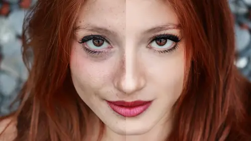
08:14 25Retouch Wrinkled Skin
20:28Lesson Info
Retouch Wrinkled Skin
I want to show you a real file, a real job file, to be nameless, who this is. But I just want to talk about some of the corrections done for retouching, and I don't think I really spent a lot of time on older faces. I mean, I'm old, but I'm not quite there yet. So, how this file, and this is an actual job file, got built, is there was a retouching, and on this retouching, what was done was the neck was grabbed and moved. I think I can do it. It's merged, again, I think I mentioned to you guys earlier when you're pretty confident at doing this job, you can do these moves and merge things. When you're starting out, you might not want to. You might want to keep it as a separate layer, but I've been doing this for awhile. So, command J to select that neck. Command T, or work or, my God, my new favorite thing. You know, I'm going to use that everyday. Thank you for that. You can actually stretch up the neck. And, again, this is just to move it. Put a black mask on it. Why do you put a black...
mask on it? You put a black mask on it because you always, always, always, want to see what's being painted in. (coloring sounds) Women can be very furry, very, very, very furry. And, do you remember that, the skin technique that we talked about, and how we'd done that? The frequency separation, or the surface blur. One of the blessings of those processes, I think I got that right. You don't have to be super tight on your masking, because you're blurring. Spend the time where you need to. If you don't need to, do not spend time making that picture perfect unless you have to. However, do you know how we talked about, before, if you have to coat back, if you have to... Sorry, Siri wants to talk to me. If you go back, and the client says, "Pull back on the blur," don't forget to fix your seams, if you're loose on your seams. Is that clear? Don't be tight on your seams is you don't have to. Don't do work you don't need to do. So I know I'm going to blur the holy heck out her, because they want her young. So, I'm not gonna be really tight on this seam and paint it perfectly because my frequency separation is probably gonna take care of a lot of this. However, if I have to pull back on the blur, I'm gonna have to go back and tighten it. Okay, so I'm going to delete that because you don't need it. And that's the retouching. So it's not, it's not pixel perfect, but it's good enough. And then there's the Gaussian blur method. This is the cheap method. Remember we talked about that. Either fast, cheap, or good, you get to pick. This is the frequency separation method. Frequency separation method is way better than the Gaussian blur method. Would you agree? I think so, way better. Smart filter for liquefy, did we just talk about this? We did. Smart filter for liquefy. These are question, this was questionable. This was a new client. I wasn't sure, but I was like oh that's gotta go in. And what I did was merged it all, so that I could liquefy it. That's before, that's after. And I wasn't sure, I wasn't sure. I left it, because, this is my thinking process. This how I think, and I'd like you to see how I think. Now, after this, I've lost my mind. (laughing) And, this is lightening and darkening. This is more of a finished look, and I'm gonna, rather than go through each one of these, just for a second, I'm gonna show you the final result. So what is happening here is, this is my fairly decent frequency separation, which is fast, but there was just a little bit more. Do you see there's some crevices? I just thought she needed some highlight, a little bit of tone. This is more time. This is, excuse me, this is bleaching in there... I, that's actually, I cropped it out. I had to crop out to protect those who were not hurt making this film. This is a lightning curve. I'm gonna turn it off and on for a second, let you see this. This is fine detail work. This is, you've got more time, we're spending the money. Do you see that? All that is, is, let me turn this one off, it's a lightning curve. And the rivers are being painted. Do you understand? Little rivers, lightning. It's our normal. Neck coloring. Do you remember that hue saturation we did? And I said; why don't you match a hue that you think you like? And then paint it in. Why do we do that? When you lighten, when you lighten flesh, gosh, it turns gray. Do you see how gray that is? It's gray. Now, it's warm. Gray, warm, gray, warm. I'm hoping you can see it on the screen, or trust me. Chin coloring. This is really subtle stuff. Do you see light this brush is? These are subtle colors. I guarantee you on your screen, you're not gonna see this. On the print, you are 100 percent gonna see this. And did someone not talk about this earlier, about your eyes, you start developing your eye? Or was that the other class? About developing what you see. When I, I think I mentioned this before, when I was retouching for that guy, and he said; those nuggets by the nose, and I couldn't see 'em, and I started cloning. I was cloning, I didn't know what he was talking about. He said; clean the nuggets by the nose. Ahh, okay, I'm cloning. It took a week and a half of so for me to be able to see it. Some of the stuff I'm working on it so subtle here, but you'll start to see it as you get going. Do you see that cheek coloring? A little colorization. It's all very subtle. But I've gotta tell you, even though this is subtle, it's pretty, it's not too slow. When you do this time after time after time. Do you remember we did the hair? And we changed the hair color, and I said; that hair needs some highlight. That skin needs some highlight. This is a channel pull. Do you remember that luminousity mask that I said you could buy off the internet for like, three bucks.. (puckering) Luminousity mask, and it's got a correction. The correction is a solid white curve. What?! The correction is a solid white curve. Black curve, white curve, normal curve. Why do you do this? It takes less memory than a white, a layer of white pixels takes more memory on your computer than a mathematical curve. Cause all this is, is one alpha channel. If you have a layer of white pixels, it's the red, green, and blue. So, a lot of retouchers retouch with color codes where they can because it keeps your file size much smaller. Eye color, you can't see because her eyes are gone. Hand color, you can't see because her hands are gone. Yeah, you can't see the rest of this, sorry. Cause they're cut off. Is that helpful to see layered file on the actual final file? Oh, yeah. Awesome, good, good, good. And the only, I would say goof in this, or potential goof, trouble, is that all those final adjustments were done after that chin got fixed. So, if the client came back later and said they wanted that chin back, awww, I have to fix that. Eh, it's a little chin. That's easy enough to fix. That would be the only mistake on this file. I think. Question from Photo Maker, was how on that one were you able to maintain that surfaced texture of skin across all the different retouched areas? Of the face, and the neck, just kind of a reminder of how that works. Let me see I understand what you're talking about. And you were talking about this file here? Yeah. The surface texture, how is it... Just maintaining how it looks across all the things that you've just retouched, the texture, the skin. Right, I think basic... Yeah, and that's a really good question, and, let me turn all of this off. So, how the texture is, first of all and foremost done, is frequency separation. So, it's held through frequency separation, and then, where it got a little wobbly, and it's gonna get wobbly, that was where all that hand painting came in. To start smoothing that out. Cause if you can see, if you can look at those colors, look how, those are adjustments. Those are color adjustments, sitting on top. Do you remember those lighting curves I just showed you? That color curve, that's all this is. And, okay, this is time in, this is time in, hand painting, very gently, with like a 10% brush or a 20% brush. This is not fast. If you can do this fast, I'm out of a job. If you guys, who are starting out, can do this fast, I have no business doing this. So, I say that, not as a gauntlet to throw down, but as someone who wants you to not feel like this should be fast, and I guarantee you are gonna get jobs, and clients are gonna expect that. Well, can't you do that in an hour? No, I can't do that in an hour, I can do that in four hours. And, if you're starting out, I can do that in eight hours. I hope that gives you kind of some scope about timing. I have a question about monitors to help you develop your eye and see things. Do you use like, the apple retina shiny screen, or do you use a flat matte? I use a flat matte, but I got to tell you, I don't think it matters that much, the environment, that's a good question. The screen itself doesn't matter, depending on the environment you're in. So, I'm in an environment where there's not a lot of things bouncing, did I joke earlier, I'm in the closet? Yeah, I'm in a closet, working in a dark room. Because I can't have all this stuff bouncing around, so if you are in a shiny room, you might have some trouble. The other thing is, and I'd like to talk about this, I hope this is pertinent, do you see how my screen is gray? My screen is not gray for you all, because I'm here, my screen is gray because when I'm working on the file, I don't want colors, so get that little sunshiny sunset off your desktop, or those zinging colors, absolutely get them off your desktop, and in your room, you don't want zinging colors. You may love red, that may be the room color you want, do not retouch in a red room. Don't do it. Back to the catalog warping example, with the red dress you turned purple and what not, how, since you're not a photographer, and you're just getting the photo sent to you, and you need to return it to the business selling this dress, how do you know what the accurate red is? Yeah. You know, if the photographer captured it a little too hot or just, their white balance was off, or whatever, it's tricky. It is very tricky. I had an interesting, I just did a nurses catalog, and they did me fabric, they actually gave me fabric, to look at, and I was like; alright, well my monitors calibrated, so I really hope that this is the accurate color, and when I get jobs, I don't get jobs like; oh, you got seven months, let's get this catalog done. I get; oh my God, our regular retoucher is unavailable, can you fix this, and you've got two days. I don't have a pantone book anymore, so I can't put a pantone, I can guesstimate so I do the best I can, I can guesstimate. I will tell you, however, with most of the catalog jobs I've had, the colors are pre existing. What that means is they've already done a catalog, and they're just updating the design, but the colors are all the same because the fabrics are similar and they don't want to pay for different dyes, and if I can get a digital file, and I always ask; do you have a digital file of what you've already turned in so I can match it, and then I put that straight on top. I do that for a skin tone too for it's catalog. So, that whole color correct thing, and what kind of skin do you want, is it Hispanic skin, is it dark skin, is it light skin, do you have a particular color palate you like, are you using the same models, and if you don't ask that question, you're client's not gonna know to give you those files, and then, if they're using images from last year, along with this year, it's gonna jump all over the place. So, once again, ask for files so you can see what they did last year. Great, we have a couple final questions. Please. From folks at home, so Christine Pie, and this one had a number of votes on this particular question, and I've been saving it for end of day, so, when you're finished with the file, post frequency separation, and all these things, and you want to do a print or export a quick proof, what would the process of merging, flattening the files, would you go through, just sorta to get to the next step? I don't think I did this in this course, so let me talk about it right now. I'm gonna make a fake job folder, and then move it up. Alright. So, when I have a job folder, what I do is I have my assets from client, those are all the raw files that I'm starting with, those are samples, those are whatever I get from the client. The next file I have are WIPS, which are my work in progress. This would be a WIP. Do you notice how it's masterfilewip1a? Fully layered file, when I deliver a file to a client or a printer, it is always a version. It might be a print version, it might be a JPEG version, it might be a TIF version, but it is a version, and as a general rule, I like to flatten my files. So, what I would often do, let's say, is I'm gonna turn this file in, and I have to turn in a couple files. So, first of all, I've got a print file I need to turn in. So, that might be version1acmyk and I'm gonna save it as a TIF. CMYK, I'm gonna flatten it, boy you have to pull layer file out of me with teeth, by the way, is that the expression? Anyway, yeah, it takes, it's like pulling teeth to make me give you a layered file, cause I don't want to do it. I'll do it, I just don't want to do it. So what I do, is I do my CMYK version, this is really important, why do I do my CMYK conversions? I do my CMYK conversions cause I know sure as you know my name, I have opened it in the right color profile, and I'm converting it in the right color profile, and it is the same every time I do it. When you do production jobs, who's on the night crew? What machine are they opening it at? Is there a warning set to tell you that the profile is different? Well, I don't know. I spent many early years working, and chasing color where the client said; what the heck, this doesn't look anything like it's suppose to. Oh my goodness, I'm so sorry. Yeah, it's too red. Any then I send a file, where I've adjusted the red, and then the client gets it, and they're like; my God, it's so red, what have you done? And it's because the night crew didn't open up the file the way the day crew file did. What machine were they on? What was it set on? Do you go to those color settings we talked about? Did they have these clicked? Photo shop delivers photos, photo shop delivers with those turned off. Guarantee you didn't have it on. So, I convert my CMYK files because I do not want the client to convert the CMYK files, I want to do it. So, how I deliver, is, I deliver this way. And then sometimes I have to do JPEGs. So, if I have to do a JPEG, I ask them for their JPEG specifications, and I assure you, they will have them. They will know exactly how they want their JPEG. I will duplicate it out, and if it's a JPEG, if it's a reduced file, like for example, with ABC, we have to deliver a web file, or it used to be called an AV file, back in the old days, and a web file has a very specific dimension at that job. It won't make any difference to you guys, but there's a very specific size it is. Yeah, well that's actually the size. It's 10.125 violet fall, at 300 BPI. And then I make sure I throw all my channels away, clean your house, clean your house, clean your house. I cannot stress this enough, clean your house. No paths, no channels. Flatten your file, no layers, no funny names. No funny girl with brown hair. You'd be amazed how people label their files. They'll put things they shouldn't put in there. Don't put anything you shouldn't put in there. JPEG, and so that's, that's two files. Anybody who works with me, who has to pick up this job, they will know my master file's not there. That if they get a master file version 1A TIF, that they have to go to W1A, and that'll be the layered file. The web, web file... Do you notice the CYMK went off? Do you guys notice that? It went off cause I forgot to put a period after it. Watch out for that. When I saved it, you have to put a period. So, hopefully that answers those questions. The client should really dictate how you deliver a file, I don't dictate, they dictate. Other than I try not to give them a layered file. Great. Cool. Okay, one final question for you. Yes mam. This is from Art Hill, and I'm sure a lot of people out there feel this way. Art Hill says; what are the essential skills that one should know before presenting themselves as a professional retoucher? Since I'm teaching myself by watching classes like yours, I never know what I haven't learned yet, and never feel ready, but everyone has to start at some point, even though there's more to learn. So, if we're putting ourselves out as a professional, what should be our baseline? This is really a great question. Alright, there's a few things, and first of all, let's talk about terminology. What is a retoucher versus a compositor, and what image are you in? So, what world are you working in? In my world, as a entertainment retoucher/finisher, what that probably should be called is a compositor. In entertainment art, you have to composite, so if you're gonna do entertainment art, you have to know masking, like you're breathing. Just masking comes natural to you. Coloring correcting, frequency separation without question because it's for skin. Are you doing a job with people in it? You need to know how to handle people. But, that is a compositor, that is not a retoucher. That's a compositor. Retoucher's often, are really good at skin, and beauty, and hair, but they can't mask, because they don't have to mask. So, this is a really sticky wicked question, because I don't know if he's calling himself a retoucher, but he wants to do compositing, or if he wants to do both and the industry he's in refers to it as both. I suggest highly to do informational interviews in the industry you want to work in. And what that means is, go to somebody in your industry and say; hey, I'm not looking for anything, I'm not looking for a job, yet, I just want to know, what do you guys look for in a retoucher or finisher? What are the major skills that you need to know? And when I was starting out, what I was told, this was, as I said, a long time ago, that I just needed to know how to mask, and how to clone. Rubber stamp in those days, healing didn't exist. And I knew how to clone skin and retouch the skin a bit. Skin and masking was all that I was asked for when I first started. We covered a really broad, broad, diverse section. Some of the stuff was beginner, some of it was intermediate, some of it was advanced, go slowly through it. Don't expect to know all of it, or that all of it's gonna come easy. If you get too frustrated, walk away, come back. Please try, please try the files, it's really good exercise. And then try it on something else and see if you can emulate it, and I would suggest in six months, look at it again, three months. Because honest to Buddha, you'll see something totally different that you didn't see. This was basic. While it's very complex, it's still very basic. Each one of these subjects, you can go on for days. We have a hair workshop, frequency separation. Even in the frequency separation, that's got a million things you can do with it, because it's so expansive. You guys have other classes, you color classes on masking, I would highly suggest you take a masking class, that might be great.
Class Materials
Bonus Materials with Purchase
Bonus Materials
Ratings and Reviews
Tab
If you were like me and had no idea on where to start and feared that the editing process would be too destructive and would have to start all over again if the client didn't like your completed work - then this is the class for you. I watch this class often for review and to make sure that I maintain these good habits Lisa suggests to do. If you follow all of her helpful commentary on her how's and why's you will end up in a far better place when that time comes that you have to re-edit your edit. I cannot say enough great things about her work flow and how it not only enhanced my images to the result I was looking for but also decreased my editing time(bonus!!!!). I also on a whim sent her a email through her personal site and she replied with a massive helpful technique for enhancing freckles on a job I was working on. She is amazing! She is a true teacher who is there to show you how to use photoshop for you to find and gain your own editing style. Far too often i find myself in retouching classes that only demonstrate how to make your images look like who is teaching the class... Workflow and Style are very different, you can have the same workflow but your style is determined by your taste. Her workflow is solid and delivers time and time again. This class should be in everyone's dashboard hands down.
Kristine Pye
Thank you for taking the time to answer my question and take us through your "delivery" process, I found that extremely helpful. I have purchased two of Lisa's classes immediately after the live stream during Photoshop Week 2017 and was very excited to stream another set of lectures from Seattle. I will be purchasing the last two courses of Lisa's within the next 24 hours as I did just over a month ago. I find her classes to be absolutely brimming over with useful information--everything from the technique, her process, what other professionals in her work are doing, and **why** she chooses the methods she does in retouching. She is relatable and genuine, and her knowledge of the program and how to maximize efficiency while "skipping the actions" really reinforces the educational part of her courses. There are "easy way outs", but she emphasizes that you should understand the ways in which any adjustment effect the entire photo. These courses have helped me to move forward in my education, helping me to realize that with enough practice and good habit formation--such as naming every single layer every time-- that it is not irrational for me to make an effort in building a portfolio and a Master's degree with little-to-no- previous experience with the software. I am very appreciate. I hope to see more from Lisa in the future, but I have plenty to practice with for now! Thanks again, Kristine Pye kristinepye@gmail.com
Jeff Robinson
Lisa Carney is amazing! She has a depth of knowledge of Photoshop, retouching techniques, and compositing that she shares in a fast, but straightforward, easy to follow, step by step manner. No matter what your level of expertise, you'll find gems, shortcuts, and methods in her teaching that you can practice and put to use to make your work stronger, faster, and cleaner. And with the bonus materials she graciously provides, including workbooks with her detailed steps, practice files of the images she uses in class, and before and after comparisons, you'll be on your way to improving your skills immediately. She's an accomplished retoucher and gifted teacher. If you have the opportunity to take one of her classes, take advantage of it!