Lessons
Class Introduction
07:26 2Getting Started on the Image
05:12 3Mark Up Process
21:14 4Spotting & Cloning
28:53 5Gaussian Blur Smoothing Skin
21:34 6Surface Blur for Smoothing Skin
12:08 7Frequency Separation for Skin
24:30 8Create Skin Textures
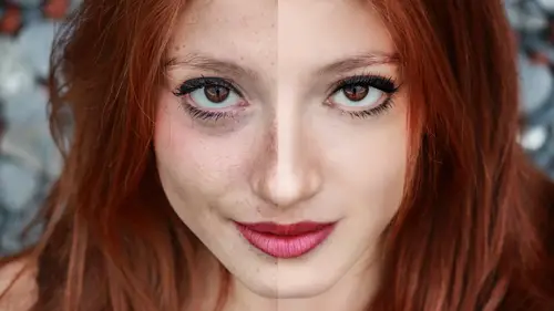
10:24Color Correction for Skin
21:29 10Add Details to The Face
10:25 11Add Natural Looking Eyelashes
11:05 12Enhance the Eyebrows
03:20 13Brighten Whites of the Eyes
05:54 14Sharpen the Eye Details
05:08 15Replace Face Details with Masks
05:30 16Subtract Details: Freckles
15:27 17Add, Subtract & Paint Hair
08:46 18Create Hair Highlights
04:42 19Change the Hair Color
08:27 20Body Shaping: Overview
07:36 21Basic Body Shaping
08:48 22Body Shaping Through Masking
06:35 23Body Shaping: Liquify Tool
06:09 24Body Shaping: Puppet Warp Tool
08:14 25Retouch Wrinkled Skin
20:28Lesson Info
Color Correction for Skin
Color correcting, now, most things here, I'm just barely gonna touch on this. We're gonna talk a lot, well, I'm gonna talk a lot. But in a world of color correcting, there is so much that can be done. And I'm just gonna start talking about different issues that you have to deal with, different ways of correcting it. It might feel a little haphazard but there's actually, I find for any job, there's no one like one step after the other. Every job has it's own event flow and things that you need to do. So I just wanna talk a little bit about some tricks we use, some curves we use, some adjustment layers we use to do these kinds of tricks or not tricks, really, just retouching. Now, let me start out with any kind of color correcting I do. I almost, always without fail, will always use an adjustment layer as oppose to going here to image adjust. And that's because, it's all about flexibility. Files need to be flexible, I need to go back to ground zero at all times. And frankly, I think you ...
guys should. Because you get better as you go and I need to go backwards. Alright, so one of the techniques we use ... I'm gonna show you couple different things. This is so basic but I think it's good to start with. With curves, is kind of balancing out the image. And there's a lot of ways, you can do automated. But I'm not a huge fan of it and I tend to like to have the curve fluid for me in the actual file. Meaning, I can adjust the curves as I go. So sometimes what you can do is click on it. Seamless shot like this with Chelsea ... And I'm gonna show you couple different ways to do this. You can click on that gray eyedropper here in the middle and say "Hey, can you make that gray?" That just made a neutral gray and that was two seconds. There you go, that's a way to make it gray. I don't have a very complicated file but I'm gonna show you another way to do kind of the same thing, it's a slightly different step and it's got a little jig you need to do. And that's called average blur. And again, on this image, it's a little tough. But I think it's still okay to show. Average blur, average blur. You make a copy, you go to blur, you go to average. It's gonna average that all those pixels out and make it one. She's got a very red dress on, so it's gonna throw the file off just a hair. You put your curve on there. And you do the same thing, you pick gray, and you say, hey, make it gray. And then you throw that average blur layer out. Now, in this particular image, because her dress was so red, it's gonna skew it to cyan. It's not a big deal, you go to your reds. And you just pull them up a little bit. Now, why this is handy? This is handy as if you have a shot of somebody in a forest or in a scene or in a background or something else. And you don't have a scene list that you can tap on. Use that average blur and it will get you close. I will tell you, it tends to ride cyan just a hair. So almost always, I have to grab that cyan point. It's almost always at the mid range. And it's always just like that little teeny click. This is just an average blur. Cool, very simple, very basic, handy to do. Hue, saturation, adding tone ... Oh there's so much to talk about. Alright, I'm going to open ... And what do I wanna start with with this? Alright, this is a pickle for me. In the sense that it's a philosophical pickle. What color, when, how, who? Everybody, differentiates what they want, what they think is. I have a, one of my main clients, every file they do is the skin and the flesh tones are, the green, the yellow are way too green, I can't stand it. It's what they like. There's nothing I can do about it. So there's no right or wrong with this. So when you do color correction for files, you really need to find what you like and what works for you, what works for the print. There's no one color and I don't ... How many times you guys heard, oh just color correct it. Can you just color correct the skin? What do you mean, like correct to who? This is one of those times where you might want a sample, okay. And I have to tell you as a general rule, I just like to add a little contrast with a curve. I like to go to the reds and see if I should maybe pull down the reds. I tend to lead reds in the highlights but pull them out in the shadows. This is all a very personal process. And this really affects how you retouch. This really affects how you retouch. So what I mean by that is, if your client has a set color or a set file to match, you might wanna do all of these before you do retouching. So that you can see the effects. Can you imagine going through all that spotting, cloning, healing, and all that. And then realizing, oh, they took all the reds out. I didn't have to do all of that cause it doesn't show up anyway. Do you understand what I'm saying? So what I like to do is when I do color corrections, I put them in a layer set very much like frequency separation. I'll label them cc and I leave them on top of the file. So while I was talking about the order of a job, I actually did contrast and color early. I do it maybe in before spotting. I know, it's forbidden to say things like this. Now I wanna talk about something, really, some kind of tricks we tend to use for these files. We tend to use hue saturation for skin. We tend to use hue saturation for skin because what we'd like to do is we like to go to the reds under hue saturation. And say, hey reds, I'm gonna add a little yellow to you. I'm gonna turn a little green, don't panic. Because I'm gonna say, hey yellows, add a little red back in. I think a added to much yellow to my red. Do you see how the colors evening out? And this is ... We talked about earlier before printing and knowing where your color values are going. Sometimes, we pull the saturation down on the reds often. It depends on the shooter. There's a shooter from a very well known agency that I would never, never ever name. Who's files all are yellow, it's called the ... Name of that shooter yellow. Because every single file that comes, the skin is just yellow, it's just the way it is. So we have curve and in fact it's a built in curve on a library that we keep a built in curve on a library shell. I discuss that quickly, sorry, don't kill me. I'm going out of order, just a hair here. Libraries, you can save adjustment layers and color corrections into a library. So I'm ... Let's say this is the unnamed photographer fix. And every single job that comes from that has this fix. Period paragraph, you can put it in a library by ... You have it on your file. Mask or no mask, it doesn't matter. It's completely neutral. Drag and drop it into your file. Now this is stored right here in the unnamed photographer. If you need to get to it, I've opened up a job, it's three weeks later. It's whenever it is. I just hold the control key, place layer. There it is back on. This is only in my creative cloud. And let's say, Collaborate. Can you imagine? The photographer, the unnamed photographer I'm discussing for, works for a network, a whole network. I came to tell you that thousands and thousands and thousands of photos that go out that have this particular problem. Now, what else do I want to tell you about that? It's a very subtle color curve but use it all the time. This, minus red. I call it minus red but I really shouldn't. It's add red, add yellow to red, add red to yellow, add yellow to red, and occasionally, and quite often, it's a desat on the red. Takes care of rosacea and veins in legs. Isn't that a happy day, rosacea and veins in legs. So it's a very very simple color curve but we use it all the time. I'm gonna review a color curve that is part of the color class that we did but I think it's pertinent. And that's a matching skin tone. In fact, let me show you how I do it from scratch. Also, to even out skin tone, what you can do, again, that you pick with a square, I really like to use it because it helps you see what you're doing. You go to your hue saturation, you go to colorize. And you get a color that matches the overall color of the skin that you think you wanna match. So, you wanna have something you think is fairly decent. And lightening, just a hair. I'm increasing the saturation. I'm redding it up a little bit. Let's just say for kick, this was a color we like. Black mask, paint it on. And what this can do is even out make up coloring. However, as we discussed in the color class, the saturation and the shadows is crap. So you generally wanna switch this to a hue mode. And on certain files, what this will do is it allows you to even out the skin tone and then, you add your highlights and you're differencing tones yourself. You don't have to worry about the file, the color being all over the map. I know this is very very very subtle. But on a print, you absolutely, 100% can see this, 100%. This has nothing to do with retouching. This has nothing to do with retouching. You see all my spots still there, this is just color. Okay, nothing to do with retouching. But it's really important. As we go through the class, what I'm going to do is, I'm gonna show you files that are all finished. That help all these techniques in it. I just like to isolate the technique so you can understand what I'm talking about. This is a technique for fixing blown-out files. Again it's still using curves and tone. But it's using another special trick that I very much love. Alright, so let's say we have this lovely photo of Chelsea. And her skin is all blown out. I'm sure this happened to many of you, that you've got files that are completely blown out. This is not a raw file. Let's say, I can't go back to the raw. This is all I've got and I need to add tone to her face. Now overall, she's a little saturated, over saturated for me. So I'm gonna do a generic fix. Do your remember that red I just talked about. Like I'm forever pulling the red out. So I just did a generic slight fix. And it's only that it helps my eye when I'm trying to figure out what I have to do. I may or may not keep that overall correction. I probably will but it just ... Sometimes I think what happens ... I see other retouchers do is we try to get everything perfect and set in your in a little zone, instead of working around the piece like we talked about before ... Bear with this for this analogy. I know it's a little weird. Do you ever had to put that Ikea table together? And they say, put it together, not tightening it down. But it's kinda loose and the legs, and it's a little wobbly and then you squared up and you tighten it down. I find retouching very much the same way. I know, it's a strange analogy but I think it fits. Alright, so what we're gonna talk about is the highlight area here. And what you can do with a curve, and I absolutely love curves, is you can fill in that highlight area and get some tone back in. And then because you know ... Because we talked about pattern fill, you can put a pattern or texture back in. This is one of those things on the screen that is very hard to see the texture. Cause it's in a highest quarter tones on the screen. So you know, you're not gonna see this. You will 100% see this on a printed file. So let's talk about the curve and what you can do. And let me just pull up the curve I already have cause I think it's useful. Alright. Basically, on the curve, and if you look at my curve here, you'll see it, you're gonna pull down the green and the blue. You're gonna pull down the green and the to make this. Now I'm gonna show you the process. And i feel like I need to talk a little bit, in case you didn't see the color class about color correcting with curves and how they work. So I'm going to make a little square here. And I do a quick run through on curves. Just sit back and relax, this is a little ride. This can be a little conversation about color correcting with curves. Alright, a curve dialog box shows you luminosity or tone on the front windows. So up lightens, down darkens. The highlights are up here, the shadows are down here in the lower quadrant. Red, the red channel, red color, the red control, whatever words you wanna use. The highlights are up here and as you add here in upper right hand corner, you slide over, you're gonna add red or lighten. This is very important to the demo I'm about to show you. Or down in the bottom quadrant, you have cyan or the shadows, all with color. And when you pull this way, you darken. Darken, see this, I'm pulling down from the highlight. It's a little different than the color class. So if you even heard this before, pay attention. Darken the darks by color, lighten the darks. I'm making the shadows red, I'm lightening them. I'm taking the highlights and darkening them. But I'm doing it through color. Green, highlight, lighten, highlight, darken. Shadow, darken more, it's gonna go magenta. Lighten, it's gonna go green. Blue, darken highlights, it's gonna go yellow. Darken shadows, it's gonna go more yellow lighten shadows. It's gonna go blue, alright. RGB, red to CMYK, cyan. RGB, green to magenta. I'm almost done, I know this is painful. RGB R light, heading towards the sun, gets lighter. Down dark, red, yellow pardon me, goes darker. So if that is true and you know it's true cause I wouldn't lie to you. And you know you want to darken down a highlight. What you can do, is draw a little box as I've done. And think about this, you're gonna wanna do this in color. Well, I know that if I'm in a reds, and I wanna darken, I could pull down the color there. Oh, she doesn't look very healthy there, does she. No, not very pretty, I aint gonna do that. Green, ah, well wait a minute, that's more flesh tony, right. Well, wait a minute, that might work. Oh, but it's a little too cool. I need to warm it up, we'll add some blue to it. Now, right now, I can tell you, I'm having a little trouble seeing what I'm doing. I don't know if you are because I just want to correct this one little area. This one little area right here. So what I might choose to do at this point is stop and say, "Hey, I need a better selection." I need a better selection. And say it one more time, I need a better selection. And this is a little backwards for some people's thinking. What you might wanna do is get your selection first then do the correction cause it's easier to see, alright. So what I'm gonna do, and I hope this is closer to say, I have some actions that are fabulisimo lovely, that I love. One of them happens to be something called luminosity mask. I cannot make a luminosity mask. But I know how to search the internet and purchase an action for making a luminosity mask. And since you all are clever internet users, I am most certain you can purchase a action to make a luminosity mask. I wish I was clever enough to make it, I cannot. I'm gonna delete what it is done and I'm gonna go ahead and run the actions so it will show you what it's done. But I cannot live without it. It is my favorite thing. Well, I could but I'd be sad. Let me fix my panels so you can see it up here at the same time. I have no recommendations on where to buy it. But I'm certain you'll find something. There's a bunch of them. Alright, so I just lead my panels over so I can see them. I'm gonna delete the existing channels. Alright, I'm gonna be on my layer. And I'm gonna go to my Actions cause you will purchase set Action. And you will install set Action and then when you go to it, and you will say, oh, luminance mask, I love it. And you don't even have to walk away for coffee. It's that fast. And what it's gonna do, it's gonna give you a channel of the highlights, the brighter highlights, the brightest highlights, the shadows, the darker shadows, darkest shadows, and then mid tones. I wish I knew how to make this. And I'm sure if I did an internet search, I could figure out how to do it. But for three dollars, some genius on the internet has made it and I'm thrilled to use what is used. So since I said on this correction, I would prefer to make the selection first because it will be a little easier. This is where you have to kind of stop for a second and think. What am I doing? Which selection do I wanna use? And what I'm gonna suggest is you take the brightest highlight because, well, that is in fact what we are trying to fix. Isn't it, the brightest highlight? I think with all of these Photoshop stuff, this color correction, this training, if you guys would consider what your destination, what your goal, what are you trying to do in this immediate moment. Your brain will tell you how to get here. Okay, this doesn't have to be overwhelming. So what I'm gonna do is, I'm gonna say, hey, that brightest highlight is good. It's not perfect for me, because I don't think I want all the gray around it, so I'm gonna make a copy of that brightest highlight. And I'm gonna do a levels move and just crunch it up just a hair. I can change a slight later, I just wanna be able to see what I'm doing, okay. And now, what I'm gonna do is, I'm gonna load that selection. I'm gonna take my cursor and hold the command key and put it over the icon for that channel and click. And then I'm gonna go back to this file. I'm gonna command H to hide those marching ants. Command H, it's under here under the View menu somewhere. Do you very use actions or quick key so much that you can't even find where it is anymore. Command H, you can figure it out, command H. And now, I'm gonna go back and start that curve all over again. And it should be a much easier process. And I'm quite please with that. I think the mask is way too heavy. The mask is too much but at least I can see it. No big deal, I'm gonna fill that mask with black. Let me do the shake cause I'm really pleased. Dancing is free, no extra charge. I'm gonna go back to that mask that I made. I'm gonna command click on it. I'm gonna command H to hide those marching ants cause I wanna see what I'm doing. And now, I'm simply gonna paint in that tone just where I need it. Ah, common it's good, you know it's good. Alright, now there's gonna be extra retouching done on top of this. And there's gonna be texture put on top. But I have to tell you, this is one of the more difficult problems I use to face. And it was always a little bit of a challenge how to put that tone back in. And this is a way to start. I mean, we've lost a tone on our highlight and we need to fix that. Now, this is one of the occasions where I'm probably would do this under the frequency separation. Because, I wanna smooth her skin. But I don't wanna do have to redo this mask, right. And if I smooth her skin, then this mask is gonna be invalid. Because if you look at it, it's all pebbly right. So this is one of the very rare occasions for blowing out what, which, what i will do is I will prep the file. That means I'm gonna do it underneath. It's a risk, they might come back, they might hate it. But it will make everything easier. Including frequency separation. Because in frequency saturation, there's nothing there. There's not gonna be any tone there. There's not gonna be texture there. And in fact, I'm probably gonna have to add the texture separate which is what I had to do on this one. I had to add the texture separate. I'm not sure if you guys can see this on the screen. I know it's a little tough to see. And you can add a harder texture or we do a grain. You guys understand what I'm saying? Excellent. So again, underneath frequency separation. I call, what do I call this? I call this something ... I'm adding tone with the channel and using luminosity mask. I cannot stress enough the value of this luminosity mask. Absolutely fantastic. I use it for pulling highlights, for masking, for color correcting, I use them all the time. I just wish I knew how to make them. But I know how to buy them so that's also valid.
Class Materials
Bonus Materials with Purchase
Bonus Materials
Ratings and Reviews
Tab
If you were like me and had no idea on where to start and feared that the editing process would be too destructive and would have to start all over again if the client didn't like your completed work - then this is the class for you. I watch this class often for review and to make sure that I maintain these good habits Lisa suggests to do. If you follow all of her helpful commentary on her how's and why's you will end up in a far better place when that time comes that you have to re-edit your edit. I cannot say enough great things about her work flow and how it not only enhanced my images to the result I was looking for but also decreased my editing time(bonus!!!!). I also on a whim sent her a email through her personal site and she replied with a massive helpful technique for enhancing freckles on a job I was working on. She is amazing! She is a true teacher who is there to show you how to use photoshop for you to find and gain your own editing style. Far too often i find myself in retouching classes that only demonstrate how to make your images look like who is teaching the class... Workflow and Style are very different, you can have the same workflow but your style is determined by your taste. Her workflow is solid and delivers time and time again. This class should be in everyone's dashboard hands down.
Kristine Pye
Thank you for taking the time to answer my question and take us through your "delivery" process, I found that extremely helpful. I have purchased two of Lisa's classes immediately after the live stream during Photoshop Week 2017 and was very excited to stream another set of lectures from Seattle. I will be purchasing the last two courses of Lisa's within the next 24 hours as I did just over a month ago. I find her classes to be absolutely brimming over with useful information--everything from the technique, her process, what other professionals in her work are doing, and **why** she chooses the methods she does in retouching. She is relatable and genuine, and her knowledge of the program and how to maximize efficiency while "skipping the actions" really reinforces the educational part of her courses. There are "easy way outs", but she emphasizes that you should understand the ways in which any adjustment effect the entire photo. These courses have helped me to move forward in my education, helping me to realize that with enough practice and good habit formation--such as naming every single layer every time-- that it is not irrational for me to make an effort in building a portfolio and a Master's degree with little-to-no- previous experience with the software. I am very appreciate. I hope to see more from Lisa in the future, but I have plenty to practice with for now! Thanks again, Kristine Pye kristinepye@gmail.com
Jeff Robinson
Lisa Carney is amazing! She has a depth of knowledge of Photoshop, retouching techniques, and compositing that she shares in a fast, but straightforward, easy to follow, step by step manner. No matter what your level of expertise, you'll find gems, shortcuts, and methods in her teaching that you can practice and put to use to make your work stronger, faster, and cleaner. And with the bonus materials she graciously provides, including workbooks with her detailed steps, practice files of the images she uses in class, and before and after comparisons, you'll be on your way to improving your skills immediately. She's an accomplished retoucher and gifted teacher. If you have the opportunity to take one of her classes, take advantage of it!