Additional Examples of Color Correction
Lesson 10 from: Adobe Photoshop Mastery: Retouch and RestoreBen Willmore
Additional Examples of Color Correction
Lesson 10 from: Adobe Photoshop Mastery: Retouch and RestoreBen Willmore
Lesson Info
10. Additional Examples of Color Correction
Lessons
Class Introduction
03:50 2Tonal Rescue & Noise Reduction in Adobe Camera Raw
14:04 3Retouch a Hazy Image in Adobe Camera Raw
07:33 4Recover the Brightness Range with Levels in Adobe Photoshop
11:34 5Use Curves to Restore Details on Vintage Images
48:12 6Color Rescue & White Balance in Adobe Camera Raw
10:12 7Selective Color with the Adjustment Brush in Adobe Camera Raw
06:29 8Correcting Color in Faded Images with White Balance
13:02Correcting Color in Faded Images with Levels & Curves
26:02 10Additional Examples of Color Correction
14:26 11Retouching Images with the Spot Healing Brush
14:27 12Fundamentals of Retouching Vintage Images
30:29 13Overview of Retouching Tools
46:51 14Refined Adjustment Techniques
21:29 15Refined Channel Adjustments
05:31 16Refined Texture Adjustments
07:16 17Refined Compression Adjustments
06:57 18Adding Color to Vintage Images
12:32 19Adjusting the Background of an Image
13:48 20Audience Questions & Final Tips
15:44Lesson Info
Additional Examples of Color Correction
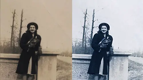
All right, let's. Look at other examples that might need different kinds of fixes. Well, there's, some of these that are nasty. Look at this one. You look at this one, man, that one looks easy. That be the same thing we already did, right? But we need a selection because we have part of the image that's not actually part of the photo the border. Right? So you make a selection, do exclude the border, then do levels or curves with the auto options and throw away the mask, and you'd be pretty close. So let's use. Well in general, with all of these kinds of problems, you need to know a little bit about what your image is made out of in order to fix some extreme problems behind the scenes, all of your color pictures are made out of three components three pieces, just like if you know your inkjet printer at home. If you happen to have one, you know how if you open up the ink trade it's not like just one, inc in there to print your image instead it's divided up into different colors, isn't it...
? You have science, magenta, yellow and black ink, and sometimes even more colors well, when it comes to the images you work with the screen that used to display it on if you were to grab a microscope and put it really up close to it just like doing the same thing your inkjet printer you'd see what it's made out of on your inkjet printer it be made out of scient magenta yellow in black dots on a sheet of paper on screen now it's made out of red green and blue docks if you literally had a powerful enough magnifying glass and you put it up to your screen you'd see every single little pixel it makes up your screen has really made out of three colors red green and blue and all it's doing is very and how bright they now most of time you don't care about that you don't want to know about that you just want to work on your picture but sometimes it's useful to be able to delve into that information and get out of it what you can so let's take a look in this case I'm going to go to the channel's panel now if you don't have channels visible on your screen that means you have to go up to the window menu and this is where all those panels are listed so if it's not a bill visible on your screen go up there get channels visible this will show me how the images being made behind the scenes and let's see if any of that information might be useful here is what's in the red channel. I just clicked on the word read in that panel. I don't see the problem there so that's great here's what's in the green channel. I see the problem big time, right? And then here's what's in the blue channel I see just the hint of the problem, but almost nothing. Right? So what if we could somehow mix these together to say, replace what's right here in this part with what's either up here or down there? And if we did that to say on lee effect this one into shove into on lee the area where the bar is shevin what's up here and that might help us start to fix the picture. So just remember that green had the problem in red look pretty clean, like we might feel. Push. Read into there as an alternative. What? I click on the top most channel that brings you back to normal. That means make everything visible. So this is what photo shops doing behind the scenes he noticed any time you click on your foreground and pick a color to paint with there's always numbers over here red, green and blue. That's just saying how bright is it going to make the read the green and the blue that we just looked at when you paint but it's everything you do if you come in here and do an adjustment let's say I did kind of layers remember we were in levels or kurt why do you think this menu lists red, green and blue because what your pictures may not and all this does is say let's adjust the brightness of those three uh images we looked at a moment ago separately so we need to find one of these that allows us to mix them together so what I'm gonna do first just so we don't see the entire picture changing is I'll make a selection that temporary right here to say only effect that therefore when I make my adjustment I won't see the whole image shift and therefore I can compare the area we're working on to its surroundings if I didn't have the selection the entire picture would change I'll go over here to an adjustment layer and do you think possibly the one called the channel mixer like the useful and in the channel mixer? Do you think we might want to tell it to output to the what was the one with the problem green channel and here here's the mix that it defaults to which says use one hundred percent of what used to be in the green channel to make up the green channel, therefore the picture hasn't changed yet I'm going to say no use none of what was in the green channel so all set green zero then I'll come up here to bread and I'll just grab this little slider and say let's, push some of what was in the red channel into there and I'm just comparing this to the rest of the image and saying let's see if we get the color and the brightness to be as close as I can the surroundings let's say about there. So what did we just did? We just literally went into the channels panel the same place I showed you a moment ago where you saw those black and white pictures, we grabbed the picture that was in the red and we pushed it into the blue but only in the area had selected because I made a selection first. Now I'm going to change that mask I'm just going to grab my paintbrush tool with a soft brush or in fact I wouldn't even have to use a paint brush. This is just a grey scale picture sitting right here remember you painted on it before it's just a picture we can apply filters to it let's just blur it blurring should soften the end shouldn't that's what burned does all we're doing is blurring the paint that's in there trying to make that edge softer it looks like I need to extend it out there meaning my selection wasn't the right with it was perfectly the right with that could've just blurt it, but instead I'll grab my brush the soft edge brush and pending with white to say also adjust this just trying to get the right transition then I can come in and do a little further adjustment which might be human saturation there's a trick with you in saturation and that is if I click on this that means on leah just the same thing that the layer below is when it comes to adjustment layers so it's a ziff this mask is also being used up here it's kind of saying piggyback onto the mask of the layer below piggyback on that thing. So now if I did something like brought the saturation all the way down, you see it's not affecting the whole image if that icon at the bottom was not turned on, it would affect the whole picture but when I turned on the iconic looks like this one here as long as the layer that's underneath is an adjustment layer it means piggy back on to the same mask it's there and it's not that I wanted my saturation all the way down I'm looking here though, and I noticed where we had white chalk marks on the ground there no longer white so with that little hand icon active I'll see if I can click on that and then I'm just going after I click on it it's isolated it and I can say make that less colorful because that's what saturation is maybe making a teeny bit brighter maybe his shirt's a little too blue or something in that area I don't know just click on it that means isolate that color and then here I can say make it more or less colorful or bright or dark that kind of stuff maybe I even find tune the base color that's there if I can get to it because I think it's a little to read a little not yellow enough well I gotta be careful with faces for that transition is we should have been better with my channel mixer one be more precise that kind of stuff you can further do changes remember the same trick we used on the edge of a photo before in on the woman's face you can create a brand new empty layer you can set the blending mode to the of the empty layer to color and now I could come in here with my brush and say, well I like the color on the left side of his face so all option click on it say grab that color and I'll paint on the right side of his face with it but she's undue can see the change it's too much I could lower the opacity like the color on this part of his leg less than this part. So option click to grab that color painted in if it's too much lower the opacity, I'll bring my a passenger down at thirty to paint a little in his hair maybe I don't like it, so I crab some color from over here. I'm only at thirty percent self to paint a few times, but is that a more useful picture right now? Compared to what we started with so sometimes it's useful to see what the images made out of behind the scenes and mess with that it's? Not for everybody because some people's brains or if you're too much of a visual person and you're not enough of a of a what's, the word and a little cold just you know, I want to think about how this works, then it might not be compatible with your brain, but if you can, you might be able to do some amazing things. This image looks ridiculous. I don't know how the heck you get a picture to do that. I don't expect to be able to fix this, but let's just see what it's made out of channels read that looks like a normal black and white picture, doesn't it? I could just grab that select all copy, paste it into a brand new dock. And then I got a black and white picture that looks pretty terrible. That looks pretty bad in the surroundings, but it's the red that looks useful. I'm going to select all and copy. That's command a command. See, you could just use the menus if you'd like. But then let's try justice. The first choice. Why not pace it in? How this to command v that's paste. So now, in my layers panel, there is a black and white version sitting on top of the color. It's really? We copied from one of the channels and put it here. Let's, try setting that toe luminosity and just see what happens. That means use this brightness, but the color from the original right. Okay, let's, turn that off. We might come back to it. I don't know if we're gonna be able to fix this. I'm just messing with it. How? You're supposed to know how to fix something that looks that ridiculous. Well, let's, go over here and try our levels. Trick. Well, when you have an extreme image, that levels trick where you do auto options on enough it's going to handle it. Cancel that you're like man what else could I do you could use these eye droppers we could try the black one on the dark area we could try the white one on a bright area but it's mainly I think the middle one that might help how do you know what would be gray completely guests the wood they're staying on at least it's not going to be blue or something that well that will be now khun try they're part of their outfit what about her headband is tiny tiny and it's looking white so wow ok then let's put on that layer that brings our brightness back remember the one we have on tom it's better but it's film I don't know idea how you get your picture look that way okay this trying stuff here um so some images it's a matter of how much tom you want to go in there and play because it's going to take some playing to really get that and keep the color because there's next to nothing in there in this case I might just end up with a black and white the same cbo tony yeah so but at least we were able to get something out of it because it was one of the three channels that was useful if we were just to take in fact let's reopen that for a second if we were to just take this whole image and do this it's rather dark and everything we could adjust it then I can go in here and doing levels to see if we are going all the way across and pull that in a bit and that I could use curves to bring out you know make it steeper making whatever wherever I need some detail or you go into the individual channels grab the cleanest one and that's what I end up doing any time I have, um images that have tinted colors like this when I said even though it's a really no color in the original scene well there was but the original capture of it had no color it's tented like this I find if you go into the channels and you click here is red let's compare here's green and here's blue you're going to have three different versions and one will usually be much more useful than the others in this case the blue has very little shadow detail the greens got a lot more in the reds looks different in the shadows. I'd have to decide which one of those too do I like better then either select on copy that's your picture there or here you can even just drag these other channels throw him away but then you'll be in a weird mode and you have to switch to grayscale thinks you still have a color picture with only one he's like oh eso, even if it's a black and white picture of its cut, any hint of color, scan it in color. Look at the channel's. See if one of them of more useful than the others.
Class Materials
Bonus with Purchase
Ratings and Reviews
a Creativelive Student
Wow! That is pretty much what I thought about the course. It was my first live studio experience and it was fantastic! Ben is a great instructor because he presents the information in a straight forward manner that is understandable, detailed, and concise all at the same time. I have a couple of his other classes and the handbooks his wife creates are exemplary and make going back and reviewing the rebroadcast so much easier. Also, I want to give a shout off to the Creative Live team...Kudos! They are an excellent host...they are professional and fun at the same time! The content they produce has helped me tremendously to expand my knowledge and skills and mostly importantly they are affordable!
Wilson Blackwell
Super class! Ben is the best at explaining Photoshop and how to make full use of it. This class included techniques I've never seen or heard explained in other photo restoration classes I've taken. And the accompanying book, while I've only glimpsed through it so far, is expansive, well laid out, attractive, and looks to cover everything Ben went over in the class - it's a valuable resource as well (thank you, Karen Willmore, for all the effort you put in to produce a worthy complement to what Ben teaches.)
Old_Redeye
Ben is one of my favorite instructors on CreativeLive. (That's saying a LOT because they are all so good!). Besides being very thorough and understandable, Ben sets himself apart with two things. 1. He thoroughly demonstrates a process, then does a recap of all the steps he just took. That makes it much easier to remember. 2. His wife takes notes during the broadcast and creates a handbook which is available to download when you purchase the course. Some people find it easier to learn by reading than by re-watching the video. I like it because I can find information by using a word search. I feel so fortunate that I was able to sit in the audience for this class. It was great to be able to talk directly to the instructor and interact with the other students.