Adding Color to Vintage Images
Lesson 18 from: Adobe Photoshop Mastery: Retouch and RestoreBen Willmore
Adding Color to Vintage Images
Lesson 18 from: Adobe Photoshop Mastery: Retouch and RestoreBen Willmore
Lessons
Class Introduction
03:50 2Tonal Rescue & Noise Reduction in Adobe Camera Raw
14:04 3Retouch a Hazy Image in Adobe Camera Raw
07:33 4Recover the Brightness Range with Levels in Adobe Photoshop
11:34 5Use Curves to Restore Details on Vintage Images
48:12 6Color Rescue & White Balance in Adobe Camera Raw
10:12 7Selective Color with the Adjustment Brush in Adobe Camera Raw
06:29 8Correcting Color in Faded Images with White Balance
13:02Correcting Color in Faded Images with Levels & Curves
26:02 10Additional Examples of Color Correction
14:26 11Retouching Images with the Spot Healing Brush
14:27 12Fundamentals of Retouching Vintage Images
30:29 13Overview of Retouching Tools
46:51 14Refined Adjustment Techniques
21:29 15Refined Channel Adjustments
05:31 16Refined Texture Adjustments
07:16 17Refined Compression Adjustments
06:57 18Adding Color to Vintage Images
12:32 19Adjusting the Background of an Image
13:48 20Audience Questions & Final Tips
15:44Lesson Info
Adding Color to Vintage Images
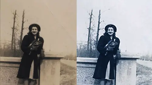
Let's say that we got into this photo. We did some retouching whatever kind of enhancement will want. What if we want to add color in? Because if you're restoring a photo, some people take old photos in colorized them well, problem with colorizing old photographs is usually it's pretty obvious you've done it, and reason for that is with most techniques. For adding color to an image is it adds the same amount of color across the whole area. You're doing it too. And if you look at a normal full color picture of trying to find one here when you look at a normal full color image, look at the brightest area of the skin you can see here and just ask yourself is there is much color in that brightest area of the skin as there is in the other areas and if I look right here this is a really bright area on the skin right here and there's very little color showing up it's nowhere near as much color is what is over here. Hi with most colorizing techniques. If this is a black might photo, we tried t...
o add color back in it's gonna put justus much color in that bright highlight is it does in this medium area, then also look at the dark parts. Where there's not much light hitting the skin look over here words in the shadows looking here works in the shadows may be on the side of his head is it anywhere near is colorful in those areas not really so let's see how we can cull arise get it to look a bit more natural in fact we'll take this color photograph I'll pull the color out of it and we'll try to put some color back in and therefore we can compare it to the normal image in order to be able to compare it I'm gonna work on either a duplicate layer or I'll only use adjustment layers one of the two just to make it simple duplicate the later therefore the bottom layer will always be the original being compared I'm gonna pull all the color out by just doing an adjustment that is called de saturate color's gone and then let's put some color back in now the first thing to do when you're colorizing any picture is you can click on your four round color and pick a color to paint with but if that's how you do it or you're just kind of get it off the top of your head just kind of guesstimating it's probably not going to look very good so the first thing I would do is open any full color photo of somebody that has a skin tone that's similar to what it is you want to reproduce and it doesn't have to be high quality photo doesn't have to be well composed or anything. All it needs is a reference color for you to look at, I'll just use part of original skin is my reference, and what you want to do is grab your eye dropper tool and just click on that skin so that your foreground color right here is the color you're trying to somewhat simulate. Then there are two primary methods for adding color to a black and white picture. The first thing you need to do is make sure that you're not in the mode called gray scale because we have a black and white picture it might be in gray scale mode, and if so, you can't add any color when you're in that mode. If you're in gray scale mode, just go to this menu and choose rgb rgb means full color where you could add colors, then here the two different techniques the first is you could create a brand new empty layer, and on that brand new empty layer you grab your paintbrush tool and simply pain. If I were just pain, you know how usually would completely cover up whatever's below, but wasn't there a menu right here we could play with? It wasn't their choice within that menu that would allow this color or whatever's in this layer toe on lee effect the color and therefore it wouldn't affect the brightness. Well, that's one way to colorize, but notice how much color it's putting in the bright part of the image where that highlight isthe it's a lot of color and how much is being put in here in the dark part it's a whole lot of color and the color doesn't vary it all because I'm not hearing what I'm paying with but that's okay, we can still make this look a lot better, but before I show you how to make it look better, let me show you the one other method for adding color. Now, that's too much. Of course, I could lower the opacity of the later. I'll just click on the word opacity and dragged to the left and I could say, well, let's only put in a little bit. This is seventy years about seventy percent that's looking like a colorized photo. So now let's, try the other method I could instead use an adjustment layer. I'm gonna cheat here and make a selection of where I've painted just so I don't have to create this election ahead of time, and I'll go to human saturation, inhuman saturation there's a check box right here called colorize if you turn on colorize, it will force red and your picture usually read the default setting is red, but since the last color I had is my four round color was not red, it chose something slightly different than it, but usually look like this. Then you could move the hugh slider to control the basic color that's being applied and you could you move the saturation slider to control hall of strong? It is and that's the other method for adding color, but with both of those methods usually end up with way too much color in the bright and dark areas, so let's, figure out how to fix it. First let's fix this one would think it looks ridiculous to fix it. We're going to go down to the letters fx and want to chose blending in hodgins remember this and what we're going to do is it's not really going to matter which of these two we work with, although in this case, I think the bottom one is actually what I'm going to use and what I'm going to do is pull this in. What that's going to do is say, take the areas that are in this brightness range in the underlying image and let them show through a breakthrough. Whatever's in this layer so this layer is applying colored in the image, and if I bring this over, it says, let the bright areas of what's underneath simply breakthrough. If I get it over far enough, do you start to see the highlights in her skin breaking through? We no longer see color on him. Well, I don't want to completely disappear there. I just wanted to be lessened and that's when you go over here to the slider and you split it in half but holding on option alton windows in point on it like this, that means slowly fade out. Don't abruptly breakthrough, sure, right here start to disappear, but then disappeared less and less and less as we get over. So now I'm going to mess with these and see if I can get it where it more gently goes into those highlights. Just bring this over and can you tell that less color it is being applied to that bright highlight? If you want to see without it, I'll turn off the preview checkbox before you see how much color is being applied after you see it's lessened. And now I'm going to do the same thing in the dark part of the picture by moving to the other side over here you could split it apart of the beginning if you want you just have to hold option to get her to split and I'm going to bring this over and I'm looking now at this area the dark area you know bring it over until I see the color to start to go away and you can even have these cross and I could bring the other side over there we go it's not too far not used to having these perfectly cover each other up like that click ok now that's thinking so we have a lot less in the shadows a lot less in the highlights and now the main thing we need to do is adjust the capacity to control how much color is going into the image and fine tune the color itself and this is where if I had a full color image I'd put it right next to this and compare the two we have painted this layer but I can adjust the color of the paint by going over here to human saturation the huge slaughter will control the basic color and I can shift it around to say what color might look best on her particular skin and then the opacity will control strong it isthe and I could do the exact same change if I was using the adjustment later, if I have that instead I go again to the letters fx choose blending options, and I do the exact same thing to say don't apply so much two shadows, and then I can work on that adjustment, which is that layer is active adjustment should be it right up here, and I confined to exactly what color is being applied and either saturation or opacity either one will control how strong it can be, and the other thing that I find to be useful is the problem with using the adjust claire approach is you get one color across the entire area. If you use the painting approach, it could be useful to use different colors here, where she would have a tan line where you she wouldn't be a cz bronze and color so I could paint a different color there. Ah, and use a different color where she is more deeply tanned to put it in. But if you don't use the blending moments where you can limit where the color shows up, then you end up with way too much color here, the dark part of the image in way too much color in the bright, any questions about the general idea of limiting how much is being applied to the highlights or to the showers? Would you use the card? Like she does have a tan line would you use that approach and just kind of flipped us those tan marks and fill it in with color or what you can do is remove the color because here if I turn this on do you see the color being pushed into where her can is uh we do that with a black and white in here and so I would come in here and possibly use the eraser tool or paint with a shade of gray and I can come in here and soft enough brush maybe with the eraser I do a twenty or thirty percent capacity and I just start a softer brush twenty percent capacity coming here just start the lesson how much is being put in there that's? Slightly small russian paying up a little further in less in a little bit or or put in a little bit more yellowish a little bit less of a bronze kind of color so it's a matter of freaking out and also be nice to people and not using the exact same color for their lips he look around people's lips so usually redder than it is for the rest of the face don't put the same color their skin as their gums or their teeth or their eyeballs and the more you spend the time to actually pick good colors for various areas and the more you very how much that how much color is used? The better it's going to look. But I mainly wanted to show you the, um
Class Materials
Bonus with Purchase
Ratings and Reviews
a Creativelive Student
Wow! That is pretty much what I thought about the course. It was my first live studio experience and it was fantastic! Ben is a great instructor because he presents the information in a straight forward manner that is understandable, detailed, and concise all at the same time. I have a couple of his other classes and the handbooks his wife creates are exemplary and make going back and reviewing the rebroadcast so much easier. Also, I want to give a shout off to the Creative Live team...Kudos! They are an excellent host...they are professional and fun at the same time! The content they produce has helped me tremendously to expand my knowledge and skills and mostly importantly they are affordable!
Wilson Blackwell
Super class! Ben is the best at explaining Photoshop and how to make full use of it. This class included techniques I've never seen or heard explained in other photo restoration classes I've taken. And the accompanying book, while I've only glimpsed through it so far, is expansive, well laid out, attractive, and looks to cover everything Ben went over in the class - it's a valuable resource as well (thank you, Karen Willmore, for all the effort you put in to produce a worthy complement to what Ben teaches.)
Old_Redeye
Ben is one of my favorite instructors on CreativeLive. (That's saying a LOT because they are all so good!). Besides being very thorough and understandable, Ben sets himself apart with two things. 1. He thoroughly demonstrates a process, then does a recap of all the steps he just took. That makes it much easier to remember. 2. His wife takes notes during the broadcast and creates a handbook which is available to download when you purchase the course. Some people find it easier to learn by reading than by re-watching the video. I like it because I can find information by using a word search. I feel so fortunate that I was able to sit in the audience for this class. It was great to be able to talk directly to the instructor and interact with the other students.