Creative Neural Filters
Lesson 3 from: Photoshop AI: Getting Started with Neural FiltersBen Willmore
Creative Neural Filters
Lesson 3 from: Photoshop AI: Getting Started with Neural FiltersBen Willmore
Lesson Info
3. Creative Neural Filters
Lessons
Lesson Info
Creative Neural Filters
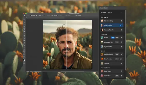
(upbeat music) There are two filters known as creative neural filters, and what they allow you to do is take the visual quality of one image and apply it to another. And it will allow you to literally change the time of day, it looks like a photo was taken in, or even the season. Going from spring, to fall, to winter, that type of thing. Or to add a stylistic look to your image. So if you would like to mimic the look of a famous painter, that type of thing, as long as you have an example image, then you can attempt to get Photoshop to change your picture to match. Let's take a look. I'll start off with a landscape. This is an image taken in the Grand Tetons. And if you look at it, you see how much greenery there is in here, there's only snow in the very top of the peaks, and so let's see if we can change that. I'll go to the filter menu, choose neural filters, and there you'll see that section called creative, and here we have the landscape mixer. I'm gonna turn on its little light s...
witch there and we can do this based on a photograph by choosing from one of Adobe's examples here or choosing a custom one of our own. Or you can just come down here and you have a series of sliders. And so if this is something where I want to change the time of day, it's already daytime, so I don't think increasing the amount of daylight there will help. But here we have night. And if I bring that up I might be able to get this scene to look as if it was captured later in the day. Possibly just a little hint of it might be a little more realistic and we can shift that a bit. But if I bring up something like sunset, it's gonna be of limited use because in order to make it look as if this was taken at sunset, it's gonna have to shift things around tremendously, and oftentimes you'll find the result doesn't quite have the detail. And just to be useful, to be useful because it looks a little too basic. If this was instead of being a large image, because this is a huge panorama, if it was instead sized to the internet where there's only a limited amount of detail available, then something like that could be useful. Here I'll bring up spring and let's see if anything changes. Here I'll bring up Autumn and let's see if we can get things to change. And yes, it looks like the greenery has disappeared, become more brown, because it's getting ready for winter. Bring that back down. But really what makes this fun is that you can tell it to match another photo. So I have another photo open and I like the general look of it. It's a little bit more dark and moody. So what I'm gonna do here is choose customs so I can work with my own images. And here there's a popup menu and I can choose from any other open image. Well, I think the other one was taken in Glacier National Park, so I'll choose it here. And we'll see a preview of it here and then it will change this image. And you take a look at the preview, you see how dark these areas are where it's harder to see detail, and only in the brightest highlights can we really see anything. Well, now we have a similar feel to our image. Or if I wanna choose from my hard drive, all I need to do is click on the folder icon and I believe I have an image right here. If I hit space bar on a Mac, I can get a preview taken at sunset in the bad lands and I'll say to use that image. The only problem with that is oftentimes it treats the sky differently from the rest of the image. In this case it's trying to preserve the blue in the sky, but it is giving us a lot of that warm feeling. And if you don't have your own images to work with, then just come over here to presets and here you will find things like images that were taken in the winter. Here's a nice snowy one. And if you click on it, you'll find it changed the look of the entire picture. But once again, these choices that are here and just this filter in general is only useful really for low resolution images. Because if I click okay, this is a supremely large image. Right now we're viewing it at only 8.33 percent. And if I zoom in on this image, it just does not have the detail anymore. If I turn off this neural filter, you can see the original image, it had a lot of detail. But when I zoom up on it and I turn on the neural filter, you'll find that the detail is largely gone. And so it really is limited in the size you can apply it to. So I would generally think of it as something that is about the size of an HDTV. Like that kind of 2000 pixel wide kind of range when this can be a useful filter. Let's switch to another image and there is one other feature you should know about. Let's come back up here to neural filters and let's go back to our landscape mixer and let's see if we might be able to make this look more a little bit more like autumn, where the colors would be different. And it does, but look at what it did to the subject here in the middle. The landscape mixer is only really going to recognize stuff that would usually be found in a landscape. So that means trees, mountains, green grass, that type of thing. And humans, it's not often going to, well not often, it's never going to really know what they are. So there is an option in here if I scroll down far enough, that's called preserve subject. And that's gonna do the equivalent to going up to the select menu where you find the choice of subject and it's going to attempt to not change it. So if you have a person standing in front of a landscape turning on preserved subject, it has the potential of bringing them back. But when it brings it back, it is not necessarily gonna make it look as if it matches whatever kind of change you've made here. So there's also a choice here called harmonize subject. And that ends up using the general idea behind another neural filter that is called harmonization, which tries to get the colors in one area to match a new background. So if I turn on harmonized subject, it will shift the colors in the hopes that it will better match the surroundings. You'll get mixed results with that. It really depends on what kind of change you're making, but now as I increase this, you might find the subject shifting a little bit along with it to better blend in with the newly changed background. If you don't like the look of it, just turn off the harmonized subject checkbox. But overall with the landscape mixer, you have the choice of matching to a photograph or simply moving these sliders to fine tune the results. And when you have it match a photograph like one of these, I'll bring down my autumn so we're only having one thing affected, but here you see how it's supposed to look like winter, you do have a strength slider as well. So if you only want it to look a hint like that, you can back off on it. Now let's try one other type of creative neural filter and let's head into style transfer. That's going to try to transform my image to make it look less like a photograph and more like a painting, drawing, or just stylized image. Now when you do that, you have different categories of things you can apply. You have artistic styles, which are here. You have image styles, here. And then you have custom, which is where you can feed it one of your own images. So if you have an example of a certain artist's drawing style, you could feed it an image such as that. I'm gonna go over to presets, choose the choice called image styles and scroll down and see if there's anything that looks like it could potentially be appropriate for a portrait. First, let's go with this one. This reminds me of the movie The Matrix. Let's see if we can get something that looks like the little green numbers and letters that they used in the movie The Matrix, but has a hint of this in it. I can see her eyes and her lips, even the shape of her hair. In order to get at this, to appear this way though, you have to have certain settings on the right side. Notice mine has style opacity set to 100. And that means that this particular stylization can completely replace the image, it won't be blended with it. Then we have a choice called strength. If I crank the strength up, you might find it to be much harder to see the image you started with within that. I can still get a hint of her eyes, maybe a hint of her shoulders, but if I need to see more, I might need to bring strength down. Here let's bring it down to a really low setting and now we're starting to let that show through a lot more. So just by experimenting with strength, I can decide how much do I want to really be able to get to see the original image within the results. And I need just enough where I can recognize the lips, the eyes, the general shape of the face, and so I think I need to be relatively low on strength. Then we have style opacity. If I bring that down, it's going to allow some of the original colors and details of the image to show through, so it could bring it down a considerable amount, then the effect is barely noticeable. Or bring it up a good amount to say how much of that really should take over the look of the image. And in my case, I want it so there's only a hint of the original image showing through, and instead it has primarily the look of that green look. Then we also have a choice called detail. Right now it's turned all the way up, let's bring it down a bit. And you see in this particular case it is scaling the effect that we're having. If I bring it up, we get really small details because the green effect is using small pieces. Bring it to a low setting and it's simply gonna scale up. And so I can decide exactly how big I'd like that to be. And so I'm just gonna experiment here and I'll show you my end result when I'm done. Then once you have it dialed in the way you like, you have brightness and saturation. So if your end result is a little on the dark side, I can bring up my brightness overall until I'm happy with it. And if it's a bit too colorful, I could bring down the saturation or boost it. But those are things you can always change after you leave the filter and just use Photoshop's adjustments to do so. Then there is the choice of preserving the color. If you do that, it will try to keep the color of the original image and it will only allow it to change the brightness. It can sometimes be interesting, but for me personally, I prefer to do that afterwards because I could then layer the original image on top of this and I could tell it to put in the original colors. But then instead of just having a checkbox like this, I could adjust the opacity to fine tune it. So I'm gonna put it at this particular setting and for now I'm gonna tell it that I want this to be on a new layer. So I'll have the original image on one layer, this on another. Although if I want to be able to change the settings, I'd want to have this set to smart filter, but I'm pretty happy with these settings. I'll click okay. Now you can see the original images underneath my effects are here. So I'm gonna take this original image, unlock it, and just put it on top. And then I can tell it to take the original colors from this. I do that by changing this menu to a choice called color, and that means use the colors from this and the brightness from what's below. But then I can lower the opacity and that will allow some of these colors to show through. So I'll just bring the opacity all the way down and then slowly bring it up to decide exactly how much of the original colors I want. And I think I want about that amount, where there's just a kind of a hint coming through. 30 percent. You can see the difference, here I'll turn it off. And then back on. The other option you would have is to paint on a mask. If you add a layer mask to this, you could paint with various opacity levels to control exactly how much of that color is allowed through. But I'm gonna choose undo a few times here to get back to my original picture, and let's head back in there and try a different choice when it comes to the style transfer. I'm going to again go over here to image styles and I thought I saw a black and white kind of pencil sketch look right about here. And let's see what that looks like. Let's see what happens that we preserve the color. And then I wanna see a little bit more of the original showing through, so I'll bring down the style opacity a bit to allow some of that original showing. And then let's experiment with the strength and the detail. So I'll try strength a little higher. And let's see if what happens if we lower detail, although I think that might become a little bit too basic in the stylization. Finally, the background here, I'm gonna try background blur. If I bring that up, it should soften the background of the image a bit so I can isolate it from the subject that I have. That's only gonna be useful if your subject is kind of obvious where Photoshop is able to really find it. Then overall this is too bright. So I can adjust my brightness, bring it down a bit. But in general, I'm not happy with it once I adjust the brightness, so I think what I'll need to do is simply blend in some of the original picture. That's not something I can do in here. Before I leave this, I'm gonna turn off preserve color just to see the difference, to see if I liked it or not. And I think I'll leave that on. Let's go in here and tell it to do that on a new layer and I'll click okay. Then underneath is the original picture. So what I can do is just work on this layer. I'm gonna add a layer mask and I'll choose a paintbrush tool. If I paint with black, I could hide this effect, but I probably don't want to hide it all the way. So what I wanna do is bring back some of the original image, to do so I'm gonna adjust the opacity. The last time I used it, I had it at 50 percent. That might be fine. I'm gonna click right here and I'm just gonna do this all in one paint stroke. Because if I let go of my mouse button, we wouldn't get just 50 percent, the next time I click, I would add up another 50 percent. So right now I'm doing this as a single paint stroke, keeping my mouse held down tightly, because if I let go and click again, it will delete more of the effect and that's not what I'm looking to have happen. And so I'm being a little bit on the careful side here. The alternative would be instead of painting with an opacity of 50, instead paint with 50 percent gray. So instead of painting with black, choose just a lighter shade. Then you can let go of your mouse button as many times as you want if you had your opacity at 100. And so there I've blended in a little bit of the original picture. If you wanna see without that, I can disable this mask by holding shift and clicking on it. Shift click a second time, you can have it come back in. And the other thing that can be useful is if you're not certain what opacity you want to paint with, let's say I wanna do something to her lips and teeth, I paint with black and it completely removes it here. If I then decide that that's too much, make sure you did that all in one paint stroke, then you can go to the edit menu and choose fade. And fade allows you to adjust the opacity of whatever it is you did last, separately. So I can bring it all the way down and I'll see what it looked like before I painted and I could slowly bring this up to decide exactly how much of that original do I want to have show through. In this case, 44 percent is what I like. I'll do it again with the eyes, bringing them back all the way. But I can't do both eyes because that would be two separate operations. When I go over here and choose fade, it's only the very last thing I did. If I let go of my mouse button, that's considered a step and so I have to do one eye at a time. And I kinda like it about here, 43 percent. Well then all I need to do is either type in 43 percent in my options bar for my opacity or when I fade this on the second eye, just type in the number, 43. So it's an even amount between the two eyes. Let's try this on a non-portrait image and see if we can turn this into something that looks a little bit more like a drawing. So again filter, neural filters. And we're going with style transfer. These artistic styles I've had limited success with because oftentimes they seem to interpret things oddly, like as mountains when I click on this one or just odd shapes it seems to introduce. I find the one called image styles, the ones in that category are a bit more useful for me. Like there we got a nice little appearance and let's just see how we might wanna blend it. We have strength, let's see if we want it to be much stronger where it takes over the image. And if we wanna blend in any of the original or I could put this all the way up and then there'd be no hint of the original. And then detail, do I want it to be more big chunky pieces or do I want it to be more small fine pieces. And I like more of the big chunky in this particular image. There we go. We can always see if blurring the background would help if it's able to detect where the subject is. In this case, I'm just kind of mixed where I might want to just go with a low amount. Let's see if preserved color helps. I don't mind the colors I was getting there, the little hint of blue. I do like it where the actual lighthouse is, but I like it turned off for the background. So let's figure out how we can mix those together. To mix them together, I'm gonna click okay here. This is gonna be on a new layer, so I'll have my original separate. I'm just gonna take that original image, I'm gonna put it on top, and then I'm gonna tell it here to use the original color, which means this choice called color. So now the color from the entire image is being applied to what's underneath, but I want it to only apply where the lighthouse is. So let's go to the select menu and see if it can find the subject of this photo, which to me is the lighthouse. It looks like it could. And then I'm gonna add a layer mask. When you add a layer mask, if you have a selection active, it ends up only keeping the area that's selected. So when I click the layer mask, now the color is only coming from that area where the lighthouse is. I might need to touch it up a little bit with the brush tool. If I just come in here, I can see a boat that's over here that changed. I'll just paint with black to say don't affect the boat. Like that and, if there's any other areas. You can always disable the mask if you hold on the shift key and click to see what would it look like with the original colors. Shift click again and see what it looks like when you get it back. My wife is actually in front of that lighthouse doing a yoga pose and I prefer the skin tone in her when it was original. So I'll come over here and I need to paint with white to allow the color to come through and I'll paint right where her hands, her face, are to get her skin tone to be able to come through. Like that. The other thing I might decide to do is bring back some of the detail in the lighthouse. To accomplish that, I would simply take this layer that is currently in color mode and duplicate it. I'll drag it down to the new layer icon. Now we have two copies of it. I'll set that second copy to normal mode, so you just blatantly see the lighthouse. And then I could either use a layer mask to paint in where I want this to appear, or I could simply lower the opacity and just allow a little more hint of the lighthouse to come through. What I think what I'll do is I'll click on the layer mask and then I'll come over here and paint with black wherever I want the full look of this effect. So what I would like is the full look up here where we have the top of the lighthouse all the way up to that area. And I want the full look down here where we got this kind of reddish area. So like where it hits the rest of the image, maybe where that door is, maybe in here. I'm just letting it hide this normal version of the image. And then I could make some of it show through in the rest. And I can do that by painting with a shade of gray. So if I paint with black, I will completely remove the original version of the image. If I paint with white, I bring it back. But if I click on my foreground color and I choose a shade of gray, let's say I go in here and I bring in maybe only about this much. If white means completely show up, black means completely disappear, this means show up at about a third of the way. Now I'm gonna come in and I'm gonna paint on this portion to allow some of that effect to come through. And since I'm painting with a shade of gray instead of lowering my opacity, therefore it doesn't matter if I let go of the mouse button, it is going to be the same amount regardless of where I paint. And I can bring that in. I can always change the shade of gray and say I want even more coming in, in some places. Here's about three quarters of the way coming in and we'll just put in a few areas that have that. And mix it in however much you'd like. If you really wanna see what you're doing, look in the layers panel, look at the mask. You can view the mask itself if you hold on the option key, that's alt in windows, and click within it. And this wherever it's black, you have the result of the filter we applied because that is what is found in the layer below. Wherever this is white, we have the original picture with no hint to the filter whatsoever. And wherever we have shades of gray, we have a mixture where the darker the shade of gray is, the more of the filter appears. The lighter the shade of gray is the more the original image appears. And so it is a mix. You can option click on the mask, alt clicking if you're in Windows a second time to go back to looking at this version. And that is style transfer. If you want to get more sophisticated with this, sometimes I end up applying more than one version of the filter. I'll simply duplicate the original image. And it might be that for areas like the sky and the water, I want the detail to be low, so we have these big shapes. But then when it comes to the area, like where my wife is and the lighthouse itself, maybe I want much smaller detail. So that slider called detail, I could apply it once with a lowest setting in one layer, once with a high setting on another. And then stack those two versions and use a mask to kind of mix the two and decide where do I want the higher detail and where do I want the lower. So those are the two neural filters that are in the creative category. Most of the time when I use them, I find I need to use more than just the filter. I need to combine that with multiple layers, some layer mass, maybe some blending modes to really get what I want. And that's why we spend a little bit of time giving you some idea of those other features, but there's a lot more you could do. It all depends on how much you know about the other features in Photoshop and how to use them together.
Class Materials
CLASS MATERIALS
Ratings and Reviews
Chris Evans
Introducing the brand new Neural Filters and the how to get the best out of them. Ben does this with his usual ease. The examples he uses are clear and precise and the extra tips he throws in are worth the price of admission alone! Brilliant class!!!
Audrey Agin
Oh Ben you are wonderful. I will have to watch this again. Parts are Medium to Advanced and that is what I am needing. These lessons showed so many different situations that a person may come across in their photography or restoring old photos. You also showed some work arounds! Most other teachers may mention something that the topic can also be applied to, but do not show how to do it. That is so frustrating! They stop short of giving a full lesson. You go deep into your lessons, I can always find info to help me out! Thank you!
Aston Moss
Great step by step instruction with some excellent ideas as to how to enhance and completely create images.