Adventure Photography Image Critique
Lesson 2 from: Photography Critique with Alex StrohlAlex Strohl
Adventure Photography Image Critique
Lesson 2 from: Photography Critique with Alex StrohlAlex Strohl
Lesson Info
2. Adventure Photography Image Critique
Lessons
Lesson Info
Adventure Photography Image Critique
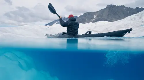
Speaking with the first image right here from the adventure category. So I love these kind of images because it's obviously shot with a zoom lens from, it seems like far away. Either from like another mountain or another rock. And I love these textured images where the rock plays a big role. I love putting on zoom lens because it allows you to see the world very differently. Like when you put on the zoom lens and you start like, 200, 400, it's like new things just popping up. So I love these kind of images. For this one it seems like it's a beautiful moment. Like the person has a nice move going on, the climber is in an extension. So I'd start with that, I feel like if you wanted to get it, you know, to improve that image, you could have had the climber had a, maybe a more aggressive move with the legs at least. But the color is right, like the climber is wearing a colorful color. Imagine if she was wearing black or gray, like this image wouldn't probably be here, like it's not the sam...
e. So props for the color. I'd say that maybe the image is a little to stirred to the, like the subject is too much on the left. Like if you look at the thirds, D for develop, you know like, I feel like the climber could be a little more towards the middle. Not in the middle, but more towards the middle. I feel like there's two big things going on, there's like this part of the image, really shiny with the climber. Then this middle part, that's cool. And then this right side that's even more interesting. But I kind of don't know where to look. Like I want to look here, then here, and then have this black mass that could have maybe edited out to bring more light into it. We can actually do it right now with this. And it's a jpeg so, it's not like we're doing a raw but at least, reset your filter double click on effect. We could have you know, brought a bit more light to that side to make it feel more balanced. And also there's a difficult decision to crop that side and you know, bring it to the climber again. Then it gets a little too tight, you know? I would have probably shot this image, probably wider. Or moved to the left so I can have the climber more to the middle and then this big dark side closer to it. And it's always ideal in the mountains to move like that. But that's my big thing is in, I mean the image is cool as it is I just wish the climber would be more towards the center of the image and there wouldn't be this division in the middle. That kind of doesn't do much. But up there is pretty tricky, it's not like you're sitting in a field and everything's perfect, right? So easier said than done. So that was from Ronen Golan. Next one, Adam Schmidt in, could be Washington. The Cascades or something. Beautiful day man. You just, when I see this image I want to go ski. I want to go skiing this same hill. First thing I notice before anything is the big sun flare. So probably with like a, some sort of polarizer filter. I'm not a big fan of sun flares, that's just a personal opinion. But if you're gonna have it, at least like, make it fit. Because the sun flare is cut in half, so I'm like, ah. Like you could have that, you could have just walked a little more back to have the, because that sun flare is cut because Adam was trying to fit the skier I'm assuming. So he could have just walked a little more backwards, had the skier wait, and then would have had the skier and the full sun flare up. So now we have my first thing. Otherwise, I find the sky to be, again, for my personal taste to be a little too saturated. And that's just again, really personal, but I would probably like, you know, clear a little bit of the saturation. And if it was a raw you could warm it up a bit. So this is gonna be terrible because it's a jpeg, but if it was a raw you could just warm up that sky area to just make it a little less blue. And you can also go play with the HSL here. There it is, play with toning. You could work with your blues, okay there it is. So you could also kill the saturation of your blue like this with the little color picker here. Or the hue, I would have probably made it a little more teal, that's again just super personal. But I wish it was a raw honestly. Because then it's messed up these colors down here. But otherwise, I like the image. I wish just Adam would have walked a little more backwards. So before and after but, when it's a jpeg, you know? Alright, there you go. I really like actually seeing this little cabin here on the side. Like I just saw it right now and it's such an important part of the photo but I'm just seeing it almost too late, so I'm guessing Adam was just trying to ski and took a couple photos while he was skiing, which is cool. But if he was out there to take photos, he would have probably done a different thing where you can integrate that cabin there, the sun, just work a little more on the concept. Next up, from Anthony. So, I don't know what's going on exactly. That thing is like a big kite. Somebody's flying the kite. So first I'm wondering what's going on with the image. I see that the sun is hidden with the wing, which is pretty cool. Like it makes the wing glow a lot, which I like. Seems like it was a fisheye lens that was used and the horizon is almost warped. Which I'm not a big fan of that, like seeing the horizon kind of rise on each side of the image. You can correct this pretty easily in Post. And also, big thing is I feel like the horizon is almost in the middle again. And it's maybe a little predictable. I probably would want to raise it to give this wing way more presence. If you look at the split, it doesn't show the crop. Yeah like it's, the subject is really centered, but then the wing is kind of to the left. If I were to shoot this image I would have probably gone closer and then had the person closer and then the wing more in the back. So play with the wind, to have this big wing behind the subject, otherwise the colors, I don't know what happened to the sand but it's really green. It's almost like muddy sand, so I'd say like work on the edit to make it a bit more natural. I would say and try to think about the concept, like what's going on because you have this person, this big kite. I mean super cool location, like the light in the kite is great. So I'd say hats of for that but I'm just not understanding it. Wow, this is really nice. From Ronen Golan, which was I think our climber. Second photo. So crazy location, wow. It's like the Himalayas or Peru, I don't know. But amazing. First thing I want to say is Ronen you did such a good job at having your climber wearing purple on your first photo that we saw and then now this hiker here is just like wearing gray, he's kind of melted in the trees here. I wish he was, gotta give this person like a better jacket, just more bright, to have him really stand out. Because I see the connection you're establishing with the river it's really cool, like have this mountain here and this river is leading to the subject. So that was really cool. But with the subject melting into, kind of blending into the trees it feels almost like an afterthought. So really cool location, I'd say the time of day probably wouldn't have take this time of day, looks like noon, very strong shadows and there's really no depth between these rocks here and this river here which is like, 20 miles away. I don't see any depth. And so probably shoot this in the morning or in the evening which is always tricky when you're in the mountains with a lot of logistics. But I mean the first thing I want to do here instinctively is. Reset this thing, I just want to darken a little bit, these rocks, just so this mountain's lit better. Just slightly, just so it looks, and then I probably want to invert this thing. I want to light up my values is what I want to to do. Big, okay, so, boom. Yeah, so there it is. So with this, this is called radial filter. So with it you gotta be very precise and very slow increments. But I just want to light up this value more because it's really insane this river. And to have spent way more time on it. But at least I want to show you that just by, this is before on the left and the after on the right. I feel like just like darkening the rocks give way more life to this part of the image. And then I would say yeah, shoot this, I mean imagine this at sunrise or sunset. Imagine the clouds and the mountains there. Really cool fog running on the sides. Next up, Dave Deublin. Really cool rock here on the left, I love this image. Really subtle edit, it almost looks like it wasn't even edited, very slightly, I love it. The sky is what it is. There isn't much going on. So it kind of works well though with the rock. Because the rock has such a good presence. I would have probably had here the hikers, again I love seeing people in context in landscapes, I probably would have had the hikers be a little more to the left. Not centered, but a little closer to the big rock here. Just so there's better balance between the two rocks. And see the foot tracks here on the right, really cool feature but I wish that the foot tracks would have left with where Dave was standing. Kind of, the foot tracks would lead you into the rocks, that would have made like, really outstanding. It's a great image, but that's what I would have done. So I don't know if this was planned or not, he was just there standing and this is luck, but that's how I'd improve it. Chamonix, France, home country. So this is a classic place. You take a cable car here and this is the view. Yeah, just thought of Chamonix, 10 minutes and you're here. Solid place. So all these guys here down there, they're either skiers, probably skiers in this time of year, mostly skiers they're gonna ski the Vallee Blanche which is a very long decent to Chamonix. Douglas I'd say that, I mean if you're gonna take this photo, which I've taken and a lot of people have taken, which is classic. If you want to make yours stand out, maybe come at a better time of day. I feel like there isn't much depth again. Like there's very cool shadows here but I wish like you could have shot it, like you see this is one mountain range right here, and then behind there's another one. This place is very special because of all the depth there is. Like you're looking north at the Alps. So you're seeing the whole chain behind you of the Alps from this privilege location and then you manage to make it look like it's all flat here. So I'd say if you come different times of day, and it's a cable car so you can take the first ride, I think it's at eight, which would have already better light than this, this looks like 10 o'clock. So you could have just woke up a little earlier and got in a way better photo. That's what I would say but what a place. Sarit Krupka, riding bikes. Well this image, I mean it's cool movement, I mean the first thing I see maybe it's because I'm picky but I'm seeing this, whatever this is. These rocks back here, so this a really quick cleanup job on Lightroom or PhotoShop. Not gonna venture down this path right now, but you could have cleaned it really fast. So I would have just cleaned up this and then, I mean it's a very basic rule in photography that you want to be looking at where your subject is looking. So this guy is looking to the outside of the image but there's no real breathing room between here and here. So there's way more room behind his helmet to the outside of the image than the opposite. So the natural way is like, we see this guy looking to his right shoulder, we also want to look here. But there isn't much, there isn't enough room. So I'd probably go with a simple crop. And then the photo's already super cropped. Like I don't think he shot it like this, it seems like it's been pretty cropped. But we're cropping it even more, but at this point. Alright this just like this, it's got more something to me. I wish you could also spend a while removing all these tracks behind, which are a bit confusing. But otherwise I'd say if you go back, probably get a better angle I'd say. Like what if he was a little closer to the rider here with a wide angle lens and you could, he was shooting the rider from I don't know a couple feet? Safe distance but closer and a little lower so we see like the mud flying into his lens. Different kind of shot but I'm saying if you're gonna shoot that, that's a way to make it look more interesting. Casey. I mean, I want to be there. That's the first thing I feel is I want to be where he is. This looks very comfortable and warm. I can feel the summer. So I'd say great location, again great choice of colors here. We got the red covered. I understand the connection, I wish the subject was looking up a little bit more up, in a natural way like at the sun, seems like he's just looking down at his phone or something, but I wish there was just like, a connection between the subject and the sun. Otherwise, I mean really cool shot. We're just picking here but it's, if I were to improve it I would just improve that and not much else. I like it as it is, I mean the edit is a bit surreal up there. So it's again, personal taste. I would probably like not go that purple up there. This looks really purple. But otherwise, it's a great shot. I wish the photographer was maybe a little higher, or lower, he's kind of between like, this line of horizon here is cutting our subject in a weird place. Like in the shoulders, it's not like the, it's not cutting the head, it's not cutting the knee here, so probably work on that, like, take a few test shots and see that if you're like, I would improve that. But great location, good image, nice. Tara. Another climbing shot. So first thing, I mean. The light is woo, noon again. Just like the guy that shot up in Chamonix. Really bright light, I mean first thing I want to do is just woo, like, I want to rest my eyes and lower this exposure, it just feels very bright. He was also on the wall, so that's good, he was trying to get to the action, he was maybe too far away from his subject with this lens. The subject seems like it's almost in focus. Yeah, really close to focus. It's really difficult when you're hanging off a wall with lenses and ropes but you could have just nailed that focus on the subject instead of the rock right here. So I'd say the focus is the first thing. But it doesn't really matter that much to me, like, where it's focused. Except when you're using a long lens you can really see like, where the mistakes were made. If it's a wide, it doesn't matter too much. I like the little trees behind, but yeah again, I would shoot at a different time of day. Just to get softer shadows, like the sun is really, I mean it's almost like this rock is a mirror, it's really strong. Matt. Good vibes, yeah it's nice. I want to be there too. I'd say that the sky looks almost too bright compared to the ground. Like he probably did like a long exposure. We don't see the specs here, like a long exposure of 30 seconds or something, because the stars aren't moving too much, so probably like under 30 seconds. But I wish that the sky was a little darker. I don't know why because when we, naturally when we look at the sky outside, it's dark. And the fire is bright. So when I do images I try to replicate what I'm seeing, this is the way nature is, like if the fire is bright and the sky is dark, I want the image to show that. Otherwise it looks a bit weird. A little bit fabricated. So I would just try to make this, just the sky darker. And maybe a little bluer. See how much we can do it like, yeah. And you gotta be careful with the tree because it's gonna get really dark as well. See just like adding a little bit of darkness to the sky I think gives more importance to the scene behind that's unfolding, these guys with the fire. So the sky is really important, but what's happening down the sky, I think is more important. Is our guys just chilling there. So I would say either do multiple exposures on camera, like do three exposures and then layer them in Lightroom, it's pretty easy nowadays, and just get that sky a little more natural. And also when we're looking at colors which is a big deal for me is this feels a bit red, like copper down here, I don't know why it's copper. Probably like a decision with the edit. But the campfire doesn't have this color in my backyard. I'd just go something a little warmer. It's also beautiful contrast, the warm of the fire and the blue of the sky. So he had all the ingredients, everything great, he just like, maybe the edit he could have just done better, or, and the capture with the sky. But nice. Giles, yeah speaking of colors. I mean it's a beautiful place, like I don't know, the Sahara or, sort of Dubai, Empty Quarter. It's a beautiful place but, the colors, you know the sand is really green. That's all I'm seeing, I see a rider here so very cool, it's probably like a drone image he had or from a little plane, fixed wing. Beautiful shadow behind the dunes, that's great. I'm trying to think why is the rider there? Like I almost would want, we have all this horizon there that's not serving much purpose. Like I'll almost maybe just go full on pattern on this one. Have my rider close to my thirds and, because that horizon isn't doing much. Even worse, I'm seeing a road. So it's adding this context that's not necessary to this image. Like this is like wow full on adventure, and then we have this road here, it's like oh well, I guess it's a bit more civilized than I thought so. Photography allows you to just create these worlds, so take advantage of it. Just crop it and make it look like these guys are crossing the desert. Like Lawrence in Arabia or something. And then yeah, colors. Let's see if we can save something here. But I wasn't there, so I don't know exactly what color the sand was but just, oof, this feels a little more, we're salvaging at this point. But this feels a little more natural to me, like the sand should be. And see how much yellow we removed from it. Alright, next up. Kalos. It's a really cute scene unfolding here on the right. That's what I'm seeing, there's a dog, there's a baby, probably like a family photo. So it's great, I mean I think it's good to shoot photos of your family like this. I like to do that. I'd say first thing, I just want to fix the horizon because it's not straight, now it's better. Then I'm kind of wondering what's going on between this big mountain here and my subjects here. Like, I almost feel like, you know I just want to crop way more like I feel like this image, everything happens between this tree here, so from here to here, there's my image. It's a portrait. I don't know what this is doing here. It shows the context, but I don't think I really need this. We have this beautiful mountain actually here really well centered between the trees here, so I feel like my context is happening here. So I would have just gone portrait. A lot of people get locked down in this wide thing, always wide wide wide, but this is a right time for a portrait. And maybe get a bit more foreground from this grass here too, leading to the subject. There's this nice crack in the rock leading to them, so. And yeah, then there's the time of day again, that's my big beef is shooting at sunset or sunrise or when the light's a little softer or weather's cloudy. Dave as well. This picture, really nice, I love this part of the coast. I really like the depth between here and there. Composition wise, again, it seems like Dave likes to have his subjects really on the right side of the images, that's his thing. And they're always too dangerously close to the edge for me. And it's a big deal when you're framing. Like imagine if there was, we don't want to crop out this beautiful coastline, but imagine if it was stood just behind the subject and, because it's a nice connection between the subject here and the horizon. So if we would have just had that better, if Dave would have stood to the right and behind the subject here, I think he could have got a solid shot. Because beautiful light, he's shooting at the right time of day, nice view behind. Little blanket, looks really cozy. I would maybe hide the hood behind the, you know if we're getting technical hide the hood behind the blanket, but yeah, just the framing here.
Ratings and Reviews
Ron Boger
Alex's class is spot on for learning proper technique and process. Alex is a fantastic story teller with his images. How cool is it he shares his insight with us and our images! So glad I came across this offering from CreativeLive and Alex Strohl.
shelley
Wonderful class! Thank you for your critique on my photo!