Lessons
Day 1
1Introduction
37:33 2Why Do Expressive Painting
21:39 3Adobe Bridge Setup & Image Optimizing
27:03 4Jack's Painting Presets
15:18 5Enhancing Source Images
24:01 6Photo Hand Tinting & Workflow Options
26:23 7Working with Brushes & Palettes - Part 1
20:10Working with Brushes & Palettes - Part 2
37:59 9Pattern Stamp Tool & Watercoloring - Part 1
22:08 10Pattern Stamp Tool & Watercoloring - Part 2
13:58 11Enhancing Methods of Watercolor Image
27:33 12Creating Repeating Patterns
17:14 13Actions, Layers & Filters for Sketching
24:50 14Accessing Jack's Free Basic Presets
06:32 15Smart Objects & Oil Paint Filter
34:10 16Inverted Mask Trick & Q&A
13:00 17Q&A
10:22 18Mixer Brush & Parameters
21:27 19Jack's Brushes & Brush Strokes
15:20 20Secrets of the Mixer Brush
20:05 21Still Life Painting with Mixer Brush
28:27 22Still Life Underpainting
30:32 23Final Blending of a Still Life
25:17 24Print Discussion with Q&A
09:28 25Snapshots for Painted Portraits
15:19 26Painted Signature Stamps
10:15 27Simple Portrait with Mixer Brush
53:01 28Pet Portrait Overview
08:42 29Enhancing in Camera Raw & Lightroom
35:28 30Painting a Pet Portrait
1:17:41 31Pet Portrait: Final Blending
13:41 32Photo Prep for Watercolor Painting
17:36 33Watercolor Painting of a Flower
36:27 34More Enhancing & Embellishing of Images
28:04 35The Liquify Tool & Sketching
39:12 36Comic Book Action & Watercoloring
15:22 37Changing Image Aspect Ratio
11:55 38Framing Effects & 3rd Party Apps
16:39 393rd Party Painting Filters
23:56 40Final Q & A
15:54Day 2
Day 3
Lesson Info
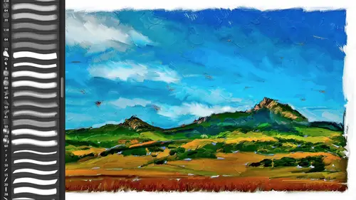
Still Life Underpainting
What I want to do is do that under painting okay? Because at this point, if I could come up with that under painting and where it shows up it's going toe again effect where I'm doing the painting and I could do the underpinning before I start, but I seem to like it at this stage at the game and it's not part of my action because it's really something that I do most painters don't do ah complimentary under painting to it or any under painting um the simplest under painting you could do right now if you come over here to this pattern, phil, we talked about yesterday different ways that you can change a layer, any layer, even these phil layers by taking advantage of these effects, what are known as layer style so I could do a color overlay and I could come up here and especially if I said it too like multiply I'm in color overlay right now I now have a grey canvas and you'll notice that now I'm working on a gray ground and the white pops muchmore because I'm working on a great ground I ca...
n go if I want to, I can get really expressive and now I've gotta read under painting, which I love just forget the cold complimentary thing you just want to freak out and have a red burgundy under painting and you can see how that's going to make the colors pop out and you can see why I ended because having a little bit of that color makes a big difference so that is putting in a colored ground and because remember, I've got a phil layer, right? So I've got my canvas texture, so I'm getting that even though I'm going to cover most of it it's still there? How my coloring that did that'll quick but that's a refresher from yesterday I've got my pattern feel this could be any layer in the world I'm taking advantage of the fact that every layer in the world can have a layer effects known as a layer style applied to it. One of the layer styles one of the effects is color overlay and color overlay. As with everything in the layer styles, palette has opacity and blend moated as its disposal so blend mode specifically multiply multiply is like taking two thirty five millimeter slides and put them in the same slot in a slide carousel and projecting them on the wall. The problem with that analogy is nobody in the world knows what a slide is, nor do they know what a slide projector is, let alone everything else so kind of hard to come up with a natural analogy these days, since nobody knows what a slide carousel is but anyway, so um if you really nice asked me about my layer style library, I will tell you one thing right here this right here, a lot of people don't know that where it says stiles seems like a label that actually shows you all your built in layers styles. These are the ones built into photoshopped clicking over here in the upper right. I told you also, that wherever you want to augment or extend any thing in photoshopped, you simply just come up here and click on it. Here are my twenty libraries of layer styles, probably five hundred layer styles, twenty different libraries from photographic ones for edges framing, tinting, coloring, darkroom grain texture going into, uh, dimensional ones for typography, chrome, metal, glass, jim plastic would rock organic. The organic ones are fills organic fields, fabric fills no, actually, those are organic, still dimensional fabric stroke halo and then, uh, fabric ones and then halo glow button styles. The halo ones are good for, like water marking and stuff anyway, like I said, don't get me started it's your fault I didn't it's not like I'm getting off track color overlay, I chose a color and I'm good to go in this case, I'm not going to use read, so I'm gonna cancel out of here, it's back to the white and I'm going to do this complimentary because I want different colors the idea of putting the opposite of the color spectrum behind one color to make that pop is what we're talking about so how can we do this but there's a few different ways that you can, um do an under color painting in here? And I think I'm going to do the simple way of doing it um because it's barely going to be visible it's only going to be these little tini pinholes of color throughout your image rather than actually painting a complimentary one I could actually come underneath here take my regular color and I could just paint the opposite on the color wheel and I could paint in hand one the thing is is that I've already gotten all my colors right here in this image, okay? And by the way, when you see me doing this when I'm automatically ableto hide every single layer except for one if you hold down the option key on the mac or all can the pc that's a toggle between everything you currently have visible and what if you're clicking on? So if you didn't know that that's a really, really useful um, feature, so I've already got my entire painting right here, right? I'm not even going teo I'm not using this right that's just a reference don't really need it it's really easy for me to make a complimentary color from this photograph I just do command I now command I did that actually invert the colors of the image it really didn't what that did is it made a negative of it as if it was a negative in a camera so it is a negative what was a positive became a negative we really don't want to do this okay and see what this looks like in terms of the colors it inverted my tone as well as my colors what I want to do is come up here to image adjustments hugh saturation and what I want to do is I want to shift the colors of my image on the color wheel this right here in hugh goes from red to red this is actually a three hundred sixty degree color world that's been split and put on edge so and it's yugo not quite sure where that line is basically all the colors when you're in that this master version of hugh saturation is all the colors in your image. So if I take what is right now sayin blue as you'll see here and if I move it one hundred and eighty degrees that sayin blue is now or in dread okay she'll notice that I am getting the opposite of the color wheel but it's not inverting the tone all I'm doing is inverting the color want to come down here guess what it's exactly the same color at plus one eighty as minus one eighty because it's a color wheel okay, so one there's a couple things we could do with that is one you can say what you know what I really I don't need it to be exactly hundred eighty degree I liked it to be more red and blue so you khun doesn't have to be the complete switch of the color wheel so I'm going to use this is mai under painting is a red thing red hut so now it's going to be green the grass will have a nice blue behind it um and I'm gonna have a nice red throughout the mountain so it's not a complete opposite of the color wheel one other thing to keep in mind here when you mix red and blue what color do you get yellow and blue yellow and blue green, huh? No wrong and I just had to do that because you're thinking the primary colors of reflective light of science yellow and magenta you're thinking of the crayons you were born with the computer uses red green blue there's not even a yellow what your disposal to make a color so you're already in oz with dealing with colors when you're switching the colors one hundred eighty degrees it's the hundred eighty degrees of the red green blue color spectrum not the scion yellow magenta spectrum the real colors the rial primary colors of your crayons or scion yellow magenta not red, yellow blue you think we think of his red, yellow blue they're really not it's science yellow, magenta, red, green and blue are the primaries of the computer all that's to say if you really want to get anal retentive about this, you can convert this document into c m y k reflective primary colors and then when you invert the colors, you're going to get the true what you normally think of as and inverted spectrum so we're not going to get into that now but just isn't aside there's nothing stopping you from going up here image mode and go into c, m y k or lab or whatever and colors work differently in those moz okay, which I love if you're going to use a half tone I've given you guys a half tone filter to make comic books as part of that action it goes rgb converts your image into c m y k creates a c m y k have tone pattern converts it back into rgb you don't even know it anyway, okay tonight digress there just a little bit way had a question about that so you just covered it oh good, good, good, good yeah, I yeah I s p was going on that I do a preemptive answer's probably somebody was asking about brian regan in comedy as well answer that as well. Ok, so back here back here we're now the refining the oh no we were at the sorry we were at are doing the inverted color range our background painting so back over here we go into shoes saturation I'm going to shift it down here so kind of red and blues kind of like that right there that I just need to drag up above my, um painting canvas and now I'm looking through to my inverted colors and now there's my campus as well so I just did there is my inverted color scheme and now you can see why I do it at this stage um because now I can kind of see how that's doing how the blue is interacting with the greens and the roads and I can see the you know, mountains and stuff like that. So this is my complimentary color ground method of painting if you use this, you owe me money um no, but you'll come up with your own things that's the great thing about this now you're going excuse me, I'm going to say that this right here is actually the photograph that's underneath yes it is when we get to the blending and everything else mode it's not going to really make a difference especially once we time we add our little brush strokes but if you want to at this stage you could take your regular good old mixer brush, which I've also given to you you could take that mixer and just smudge this around you could do a cosy and blur on here you could use that filter um ah blur and you can do your medium blur you could do a smart blur let's do our median we use this before remember median is what we used that's part of my action that simplifies the photograph for that oil paint filter so I could come up here and I could use median and that's going to automatically get rid of all the subtleties leaving a razor edge um edge whatever you want to do, how far you want to paint it ah lot of real painters they're going to come up here and they're gonna want to really paint that so there are brush strokes, so if it shows through, you see a brushstroke knowing that I've got up here my mixing stage where I'm going to blend images in that's when I'm gonna worry about it. So at this point and for this class, I'm not going to, but oftentimes I'll do a real under painting that's up to you if I didn't just for giggles the blender you'll notice blender automatically turns on the samples, so this right here is where I could do that under painting if I wanted to have the brush jokes there's no reason for me not to show you so this is you know how quickly you could dio the under painting if you really wanted breast strokes in there now I've got breast strokes they know that's gonna be the other people going he's not really in your painting and I hate it when people wind okay so you get the idea so there is that in again of course you can continue to change that okay back here and now we're here and back to now my new customized oil brush too which is taking advantage of my directional source on this pen okay and I am going to turn on my references I'm going to turn on both of them I don't really need that pan but when you use the photograph just because some of you may not be as familiar with it one thing that I want to emphasize is there's this volcanic peak that stands out on the side you're always thinking about why you're doing your story what is it about the story that makes it unique? It's the puppy dog's eyes it's this little portion of the little toy it's this area of your landscape it's this cliff which is famous so again you're not scribbling you're coming up here and you are telling a story so this edge right here which is gonna be a little bit hard to tell okay, this edge right here is, um for me making this volcanic peaks stand out and this shadow side of it is really important to me so I'm going to come up here and emphasize this and this little ridge is important to me because that helps it blend into this base and this blue over here of this shadowed portion is really important to me. So this is how I would paint it. I would be looking at my reference photograph and shaping this based upon that you go do that's ugly a sin trust me, it's going to get better especially when we start blending these colors together I've purposely made this brush to be as fast in his response it is possible you could do a huge painting with this and it's going to keep up with you. Okay, so again I'm gonna come up here and I'm gonna start doing now I can come up and follow the contours of the, uh valley here, keeping in mind that I'm a wanted have some little you know gaps. The nice thing is with that under painting you could you know, theoretically there's nothing stopping using layer masks and things like that too um put in your under color after the fact you can really cheat if you want, just as you could come back in and put in red highlights you know, in a regular painting and again for you all this is what I'm doing here you're going I don't see where you're going with this this is just doing the line work so you can kind of barely see it so that's why I'm kind of making this so you can see what we're doing here and I'm gonna keep going because well, I want to do several different paintings in here so since I've given you a rough one I like this ridge this ridge is really floats my boat here but I need to keep turning it off because you're not seeing what I'm doing here okay? So that is this the light is coming it down into the valley right here some lighting that up this right here emphasizing the shadow on this portion of the mountain this is also why it's so fun because if all you were doing was scribbling which again is a lot what we're doing with the art history brush and even with the pattern stamp you're never going to feel that you are interacting with the area you're not sculpting it like you would a real painting and that really is one of the most exciting things about it is that you are doing this just like you would do a real painting except obviously if I was doing this much painting every time that I needed to stop and clean my brush okay are you know, check my reference photograph since I'm just really trade this is really cheating but you're cheating in a way that is a cz close to giving me the thrill the you know, the interest in real painting as you could possibly get because it's the it's the control of me telling the story that I want and yet it's also may being a complete lazy you know, troll and um having it do all this amazing work for me okay, so we're just going to say that is right now good enough questions concerns considerations see uh yeah, we do have one question here uh we have a question ask why didn't you use the paint layer resource one percent file to do the hue of alteration why the photo at one hundred percent and that's from swamp for the photo alteration for the under color for the under painting probably um one could I could have if I wanted to it's actually is an interesting thing one I wanted the entire canvas covered so I didn't want to paint it so by using I already have the photograph, I just shift to hugh and I've got the entire thing done, so if I want to paint it from scratch, I certainly could um so that's why it's there and I'm not using it so just going up there the interesting question though about that is, could you? And this kind of brings us back to what I had mentioned before let's put that back in there, take this reference, put that underneath this painting that has got the one percent in there. All right, that is one percent. So the person saying, couldn't you come up here and come up and take that? Hugh, put that over here and now what's gonna happen when I paint on this that's awesome! So now I'm doing an under painting based upon that I can't paint over paint remember, once I've painted, so I get a little crazy here, just a little, little, little crazy. Um, but could you use the one percent now that you understand it? What I love? The fact of that question is that the person is thinking in the technology, you're thinking how this works, and I've never thought of that right now I never would've thought of I've thought about inverting the colors and making warm or cool, but for the under color, too. First, you have to figure out what you want, so you'd still have to do it on the original. So you really haven't saved any time the fact that you already had to figure it out by looking at something and going okay, it's a shift of the huo over this much and now I'm going to memorize that number and now I'm gonna not do it on the original but do it on a copy of the one percent it actually ad's multiple steps to do what I just did, but I kind of like it because it's really quick under painting like I much might d'oh you really when you do under paintings, you're doing washes thes giant washes that are going to show through your painting, so from that standpoint, I like it I like it even better than, you know, showing my original from up artistic standpoint, so I love that question it's awesome! I'm gonna put it back down here because this one covers up everything that's an awesome, awesome question. So this right here, those of the refining sze that I did on this layer remember we're moving up the scale here is our rough blocking in shapes here is putting in details where I'm just kind of start refining the things that are important that peak the valley ridge is those things like that? Maybe I'll come up here and add the, um some highlights in the clouds okay, so this is all in there find yes that I see that hand, so how are you adding the highlights? Are you painting with white or are you going to the under layer and picking up the white the white is just any other like any other color in my original since it's coming from the original photograph, the original photograph has white so I can paint with white that brings up a good deal uh, good point as well if I want to clean up, start clean these up because white is in my original, I can clean up these edges a little bit that are going off the side because my original has white there so it's just a ziff I had come in here and either smudged off took my little turpentine rag that I always have with me because you guys are real painters and I'm now painting, you know, with with white and so again I'm starting to do that edge so I can do that as well. Great questions. Okay, so let's refine painting detail, I'm not going to finish off this painting um completely, but we're gonna come up here and I am going to do a little bit more turn on those reds. I'm still using the same brush let's actually go ahead and turn on my, um detail brush lands not going, I'm going, I'm going to keep using the two at a smaller size since I got a bug in my solid color brush I don't want to risk these again for those of you following along at home because these air there are so many steps, so now we're finding details, so I'm going to come up here and that mountain ridge I'm actually going to come up here and do that ridge want to come up here and kind of sculpt in the the whites and darks around that edge, so it really reads as the profile of the valley, but as I mentioned, that action literally has over one hundred steps to it some of them quite elaborate, like where I have to take your original change its color and tone do the one percent blended back down and then throw rant threw away that copy that I made of the lighter or darker tone and continue on that process quite a bit of programming even though I know no program and it can't do programming I've ended up being a programmer because there's no way you can write a script as it were for all these stages without having enough of a analytical brain where you're going to be able to go um we're gonna be able to, uh, you know, keep track of all that stuff that's that was my disclaimer, though, that if there's a bug in certain things, uh, I'm doing my best okay, so let's see here so now I'm going details and we're going to say that that is good for now because now what I'm going to dio is and again you don't need to look at any reference if there's anything that you want it's going toe pull up that color on each one of these layers it's always going to go back to my original so if I want to come up here you know and do something that's even a little bit more expressive I can do that there's nothing stopping me from, you know, doing that so I kind of like that, okay? You can see where we're starting to get in here final highlights this is that one that I mentioned is a lighter version of your complete image I'm going to keep using the same brush I don't need toe change it to anything let's get rid of that I'll keep that obnoxious green highlight on just so you can follow where my cursor is sometimes so now this is going to be let's turn it off just so you can see it. This is a lighter version of that same photograph, so I'm gonna because I want to emphasize the light direction on this thing I've already exaggerated by using that things like clarity, but by coming in here I'm able to, you know, adm or highlights where I want them to be okay, I'm gonna come up here and I'm going to exaggerate he's going to see that they the cliff here is going to be exaggerated because I'm coming in here where the highlight just like I would do in the real world I would not be concerned with that my source photograph really didn't have you know it wasn't this contrast in terms of that I used the clarity I use whatever I want at my disposal teo um tell the story that I want that's in my heart as it were okay okay. And then this ridge like I said, I'm gonna come up here and hit this ridge much like I would do with a riel paintbrush so what I just did and again you go to that still not still not floated my boat wait wait for it. Wait for it! The um the blending of these different brushstrokes is where it really is the secret is the magic secret sauce okay? And this any other questions on the studio audience? This little trail emphasized this. Well, I love the path here and it's woven and its war in the tire treads are permission to come up from seem rudely who said is it pronounced it how is it pronounced guest? So just just so just so I thought that jessi pattern was on top so what is the canvas in the pattern? Fill one layer for the one right above the back of folder very very good question because I'm completely covering it it's not really doing anything, so answer a question it's more or less uh, there if something were to show through, um it's infinitely more important, something like a watercolor that is inherently translucent you're seeing it right here if we look at it where I haven't painted, the texture is coming in, but in terms of what, in the final analysis when I'm all done with this painting it's gonna have virtually no effect whatsoever. It is not being applied on top of the paint. You're absolutely right. That's what's going to come up here so very, very good point it is it's a conceptual thing right now rather than any practical addition to the photograph is just happens to be that, you know, that's where I started with if I wanted to and here are my final highlights, okay, um, if I wanted to have just a colored ground where I'm leaving, this is not my under color, but I'm actually do using a colored canvas, then it would be really important that I as I started off when I use that layer style, it would be really important because I'm purposely leaving gaps in the painting to show that canvas texture, so even in this case, it might be incredibly important um, if I was using that technique rather than painting there, so I was wondering if you could just show each layer individually real quick just to sure everyone an idea recap of what we did so here is our blank canvas here is that rough under painting? Here it is by itself. Of course the checkerboard is where there has been no painting the transparency here it is with the under painting ok coming up here and that's those gaps being filled by that here is back with the paper turned on. You can see that I've almost painted white all the way around so there's very little of that showing to begin with here so there's the under color there is the refining, the detail this is where I'm coming in and I'm just refining the shapes of my object. Here is the more details a little bit maurin here in terms of that shaping of the peak this is that going to shape the ridge of the the mountain range in relationship to the sky, putting more highlights? Here are the highlights by themselves these air going to be this is the tone on the ridge this the street I'm doing the light on the hut a little bit of the mohr of our little peak here and turning them all on an order under color rough, refine, refine details, refined highlights and now I'm going to do final shadows okay, so and now I'm gonna turn back on my photograph now I'm going to do the opposite of what I did before in the sense of now I'm gonna come in and hit those shadows now if you really did your enhancing stage um as part of that first step when we were in adobe camera raw or in light room you could say, well, I've already done the contrast as much as I want and when I did the painting then technically um each one of your strokes is exactly what you want I like disability and and oftentimes I don't use the shadow as much as I'm doing now um but I like having that ability to come back in and shape it the way I want after the fact of how contrast you want and of course subtlety is nowhere near in my vocabulary so that's why it gives me you know, more control and the nice thing is because it's just a darker version it's not black I'm not painting in these you know, black details what I'm doing is I'm just you know, adding a little bit along this road if I want where I've just painted in highlight here okay? By putting that in there I'm adding to exaggerate the tone ality of the mountains and again, if I come up here and here I'm goingto exaggerate the shadow underneath thie um lip of the hut over here and that just allowed me to exaggerate that shadow. Okay, so for me, that it's just, you know, really cool. And also don't exaggerate the shape of this bush, which is really just a scrub. And by adding a little bit more to it, I can give it, you know, a little bit more shape.
Class Materials
bonus material with purchase
Ratings and Reviews
Shannon
Okay, I'll be first. Jack has an easy, approachable way of teaching. It was more like being in the room with him, watching over his shoulder as he created something utterly new and exciting. Even when he worked on images he had done many times, I never sensed boredom or a lack of enthusiasm. He was patient with questions and answered them completely. I hope Jack enjoyed this way of teaching as much as the world enjoyed watching. Maybe he'll find more to share. I know I'll sign up for his next one. This workshop inspired me to start creating art again. I'm slowly losing my sight and sad to say, I was starting to let it get to me. As I watched Jack, I tried just a few things and realized that I can do this. Digital art is much easier for me than pencil and paper because of the technology. I miss the pencil and paper drawing, of course, but this is so much FUN! The techniques that Jack shared are wonderful and the results rockin' ... or as Jack says, bitchin'. Thanks to Jack and creativeLIVE I'm back in my head in a good way.
a Creativelive Student
Thank you Jack Davis. Having tried to paint, both in the real and digital worlds, this is the first time I have seen a comprehensive demonstration of the techniques and philosophy for the artist. This course is valuable for any aspiring artist, digital or otherwise. By the way thank you CreativeLIVE for the long form training space you offer both the teachers and students. Jack is inspirational, talented and sometimes funny. Watching him paint in real time is by far the most impressive sight but the information about why is more valuable. Overall this course will give you ideas, knowledge and skills (if you practice). I highly recommend this course for anyone that has tried to paint in the past and was underwhelmed by the results.