Lessons
Day 1
1Introduction
37:33 2Why Do Expressive Painting
21:39 3Adobe Bridge Setup & Image Optimizing
27:03 4Jack's Painting Presets
15:18 5Enhancing Source Images
24:01 6Photo Hand Tinting & Workflow Options
26:23 7Working with Brushes & Palettes - Part 1
20:10Working with Brushes & Palettes - Part 2
37:59 9Pattern Stamp Tool & Watercoloring - Part 1
22:08 10Pattern Stamp Tool & Watercoloring - Part 2
13:58 11Enhancing Methods of Watercolor Image
27:33 12Creating Repeating Patterns
17:14 13Actions, Layers & Filters for Sketching
24:50 14Accessing Jack's Free Basic Presets
06:32 15Smart Objects & Oil Paint Filter
34:10 16Inverted Mask Trick & Q&A
13:00 17Q&A
10:22 18Mixer Brush & Parameters
21:27 19Jack's Brushes & Brush Strokes
15:20 20Secrets of the Mixer Brush
20:05 21Still Life Painting with Mixer Brush
28:27 22Still Life Underpainting
30:32 23Final Blending of a Still Life
25:17 24Print Discussion with Q&A
09:28 25Snapshots for Painted Portraits
15:19 26Painted Signature Stamps
10:15 27Simple Portrait with Mixer Brush
53:01 28Pet Portrait Overview
08:42 29Enhancing in Camera Raw & Lightroom
35:28 30Painting a Pet Portrait
1:17:41 31Pet Portrait: Final Blending
13:41 32Photo Prep for Watercolor Painting
17:36 33Watercolor Painting of a Flower
36:27 34More Enhancing & Embellishing of Images
28:04 35The Liquify Tool & Sketching
39:12 36Comic Book Action & Watercoloring
15:22 37Changing Image Aspect Ratio
11:55 38Framing Effects & 3rd Party Apps
16:39 393rd Party Painting Filters
23:56 40Final Q & A
15:54Day 2
Day 3
Lesson Info
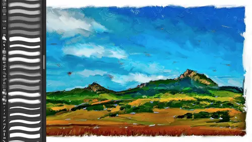
Enhancing Methods of Watercolor Image
Let's, go onto thie back to what we started that outline about doing our painting. We did our enhancing of the photograph, we made our paper and our textures and our brush. We loaded the photograph into the brush in this case by making a pattern up here and then loading it into the brush. We did our initial painting in this case, we've done it on several different layers for both density and some, um, detail. Now we're going to enhance it enhance could be a number of things in this case of a water color, the thing that I want to really exaggerate, even though we're getting some pigment pulling along the edge. Um, we're not getting a lot it's a pretty subtle thing remember, wet edges is turned on inside our brushes here, this wet edges is what's giving us our little buildup of paint along the edges, so I want to exaggerate that, and I want to do that with a filter, and there are, um, a couple filters that you could use for this you could actually use on sharp mask. You could actually us...
e high pass on it, but I use one called photocopy it's, part of the now what's known as the filter gallery, so it's a little bit harder to find. Um and it's one of the things that I've given you a preset for specifically in action as part of those ones that you can download so I'm for now I'm just going to show you because we haven't run in action yet this edge enhance will go to extreme so wow paint edge enhance extreme we have subtle and we have, um an m boss, imposture and boss, subtle and with canvas, so when we do to an oil, there are other ways of doing an edge and mention that's one of our main enhancing this case, this one right here is for watercolor is it for the things will go for extreme since I can't reach the button will use the shortcut that is commander control double click on any action will play it all my actions are nice and friendly and we'll tell you what they're going to do and why they're going to do it there for educational purposes, and therefore typically they don't automatically flatten the file for you or do something else to hide what they're doing. So this one this wire action creates a while ej enhance layer above excuse me, you're currently active paint layer that will darken the edges around heirs of contrast in color a nice effect for all sorts of paintings, especially watercolors continue your paint layer is not active click stop in other words, if you were down at the bottom when you click this click stop click your paint layers name in the layers palate then we click the little button unbuttoned mode or the play arrow at the bottom of the actions palette if in list mode you have what's known as a button mode if you haven't played with that and actions okay and it has done and what it did and that is the extreme one is it did this it ran what is known as the photocopy filter and the photocopy filter does this little effect here kind of like high pass? If you've worked with high pass, it finds every area of contrast and it takes it and does what in the olden days old photocopies old tv sets used to do this if you remember the old ed sullivan show, it would automatically do these exaggerations of edges and photocopies would do that as well. So this area that is white and gray is what's left behind and by coming up here and setting it to the color burn mode, what it's going to do is take the dark, the lights are going to be ignored and the darks are going to be burn in to the file as if the pigments had pulled. Now that in this area is too dark, I kind of like what it did to the skye um let's go ahead and we'll just run the same thing with subtle just so you can see the difference between it so I did the m boss there's the m boss kind of a tauron paper look this one um that's not what we wanted hit the wrong one, but that shows you that let's go back to this one actions and we want ej enhance subtle came probably a little bit more appropriate and of course if you're familiar with layer masses nothing stopping you from using the extreme on the sky and then more subtle below but we'll just use this one here and let's go ahead and we'll delete hidden layers so here is our pooling of pigments along the edge of course, because you have opacity, you can just dial that down to whatever you think is what you're looking for, okay? That makes sense that presupposes that you're working on kind of a wet on wet technique with your washes and watercolors but that's doing a little enhancement to the color let's do it a little enhancement to the paper as I mentioned, the thing with watercolors is when they dry they completely go into the substrate of the medium and so you should see paper throughout even though you're seeing it where you went quickly I want to see paper throughout so I'm going to come up here and go layer knew uh actually layer knew phil pattern and I'm gonna do another pattern in this case I could change the blend mode which I'm going to eventually do but in this case I'm not such a so for teaching purposes you can see what it looks like with the normal probably not the texture I want to use the pattern I'm going to come up here and we're going to go to, um the watercolor paper okay? And we could even dio I like this one, which is a more subtle version of it so this right here is the wow watercolor overlay which I'm giving to you all that is a real photograph of real watercolor paper with a grey wash I went into a cr and what tone did I make that if I want to use the texture but not the tone of an image when I make a pattern when you make a pattern, you're goingto make sure that the overall tone ality of a texture is roughly fifty percent okay a fifteen percent fifty percent gray because now when I come over here and change this blend mo too overlay or soft like you guys are awesome overlay think of that is the overwhelming big brother soft light is thie softer little sister I'm going to come up here and I'm going to get a perfect watercolor paper texture overlay without changing the overall luminosity of the file at all and again, if I want, if that's a little bit too extreme, I simply come up here and dial in the opacity that I want. Okay, so you can see already in this case, the enhancing here is the painting here is adding, the density is part of our enhancing step here is adding the edge of the pulling of the paint using the photocopy filter in the color burn mode, and here is adding a texture, patina using the soft light mode. I'm gonna do one more because that's just the kind of guy I am. I'm gonna come over here and layer knew we could take advantage of the fact that that's a pattern phil there and just duplicated and change it, but we'll say new fill their pattern, we'll do the same thing. I'm going to use that salt stain. Now that's looks a little bit bigger for this than I need, so I'm gonna change that scale down, and it could be that I want to move that scale around cause it maybe I've been doing a portrait or something, or the blotches that were inherent in the pattern aren't quite right aren't pleasing the neat thing other need thing, I mentioned it before about this filet er if you look up here, there's a little love note from adobe by the way, did you know that you could click and drag to reposition the pattern when it gives you a love note? Say, no, I didn't know that thank you, and so you can do, and since I've made it a seamlessly tiling pattern, which we're going to go through before we finish up today, how to make these, um, I could just move it wherever I want. Now that presupposes that I'm probably going to change that blend mode, so it does just like the pattern below it blend in without changing the overall tone of my image. That blend mode would probably be soft later overlay one of those two penny point we're at overlay will increase saturation as well as the tone, so that's, why you'd use one of the other if you really want to use, um, maur, extreme tonality and increase saturation overlay would do that soft light here is that exaggerated one will come up here and take that down, and here is the salt stain, and again, if I wanted to now is that pattern didn't quite jive. Double click on its icon, and now I can move the salt stain over the image very hard to do in real life, almost impossible for you to move assault stain after you've finished the painting, okay, so and then, so there is our painting and then you can see how much the enhancing stages add to a painting one less what was the very last step in terms of the painting no matter what the technique there was one final one sharpening sharpening there's different ways that you can sharpen you could actually take all your layers and combine this into a smart object if you've never done that, you can select all right click and say convert to smart object and all of those layers will be made to act like one layer they would actually you'd still have access to all of those separate layers but now you could like, run a filter on everything in one time um I'm not going to do that because that you end up with a file that has one layer and the whole point of this class is to show you how the different layers work together. But just as a reminder that's one of the benefits of smart filters is you can do it after the fact and do it to something like this. Um what will also probably do before we leave today is I will show you the oil paint filter and I love running the oil paint filter as a smart filter meaning it's non destructive I can change it I can change the parameters and so if I wanted to run that it's oil paint filter on everything here I could take all of these, turn them into a smart object and then run that filter, but in this case, I'm going to do what most people would normally do for sharpening layer is I'm gonna make emerged copy at the top of my layers stack and the thing that also remember about sharpening is you sharpened differently for different output and usually also for different sizes, so if I'm going to go to a glossy if I'm this is cool but it's not going to be a greeting card on glossy paper, I would sharpen it pretty suddenly okay? Because the ink is going to sit on top of that glossy coded stock. I was sharpened it differently if I'm going to print it on actual watercolor paper because that not being a coded stock is going to have what's known as dot game especially, I'm probably going to print with an ink jet printer it's going to hit that substrate and spread or have dot game it's going to gain size and therefore you can usually you'll typically over sharpen when you're going on to a non coded stock, the same thing goes if you would go to a canvas, the canvas um itself is going to hide the, um the detail in the image, so you're going to exaggerate that by sharpening mohr so in this case will come up here and the easiest way to make a merged visible copy of everything that you have is what's known in the computer world as elbow e or claw e I like elbow. You've obviously been taught claudie but elbow e, meaning you put your elbow in the entire lower left corner of your keyboard or command option shift control all shift on the pc and then tap e, and that will give you all your current copies in one layer, ready to be sharpened. Okay, if for some reason certain layers don't like that depend upon what your top layer is sometimes type or a shape, so command option shift end, which will create a new layer and e to march those two that new layer will always work, so sometimes I use that shortcut command option shift and e will always work to create a new layer at the top of your layer stack, okay, and then I'm just gonna go filter other and will sharpen on. We'll just do a traditional in sharp mask. The default settings of one one hundred one and zero is fine, but you can see how much of a difference do you see how that goes from? Uh ah, it may be very hard to pick up, but because a watercolor is razor sharp when it comes in, when that pigment dries, even though it's water it comes up and it's going to be a hard edge even a bristle on a painting it's not like there's ever going to be an out of focus painting if you're looking up at it, whatever it is, is it it is and again, if this was going on a watercolor paper, even this standard one hundred one and zero is going to, um at, uh considerably to it, I don't need that since this is all that screen resolution, I'm gonna take that down a bit and since we're not actually printing it in class here, so I'm gonna take it down threshold, you all know what threshold does threshold it's amazing how many people don't know what threshold is or what the mask feature is when sharpening in light room where adobe camera basically it allows you to not sharpen subtleties and usually in this case we want to settle sharpen subtleties because that's all the little the grain and the textures and stuff like that. But whenever you're doing a portrait or any almost anything else, even a landscape there's no reason for you to like sharpen all the noise in the sky or sharpen the pores and a person's skin those air subtleties threshold is at what point does that filter kick in? So let me exaggerate the this edge here and here's every single thing being sharpened and the threshold is going to stop the subtleties from being sharpened, even at five hundred percent, so it allows you to onley sharpened edges, leaving subtleties alone, which, in a portrait or even a landscape with a noisy sky is fantastic. So if you haven't been using threshold it's similar to the mass preacher and adobe kameron light room, that's actually is a true mask. This is a threshold that actually does a true master. Um, again, you're welcome to you see my light room title available it creative, live dot com okay, so there is my watercolor painting or saying that's, good enough since we did that for in class, when you watch we'll say that's good. Ok, quick sketch let's, go ahead. Well, that is still here, and do that little trick image duplicate will say not march layers will do everything. I am going to take each one of these layers of paint, and I'll throw that away. We'll throw that away, and, um, we'll throw that away, so all I'm doing is I I did a command a to select everything, and then I'm just hitting the delete key, so that leaves me behind with my pattern, my paint and even my patter field pattern for layers, so I can actually use this for another painting so right now we've got my pattern phil I'm going to change that from watercolor paper to canvas so this is going to be a canvas I've got a canvas backdrop that's the same one is this so you'll notice that this is an exaggerated one? What am I going to do with this texture? This is what I'm gonna use to build a brush that skips across canvas so this is the texture that's used instead of a brush it's a little dark unless I was trying to imitate you know a great canvas for the ground. This is the exact same texture um, that I'll use for the white canvas. Okay, forty that shows through I'm gonna paint over most of the surface. So it's not a big deal, but that's that there I want to see through so I can trace what am I going to do so I can see through this take down the opacity I've got now an empty layer ready for me to paint I'm good to go come over here to my pattern stamp tool I'm going to choose another one here we're gonna go to oil large and, uh you don't have that set up so, um oil large let's see if I this is again a lower as file that medium is probably going to be plenty um I could have made multiple patterns light, medium and dark but again, so keep that in the back of your mind and now I'm going to do paint strokes okay? And this one I don't have to worry about the overlap because of how the opacity you'll notice that the flow is at a hundred the opacity is that one hundred as opposed to my settings for the watercolor brush so I don't have to worry about it I can go over it and we'll start to fill in those little gaps a little bit you'll notice that as I go faster okay, so I'm gonna be blocking in um color much like I would do on a regular role if I come out here, you'll notice that it also like the other as it comes into white there is no color here, so I can actually use it to kind of clean up the edge so I can do a combination of painting toward the edge and then coming back so I like that, okay, I'm gonna follow these contours. You get the idea. The thing is with this, um I could do this and then this is going to be smaller brush, bigger brush so that's turning on since it knows that I've gotta walk him so I can come up here and that will give me a little bit more variation on it the thing to keep in mind in terms of amusing that pressure sensitivity for these sorts of brushes is since they're pixel footprints when you change the size of the brush it has to re sample the brush and it actually gets a little softer different sizes so it it at a hundred percent which it never really will unless you crammed down on it it's sometimes not only smaller but it's smaller and softer so often times that's why again, I've created different sizes because I can maintain control of the the feel of that brush by not having it re sample on the fly and change the shape if you're working with a brush that is, um like a round brush one of these you know, airbrushed tips at the top it doesn't matter because it's not sampling that's not a sampled, you know, foot footprint it wouldn't have any difference at all if you went ahead and had that pressure sensitivity control the size of the brush okay, so we're just gonna block in since we did that watercolor I'm not gonna do this too much and tomorrow when we get into the um mixer brushes when you really will have fun with imitating oil but we'll just do a little bit more here so you can see it and I definitely would on something like this would want the light and dark versions of my source file this one you could do the same thing in the sense of duplicate the file tio enhance it let's do this and we'll take that paper up so that's what we're working on in terms of using this brush here if we were to duplicate that layer that's going to add that density into it it's not nearly as essential as the others again, I've got textures for the canvas that you can put on top of it let's do one more layer here and do you want another set of brush? Is that I've done in here? They oil the dry brush is the one that I actually like even better than the, um so variation on that theme until I until I finished a painting would be a little bit hard to tell the difference of it you'll, uh, notice one thing that's going on here? I'm not using the art pen that's automatically rotating in my hand, but when I do something like that last circle which will do on the clouds it's um following the pen even though that's a straight down pen it's following it like this and that is because in the brushes palate under uh shape under uh shaped dynamics we have the control is direction or initial direction in other words, the first direction it will be that way this is direction completely so as I do it it's going to continue to follow that curve if I have it on initial direction than here I can do um a line and it and then it's gonna go straight so here that you see it's not the same so it's changing whatever my first line is and then it locks it into position if I go like this it's this way this way it's this way and if I start this way and then down it's skinny to begin with so it just gives you um that ability I tend to like as if I was spinning the barrel of my brush we'll go into the brushes palate and then have it on direction complete direction so it's away until you get your, um sixty brush and let's see if I've got this yeah it's mainly you want to use the art pan brush for um makes a brush which is where we're gonna spend a lot of time tomorrow. Okay all day tomorrow so um back to our dry brush variation chalk let's do just that larson couldn't see the brush stroke it actually is a neat paint and as opposed to that art history which is doing the strokes remember if I just click and hold it starts keeps doing strokes every single one of these brush strokes you know I'm in charge of so um the pattern stamp is a great working great way to work even with dry brush when we get into the mixer brush which we had a sample here we've got the exact same image that we used here this is using the um mixer brush where it's gonna have that mixing of thie paint in ways that I'm not getting in this dry brush so a wet on wet technique is going to be um mohr with our mixer brush which you know again a lot of people like this is again like a ten minute sketch um verse verse is um a uh dry brush technique this for the water color this is um using the exact same technique we just did I just added a little line stroke around it as if it was a ink drawing that was filled in with watercolor which actually takes us to one thing else that I'd like to do before today when we're talking about these automated ways of um drawing the image and that is something that I've given you which is taking this and taking it into this because this little teeny thing right here can be done either with a pattern stamp or the regular brush so let me um a recap question from linda tom who wanted to know how you got the original image again in the pattern stand um anything that you see it can have as many layers as you want. Um like as an example I could add a layer that had that white border and just add that on top of the photograph if I didn't have it already whatever you see on the image you go edit defined pattern so let's go actually go ahead since we have that here let's go ahead and go um layer new adjustment layer will go brightness and contrast well come up here in my properties panel so if that is going to be my lightened version of this I can come up here now say edit edit to find pattern once I get you do have to if I have um the defined pattern is not a viable option because I'm not on a pixel layer so it's going it's kind of confused um so I want to be on a pixel layer when I go edit defined pattern it is going to take into account everything that's visible but it does want to be on a pixel filled layer and I'll just say light and now when I come up here I can again hide this and let's do an extra no go back to this one provable to that dry brush small and now if I come up here and choose a different pattern rather than when I started with now the light now when I come up here I'm going to be painting with a lightened version of that document so that's how you create a pattern and how you would have a secondary one if you wanted to.
Class Materials
bonus material with purchase
Ratings and Reviews
Shannon
Okay, I'll be first. Jack has an easy, approachable way of teaching. It was more like being in the room with him, watching over his shoulder as he created something utterly new and exciting. Even when he worked on images he had done many times, I never sensed boredom or a lack of enthusiasm. He was patient with questions and answered them completely. I hope Jack enjoyed this way of teaching as much as the world enjoyed watching. Maybe he'll find more to share. I know I'll sign up for his next one. This workshop inspired me to start creating art again. I'm slowly losing my sight and sad to say, I was starting to let it get to me. As I watched Jack, I tried just a few things and realized that I can do this. Digital art is much easier for me than pencil and paper because of the technology. I miss the pencil and paper drawing, of course, but this is so much FUN! The techniques that Jack shared are wonderful and the results rockin' ... or as Jack says, bitchin'. Thanks to Jack and creativeLIVE I'm back in my head in a good way.
a Creativelive Student
Thank you Jack Davis. Having tried to paint, both in the real and digital worlds, this is the first time I have seen a comprehensive demonstration of the techniques and philosophy for the artist. This course is valuable for any aspiring artist, digital or otherwise. By the way thank you CreativeLIVE for the long form training space you offer both the teachers and students. Jack is inspirational, talented and sometimes funny. Watching him paint in real time is by far the most impressive sight but the information about why is more valuable. Overall this course will give you ideas, knowledge and skills (if you practice). I highly recommend this course for anyone that has tried to paint in the past and was underwhelmed by the results.