Lessons
Day 1
1Introduction
37:33 2Why Do Expressive Painting
21:39 3Adobe Bridge Setup & Image Optimizing
27:03 4Jack's Painting Presets
15:18 5Enhancing Source Images
24:01 6Photo Hand Tinting & Workflow Options
26:23 7Working with Brushes & Palettes - Part 1
20:10Working with Brushes & Palettes - Part 2
37:59 9Pattern Stamp Tool & Watercoloring - Part 1
22:08 10Pattern Stamp Tool & Watercoloring - Part 2
13:58 11Enhancing Methods of Watercolor Image
27:33 12Creating Repeating Patterns
17:14 13Actions, Layers & Filters for Sketching
24:50 14Accessing Jack's Free Basic Presets
06:32 15Smart Objects & Oil Paint Filter
34:10 16Inverted Mask Trick & Q&A
13:00 17Q&A
10:22 18Mixer Brush & Parameters
21:27 19Jack's Brushes & Brush Strokes
15:20 20Secrets of the Mixer Brush
20:05 21Still Life Painting with Mixer Brush
28:27 22Still Life Underpainting
30:32 23Final Blending of a Still Life
25:17 24Print Discussion with Q&A
09:28 25Snapshots for Painted Portraits
15:19 26Painted Signature Stamps
10:15 27Simple Portrait with Mixer Brush
53:01 28Pet Portrait Overview
08:42 29Enhancing in Camera Raw & Lightroom
35:28 30Painting a Pet Portrait
1:17:41 31Pet Portrait: Final Blending
13:41 32Photo Prep for Watercolor Painting
17:36 33Watercolor Painting of a Flower
36:27 34More Enhancing & Embellishing of Images
28:04 35The Liquify Tool & Sketching
39:12 36Comic Book Action & Watercoloring
15:22 37Changing Image Aspect Ratio
11:55 38Framing Effects & 3rd Party Apps
16:39 393rd Party Painting Filters
23:56 40Final Q & A
15:54Day 2
Day 3
Lesson Info
Adobe Bridge Setup & Image Optimizing
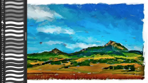
So let us start in this um uh area of enhancing our image and let's do some enhancing okay and as I mentioned before we're going to use um adobe camera for the vast majority of if you're a light room user just think of the develop module is exactly the same the develop module as what we're gonna be doing in a dope a camera I have got my bridge set up here if your bridge looks something um like thiss let's go ahead and reset our work space this is the typical workspace when you come into a bridge two things that I do to help my process here is I'm gonna take these little they actually that's not the default I reset it and it doesn't reset that's not the real workspace reset standard workspaces will reset it all the way back there we go that's what it actually looks like and this little preview window I don't find very useful I don't need the small thumbnails so here here's your first tip for the day is how I set a bridge is I drag each one of these little panels hey these tabbed panels ...
if you click and hold it you can actually move it to a different location you'll notice that blue line around wherever I'm going to drop it so if I move it here into the center I now get a nice big preview the content which are your thumbnails I'll drag that tab over here to the right I'll expand you'll notice right here that as I moved between any panels I get this little left and right arrow so I'm gonna expand that panel okay? And I can even come down here and increase the size of those thumbnails and now I've got a nice big square area I can even zoom up here you'll notice that the cursor is a little magnifying glass what's known as luke view right here so in this big preview area I can check focus or check detail and um or I can use that space bar to get into full screen mode and I can click on the image to zoom even into one hundred percent okay, so it's the bridge has got a lot of different ways of working this is my workspace that I'm goingto generally use in bridge okay just allows me to go through you'll also notice that I'm using star ratings and colored labels that helps me sort out you know what I want oh work on so if you're not using those those air up here there are keyboard shortcuts for all of those it's not a class on bridge okay, you force me go into preferences for the bridge and the one thing I'll recommend in terms of those labels turned off they're required the command or control key on pc to apply labels turn that off and that way you can just tap one through five for star rating six through nine for colored labels allows you to very quickly go through and select images and then the filter menu over here on the left hand side these are all the different colors I'm using and the different star ratings and of course you can also all your file types there's ten million pieces of its notice meta data over here so I can just as I'm doing here just show me the purple so if I don't have that on there's you know, eight hundred images right here so I can just say show me the five star show me this but since I know the ones that are purple are the ones I want to use for enhancing I just hit purple and now I've isolated that so if you're not using star ratings colored labels do so they're awesome save your huge amount of time I won't go anymore I'm going to select all commander control a so these are all the images that I want to enhance up here in the little control panel appear this little iris open camera you can also do a command or control are command are on the mat control are on the pc um I actually would do that rather than commander control o one that may open up in photoshopped a penny upon your preferences but even if it were to open them up after raw files, they're going to go into adobe camera the reason why I wouldn't do a commander control oh is that forces photoshopped, open and photo shoot for default is going to want to take seventy five percent of your ram that's the elbow room and what you work, you're going to do all your enhancing in adobe camera there's no reason for you to launch photo shop until you're ready because he'll just work much faster you can open up five hundred images in a doe became wrong work on him do a commander control are for raw and that will give you that when you're ready it in dough became a wrong you'll open in photo shop that's when it'll launch photo shop and then the ram will be there so there's another little tip for you okay, I'm gonna do a command control are and now we're here of course I did not do that select all oh, you know what we're using I like, huh? Interesting. Um, we are using a reduced resolution for recording, which I actually asked him to do normally it would be a ten eighty p resolution, but your icons and your type or thiss small and for you guys watching at home, you're kind of going dude, don't make me do that so I'm using a lower resolution and the lower resolution and ido became a raw this scrunched screen doesn't show the filmstrip on the left hand side bummer so I'm going to work one image out of time and we'll talk about this in enhancing process ok, so wait did have some resolution questions in here monopoly was asked resolutions you were working with so glad you had a seven, twenty feet that seven twenty p is actually what will be pumped out eventually okay with the recording things so it's one to one ratio so you'll be able to see for me doing the techniques because you want to see the pixels you want to see the brush strokes, not let alone the menus and the commands and everything, so I specifically ask creative life to do that and I think it it makes it better though it does, you know it's a reduced workspace and therefore it's a little bit little bit crowded um let's actually we'll take this very, very challenged image here and we'll use this one so I'll do a commander control are and we're going to go head in this one and the first thing I'll do is show you actually what the image looked like because when I photographed it it obviously didn't have a white border on it that's part of the enhancing step um we'll get to that in a second so in terms of our enhancing, we're going to start off with what I call my five step tango for optimizing images if you've been with me before over the years, I always had the tango um it is just a simplified way of, um organizing the steps for optimizing an image, getting the best possible color and tone quickly this works for any image, landscape, portrait or whatever weather portrait or landscape or anything else it's just the idea of pulling out coloring tone I am using for shop cc on here, the new creative cloud version of our shop it's the same basic engine is photo shop cs six these sliders were changed in photo shop cia six if you're using says five or before has already told you stop gone by the update its worth it don't hesitate the engine is awesome it is a new way this tango is different for c s five um like for like one five it's the same engine if you have light room three definitely upgrade to go right to five don't even hesitate if you use light room never hesitate on an update seventy nine bucks it's the cheapest thing you'll ever do don't ever hesitate this now has a healing brush in it and a radio filter and the new upright filter of the new features in the new adobe camera on the new light room five worth the price of admission right there you know the full upgrade price for photo shop if you just got those three tools in adobe camera let alone everything that happened in photo shop it's worth it so again as a basic thing if you ever go should I upgrade yes you know and this is what you do for a living this is your passion this is your pleasure you spend one hundred more times the cost on a lens than you do up creating photoshopped or light room right and your toys and everything else that you do this is what gives you pleasure trying to save money on upgrade costs is for me is not the way to go and you know should you subscribe to the creative cloud the entire suite? Yes if you but if you use more than two programs and it makes you know financial sense if you only use one application then just rent you do the cloud for one application it's no brainer don't don't hesitate ok, so the tango here is thie steps for my uh five step tango first step is going to be white balancing crop if you need it it's not cropping for the aspect ratio of your final image per se in other words, understanding what your print size will be its if there's anything in color a tone that is something that you don't want if for some reason I had the painting was on the hills and not this dark foreground I would crop it out because if you look at the history graham when I changed that crop it changes the history graham which is not updating right now that's interesting it should update as soon as I as soon as I hit enter it's going to change it so you see the history graham um changes um and normally it doesn't upgrade, but atonality of your image is based upon what's inside the crop and the next step we're gonna do is we're going to ask adobe camera or like would you please fix the color and tone for me the tone specifically so what's inside the crop is what it's interested in so crop first white balance if you're using shooting under artificial light if you're shooting indoors and the auto way balance which is probably what your camera set too didn't do a great job, then you can change the white balance that's over here okay if you're shooting a j peg is this wass you'll notice that it's all set to zero and you have auto and custom if you shot raw, you'll notice that it's measured in degrees kelvin and you're going to have a bunch of, you know, cloudy and daylight tungsten and things like that so you've got different these air actually just, um tint sliders they're not actually doing to white balance if you have a j peg the white balance was cooked into the file when you shot it when you do it did ajay pick and we won't go into that right now okay so why balancing crop of necessary next step hit auto there's an auto button right here ok we are in the basic tab which is the same as the basic um tab in light room this first tab right here we have an auto button when we hit auto it's going to try and do these six settings exposure contract next highlights shadows whites and blacks it will take a stab at all of those it may or may not do a great job at all of those if it on lee set the whites and blacks the dynamic range of the image that would be fine for me but you know sometimes again it doesn't do a good starting point this case there is my before and after you can see it's pulling out a lot of detail in the foreground but I'd like the subtlety of the after sunset you know in the sky so in that case it didn't get me enough of where I wanted to go I can still get to it by just simply coming up here and then you can see that it actually took the highlights down but I can take those highlights even mohr but I would rather I'll use the default here, and I'm going to move on to the next step. So auto, if it works, great if not undo and move on. Okay, dhobi kameron light room will not be upset if you don't use their auto, but oftentimes it'll do a great job and it'll get you down their next step. You going to do, um, exposure is your mid tones, clarity, highlights and shadows. Those are the four steps for things in the order. Um for will be the third step in your tango you know that's more than one step. Yeah, I know I'm cheating, but it's it's going to set you the tonal range for all the major divisions of your hissed a gram exposure was your mid tone value that's your main story of your image look at the mid tones in the image and see if those work for you that's. All you're really interested in at this point is the mid tone value if you're doing a portrait that's the skin tone if the skin tone looks good, don't mess with the exposure that's what you've got, you've got these other sliders toe work on other areas, so go well, it's overall dark, but so I'm going to take the exposure up no well only worry about mid tones for a portrait that's here I'm looking at the mid tone of values here and I like it. So even though it's a dark image I'm not going to use exposures start off with the next step is actually jumping all the way down to out of these six down to clarity clarity is ej contrast it's contrast is cool and groovy mixing which pop when we're talking about enhancing for a painting it's really, really important because it's going to exaggerate these edges and that's what we do with the painting where we're shaping shapes, objects within our scene, whether it's a mountain scape or a person's dress, that exaggeration of shapes in the file is one of the things that we do so clarity for ej contrast is going to help us shape those shapes and that's awesome yes watching our workflow because I've you're one of the instructors here crate of life that I enjoy your images so much so it's just it's awesome to watch you just walked through a basic photo to start off with so it's garbage photo like this I love this far oh, I do enjoy this photo I love it I love I love brazil and uh again the canoes along the way are and they're beautifully painted you'll see in a second once we pull out some details so clarity so I'm going to take that clarity up and you're going to see what that clarity is going to do that one is going to dark and highlights is goingto light and shadows but it is so powerful that it actually can start plugging up these edges and that's why I'm going to dio exposure clarity and then shadows and highlights because shadow and highlights are new sliders that allow you to pull out with ridiculous amounts of shadow and highlight detail and because you're going to get attempted to use clarity too much you know level volume twelve on our you know amplifier you're gonna want to follow it up with shadow because that's going to allow us to again pulled back in maur shadow detail and take highlights down and you'll see that we're basically getting this kind of photo hdr if you're familiar with this kind of hdr look which is in the abs and everything else were exaggerating the tonal range we're pulling out a lot of shattered detail in this case I can tell that this is an image that isn't even my original because there's actually there's more detail in here, but we'll get to that in a second. So highlights and shadows your notice here that I've actually taken all my shadow detail up all my highlight detailed down and I've taken my clarity up so I'm basically throwing the kitchen sink at this image it's up to you you'll do it you know baseball what you want because I'm painting it I'm going to exaggerate it if you were doing this for something you're going to print you would not go to this extreme okay because again we're basically creating elements for we're mixing our paints right now okay so highlights and shadows next step forth step whites and blacks whites and blacks is going allow us tto find tune that tonal range I can I can continue you can see that there's really this particular one I'm going to jump over to another version of this file that has a greater tonal range but you can see there's really nothing I'm afraid in that shadow detail in this j peg I'm just I'm barking up the wrong tree but that would allow you to find to knit and whites again would take us allow us tto find tune our highlights in this case neither one of those is bad I'm looking up at my history graham toe look to see if there's any kind of clipping or exaggerated highlights I'm not seeing it so whites and blacks I don't need the last step in tango he's going to be your color when you do auto it doesn't going to do anything down here these air kind of enhancing techniques okay so vibrance is intelligence saturation it's up to you it is non linear in other words it's going to be uh, take what's unsaturated and bounce it out with what's already saturated very nice for portrait it's also very judicious with oranges, which means that it's going to be cautious with skin tones so no matter what ethnicity all those fit into the orange skin tones so it's going to be cautious with oranges and it's going to work primarily on de saturated by definition, that means it's not linear, and it doesn't do all the colors the same way, which means it could be problematic for something like a sunset because all of a sudden that sunset it's goingto bring up here yellows and reds and leaves oranges alone, he kind of looks funny and it because vibrance is really good for skies we know you guys use it, so we're gonna pump up skies more than other things so oftentimes actually for doing painting, you may use a traditional saturation the last step as part of this vibrant or saturation is then yet and that is found over in the effects panel again in light room those run a top to bottom here in adobe camera they go left to right and um I like putting in a little color priority post crowd vignette because what's that's going to do especially if you've pulled out all the shadow detail it's going to allow you to throw that background back into the distance okay, that's one of the problems with kind of an hd our technology when you pull out all this shadow detail is you go with that? I photographed it purposely to throw things not part of my subject matter into the background I don't want it and have been yet, especially if you know there's five different vignettes and a dopey camera and in light room you can do that to kind of like a little do a quick little dodge and burn to throw your background back off into the distance all do color priority is the most subtle I'll often take that down a little bit and increase the feather amount and that'll create kind of a, you know, subtle drawing in the eye into the center of the scene, okay? And I'm actually going to say cancel on that one because that I need to show you, um the what that was supposed to do because that wass the sample um this is what that should have it should have been this file because it had been burned in the actual file wasn't raw file, so this is what that tango should have turned to the file. I should have checked for the wrong file before him, but that shows you here's the before what we were just looking at, you'll notice that there is a bunch of junk on the beach that's the other thing I didn't do it show you the new healing brush we'll do that we'll go back into another image after the break to do share the new retouching in the new order b camera, but this is giving us the color and tone were doing that clarity to exaggerate the edge contrast, you can see that the canoe here is popping off the background the hills or popping that separation of each one of these different planes going back in the hills is exaggerated I've totally exaggerated that sky in there using vibrance and saturation sow and the canoe looking be able to look inside the canoe again is something that we're going to do this one I wouldn't consider ready for print, especially when you look at it you'll see the banding that's going on in here obviously this tonal range came out kicking and screaming it did not want to come the sliders allowed us to do that so well um do um or, uh, of our enhancing with some more samples after we take a break and we'll do ones that are based upon raw files where we can see actually how far we can push it questions before we awesome jack we do have questions that are already coming in about paintbrushes and things like that, so I think we'll keep the questions simple for this one and we'll go dive into that later when you dive into yes exactly no reason to go I'm going to be covering all of that all right? Perfect so we'll stick with some basic questions marci had asked if there is a monitor that you recommend to give tour colors and clarity when you're doing graphic or illustration work or do you feel like monitors are important have a good totally a calibrated monitor is essential because the only way as especially as an artist you're going to be using the monitor as your reference point it's not numeric it's not you're not going to find a numeric value for a skin tone even though some people try and do that you want to make the screen look pretty if this screen is not calibrated to some sort of accurate source, then you'll never gonna be able to print what's on screen so it's essential the problem of course with the laptop is that as you change the angle changes the tones and normally you would never use a laptop for any kind of serious color work. Um so I know I would probably stay away from the tv sets of the tv sets an hour of ten eighty p, which is a nice resolution, but they're not gonna have that ability to be calibrated like a apple cinema display like the apple cinnamon display simon apple junkie on their nice they've come down in price um but sony makes great displays I would use one that scared toward a computer as opposed to one that is a tv set even though you're using you can use an hd emma and sam have a digital video output some of those are just going to be since their gear excuse me to a tv picture there oversaturated over contrast, you know they say contrast range of five billion to one well, that's you can't reproduce that you can't print it and that's the thing to keep in mind I'll even in that topic I'll mention one thing is, um color space there's something that's known as a pro photo color space where you can keep literally billions of colors the human eye can only see about ten million colors a j peg image, so hold sixteen million colors your raw files hold potentially sixty billion tones the problem is is when you create something and if you're not careful, you can create stuff that could never be reproduced on a printer. Printers can't reproduce even the sixteen million of jpeg file even when you get into the eight ten twelve plus colors on the printer so one using adobe rgb not using what's known as the pro photo or wide gamut theodore b e r g b is good s rgb is what most of your cameras are shooting that's inherently bad that was created pie charts really contrast in saturated, not going to give you a lot of latitude to work on so even though you may have to convert when you're done to s rgb toe, print it out wherever you're going working in the adobe rgb color space when you go from light rumor doe became around a photo shop that's in the workflow options remind me and I'll show you how to set that up so you do go in there um if you're doing all your color in tone and light room and adobe camera you can actually bring them into photo shopped in a dopey our gp even eight bits per channel not sixteen bits that allow you to use a lot of filters and photo shop especially the painting filters I don't work in sixteen so eight bit adobe rgb is how you're going to go into photo shop and adobe rgb has a nice broad cam it and is much easier to see on the monitor and reproduce your problem if you use your pro photo is you can't proof that most mothers can't display it most printers can't print it and you will get what's known as out of gamut colors you look great on screen you'll hit print and you go where did green come in that sunset and that's because it couldn't do that so it's a very good question and I would definitely calibrate your monitor get something whether it's ah q and I won some sort of hardware calibrated for your monitor you can't just trust her I you want thie hardware calibrate and now they've come so far down in price so calibrate your monitor is using a hard work calibrate er huey's or under a hundred bucks uh actually why so anything is good color monkey all of those great thank you so I think we have time for one more quick question a lot of people love the princess diana painting and david from san diego wants to know how long would something like that take I want to take you I guess because I cheated as I often do this entire process is has got a lot of that um the face was actually done quite quickly I actually tried to paint it when I was first commissioned it paint it from scratch and again the personality of subtleties make sure the differences between painted from scratch and and taking advantage of filter the subtleties of a job bone the subtleties of color and tone are you know the flavor of a person's personality that's where aerial artist like bird or other people who can take one stroke and you just go you nailed it they do one hit on the nose and you go that's them and us we're going to go he looks like my dog so um the background on that one I probably spent a day on that one because I was also working on techniques, but you could. I could probably do that in a couple hours, but it's primarily the gown and the background, and again, I took advantage of when you see the oil paint filter, which we will do today, you will pay in filter it's. Fantastic if you know this special jiggery jiggery pokery, teo, allow it to do the breaststroke. So the hair, the tiara, almost all of that was completely done with a filter, so I'll do with the mixer brush. You're still looking at maybe an hour to two hours tops for a painting and how I work in this in this sketchy sketch manner on dh. That could be the same thing of wood, like a watercolor, depending upon how elaborate, how many elements you have in it. You know, look at that. If you're really in a hurry, well, dio, I'll do. I'm purposely going to work in small images so we can do things in minutes rather than ours.
Class Materials
bonus material with purchase
Ratings and Reviews
Shannon
Okay, I'll be first. Jack has an easy, approachable way of teaching. It was more like being in the room with him, watching over his shoulder as he created something utterly new and exciting. Even when he worked on images he had done many times, I never sensed boredom or a lack of enthusiasm. He was patient with questions and answered them completely. I hope Jack enjoyed this way of teaching as much as the world enjoyed watching. Maybe he'll find more to share. I know I'll sign up for his next one. This workshop inspired me to start creating art again. I'm slowly losing my sight and sad to say, I was starting to let it get to me. As I watched Jack, I tried just a few things and realized that I can do this. Digital art is much easier for me than pencil and paper because of the technology. I miss the pencil and paper drawing, of course, but this is so much FUN! The techniques that Jack shared are wonderful and the results rockin' ... or as Jack says, bitchin'. Thanks to Jack and creativeLIVE I'm back in my head in a good way.
a Creativelive Student
Thank you Jack Davis. Having tried to paint, both in the real and digital worlds, this is the first time I have seen a comprehensive demonstration of the techniques and philosophy for the artist. This course is valuable for any aspiring artist, digital or otherwise. By the way thank you CreativeLIVE for the long form training space you offer both the teachers and students. Jack is inspirational, talented and sometimes funny. Watching him paint in real time is by far the most impressive sight but the information about why is more valuable. Overall this course will give you ideas, knowledge and skills (if you practice). I highly recommend this course for anyone that has tried to paint in the past and was underwhelmed by the results.