Lessons
Day 1
1Class Introduction
09:10 2The Design Flow Basics
18:27 3The Designer as Co-Creators
06:48 4Get to Know Your Material
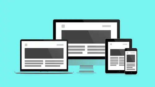
17:07 5Responsive Vocab: Floats, Flows, & Images
11:58 6Mobile First: Working Small
09:46 7Future Friendly: Embrace Unpredictability
14:17Collaborating with Your Clients
13:52 9Prioritize Your Users
39:42 10Best Practices for Defining Success
08:58 11Intro to Scrum
04:24 12User Stories & Epics
35:53 13Content Basics
27:40 14Defining the Visual Language
22:31 15Starting with Type
35:31 16Starting with Grids
15:40 17Gutcheck & The Product Brief
22:03 18Working With Developers
12:33 19Communicating with Developers
16:25 20Finding a Common Language with Developers
06:28 21Code Literacy
04:37 22Sitemap & Wireframe Basics
33:48 23Prototyping Basics
12:02 24HTML Prototypes
13:28 25Code Literacy & Developer Tools
11:46 26Developer Lingo
07:23 27Interface Personality & Behavior Galleries
17:27 28Designing for Performance
18:19 29Progressive Enhancements
07:00 30Designing a System: Discovery to Pattern Library
12:25 31Workflow Examples
20:25 32Applying the Style Guide to the Pattern Library
09:08 33Alternative Workflow
23:04 34Alternative Workflow Part 2
21:52 35Tech Requirements
21:53 36Retrofitting an Existing Site
12:15 37Project Cupcake: Building a Site from Scratch
24:08Day 2
Lesson Info
Workflow Examples
Okay, the workflow. Originally the sort of focus of this whole workshop. Here is our workflow in text form. Stephen Hay again, heavily influential in organizing this talk. Early thought leader in the idea of we need a new workflow to conform to the ever-changing process of responsive design. Traditional workflows do not work. So again one, we discover. Andy spent many segments going back and forth with you, working with you around that discovery process. We're gonna take everything that we learned form discovery, we're going to move that into the text design process or design and text, these words are fairly interchangeable. We're going to take our findings from the text design process where we learned abour hierarchy, content, size and scale relationships and we're gonna move that into these wireframes. Finally we get to draw something, oh thank goodness. Blocks, better than words. And then we're gonna like add electricity to our blocks like Mindstorm Legos, they're gonna start moving...
around and playing and stretching and stuff so we're going to make HTML prototypes with breakpoints. I have Visual Language here because I think the visual design work started earlier but here's where the conversation really sort of escalates. This is like the rising action in the drama, this is where the visual language starts to get incorporated into the markup. We're gonna do some in browser design which is that process of flowing those variables, those visual explorations into our container, our vessel, that is our markup prototype. And then we're gonna begin the process of reviewing the stuff with the client like we've needed time to get stuff and when we're talking about client review, we're talking client review of the prototype, not of the user source, not of the visual language, we're talking of the product. They've been in the room the whole time but now we're gonna start looping them in. We're gonna start getting design revisions and we're gonna start accelerating towards the pattern library. So again can't we just see pictures, why do we need to look at words first. Man, that was my mobile first drawing. This is my desktop drawing. User stories. Lead us towards the content phase of our process. Lead us into the cycle. Wireframes, HTML prototypes begin to merge with Visual Language, in browser design. Now I've created a circle to house this section because this is where this team is gonna start iterating and sprinting. These team members are continually learning from client review and then feeding that back into this iterative process. Successful patterns get kicked out of the workflow and they get to go in the pattern library but patterns that still need to get worked on are continually getting turned through this process of iterative design, are getting pushed through UX, front and visual design and in browser client review and we continue spinning. So that's fun. So here's what that looks like. We start with user stories. Epic at the top. Really specific, granular actionable steps underneath. We understand the hierarchy of things that are happening within our application on the story level. We move those stories into design in text by creating this simple content inventories, list views for each page of the product, we begin annotating elements that are required to carry out the story. We meet with team members in these documents and we push these documents around. They're living documents. Growing out of these component inventories, we begin flushing out the content in these plain text files. We start seeing how big and small our content pieces are, what the order of operation is, how they sit on the page, what stacks on top of what. We extract from our experiments in plain text a more informed idea of hierarchy and we start naming things 'cause now we have a view of the landscape. Now we can start really defining components and separating what are perpetual global structures, things that don't even exist from page to page and what are these unique things that are specific to just a part of the story and what are their little pieces of metadata, what is the structure of each component. We're gonna take what we've learned from these text exercises and we're gonna create content reference wireframes. Again we're concentrating on layout variations and breakpoints, no visual design. We're separating that from the process as this is the lowest resolution form of wireframe we could possibly do. Finally we can learn from all these things now that we have an agreed upon set of rules and of operation, we can begin to flesh that stuff out and pour our plain text into our content reference wireframes and now see something that starts to actually get closer to looking like a website but we had to do our content work, we had to do our structure work, breakpoint work separately in order to now pour our content in to our wireframes. We looked at these, we're doing wireframes again. Mobile first, but with an eye on these various breakpoints we're starting again designing for core content components first, what makes the brand unique, what is their singular component rather than index rather than a home page. Since this is a museum, we concentrated it on the museum's exhibition page. Again we took that exhibition page and we thought there's also this membership page, it's fairly light on content, the action's pretty straightforward, let's do that next. We labeled out all the different levels of membership, we were looking at Kickstarter and the way that they labeled out their membership drive pieces. We learned a lot from our earlier explorations within content type as far as these large header images. We knew we wanted like, we just found out in the user stories, the thing about space is it's this visual immersive thing so we created these large expansive banner images, clear calls to action, we knew we wanted the call to action above the ever-changing fold so we knew we needed to design it responsively where it stayed up there. The local menu here was sort of inspired by the layers of the atmosphere. We knew that like classic, a lot of illustration we saw like banded the sky, like as the sun sets, it's lighter on the horizon and then it sort of get darker, it's darker with the night sky so we sort of took that as a point of influence when we're designing even at this level. I broke my rule of designing and wire. You just blew my mind, you never even told me that that was your thinking behind that. I just thought it was cool. My goodness. I just thought it was cool. Now that once we get comfortable within the wireframes, we start playing with what we know makes each of these content types. Again we were also inspired by the same sites that you were inspired by when we did the exercise of the gut check exercise. So this is where we start playing with these large featured images, we know we need to container type and so we make these experimental places because we do feel like the museum should reflect this sort of like always testing, doing our research, this sort of like adventurous sensibility. We wanted that to be reflected in the interface. We went back through all of our wireframe for the Ministry of Space. We extracted all these components. Again knowing what the content is, we know that our exhibition is primary so we made a distinction between that primary content specific module and the secondary, more persistent modules. And we created some names, again specific to these elements. We came up with this naming feature of block which is fairly generic but then we knew we had again, looking at our content, we knew we had type blocks, photo blocks, full stretching blocks, again using this simple variation system to distinguish and still talk to the core content piece, the core component type that it was. We poured all, we took what we had learned from our wireframes and from our text stuff, we got into the browser and we started modeling some low res HTML prototypes. We took a look at this stuff and again wanted to make sure from the user story that really started this off was this idea of tickets and having secondary actions related around tickets, membership, this was the primary function and so we wanted to make sure that never slipped underneath that primary content. We did it so we broke we content into two pieces, summary and full, that way we'd have this physical way to slide the secondary action underneath our primary content brief so we used the structure of the content like a crowbar to pry a little space so we could slip this action in and stay above the fold. Very graphically viable. Yeah, ooh. If you've ever seen that movie. Nevermind. So analog I like to think, analog. Next we took all of that stuff that we had learned from our breakpoint system, we ported everything into foundation and we flowed real content in and we started to see how our content actually looked. We saw that as we stretched and grew the screen, we got breakpoints. At this point again we're just judging hierarchy, page layout, we're not doing any visual design yet, we're just making sure that all of our pieces play nice together. Visual design starts to roll in and begin to merge into the process. All of the mood boarding, all of these component styles that we've been doing, all this idea of establishing atmosphere. Dan Mall calls it atmosphere before like pixel perfection. Like that's why mood is so good like what is the sense, what is the identity, not what is this really specific part of the interface look like. We did focus design experiments after this. We expanded them into again, with technical, wonder and educate. These related to different types of users, wonder is the sort of the student. Educate, the teacher's version of the student, right, how the teacher sees the student. Technical, the scientist or the educator themselves, right. So who is the person really trying to win over? And what visual associations do they see when they look at the Ministry of Space. Again the technical minded person, about teamwork, collaboration, it makes sense. It means that and as we organize these larger groups of people, we need to work together so our displays need to show information and be organized very effectively and efficiently. Those lines are sharp, like a nice clear resolution to our displays. The wonder being sort of like that child inside of us, not necessarily the street child but to the wonder of ourselves as a sort of like, fan of space. What's the fantasy, what's the dream of space, not what's the reality of space, what sold me on space, I've never been to space but I've been sold the dream of space so we embrace gradient, sort of more a dreamy haze around space. Some of the lines within some of this stuff take on a quality that is somewhat angular with these rounded edges, this sort of faceted low res stuff, it's hard to see in this UFO over here but again everything has like a glow around it. Finally educational, bright, flat, cut to the chase, more immediately recognizable symbols. I don't need all the nostalgia right, I don't like, so the wonder is the kid inside of us, educate is the kid right now. I don't have the memories of it, it's happening to me right now and it's really bright and it's really sharp and I want it. And the edges are rounded so it's safe, safe. So we took the winners from all that stuff and this is something that I do, we talked about a little bit but I actually, I'll grab a piece of the interface and from the story seems like really evocative, it has a lot of potential to like tell a story and I know it's going to be ever changing and that's where I pour in one of these moods because I think that abstract, like Andy was saying, it's really hard for me to see a system. As a system, it doesn't stir, it doesn't like stir my gut, it doesn't do anything for me but if I can see it in the context of a specific piece, I can start to really play with mood, personality, I can bring type in again on the left, something that's a little bit more formal, maybe more National Geographic back in the day, sort of the letters are still a little bit more like again, print worthy. To the right, things get a little more sci-fi, a little more retro and then on the far right, we're just rounding things down, and things are getting a lot more modern faster. I love this image, I flipped this image, it was this way and I flipped it and it just like really gets topsy-turvy. Your art direction is crazy. It's out of control. But again playing with these different styles and usually they're not gonna do just one. Usually when you do this, people go I like this part of this one and this part of that one so this is where we got to do some collage like no, because what you're doing here is you're creating caricatures and caricatures are kind of stiff. Nobody's really a caricature, people are actually people meaning their combinations are caricatures, they're kind of like (mutters). So we took the parts we liked of each one and like okay, that's balanced. We want this and this, we want some of that nostalgia but we also want some of the real kid, right so person, inner child kid as all of the kid itself. Let's get this, that gets closer to family, right. So I do it in context and then I extract so I do it here as an experiment, a little Petri dish of like what happens and then I take what I learned and then I extract it and they get more abstract. I take those variables once I've worked them out and I start pouring them into Typecast just to test them, let Typecast do some of the math for me, sort of adjust font sizes for me and produce a deliverable, again as an experiment and then finally those mood boards that I did were in a graphics application, poured everything into Typecast, I got some variables and now I sit down with my developers with the variables and mark up the Typecast's output, I sit down with him and work together on the prototype and go this is what my findings are, here. And he brings his findings which are the non styled prototype here and we go okay, we have a hack session, let's put it together, let's start pouring our stuff in so we change the fonts, we move some of the spacing around. Again Andy has this great system and we have like a similar system but different names for them, these like, these vertical rhythm units, these blocks and so we realize that like that's really adding a lot of personality to stuff, how we consistently use not just the type and the color but the scale of the spacing around things and so we start pouring that in and we start saying, oh wow, this is really, really starting to look like something and then we finally get our images in there, get our real content in there. We start seeing we actually have like a real website all of a sudden. Like we didn't see it, we did each of these pieces independently and somehow we got closer and closer to a real thing. At this point like we're taking screenshots of the website, we're bringing them into Photoshop, we're touching up stuff, we're doing little nuances and at this point it's whatever gets us closest to the finish line, there aren't any rules that say, sorry, we're in the browser now, can't use Photoshop anymore. No you can very easily like take screen grabs, nudge things, send it back and it's whatever gets you to closer to say, this right here, that's the thing I need to change. That needs to go there. Whatever does that for you and your team is what works. This whole time we've maintained not just with wireframes but with these screenshots so imagine, with your imaginary mind that this is actually a screenshot of the website, not a wireframe so this is where you would have those conversations, you'd grab that screenshot, you'd put that screenshot of the visually designed in browser website and make comments on that and that's why you're having these sort of like, component specific, layout specific conversations using InVision. When it gets down to it, we're doing these design revisions at this point. We're like dialing in the numbers or really sort of like getting down in it. We're doing specific to the piece of markup changes. We are creating better tickets. At this point this is at the design revision phase so we've come out of the major part of the wheel of work and now we're in design revision layout. And those ones that succeeded are now at this point, now if they've gone through this whole trek and are now getting poured in the pattern library and unsuccessful patterns that need to be continually worked on or thrown back into the mill. Again we've extracted our global styles as atoms, we've began organizing our components on the molecule and organism level and we've produced HTML wireframes that constitute our templates and we've concentrated on key pages like the exhibition page to really flesh out the visual design.
Class Materials
Bonus Materials with RSVP
Bonus Materials with Purchase
Ratings and Reviews
CityGirl
I've already taken several web design classes, but there were still some details that I found confusing. Andy and Jesse did a great job of explaining things like; programming languages and how they interact to form the structure of a site, work flow responsibilities between team members and the blurry lines between them; and agile methodologies applied to work flow. They used case studies to illustrate how this all happens, where variations crop up, and how to address them. If you're new to web design, or just want to understand the functions of other team members, this is a great real world look at the whole process. I haven't found this in any other class, either on-line or local. Andy and Jesse are both very experienced working designers with current knowledge. They're very responsive to questions and seem to really enjoy teaching. Having two instructors is a great benefit because you get double the perspective, knowledge, etc.
Junko Bridston
I worked with Andy when he was a Creative Director at Funny Garbage, a design studio in New York City. I found him to be knowledgeable, articulate, and lovely to work with. I learned so much from him at the beginning of my career. In response to a previous comment: it seems silly to dismiss this class because Andy wears t-shirts with his blazers. If you think leaders only wear suits and ties, then maybe this class isn't for you. But if you want to learn from someone with loads of experience and a friendly manner, I really recommend it. You won’t be disappointed.
Jesah Segal
From A to Z, this class methodically covers everything you need to know to create a website from scratch. Great class. The teachers are great too.
Student Work
Related Classes
Branding