Lessons
Day 1
1Class Introduction
09:10 2The Design Flow Basics
18:27 3The Designer as Co-Creators
06:48 4Get to Know Your Material
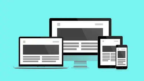
17:07 5Responsive Vocab: Floats, Flows, & Images
11:58 6Mobile First: Working Small
09:46 7Future Friendly: Embrace Unpredictability
14:17Collaborating with Your Clients
13:52 9Prioritize Your Users
39:42 10Best Practices for Defining Success
08:58 11Intro to Scrum
04:24 12User Stories & Epics
35:53 13Content Basics
27:40 14Defining the Visual Language
22:31 15Starting with Type
35:31 16Starting with Grids
15:40 17Gutcheck & The Product Brief
22:03 18Working With Developers
12:33 19Communicating with Developers
16:25 20Finding a Common Language with Developers
06:28 21Code Literacy
04:37 22Sitemap & Wireframe Basics
33:48 23Prototyping Basics
12:02 24HTML Prototypes
13:28 25Code Literacy & Developer Tools
11:46 26Developer Lingo
07:23 27Interface Personality & Behavior Galleries
17:27 28Designing for Performance
18:19 29Progressive Enhancements
07:00 30Designing a System: Discovery to Pattern Library
12:25 31Workflow Examples
20:25 32Applying the Style Guide to the Pattern Library
09:08 33Alternative Workflow
23:04 34Alternative Workflow Part 2
21:52 35Tech Requirements
21:53 36Retrofitting an Existing Site
12:15 37Project Cupcake: Building a Site from Scratch
24:08Day 2
Lesson Info
Tech Requirements
To start off, we're gonna take a step back one more time and take a look at something that Andy covered in a previous segment, when we talked about the product brief, and this thing is called tech requirements. Again, we've spent, again, a few segments talking about developers learning their language, and tech requirements are a thing that, as designers, we need to be aware of 'cause they're going to influence some of the decisions that we make, some of the features that we can use. Many of the tensions that arise between designers and developers result between conflicts of desirability and feasibility. It's a quote from Brittany Hunter, and I really like how this quote gets to, like, design is conflict, and I don't mean that in an aggressive way. I mean that in, like, a reality way. Every time I bring a design to the table, it's an educational process for me and for them. The designer goes first in a lot of projects. Again, it's not failure as much as it is focusing. So, again, you ca...
n't be afraid to be wrong, but you are gonna sort of get closer and closer to your goal, so working with developers and clients is gonna get us there. And what we're ultimately looking for is consensus. Again, tech requirements, we're in the developer's sandbox, you know? It says tech in it, T-E-C-H. I don't know if that's me, or what. So, we're gonna sit at the whiteboard, and we're gonna sit down and discuss with the developers what is the user goal? This is everything. We're all in this together around that user value, and that's what we're trying to come to consensus around. The tech is the how, right? The user value, that's the what, that's the why, so the how is up for discussion. We have one understanding about what we see other people doing, everybody else is doing, and the developers, they know the, sort of, limits of the playground, and they're gonna help coach us a little bit. So again, we talk about tech requirements, we're talking about the development architecture. This is stuff that is being detailed and listed and updated as part of the product brief. Again, it's stuff to be aware of. You're not actively contributing to this, but it does describe the landscape. You need to be aware of where to find it, like where it's listed, and how it impacts you. So again, three umbrellas here. Development architecture, what the developer is using. You've heard, like, is it a Rails project? Is it a PHP project? What is the underlying technology? What third party support, now, this is where I think we start to get closer to what might directly impact you. A lot of third party plugins, they give you their own markup. They only let you do so much to style them, and so you can't design your own Twitter and Facebook widgets from scratch. You're gonna have to go, "Oh, "in the middle of my design, "I've gotta put this other thing." So your design language has to be ubiquitous enough to sort of allow for things like that to happen, and then not to sort of feel out of place. And you're not gonna get anything on you. Everybody else is using them too, so your design system should be flexible enough to support them. And most of them allow you to do some stuff, you just gotta find out which are the right design decisions that really, sort of, are gonna be the most useful. And finally, standards. These kinda get more specific. This is sort of a reverse pyramid. They get more specific. (mumbling) More of us are affected by standards, and then depending on the needs, third party support, and then depending on your development architecture, it gets specific to your application, so this is how the tech requirements begin to determine what it is that you're doing. Technology stack kinda looks like this, this stuff. A Ruby on Rails application environment with MogoDB, a database, Redis, for sort of serving up data on the fly, the Foundation Front End, they're using SCSS Preprocessor, Compass Library, Slim for Templating, it's really great. I heard it's really good, everybody's usin' it. AngularJS, again, on the front end to make it more application savvy and fast, Jquery, CoffeeScript, MemCached is doing a lot of work for Sinatra, really, really cool. Bower for package management, need it. Grunt task management, totally, and Git for version control, hosted on Heroku. So most of this, yeah, that's real. It's a project I'm working on right now, it's pretty cool. Most of this is outside your wheelhouse, but where I find it to be useful is I think that if I do my research, some of this is gonna tell me about the culture of the development team I'm working with. How progressively-minded are they? Is this an open source technology, or is this this legacy enterprise technology? That's gonna tell me something about some of the design decisions I can make if I understand the, sort to, surrounding area around some of these technologies. How does the web product, which is the Ruby on Rails, this other thing, how does that fit in to their larger software ecosystem? So, again, this specific build, this specific stack for the thing you're working on isn't all-encompassing across all of their products. It represents the thing you're working on, so how does that technology tie in to other efforts on mobile, outside of a web context? The other thing you wanna be aware of, has the technology changed recently, or is the technology changing in the near future? This is gonna allow you to make design decisions, either, okay, they just changed technology, I can probably be a little more secure in some of the design decisions I'm making now, or they haven't changed technology in a while. I might not wanna get too deep into some of the design decisions I'm making. I need to sort of stay a little more limber. So again, they're informing you about the sort of culture you're walking into. The other thing is all of this language is gonna be used in ticketing land. And so, this is where you'll see references to different pieces of technology, and the more research you do to understand, you can see the closer a technology gets to the front end, it concerns you. The more technology gets towards the back end, that does not affect me. So if there are major things happening on the database side, you can act in a way that's sort of a little bit more independent. If it starts encroaching on the front end, like you see a ticket that says foundation is getting swapped out, you're like, oh, wait a second, that affects me. I might need to not do something that I'm trying to do. So, if you're aware of where these technologies exist on the spectrum of front end to back end, that's gonna be super helpful for you. Third party tools. Again, have their own look and feel. I can do some things to edit my Twitter widget, but I can't design Twitter from scratch. They used to kinda let you do that, but not so much anymore. So again, the more of these elements that are in your design, you gotta make sure that your design gives them the room to be what they are. A lot of them are designed to be more neutral, but again, be aware and understand that some of those styles are gonna exist outside a style sheet, and they have to be local to the widget. The other thing, as a designer, when I'm going through wire frames and I'm looking at stuff that's getting built, and I see something not listed, like, I'm sorry, but MailChimp has its own way of doing its widget. We need to include that. There's additional social sharing that's carved out here, and we haven't specked which social sharing widget we're using. You know, like, if you see that there's a gap between what's happening in the wire frames and what's in the third party listings within the product brief, feel free to just make sure that, you know, most people have a feedback tool, and a big feedback tool, this is the last thing I see added to designs. You know, there's this feedback tool on the side of your whole design, and there's this persistent element now that totally detracts. So if they planned to have a feedbacking tool, there are some things you can do to incorporate that earlier on. So if you see a feature, again, that's not listed, ask about it, ensure, and see if it's not coming down the pipes. And these also may be where, when we're talking about different types of dev tickets, those might be some that are dead tasks. You know, research some social sharing options. You know, research some different kind of plugins for whatever it is. Yeah, and then also with the feedback tools, also, if you feel strongly enough about it, find that feedback tool that has the most visual design options, and put that on the table as something to be considered. You know, like, if you feel really strongly about it, I encourage you to do your research and go to the, sort of, discussion table with hey, that's a really obnoxious button. I know it's the easiest one, and it might maybe be free, but it's really affecting the visual language. Take a stand on some things, you know, for the design integrity. Again, yeah. 'Cause there's a lot of them out there, and there's lots of options, and I think, for the most part, we are talking about empathy, about compromise. But every once in a while, it's good to take a stand for the visual language and really kind of assert some clarity. And then we'll be respected by both the client and the developer. Last thing up, standards in general. These are far-reaching, these affect everybody. Browser requirements, security, and a accessibility. Browser requirements. Many enterprise clients are gonna need to support outdated technology, which may add time to your development. So as you allow for legacy browsers, it means kind of curbing. You're setting back the goal posts of progressive enhancement. You have to sort of allow for less and less, which is still good practice, but you should know, with each add, there's gonna be time added to the design process the further back, progressively, you have to go. Again, we mentioned this earlier, websites like Can I Use It? are really great, as far as, like, finding what browsers' different effects and elements kind of work. And this is, again, rolling and being updated all the time. So if you're doing your research, you see a site using a specific thing, it comes up in a design, just sort of run that feature through Can I Use It? and sort of be informed. Again, if you're asking for a specific feature to be added to the tech budget, you need to be able to let something else go. The next piece is security, and a lot of this comes down to, for me, variance of components that I need to have. Depending on log-in credentials of some users, some components are gonna change, some components are gonna be unique to some users. Not every user is gonna see the same array of components. So if you're aware of the security issues and aware of different user types that require different elements, you can plan your component modular structure accordingly, and security starts to really play into this. So yeah, a lot of this has to do with logged in versus logged out views, admin versus public views. We see a lot of this stuff, and you'll see that there'll be specific panels and specific components for things. So again, the level of credentials of your user could affect your design. The last piece we wanna talk about is web accessibility. So web accessibility means creating digital resources on the web that everyone can use. Accessibility.arl.org, best practices. This is kind of what we've been talking about from the beginning, right? But this is more of, like, has more social impact when I hear it. It's not just technical, you know? Accessibility mobile first, accessibility progressive enhancement, accessibility device agnostic. Ethan Marcotte calls it design for reach, not just for money, but for the freedom of information, you know? Everybody deserves to have access to this content all the time, even if I have a flip phone, even if I have a browser on an e-reader, 'cause information should be free, so this is not a technology issue. This is one of getting that stuff out there, not privileging some users over other users because they have the fanciest device. Everybody gets this stuff. So yeah, this isn't just speed and performance benchmarks. This is the accessibility of information to everyone. Again, I encourage everybody to do some web research around this. We have some links in the resources document. Jeffrey Zeldman has sort of fought for web standards for a long time, and a lot of this stuff can be read about and documented on A List Apart. A lot of good reading out there around it. Is there anything you wanted to add? Yeah, you know, just from a design perspective, you have a hand in this, the colors you choose, right? Thinking about color blindness. You know, how do you, kind of, consider that? There's even now views in Photoshop that you can go and select, so you can kinda get a sense of what that's gonna look like for different users. Typography, you know, do Ls, ones, and small Ls look the same? How easy is it to read? So there's a lot of different factors that go into that. Those are just a couple examples from a design perspective, and there's other types of things that you'd wanna keep in mind. But this one of those areas that definitely deserves to be, kind of, explored a little more. And I think it's just, are you kinda goin' to color contrast? Yeah, I love this one. You're doin' it now. Because I use a color palette, a lot of times, early on that, yeah, I love this one. I used a color palette early on that didn't allow, like, aesthetically, I thought it was really minimal, and I thought that was pretty cool, but I wanted subtlety. But because I wanted subtlety, aesthetically, I was losing users. Like, I wanted this fine grain detail that I could see on my beautiful monitor and stuff, but people who have a hard time reading can't see this stuff, so I was locking users out for a purely aesthetic purpose. And so, I really had to question what's the value of this purpose? This is a great resource. It allows you, quickly, to sort of make sure your comps, decisions you're making, again, visually accessible to more people. Yeah, so just kinda keep that in mind. You know, think through that lens a little bit. Yeah. So the next segment, we're going to look at a project that exists in the wild, again, a project that's readily accessible, Boxesandarrows.com, a UX magazine resource, been around for about 10 years, highly respected publication, lots of good content here. But it had been around for a while, and their effort was so focused on content that design had just sort of not been the major business concern there. It was about getting the message out to these people, getting out to as many people as possible. So we were brought on to take a look at these. Here, I'm like, focused on my other window. Take a look at the existing site and make it as responsive as possible. So again, we had a pretty tight deadline. The project budget was pretty minimal, but we followed a process of content first, and was able to do a lot in a very short period of time. Again, as far as looking at the content, looking for inconsistency in the existing framework, taking the content and making sure it flowed between multiple break points, as well as inventing new navigation patterns, like the rolodex, that are specific for certain types of content. This was a numerical paginated system before, and we realized that that's not how people look for names. People look for people by the spelling of their name, obviously. So, we made some decisions around how layout corresponded. Since it was this all text-based website, we knew we couldn't really stretch text, so we came up with this double column notion that, again, respects line lengths on desktop, but then snaps down to the smaller single column layout on mobile. So again, really effective, useful experience here. Again, more of a visual nice to have layout eventually here as we start growing. Again, on the front page, we're using a Masonry Pinterest style stacking system here because different articles kind of come in at different lengths. But then on mobile, we strip that away, and we just have a simple vertical stack, and so we don't have the overhead of our desktop experience. Can you go back to that (mumbles) real quick? Sure. (man mumbling) Oh, this? Sure. (man mumbling) So back on home. Yeah. So looking at something like this, the point I wanted to make is, when we were talking about, say, using realistic content within wire frames, well, if I was to go and design a wire frame, and I just used header goes here, header goes here, header goes here on all those different blocks down there, then what's gonna happen? It's gonna be this beautiful-looking grid, where all of those, kind of, horizontal lines match up perfectly, and doesn't indicate at all what should actually happen. So if we have a title that goes to two lines, well, does that push down both columns equally, or are they independent, right? So just by using realistic names that we would have as an example like this, now we're gonna understand that, no, they're independent. One does not force both of them down together. It's a very simple example of how real content could help flush out how those two coms should work together. And it's really accessible modular JavaScript. Like, we could enhance an existing linear layout. We didn't have to do anything super special to make that happen.
Class Materials
Bonus Materials with RSVP
Bonus Materials with Purchase
Ratings and Reviews
CityGirl
I've already taken several web design classes, but there were still some details that I found confusing. Andy and Jesse did a great job of explaining things like; programming languages and how they interact to form the structure of a site, work flow responsibilities between team members and the blurry lines between them; and agile methodologies applied to work flow. They used case studies to illustrate how this all happens, where variations crop up, and how to address them. If you're new to web design, or just want to understand the functions of other team members, this is a great real world look at the whole process. I haven't found this in any other class, either on-line or local. Andy and Jesse are both very experienced working designers with current knowledge. They're very responsive to questions and seem to really enjoy teaching. Having two instructors is a great benefit because you get double the perspective, knowledge, etc.
Junko Bridston
I worked with Andy when he was a Creative Director at Funny Garbage, a design studio in New York City. I found him to be knowledgeable, articulate, and lovely to work with. I learned so much from him at the beginning of my career. In response to a previous comment: it seems silly to dismiss this class because Andy wears t-shirts with his blazers. If you think leaders only wear suits and ties, then maybe this class isn't for you. But if you want to learn from someone with loads of experience and a friendly manner, I really recommend it. You won’t be disappointed.
Jesah Segal
From A to Z, this class methodically covers everything you need to know to create a website from scratch. Great class. The teachers are great too.
Student Work
Related Classes
Branding