Retrofitting an Existing Site
Lesson 36 from: Modern Web Design DemystifiedAndy Pratt, Jesse Arnold
Retrofitting an Existing Site
Lesson 36 from: Modern Web Design DemystifiedAndy Pratt, Jesse Arnold
Lesson Info
36. Retrofitting an Existing Site
Lessons
Day 1
1Class Introduction
09:10 2The Design Flow Basics
18:27 3The Designer as Co-Creators
06:48 4Get to Know Your Material
17:07 5Responsive Vocab: Floats, Flows, & Images
11:58 6Mobile First: Working Small
09:46 7Future Friendly: Embrace Unpredictability
14:17Collaborating with Your Clients
13:52 9Prioritize Your Users
39:42 10Best Practices for Defining Success
08:58 11Intro to Scrum
04:24 12User Stories & Epics
35:53 13Content Basics
27:40 14Defining the Visual Language
22:31 15Starting with Type
35:31 16Starting with Grids
15:40 17Gutcheck & The Product Brief
22:03 18Working With Developers
12:33 19Communicating with Developers
16:25 20Finding a Common Language with Developers
06:28 21Code Literacy
04:37 22Sitemap & Wireframe Basics
33:48 23Prototyping Basics
12:02 24HTML Prototypes
13:28 25Code Literacy & Developer Tools
11:46 26Developer Lingo
07:23 27Interface Personality & Behavior Galleries
17:27 28Designing for Performance
18:19 29Progressive Enhancements
07:00 30Designing a System: Discovery to Pattern Library
12:25 31Workflow Examples
20:25 32Applying the Style Guide to the Pattern Library
09:08 33Alternative Workflow
23:04 34Alternative Workflow Part 2
21:52 35Tech Requirements
21:53 36Retrofitting an Existing Site
12:15 37Project Cupcake: Building a Site from Scratch
24:08Day 2
Lesson Info
Retrofitting an Existing Site
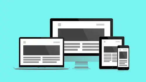
What is it? What is a retrofit? So again the realty is there are these... When I see new technologies and existing technologies get presented to me I always see this blue cloud one that's like alright we've got no overhead, it's totally cool we can do everything from scratch. It's rad. Again, this always happens in the meetup format and then I see the second speaker who's like I've had this project for two years and when I started we were using a technology that everybody said was the bluest sky and then something happened and it changed, and I still have to use this other thing, so I can't totally embrace the new thing, so I kind of gotta like do this other thing. We wanted to make sure that we gave you an accurate representation of the ideal sure this is great but then there's still a lot of legacy both software technology as well as content out in the wild. We call this a retrofit. We don't need a full design. It is not a full redesign. The architecture of the site is sound but the ...
site simple needs some added responsiveness. While we're in there though, how about we update the visual language, right? We're resetting the framework, if we do our job right in resetting the framework which is sort of the underlying CSS we can kind of begin manipulating some of these visual assets too. While we're updating some of these variables web fonts have come online, @fontface happened in these 10 years, SVG icons happened in these 10 years. We can ditch some of these PNG graphics we have. Then we can take a look at performance in overall user experience. Again, why are we doing this? The CMS was outdated so that also had to be gutted and it makes you think well, what stayed the same? How is this not a redesign? We're gutting the CMS, time was limited. We had six weeks and the cost for development was reasonable. It was a six week budget. We couldn't go over, we couldn't go under so we had to stage it into these iterative two week sprints where we can actually see this thing through. This was what we stepped up for. Art wasn't getting changed out on the website. There wasn't an Art director in house so it was this process of can I do this there. There was less consistency across some of the visuals. The whole thing was kind of flat. There was no hierarchy given to stuff. There was a lot of information and it was laid out in a way that made since, but it hadn't really been directed, pushed or pulled or sized so, this is what we proposed. How did we get there? First, we did a content migration. We're going to take 10 years worth of content, reformat it and get it ready to pump back into the CMS which we're using is called Wordpress. We're going to work directly in the browser. Take that! Take that and we're going to concentrate on typography. I was telling somebody during the break that, "A Book Apart" is great. There's this company from 'A List Apart' they publish these books that focus on one element at at time. Typography, responsiveness, mobile-first and there's so many things that you want to balance when you're making projects. I'll actually dog ear each project as a thing that I, as a maker of stuff, want to focus on cause I can't work on all of them at the same time. It would be impossible so I made this like this is a typography project, I'm going to focus on typography as I build this project. I think that that's a totally valid to go about learning new things. You can't do six things that are new at a time. You want to kind of take each project and focus on developing a new skill. Knocking some stuff out... Discovery, whatever, it's been discovered. Design in text, yeah, it's a text-based site. Okay, we're going to do some wire-frames cause yeah we need a contract and everybody knows visually where we're going. We're going to skip the HTML prototype, we're going to skip the visual language and we're going just do all that stuff called in browser design cause we only have two weeks to do this stuff. We're going to do these quick client reviews and revisions and then keep cycling. First step, content migration, step zero. This is like above the other ones so we brought 10 years of content over so we made a plan. This is much prettier than the database file that we got, I wanted something you could actually read. It's very similar to structure that we're looking at in an inventory. It's inventor-ing an actually database and looking for patterns and noting how the content is structured. We got a handshake on this. This is the way we're actually going to do it. We poured all that stuff into the browser. We took out all the CSS and look it's not bad. It's not bad. We got rid of some redundancy. We got rid of some stuff we didn't need and we focused on the thing and the core content is good. I mean it's good, sounds forced, it's good it's awesome, amazing. When we edit that let's keep amazing. Once we had the data cleaned I saw a path forward that was really clear. I was super happy. We did some wire frames and this where again I'm not designing the fonts I'm using but I am designing the scale. I wanted these headlines like really just smack you in the eyes then I wanted this white space. I was thinking of stationary like these large margins. I wanted this large piece of real estate on desktop screens and then it was just a matter of balancing stuff and moving stuff around. Again, mostly a hierarchy based project. It uses Balsamic Sans. Yeah, right. Yeah. [Laughs] Because I want to stop looking at this immediately it makes me productive. So what we did was a quick component library this is not a post, this is all the unique elements laid out in a single HTML file all in a row and I wanted to see all those styles play nicely together. I can nudge things and see okay, that's looking pretty good. The contrast is good and again, this is all happening in the browser. So straight from wire frames, content based on the text design, now we've added CSS and our framework. At this point we actually weren't using foundation, we were using our own custom framework just because we were being really careful about how many components we added to the thing and we were learning as makers of stuff. Then, we stepped back and we could actually pop those typefaces. I really love Georgia. This is a website font standard but Georgia needs to be bigger to really get it, to really feel it. We see it everyday and you don't see how beautiful a font it is but if you can expand it as in this lead intro it starts to do some cool stuff. Then a typekit we selected to headline font and again really playing with the scale. I mentioned this earlier in the walk-through we rethought some of the navigation patterns specific to people like a simple idea of a 'rolodesk' made sense; this is how I tap through people, this is how I find people intuitively made this large community of users really accessible. Navigation, pretty standard hamburger solution but again we needed to roll it in so can you see the author tends to get pushed down underneath some stuff cause content is more important than the author at this level. We really need to get that primary messaging across. You can see the headlines drastically shift from this large desktop presentation to a more modest mobile presentation but still the primary element of the page. Here's the super cool thing we did. I'm really like geek out for a second. As far as the menu, does it go off-canvas? Does it slide out from the top? I'm not going to say! I know the answer to that. I showed them. It's just the footer. It jumps me to the footer cause that's where the content is so I don't have to make a duplicate HTML object. I click menu, it brings me to the bottom of the page. Sweet, no extraneous Javascript, no extraneous thoughts. There it is and I have the option to go back if I somehow made a mistake. So really quick inline stuff really keeping it minimal. We talked about this pattern translations we took this really simple object at mobile and added this enhancement we called the side car so we dropped that content off to the side so it gives us the white space and we read that slack, that horizontal element as a independent unit. We took something that a little fancier which I wish, it's really subtle the way we use it but it's like this Pinterest style staggering shelf and then made sure that it worked as a regular width in mobile and added this offset-ness in the desktop browser. So again things to remember is that yeah, sometimes a full redesign just isn't necessary It doesn't make sense. We don't want to force our process on our clients. We want to make our process fit our clients. We are adaptable, our process is adaptable. They don't need it, they don't get it so when you should consider retrofits is when it's limited visual overhead. You can see not a lot of visual assets here. We had a lot of freedom to really focus on type and structure. If your dealing with these big banner images, lots of associated media, retrofits are going to take a little bit longer and you may need to adjust your plans. And as I said before, they don't require every step only those that are appropriate to the content. One kind of quick addition to what Jesse was talking about when we start thinking about content and we started thinking about wire frames it's really important to also consider what that max and min experience look like. An article for example, it's very easy to go and design the perfect article. Yes, we're designers. This is my vision of how this article is going to look but in reality there's probably quite a few different types of articles so how do you explain and communicate to your team those variations knowing that you're going to have some that might have very little content and some that might be super long. In the back of your mind realize that you're not just designing the perfect, your designing all of those other ones that have to fit those rules. You have to be working with the developer to set rules on how things are going to react.
Class Materials
Bonus Materials with RSVP
Bonus Materials with Purchase
Ratings and Reviews
CityGirl
I've already taken several web design classes, but there were still some details that I found confusing. Andy and Jesse did a great job of explaining things like; programming languages and how they interact to form the structure of a site, work flow responsibilities between team members and the blurry lines between them; and agile methodologies applied to work flow. They used case studies to illustrate how this all happens, where variations crop up, and how to address them. If you're new to web design, or just want to understand the functions of other team members, this is a great real world look at the whole process. I haven't found this in any other class, either on-line or local. Andy and Jesse are both very experienced working designers with current knowledge. They're very responsive to questions and seem to really enjoy teaching. Having two instructors is a great benefit because you get double the perspective, knowledge, etc.
Junko Bridston
I worked with Andy when he was a Creative Director at Funny Garbage, a design studio in New York City. I found him to be knowledgeable, articulate, and lovely to work with. I learned so much from him at the beginning of my career. In response to a previous comment: it seems silly to dismiss this class because Andy wears t-shirts with his blazers. If you think leaders only wear suits and ties, then maybe this class isn't for you. But if you want to learn from someone with loads of experience and a friendly manner, I really recommend it. You won’t be disappointed.
Jesah Segal
From A to Z, this class methodically covers everything you need to know to create a website from scratch. Great class. The teachers are great too.
Student Work
Related Classes
Branding