Responsive Vocab: Floats, Flows, & Images
Lesson 5 from: Modern Web Design DemystifiedAndy Pratt, Jesse Arnold
Responsive Vocab: Floats, Flows, & Images
Lesson 5 from: Modern Web Design DemystifiedAndy Pratt, Jesse Arnold
Lessons
Day 1
1Class Introduction
09:10 2The Design Flow Basics
18:27 3The Designer as Co-Creators
06:48 4Get to Know Your Material
17:07 5Responsive Vocab: Floats, Flows, & Images
11:58 6Mobile First: Working Small
09:46 7Future Friendly: Embrace Unpredictability
14:17Collaborating with Your Clients
13:52 9Prioritize Your Users
39:42 10Best Practices for Defining Success
08:58 11Intro to Scrum
04:24 12User Stories & Epics
35:53 13Content Basics
27:40 14Defining the Visual Language
22:31 15Starting with Type
35:31 16Starting with Grids
15:40 17Gutcheck & The Product Brief
22:03 18Working With Developers
12:33 19Communicating with Developers
16:25 20Finding a Common Language with Developers
06:28 21Code Literacy
04:37 22Sitemap & Wireframe Basics
33:48 23Prototyping Basics
12:02 24HTML Prototypes
13:28 25Code Literacy & Developer Tools
11:46 26Developer Lingo
07:23 27Interface Personality & Behavior Galleries
17:27 28Designing for Performance
18:19 29Progressive Enhancements
07:00 30Designing a System: Discovery to Pattern Library
12:25 31Workflow Examples
20:25 32Applying the Style Guide to the Pattern Library
09:08 33Alternative Workflow
23:04 34Alternative Workflow Part 2
21:52 35Tech Requirements
21:53 36Retrofitting an Existing Site
12:15 37Project Cupcake: Building a Site from Scratch
24:08Day 2
Lesson Info
Responsive Vocab: Floats, Flows, & Images
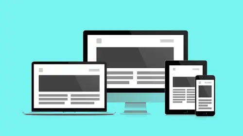
We're gonna use these terms floats and flow a lot. And so, we're going to take a minute to step back and say, "So, what, how, what is, they both sound like smoke on the water, I don't know. (audience laughing) Fire in the sky." Flow. One of the most subtle pieces of working in the browser that we looked at before, in it's simplest format. When I sqeeze that text and it pushes down, that's flow. That's flow in action. So if I were to have containers that had content in them and another container, each of those containers would begin pushing off of each other. So there's a natural push mechanic inside of browsers, and that's how content reflows once you change size. That's how that bumping and squeezing, this is why having a background in sculpture, having a background in sort of thinking in objects, helps me begin to understand layout convention. Now floats just break everything, but they're also our key to success. So floats break the flow. There's a flow happening with this primary ob...
ject. This one page flow. It's pushing everything down. When I create new objects, if they're block level objects, they're gonna render one right after the other. If I give one of those objects a float property, it's gonna get unseated out of the page flow, and just float. That's cool. Float up to the top, and to the left or right depending on where I declare it to go. It's gonna break out of the flow border and it's going to allow us to have columns. Again, getting into the technicalities of these ideas, I'm less interested in, and I'm more interested in you sort of understanding, again, at the sort of really baseline level. There are these metaphors in place, and this is how we begin to sort of understand how the objects on the page relate to each other. So when I'm working responsively, you can quickly add up floats and flows and begin to push and pull parts of your layout against each other. Yeah, and I think the other thing to add is that you'll notice as we're talking about kind of the floats and the flow, that there's this natural gravity within the browser. Everything wants to go up and to the left, right? So if you kind of think of that. That's your starting point, then it's all about control. And so using and embracing the natural flow, and then having another level of control with floats, really starts to give you that level of control. And that's, as a designer, what you want, right? That's how we're kind of making this a much more kind of engaging experience, by just starting to be able to control that. So here's another quick demo. Thing one and thing two. They're in the same flow. Right? I'm squeezing the browser. This container pushes that container. On a big browser, if I had a key called to action, I could not put it in the second container 'cause once I get to a smaller device, my sign up button is now pushed too far down on the screen. I can't put it there. Again, with a simple property, so both of these objects I'm calling panel, and they will receive the attributes that I'm giving them here. So again, the same attributes we gave before. Let's change this to 50. So now, they're floated. What was one singular flow has now become two parallel flows. So now on larger screens it makes more sense to have multiple columns, so I don't lose this object. It's now floated up and to the side. Excellent. So let's just jump back here. Floats and flow, playing nice together. Responsive images. This is it. I'm out. I'm done. (audience laughing) That's the whole thing. Responsive images. I think there's more. Max width 100%, I'm gonna go home now. (Andy laughing) But it truly is as simple as this to make an image responsive. All images in your browser, in a specific website, as long as part of your base reset, and this is fairly standard at this point, but I want you to sort of see that this isn't baked in, you tell all the images to have a max width of 100%. And that means they're going to conform to the size of the browser. But, there are some issues with this. One of those issues is this image, the big eight by 10 glossy, that's the wrong measurement for sure. Wrong width, too. Wrong width, wrong medium. (Andy laughing) And this, mobile compress image, are the same size. That can't be good. There has got to be another way to do this. So as a designer, you should know that as your job, you're going to actually be preparing multiple resolutions for images in your websites. You won't just be handing off one image and saying, "Good luck. I'll see you later." You're gonna have to have a conversation with your developer at some point. Find out what those two sizes are and you're going to process those images and work in tandem with your developer to make sure... It's not a one-size-fits-all solution anymore. So that's the first problem with responsive images. The second problem with responsive images is every website now has these big glorious images at the top. Sites like medium.com really made this popular, and they're great. They tell a really evocative story really fast. They're above the fold. They communicate with lots of people. Pictures do jobs that words can't do. They cross cultural boundaries. They're amazing. But when I shrink it, it looks short. (Jesse laughing) So that's a problem. The solution is again, you're gonna have to prepare another cropping of that image for smaller screens. This is not a rogue decision you're going to assume to take on. You can bring the suggestion to the table, but you should just know it's not a one size all proposition. So let's real quick go back to our example of responsiveness in the browser. I have commented out an image and I'm gonna drop my image back in. I love that picture. And so, here's my picture, and you see it's not playing nice. Look, the text, it reflows. It's playing nice, but this image. (Jesse mockingly groans) It doesn't play nice. Just reduce it down to max width. Same image. One property applied to that image. Now when I shrink my window, everybody's on board! We've got responsiveness! It's reflowing, everybody's playing nice. Again, my job's done. Let's go home. So that, quite simply, is how you get columns and images playing nice together in responsive land. The last piece, and probably the most complex, 'cause there's not an immediate metaphor for it, are media queries. So media queries are events that happen in the browser. And so these events are gonna check for a specific condition to take place and create the safety zone of styles. And only within this safety zone of styles, if that browser condition is met, you get access to these. Otherwise, they're hidden. They're secret. And so there's history for this, precedence for this is print queries. So all websites, when you hit print, have, should have this standard. We're gonna strip styles out we don't need. Why do I need a button when I print out a website? On my piece of paper, the button doesn't do me a whole lot of good. Navigation, site navigation, doesn't do me a whole lot of good. How do I navigate this piece of paper? So we learned to remove this we don't need. Same idea with responsive, going from mobile first. Modern media queries start small and as we grow, we nest those nice to haves and those extra features in those media queries. This is what a media query looks like. Again, traditionally, when we first came up with them, we had desktop first media queries, 'cause all websites were already built for desktop, and so we need to capture and contain the smaller screens within a media query. Now, since we're building them from scratch, from start, we're starting mobile first, meaning we're gonna build for smaller screens first and then add. So again going back to our example here, I have put this column event inside of media query. See? It's like baking the chicken before the cooking show. So on larger screens, in 800 pixels and above, I have two columns. But beneath 800 pixels, my columns aren't there anymore. I've taken those rules and hidden them. Hidden them away. So nobody gets to see them unless they show up as 800 pixels and then these rules start to emerge and then I begin to tell a bigger story. Jesse? Yeah. Quick question for you. Sure Just to kind of set a little bit of the foundation here. What's the difference between HTML versus CSS? Right? Kind of a foundation question. We've been talking a lot about Sure. Sure. media queries and things like that. We're starting to see it in Yeah the code, but I see the two columns. So maybe you could just explain really quick the difference between HTML and CSS. How many people here have done any amount of HTML or CSS previously? A little bit. One, two, three, four. Three? Cool. Do I count? Sure. Man, I know. It's like you're not even there. (hosts laughing) HTML is a browser standard. This is your content. This renders in the browser. This is what the browser is actually seeing in line. This is the semantic structure of your content. It's giving emphasis and meaning to the content. CSS is an external sheet that lives somewhere else and gets piped in and styles that content, gives it properties like size and color, measurements and width. This is also where you put your media queries. So again, your actual content exists primarily in text form, in an HTML document. And CSS files are external files that are linked to the HTML file that pipe in styles. And it wasn't always that way. Yeah. That separation that happened, really kind of allowed for all kinds of new types of progress to me made within this medium. It really allowed for a lot more control. Content is now separate from layout and style.
Class Materials
Bonus Materials with RSVP
Bonus Materials with Purchase
Ratings and Reviews
CityGirl
I've already taken several web design classes, but there were still some details that I found confusing. Andy and Jesse did a great job of explaining things like; programming languages and how they interact to form the structure of a site, work flow responsibilities between team members and the blurry lines between them; and agile methodologies applied to work flow. They used case studies to illustrate how this all happens, where variations crop up, and how to address them. If you're new to web design, or just want to understand the functions of other team members, this is a great real world look at the whole process. I haven't found this in any other class, either on-line or local. Andy and Jesse are both very experienced working designers with current knowledge. They're very responsive to questions and seem to really enjoy teaching. Having two instructors is a great benefit because you get double the perspective, knowledge, etc.
Junko Bridston
I worked with Andy when he was a Creative Director at Funny Garbage, a design studio in New York City. I found him to be knowledgeable, articulate, and lovely to work with. I learned so much from him at the beginning of my career. In response to a previous comment: it seems silly to dismiss this class because Andy wears t-shirts with his blazers. If you think leaders only wear suits and ties, then maybe this class isn't for you. But if you want to learn from someone with loads of experience and a friendly manner, I really recommend it. You won’t be disappointed.
Jesah Segal
From A to Z, this class methodically covers everything you need to know to create a website from scratch. Great class. The teachers are great too.
Student Work
Related Classes
Branding