Lessons
Day 1
1Class Introduction
09:10 2The Design Flow Basics
18:27 3The Designer as Co-Creators
06:48 4Get to Know Your Material
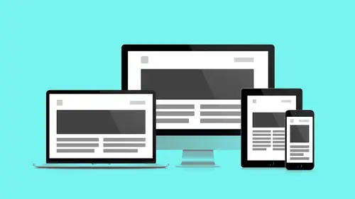
17:07 5Responsive Vocab: Floats, Flows, & Images
11:58 6Mobile First: Working Small
09:46 7Future Friendly: Embrace Unpredictability
14:17Collaborating with Your Clients
13:52 9Prioritize Your Users
39:42 10Best Practices for Defining Success
08:58 11Intro to Scrum
04:24 12User Stories & Epics
35:53 13Content Basics
27:40 14Defining the Visual Language
22:31 15Starting with Type
35:31 16Starting with Grids
15:40 17Gutcheck & The Product Brief
22:03 18Working With Developers
12:33 19Communicating with Developers
16:25 20Finding a Common Language with Developers
06:28 21Code Literacy
04:37 22Sitemap & Wireframe Basics
33:48 23Prototyping Basics
12:02 24HTML Prototypes
13:28 25Code Literacy & Developer Tools
11:46 26Developer Lingo
07:23 27Interface Personality & Behavior Galleries
17:27 28Designing for Performance
18:19 29Progressive Enhancements
07:00 30Designing a System: Discovery to Pattern Library
12:25 31Workflow Examples
20:25 32Applying the Style Guide to the Pattern Library
09:08 33Alternative Workflow
23:04 34Alternative Workflow Part 2
21:52 35Tech Requirements
21:53 36Retrofitting an Existing Site
12:15 37Project Cupcake: Building a Site from Scratch
24:08Day 2
Lesson Info
Prototyping Basics
How many wireframes are too many? Like sometimes I'll make a wireframe that's like this is page open, this is page closed, this is page half closed, this is page quarter closed. This is that point when you put your finger in the thing and you just kinda like (grunts) I can make a drawing of that and so that can get kinda frustrating. At some point it just doesn't make sense to make a wireframe. In parallel you gotta start prototyping to save your wireframing hands the trouble of having to document every little thing. Well wait, I'm making a website it moves, that's right. This is a great quote, Sophie Shepherd said that. "It moves." I think it's... We take it for granted because again I guess the way we're visualizing this, we see the movement. I see the movement when I look at my wireframes. But my client doesn't see it, my developer doesn't see it. So I've got to take what I see, the same way your client needs to take their business goals and like, Vulcan mind-meld into your brain. Y...
ou've got to take your stuff, and you've gotta find your mind-meld device, and that's the prototype. And again, using realistic content whenever possible is really gonna inform this process. The same benefits that are informing our wireframes are gonna inform our prototypes. How these containers stretch, bump into each other, the more accurate we are with content the better. And again, whenever prototyping it doesn't mean we're making a simulation. It doesn't mean I'm making your website but just locally on my machine. These are not necessarily pretty things. We're just, again, we have a hypothesis and we need to test that hypothesis. We need to make it clear to everybody on the team. Prototypes only have to be as pretty as they need to be in order to get the message across. So we're gonna look at three resolutions of prototypes. Clickable wireframe prototype, very similar to what we did on the wireframes area. As far as like... resolution wise. But now we're gonna add buttons. Kinda, in the title. I don't know why it took me so long to say clickable. But it did. And then after we have the clickable wireframe which you know now our wireframes have buttons and they link to each other, we're actually gonna get into HTML and see how the HTML affects the structure of what we're making. Finally, after developing these HTML templates that are clickable that show us some layout options we'll get into HTML wireframes. So what is a clickable wireframe? A clickable wireframe is just showing the flow. Again, we have all these screens I just need to see how we get from screen to screen. What they also do is they allow us to focus on device context, meaning what happens when this thing is in the palm of my hand. The next thing I get to do I get to foster collaboration and discussions with developers. You'll see I can send my clickable wireframe as a text message to everybody and you can have it on your phone. You can start clicking on it. Pretty radical stuff. So again, what are clickable wireframes? They are clickable. It's not just page to page, it's how the pages move in relation to each other. There are things called transitions. Does it fade? Does it slide? What's happening? This is stuff that Andy's gonna follow up with when we get to interface personality. How do things move? And then finally, what does it look like when it's actually in the palm of my hand? Not this simulation that's out there in the browser. So clickable, I have my stack of wireframes. I wanna start clicking them. I wanna start seeing how this stuff works. So again, back to InVision. Here is the homepage. Again I've uploaded all these screens previously to an InVision project. It's pretty easy to select an object in Balsamiq, export it as a PNG, and just drag and drop it into InVision. InVision lays out all those files for me. I haven't really done any real formatting here. I've just exported these straight up out of Balsamiq. It gives me a little in-browser simulation of the device. So now I'm scrolling, this is my thumb looking at stuff. That's really cool. I wanna click this. (grunts) it's broken. I'm gonna use build mode and I'm gonna draw a button where the picture of a button is. I'm gonna make a clickable surface. I'm going to have this click to my menu and I'm gonna save. Preview... I click. That's awesome, look at that. I've got a page. That's pretty sweet. But... Now I'm tabbing. But there's something weird about that. It's like, it's really joggy. So you can see I went through back in here earlier. Now that seems right. So I click on the back button which I made earlier. This is where the whole cooking show metaphor starts to break down. I made that button earlier. So I added the button to the homepage. It lets me click through, that's great. It seems kinda jaunting. I need to add a transition to this element in order to make it really feel intuitive. And then while I'm at it, this search box needs to go somewhere. Let me add a button area to my search. Select a destination. That's gonna be mobile search. And then there's this other option over here this is the transition. This is how I want this drawing, static drawing, to transition to the next drawing that I have in InVision. And I would suggest that you experiment. So let me see, slide right. Let's try slide right. See what that looks like. That was wrong. That felt like it, it felt wrong. You know one thing that's really cool about this is that if you have this link and you send it to your team and they are on a desktop browser, then it's gonna kind of come up with this frame around it. But you can send that same link to a mobile phone and if they look at it on a mobile phone browser it loses all that and then it just feels like that kinda native app. So something that's really cool, you very quickly can get a sense of it, right? So when I got to search I can see I'm kinda stuck here. So I want search to always go back to the last screen I visited. I don't wanna point this to a specific screen because this is a global element. So I want the search close to just go to the last thing because I would've gotten here from somewhere and I wanna return to there. So last screen visited. And again, so what did we do last time, slide left? I think we did slide right, so do slide left. See what happens. Do slide left. Again, pretty quick to demo. Let's close this and see if we got it right. (exclaims) That works. Make sure we add our... We never added the transition to this. So what's great about this that very quickly you can kinda test some flows and we've used this program to do formal usability testing. Kind of in sessions, you know imagine two day sessions where you have six participants each day kind of behind the glass. Also just kind of done casual things, where you're going and asking people to check something out. And then of course for your client and your team. I find myself spending probably just as much time, if not more nowadays, in tools like this than say even tools like Photoshop or Sketch. And it's just because there's so much to try to communicate in a way that say, those tools just aren't going to do that. The cool thing about experimenting is that you get to be wrong, I love that. Like I didn't know, let's see. All right, close, close, open. Sweet, that's like four times, that was awesome. You got there though I got there. That's what's important. So again, your wireframes become much more powerful when they start to flow in between them. They start to tell stories like, "oh that exists over there." It's not just like, that part of the page is bigger. No, it's outside the window. This becomes a lot clearer when you actually have a clickable prototype to do the job for you. But again, this is readily available for everybody on the team. And again you saw when we first did it this is even cooler, InVision gives you eye frames. Eye frames can go anywhere. And so I've embedded the prototype actually in the presentation. Slides.com... allows me to do this. It might make sense again to put your wireframes somewhere that doesn't exist within the application. Maybe you have an end client who you don't wanna have to log in and deal with all of that stuff. You have access to a page that's a little more client presentation friendly and you can just give them a direct link to that and embed that maybe with some comments along side. But again for this presentation it's super handy. So again the transitions help me see that it's not just a series of clicks but it's how these pages relate to each other. First we establish the connections and then we start to talk about how those connections take place. So after device preview, I mean after the clickable areas, after the other stuff we get into device preview. Device preview is called a lot of things in a lot of places. Adobe has a product called Edge, which I really enjoy. Which allows me to sync up my desktop and my phone and actually see it on my device. Again not a picture of a device, the actual device. And so again it's as simple as getting a text message from InVision. It'll output a SMS, you'll send that SMS to anyone on your team and they can immediately click on it. So you'll be surprised by how many subtle things happen when I actually have to use my phone to do things I'm currently doing with my eye and my other fingers or a mouse. This is where you actually test ergonomics. This is where you start to get into the body posture and position like, "oh, there's just not enough room "on the screen, I need that become a member button "to be above the screen." That might not come across in any other context besides being on the phone itself. Again not a picture or a simulation, but on the device itself. So again things to remember prototyping allows us to test our assumptions in the browser. Interactions allow users to experience the real flow. Prototypes are the first time you as a designer are seeing your device in this real context. So of course you're not done with your design yet. Prototypes are gonna help you design. They're not tests of your design. They're teaching you how to design. And context and posture have greatly influenced our design decisions.
Class Materials
Bonus Materials with RSVP
Bonus Materials with Purchase
Ratings and Reviews
CityGirl
I've already taken several web design classes, but there were still some details that I found confusing. Andy and Jesse did a great job of explaining things like; programming languages and how they interact to form the structure of a site, work flow responsibilities between team members and the blurry lines between them; and agile methodologies applied to work flow. They used case studies to illustrate how this all happens, where variations crop up, and how to address them. If you're new to web design, or just want to understand the functions of other team members, this is a great real world look at the whole process. I haven't found this in any other class, either on-line or local. Andy and Jesse are both very experienced working designers with current knowledge. They're very responsive to questions and seem to really enjoy teaching. Having two instructors is a great benefit because you get double the perspective, knowledge, etc.
Junko Bridston
I worked with Andy when he was a Creative Director at Funny Garbage, a design studio in New York City. I found him to be knowledgeable, articulate, and lovely to work with. I learned so much from him at the beginning of my career. In response to a previous comment: it seems silly to dismiss this class because Andy wears t-shirts with his blazers. If you think leaders only wear suits and ties, then maybe this class isn't for you. But if you want to learn from someone with loads of experience and a friendly manner, I really recommend it. You won’t be disappointed.
Jesah Segal
From A to Z, this class methodically covers everything you need to know to create a website from scratch. Great class. The teachers are great too.
Student Work
Related Classes
Branding