Project Cupcake: Building a Site from Scratch
Lesson 37 from: Modern Web Design DemystifiedAndy Pratt, Jesse Arnold
Project Cupcake: Building a Site from Scratch
Lesson 37 from: Modern Web Design DemystifiedAndy Pratt, Jesse Arnold
Lesson Info
37. Project Cupcake: Building a Site from Scratch
Lessons
Day 1
1Class Introduction
09:10 2The Design Flow Basics
18:27 3The Designer as Co-Creators
06:48 4Get to Know Your Material
17:07 5Responsive Vocab: Floats, Flows, & Images
11:58 6Mobile First: Working Small
09:46 7Future Friendly: Embrace Unpredictability
14:17Collaborating with Your Clients
13:52 9Prioritize Your Users
39:42 10Best Practices for Defining Success
08:58 11Intro to Scrum
04:24 12User Stories & Epics
35:53 13Content Basics
27:40 14Defining the Visual Language
22:31 15Starting with Type
35:31 16Starting with Grids
15:40 17Gutcheck & The Product Brief
22:03 18Working With Developers
12:33 19Communicating with Developers
16:25 20Finding a Common Language with Developers
06:28 21Code Literacy
04:37 22Sitemap & Wireframe Basics
33:48 23Prototyping Basics
12:02 24HTML Prototypes
13:28 25Code Literacy & Developer Tools
11:46 26Developer Lingo
07:23 27Interface Personality & Behavior Galleries
17:27 28Designing for Performance
18:19 29Progressive Enhancements
07:00 30Designing a System: Discovery to Pattern Library
12:25 31Workflow Examples
20:25 32Applying the Style Guide to the Pattern Library
09:08 33Alternative Workflow
23:04 34Alternative Workflow Part 2
21:52 35Tech Requirements
21:53 36Retrofitting an Existing Site
12:15 37Project Cupcake: Building a Site from Scratch
24:08Day 2
Lesson Info
Project Cupcake: Building a Site from Scratch
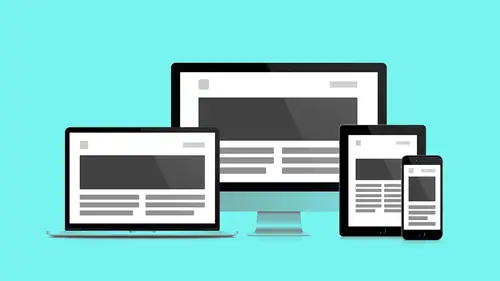
Cupcake is the name for Favorite Medium's internal time tracking tool. They mentioned we have a lot of remote teams. We have distributed teams, and so we're having a hard time finding a tool that would work given some of the nuances for our own internal team members to track time. So what we did have starting out with this is we had a minimum viable product also known as an MVP. This is going to be potentially one of those words you may hear a lot. This also may be one of those words that becomes... I forgot which one of you was like, "What is the jargon?" So MVP might be one of those overused words that you hear a lot as well, to be honest. But if you bring it up, and you're talking to your client, there is a very sense of what that means. It means that it's not the kit and caboodle. It means that you're gonna be able to work with them to help prioritize what are the features that essentially allow that product to be deployed and no more. Now again, that's still a bit of a range, and ...
everyone has their little threshold of what they're comfortable with. For example, sometimes it still may need to be visually tight. Other times, maybe people are a little more cool with it just kind of being out there and seeing what happens. But the idea is you're not trying to invest so much time into that product that to try to pivot or change direction because it's not really what people, your users, want now that they're starting to experience it. It's going to be very cost-effective. The quicker you get it out into the wild, so to speak, and get that feedback, then the more you can adjust. For us, our MVP was a working product. We had a tool that we built that we could go and enter our time in. That's what we needed to do. It was fixed width; it was not responsive. It had no media queries. Basically, you just used it on your computer, like your desktop computer. When we wanted to kind of learn and figure out how to make it better, we needed to figure out what was working, what could we make better, and what were the pain points for our users? Our users being our own team members. This is what this ended up looking like from that linear process. We still created a product brief. We had user stories, went to wireframes, prototypes. A lot of things were still very much the same. Except even when we did the product brief, we still actually had an MVP to build off of. I wanted to show you a little bit about the product brief and kind of dive into that. One thing that is very easy to do when you do your own internal projects is to be like, "We're professionals; we can skip steps. "We know what we're doing. "We're just gonna skip a couple steps here. "We're just gonna jump ahead, kind of chutes and ladders, "like voooo, there we are! "We're already up ahead." But you so often hit that slide and wah-wah-wah. You're all the way back down. You're like, "Ah, we didn't do all the things "that we would do for our client "because we were being too clever." So what we wanted to do was, as best as possible, start using what we do for our clients, start with a product brief. First thing I did was identify our business challenges. For this project, we realized that we have unique needs. We spoke about our needs as distributed teams, things like that. We realized that we didn't want this to be everything. We want it to be a tool that would do a couple specific things. Other competitors did a lot more stuff, but we didn't need this to be this big, giant, bloated tool. We realized that we were using a whole set of disparate tools for different functionality, but they didn't really integrate with each other. And, of course, cost is a consideration. Cost is always a consideration. How many clients nowadays are like, "Whatever you want. "Whatever you need, just go for it?" That doesn't happen. That used to happen actually before the first internet bubble burst. You'd be like "Whoo! "We have a Chief Morale Officer. "Awesome! "Everything's great; "they bring us ice cream during the day." That doesn't happen as much anymore. I didn't get any ice cream. Ah, did you have a Chief Morale Officer? No. A-ha! That's their job. So we also defined what we weren't going to do. We already use Google for collaboration. We didn't need to reinvent that. We have all these other ways that people communicate, so we don't need to reinvent those channels. As we talked about, we're very integrated into our Google suite and even other tools as well. This doesn't need to try to store any files. We don't need this to be used as a way to invoice. It doesn't mean that we don't want that data to kind of influence estimated rates versus burn rates. What did we estimate versus what did we actually spend so far. That was still really important. We did still want a level of reporting, but we didn't want to then kind of tie into some type of automatic invoice. And we also didn't need this to be any kind of client review tool. This was definitely internal. We didn't need that kind of client view, so to speak. But even with that, we still had different user types. Primary one being employees. This is really for them just to capture their data. You'd even think even a small team, do we really have different user types? Very much so. Project managers. That way they can dive in. We identified them as number two. They need to be able to see who's spending their time on what and how much potential hours are left so we can keep on budget. Resourcing, that was another thing. Knowing that we can see where people are at with their hours. We can then allocate different people or say, "You know what? "This person's doing lots of stuff on internal projects. "They have a little time. "We can also shift them over here." Now this works with another tool that we use as well, but this was a little bit of a check to see where things were at. And then, of course, executives. High level monitoring so you can be like, "Yay! We're doing things awesome." Or, "Oh, no, we've completely screwed that up." Giving us a sense of where we're at for certain projects. But really the key three were employees, project managers, and just anyone involved in that resourcing process. We created a little bit of a product positioning statement. And it followed a template like this: You have the for, the who, our product is a, that provides, and. That seems weird, but if you read it, "For employees and the people managing them "who have trouble with time management "our product is a self-service project time management tool "that provides a simplified, seamless experience "and visibility into data to help make informed decisions." Cupcake, yay! Sounds so awesome. Now within the product brief, some of the stuff we put in to was our user research. Besides just capturing goals, well we had very easy access to our users, so our Director of UX, Laurel Tripp, she went through and interviewed people. We did reportings and all this kind of stuff and tried to just understand what were their pain points, where were people getting hung up, what were some of the needs that weren't being met. The way we put that into the product brief was doing something like this. We essentially wrapped things around an epic. And then from that epic, we understood what the pain points were that were specific to that epic. And then those numbers there essentially represent how important it would be to those user groups. So here we have epic tied with users tied with pain points giving us the insights that we need to help inform these future decisions on what we might want to do. Doesn't this look like the nutritional information for cupcakes? Cupcake is nutritional. I love it; I love the layout. Like I'm right there thinking, "Wow, that's great." Sugar, carbs. Immediately what is, is it gluten free? Is this cupcake gluten free? Here's another quick example. We have entering weekly time. That might be one of the things we're after. Then we have what the epic is. "As a basic user, I need to be able to keep "accurate track of the time I spend on a project." Some of the pain points might be things like: Hard to find the project code or make sure that I'm using the right project code. Projects are not listed in any type of order. Some of these things are really simple to fix. Our projects in the list in our MVP were not listed in any type of order. Imagine that next time you're going to another site that has a pull down, and you have this list. Just imagine it random and how difficult that will be to use. Just by making the projects alphabetical, man, that's so much easier. Some of them are really easy fixes, and some of them are a little more difficult. Then we went in to user stories. Again, we had epics in user stories. This is a screen grab of our backlog of some of the tickets that we had. And you can kind of see here, what's the highest number there? 164. And that's actually probably not that bad for a project. But, you know, they get up there. You're adding a lot of tickets. We had wireframes. Here it is; we had some mobile wireframes looking at some of the screens. This is going to be a main screen that you'd use to enter your time, what would that experience look like on a smaller mobile phone. Then desktop. So here it is; now we have those extremes. Now we're kind of getting a sense of what that's going to look like. And now we have a prototype. With this prototype, we don't have an HTML prototype. We don't need one. We actually have a working product. What we do need is an Envision prototype. So this is where we started to take the wireframes, put them into Envision. Now we can start to click through certain things and get a sense of it. This just allowed us to communicate those ideas and show how things might be evolving. Then we created the PSD comps for the extremes. You can start to see how our visual language is starting to be built on top and evolving it. So not only were we trying to one) improve the product just from a usability perspective understanding and learning from our users. We wanted to also make it responsive. This now became a requirement. If we're going to redo it, let's make sure that people have no excuse why they're not entering their time. "Oh, I wasn't at my desk." Now you can do it on your phone. There's really no reason. And then, of course, updating the visual language and starting to establish what a language looks like for our Favorite Medium's internal tools. So then what we were able to do for some of those screens is add that layer of fidelity. We're building on top in Envision, switching out the wireframes themselves. For the key screens that we designed, we could just replace the wireframes themselves with the comps. You don't necessarily have to do that for all. You might get a little bit of a mixed bag. But now in those flows, we have examples that are more visual so we can kind of see how it's coming to life. Using Envision as a tool to increase the fidelity or your project. We had all these things. We started, again, putting them into the component guide. Here you can see this now becomes our master document. And it just kind of continues to grow. We had just examples of what some of the global nav might be, some of the button styles, forms, feedback states. And this is something that we didn't really talk about too much. But with so many of the products and so many things that you're interacting with, making sure that you're considering that feedback. How do you know if something's wrong? How do you know if, "Did I do that? "Did it go through? "I'm not getting a thank you." So much of the tool, so much of the products we use should reflect the interactions that we would expect in real life. It's really weird if I'm like, "Hey, Jesse, what's up?" and you're just like standing over here and you're not answering me. You're like, "Come on, I just asked you a question." If your products do the same thing, then that's really awkward. You need to think about how there can be a little bit of that natural reaction. So that way you have an appropriate conversation and response. So then we were able to start to create a behavior gallery. This is something that because it's an internal project, that's kind of continuing to evolve. I knew this was going to be one of those things that was going to be like the nice to have. That's reality. But I still wanted to create one. I still wanted to start identifying what motion is appropriate now for Favorite Medium. How do we consider what that's going to be across our language of products that we're going to use? So we avoid this fragmentation of behavior. This became our pattern library for our tool. We have things like global navigation. We have button styles, link styles, forms, colors, type, and tables. And this will continue to grow as we need it. There's a couple important things when it comes to something like a pattern library that I think are really worth highlighting. This is obviously a bit of work to do. As we mentioned, this doesn't come for free. There's a bit of effort. And there's also, as you're communicating with your team, fragmentation that can happen. So one of the recommendations I would make is just as you're working with your teams to make sure that you have this evangelist, this person that considers it their responsibility. They're the person that gets to prune and decide what goes in it, what shouldn't go in it. Not everything necessarily needs to go into the pattern library. Sometimes you might be using an element only once. Do you need to make it something that's truly available? Other times you're going to see it's really important. So then it's worth it to go in. And by establishing essentially this kind of owner, this evangelist, then you're having someone that's essentially the gatekeeper, deciding what goes in, what gets pulled out. So there is just a lot of flexibility there. There's a lot of control there that needs to happen. And if you have big team members, then you can switch who that owner might be. Maybe if you're taking turns or something like that. But ultimately the goal of the pattern library is to create efficiency amongst team members and to create consistency with all the various teams themselves and the interfaces that you're using. It's so amazing how often even designing a product like this where you're like, "Wow, those button styles are "slightly different, but there's no reason for them to be." Considering having someone in charge of the pattern library so that way there is that level of control. And the larger the company gets the more difficult this becomes because the number of people required to watch all those components, it starts to get really difficult. There are automated services that start to check the code, that sort of look for redundancy. And those things help you out. But true pattern recognition, yeah, you still need people. There are still the companies that get so big that I build a component over here to solve one problem in one department, I build another component over here to solve another problem in another department. All based on the same general atoms and maybe even the same molecules, but completely different organisms. It's like at some point there's bloat in that. You start to get redundancy. And there's no way for the system to sort that out. Yeah, it's sort of like the role of the whole team to be self-regulating that stuff. It's a problem that occurs sort of as these things become more complex so it's interesting. Exactly, and they quickly become more complex. You're all kind of like, "Wow, now we have a lot "of people working on this thing." So could be really helpful to do that. This was the final version of where we went from the wireframes. This is a screen grab from the tool itself. Just a lot of simplification as far as just a lot of the elements and how we were using it. Is it perfect? Nope. Does it need to be perfect? As a designer, I want it to be perfect, but I realize that that's probably not possible. And so this would be the kind of thing that we're going to continue to evolve. But knowing that we had a pattern library, knowing that we went through that process, we were able to keep building, keep improving on it. So what's interesting with this is now that we have this language, we have this established language, we have these components that we can reuse; now they can be extended into other things. So the next tool that we're also working on beyond cupcake; it's actually not called beyond cupcake. It's our Time Off app, codenamed Aloha. With Aloha, basically this is a tool that instead of trying to capture your time, the point of this tool is really to be able to take time off. To take your PTO, your paid time off. So what we have here is two columns. On the left here, this is basically showing how many days you have left, how many days you've taken, and then how many days you might have pending. You've requested them, and they're in an approval queue. So you're waiting to get that confirmation that you can take it. Underneath that is the form basically that's just asking the questions so you can go and take it. And then it's just confirming how many days that you are asked to take. Then on the right side here, we have the company time off, a calendar view. So that way, you can really get a sense of like, "Man, I have a couple options of when "I could take some time off. "I can already see that Monday, May fourth, "there's a couple people off. "Or on Tuesday, May 19th, man, it looks really busy then." So maybe not take it. So you can kind of get a sense of who's taking what time off as well as what are the holidays that are going on within the different offices. So this becomes a really great way that we can take that language that we already have, and now we kind of have this ecosystem. Now, we're gonna be able to do this for other products. Now how many products we've decided to do, who knows. But as long as we can build off of the pattern library to create that consistency, we're gonna guarantee that kind of brand consistency across these different products. I think what's really cool from a design perspective is web design, to me, combines the best features of motion and print. We have beautiful typography now. We have animation. But then we have these other awesome features of interactivity and feedback. And so that makes for a very expressive medium. We're starting to be able to push it. We're coming out of that pre-history into an area now where we're finally starting to see it starting to form into something. And we're starting to have it be this craft that's really, really exciting to be a part of. And so as a designer, don't fear interactive design just embrace it. For Jesse and I, this whole process of doing this talk was very much embracing the things that we were talking about. We don't work at the same company. We have respect for each other. We have different skill sets that overlap. And through that, we're able to figure out how can we create this faux Ministry of Space project which although it's not launching, all the types of things that we're created for were very much real. MinistryofSpace.gatehub.il. Is real, yeah. It's there. But the museum will never open. I'm sorry to say that. I was gonna start the Kickstarter immediately after. Maybe we'll get NASA involved. May be, may be. So I really see this as just the beginning for everyone. This isn't the end point. This is really the start point both for everyone out there and you guys, but also for us. Because we can't consider this like, "Yes, we know everything." We have to change. Some of the questions that you guys were asking is like, Hannah, you were asking, "Hey, can I use Illustrator? "I wanna do Illustrator. "I wanna design my stuff in Illustrator. "Can I use it?" And it's like, "Yes." I'm not trying to say that you can't use Illustrator. What I'm saying is that I use largely Photoshop and Sketch, and I use Illustrator to create content. But where's your mindset? Where is your head? What's the quickest way for you to think? Take some of these techniques and dovetail them into your own process, working with a developer to help find out what that is. And working with your client to make sure that you're solving the right problems. And I think in that way, you're gonna be successful. You can start off small. Maybe you're doing some workshopping stuff, but you're still trying to learn a little bit of code. But you're starting to get a sense of it. So maybe you're still trying to help them. Maybe you're using a Square Space site for them. You're helping them figure out their content because they still have to do that. And you're adding custom code snippets into it because you can now tweak it a little further now that you know the vocab. Maybe you're taking a little step further and using something like Front because you can play a little more. And you wanna build, and you wanna experiment. And you don't want to be limited by some of the choices in templates from Square Space or Wix or something like that. Or now maybe you're willing to take things further and work with your developer, build something from scratch. Maybe it's using Photoshop at first. Maybe it goes beyond that, and now you're just designing right in their browser like Jesse is. I think that my biggest piece of advice is something we touched on in the first day. Whatever your process is, keep it fairly modular. I would never buy into one suite of tools and say, "I use this branded suite of tools." I think that limits my options. I would say experiment with a range of tools 'til you find the tool set that solves your problems for you. And at the same time, I would not get locked in to those models of thinking, that idea that Photoshop is the real thing and the browser is a broken version of my Photoshop file. You know what I mean? Or that the website is the real thing, and the Photoshop is a mummy compared to what I think it is. As long as you stay open and realize that no one of these things is the finished thing and actually understand it's the user's story is the closest that you're getting to the real thing. And everything else is just a version of that.
Class Materials
Bonus Materials with RSVP
Bonus Materials with Purchase
Ratings and Reviews
CityGirl
I've already taken several web design classes, but there were still some details that I found confusing. Andy and Jesse did a great job of explaining things like; programming languages and how they interact to form the structure of a site, work flow responsibilities between team members and the blurry lines between them; and agile methodologies applied to work flow. They used case studies to illustrate how this all happens, where variations crop up, and how to address them. If you're new to web design, or just want to understand the functions of other team members, this is a great real world look at the whole process. I haven't found this in any other class, either on-line or local. Andy and Jesse are both very experienced working designers with current knowledge. They're very responsive to questions and seem to really enjoy teaching. Having two instructors is a great benefit because you get double the perspective, knowledge, etc.
Junko Bridston
I worked with Andy when he was a Creative Director at Funny Garbage, a design studio in New York City. I found him to be knowledgeable, articulate, and lovely to work with. I learned so much from him at the beginning of my career. In response to a previous comment: it seems silly to dismiss this class because Andy wears t-shirts with his blazers. If you think leaders only wear suits and ties, then maybe this class isn't for you. But if you want to learn from someone with loads of experience and a friendly manner, I really recommend it. You won’t be disappointed.
Jesah Segal
From A to Z, this class methodically covers everything you need to know to create a website from scratch. Great class. The teachers are great too.
Student Work
Related Classes
Branding