Lessons
Day 1
1Class Introduction
09:10 2The Design Flow Basics
18:27 3The Designer as Co-Creators
06:48 4Get to Know Your Material
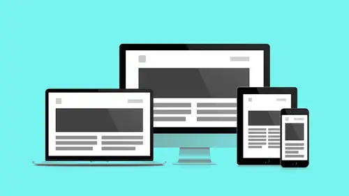
17:07 5Responsive Vocab: Floats, Flows, & Images
11:58 6Mobile First: Working Small
09:46 7Future Friendly: Embrace Unpredictability
14:17Collaborating with Your Clients
13:52 9Prioritize Your Users
39:42 10Best Practices for Defining Success
08:58 11Intro to Scrum
04:24 12User Stories & Epics
35:53 13Content Basics
27:40 14Defining the Visual Language
22:31 15Starting with Type
35:31 16Starting with Grids
15:40 17Gutcheck & The Product Brief
22:03 18Working With Developers
12:33 19Communicating with Developers
16:25 20Finding a Common Language with Developers
06:28 21Code Literacy
04:37 22Sitemap & Wireframe Basics
33:48 23Prototyping Basics
12:02 24HTML Prototypes
13:28 25Code Literacy & Developer Tools
11:46 26Developer Lingo
07:23 27Interface Personality & Behavior Galleries
17:27 28Designing for Performance
18:19 29Progressive Enhancements
07:00 30Designing a System: Discovery to Pattern Library
12:25 31Workflow Examples
20:25 32Applying the Style Guide to the Pattern Library
09:08 33Alternative Workflow
23:04 34Alternative Workflow Part 2
21:52 35Tech Requirements
21:53 36Retrofitting an Existing Site
12:15 37Project Cupcake: Building a Site from Scratch
24:08Day 2
Lesson Info
Mobile First: Working Small
So now we know we're working small first. We saw in media queries really quickly. Again, the old way of doing it, all these types existed. So yes, we were retrofitting them. We were kind of taking them and bending them and shoving them into our phones to make them fit, and now we're building from scratch. We get to start over. We don't have to repeat the mistakes of the past. We get a fresh start. This should be exciting. I am part of this thinking as a designer. Let's start mobile first. Let's start small. This is a quote from Sleepless Media. This sort of generally captures the idea. "Mobile first is the process of designing navigation, "layout, and content for the site on the smallest device "before you even think about desktop," right? So don't get ahead of yourself. Sure thing. I have a question. Yeah? Since we're talking about working mobile first, smaller first, how does wearables work in this picture? Are they changing the game or what's happening? Wearables in my mind ...
are still edge cases. So I would still, I would personally, I'm still designing for this 3, 20, 4, 80 sort of single column display and moving up from there, but we are beginning to pipe in channels, and again, it's a content request at this point. So it depends on user adoption and how quickly the market grows. Yeah, I would agree with that, and I think the other thing is that because of its limited size, it's really kind of like the watch itself, a bit of an accessory, and I think we're gonna see a lot of experiences that are more kind of extending an experience rather than becoming the primary one. Now, that's just where it is now, and we will see that kind of evolve, and people will continue to push the limits, and because if the experience itself is responsive, then we're gonna start to see how that content should also work on those devices, but because there has to be a level of comfort and even asking, say, your client to kind of think mobile first is gonna be a little bit of a shift for them. To kind of go that small I think may be too much of a leap. So thinking about mobile or a small style of a break point is gonna be a safer bet. Really what you want to think is ideally it's just one column, right? That's what you're really trying to get. How do you prioritize the experience into a one column of content? It just so happens we're about to talk about that. That's so great. So again, mobile first thinking is threefold. On the first level, we have business goals. In the following segments, Andy's gonna talk directly about how we address those first, and in this segment, we're gonna talk quickly about how you can convince, which at this point you shouldn't have to convince them, but why it's a business goal first. Next up is performance. We're gonna talk about why working mobile first is gonna sort of really cut the crust off of what you're working on, and sort of really give your team discipline and speed, and then the last one is it really does your content a huge huge favor, because by limiting all the distractions you can actually concentrate on what's important and begin prioritizing stuff. So, business goals. Mobilegeddon, it's real. (laughing) I didn't put the atom bomb mushroom cloud in here. I thought you were gonna have that. Was it too much? Godzilla (growls)! Yeah, it was a little much. So are people familiar with this term or have heard it around? All right, so Google, what they used to do is they used to give you points for being mobile friendly. Hey, your mobile friendly points, a boost. Now, I'm afraid they're getting a little more aggressive. So at this point Google will begin penalizing you as a website, web product, business designer, everybody if you're not preparing and presenting a mobile first strategy, if you do not have responsiveness baked in to your website. So it's not, again, as optional anymore. So, again, it's becoming about real business, really sort of getting Google behind you. So we talked about Ethan Marcotte in the first section. This section is dedicated to LukeW, who wrote the book on mobile first, and he says that "building mobile first ensures companies have an experience "available to this extremely fast growing user base "widely considered to be the next big computing platform." And here are just some numbers that really sort of drive home that fact, and these numbers are all over the place. These are from forbes.com, but you'll find them anywhere you look on the Internet. So two years ago, this might have been more of a shock, but I think we're pretty much in that wake up call now. We understand the sheer number of devices available, mobile devices available is just dwarfing PCs. The other interesting fact that I thought is it's not that people are computing more on smaller devices. They're actually computing, but they're not on the Internet. Computers don't require the Internet to work. My phone, my mobile device, does, because without the Internet, it's just kind of a brick. So it has to do with the object. There's more things I can do here. I can get distracted by work, but having a mobile device, it's all I can do. So it's the default thing I do on this device, so there's more of them and it's my default action. Again, you can see people getting pushed and pushed more and more in this direction. So the simple thing you can tell your clients is why do you want to be a mobile first? Well, do you want to be everywhere? So it's getting your product in front of people's eyes, having that real brand reach. This is another graphic from LukeW. It was about 2011, 2012 when the crossover happened between PCs and mobile devices, and it is just escalating and escalating and escalating. It's kind of amazing too when you think of just how as users, our behaviors have changed. Our lifestyle has changed. If you kind of remember what your day looked like 2009, 2008, you had a very different kind of day to day experience, right, than now, and I'm sure some of you guys may even get a little antsy. I had someone kind of called me or texted me or, where's my phone? I need to kind of do something so I think our entire behavior has changed with the way we act because of these devices. The next thing up is performance. Again, we talked about business goals, and now let's talk about performance. Speed. So "when a team designs mobile first," another quote from Mr.Luke, "the end result is an experience "focused on the key tasks users want to accomplish "without the litter, the debris, "that clutter our desktop experiences." So this isn't just about bandwidth speed. This is about cognitive speed. This is about don't get in my way with all that stuff I don't need. When you put this on my phone, it's not just the fact that I have a slow Internet connection. It's the fact that I'm doing 10 other things. Get rid of all the stuff I don't need when I go to buy a ticket on my phone. I don't want to find out about all these other offers you have. I want to buy my ticket. So you don't have that, you don't have, your users are just a little more task driven. So you've really gotta cut the excess. You really gotta focus and again, this is an experienced performance, not just something I can clock in seconds. How does it make me feel? How performative is it? In the end, cut the excess. Andy trained me to put these really simple slides in between the informative stuff. Thank you, Andy. Lots of info. That's right, and colors. Discipline. When working with your team, we talked about this. All this extra feature, (grunts). It's nice to have (grunts) that. I want to buy my plane ticket front and center, and this is gonna sort of help you have conversations, again, with clients and developers. Discipline, focus, mobile first. Content hierarchy. Content king. So content hierarchy simply put, is the visual progression of hierarchy in mobile design. It's gonna guide the viewer through design where you want them to be. So, again, we've got our client onboard with business goals. We understand we've cut the crust, and we've gotten down to its focus. So now, how do I get an I from A to B? And like Andy was saying earlier, it's a question of first thing first. As an exercise, your client is gonna have 50 priorities, and they're gonna want all of them at the top of the page. I'm sorry. The real estate battle. (laughing) I'm sorry we can't do that.
Class Materials
Bonus Materials with RSVP
Bonus Materials with Purchase
Ratings and Reviews
CityGirl
I've already taken several web design classes, but there were still some details that I found confusing. Andy and Jesse did a great job of explaining things like; programming languages and how they interact to form the structure of a site, work flow responsibilities between team members and the blurry lines between them; and agile methodologies applied to work flow. They used case studies to illustrate how this all happens, where variations crop up, and how to address them. If you're new to web design, or just want to understand the functions of other team members, this is a great real world look at the whole process. I haven't found this in any other class, either on-line or local. Andy and Jesse are both very experienced working designers with current knowledge. They're very responsive to questions and seem to really enjoy teaching. Having two instructors is a great benefit because you get double the perspective, knowledge, etc.
Junko Bridston
I worked with Andy when he was a Creative Director at Funny Garbage, a design studio in New York City. I found him to be knowledgeable, articulate, and lovely to work with. I learned so much from him at the beginning of my career. In response to a previous comment: it seems silly to dismiss this class because Andy wears t-shirts with his blazers. If you think leaders only wear suits and ties, then maybe this class isn't for you. But if you want to learn from someone with loads of experience and a friendly manner, I really recommend it. You won’t be disappointed.
Jesah Segal
From A to Z, this class methodically covers everything you need to know to create a website from scratch. Great class. The teachers are great too.
Student Work
Related Classes
Branding