Lessons
Day 1
1Class Introduction
09:10 2The Design Flow Basics
18:27 3The Designer as Co-Creators
06:48 4Get to Know Your Material
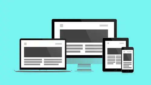
17:07 5Responsive Vocab: Floats, Flows, & Images
11:58 6Mobile First: Working Small
09:46 7Future Friendly: Embrace Unpredictability
14:17Collaborating with Your Clients
13:52 9Prioritize Your Users
39:42 10Best Practices for Defining Success
08:58 11Intro to Scrum
04:24 12User Stories & Epics
35:53 13Content Basics
27:40 14Defining the Visual Language
22:31 15Starting with Type
35:31 16Starting with Grids
15:40 17Gutcheck & The Product Brief
22:03 18Working With Developers
12:33 19Communicating with Developers
16:25 20Finding a Common Language with Developers
06:28 21Code Literacy
04:37 22Sitemap & Wireframe Basics
33:48 23Prototyping Basics
12:02 24HTML Prototypes
13:28 25Code Literacy & Developer Tools
11:46 26Developer Lingo
07:23 27Interface Personality & Behavior Galleries
17:27 28Designing for Performance
18:19 29Progressive Enhancements
07:00 30Designing a System: Discovery to Pattern Library
12:25 31Workflow Examples
20:25 32Applying the Style Guide to the Pattern Library
09:08 33Alternative Workflow
23:04 34Alternative Workflow Part 2
21:52 35Tech Requirements
21:53 36Retrofitting an Existing Site
12:15 37Project Cupcake: Building a Site from Scratch
24:08Day 2
Lesson Info
Get to Know Your Material
Next up, again, when we first drafted this workshop, we focused solely on work flows. And we thought that that was really what has changed. We still have, again, pretty things in the browser, but how we go about making those pretty things has changed. And so and especially with responsive that has changed. Initially this talk had the word responsive in it too. And we took that out. One of those reasons being we used to ask our clients if they wanted responsive, and now it's a given. It has to be. It's like this is how quickly the technology changes. So again, that's why it's a good thing to make friends. It's a good thing to open dialogue because I say many, many times a day, I have no idea what you're talking about. I say a lot, I don't know how to do that, do you? And then I learn. When you open your mouth and you finally admit that you don't know how to do something, that's how you sort of move a project forward. We are going to get more into how you collaborate with clients shortly...
. We are going to get more into how you collaborate with developers later. But at first it's designer me time, just for a second, we get a little bit of me time. This is getting to know your material. I read in some of the bios from some of you that the tech jargon is kind of confusing. Again like there's a lot of verbiage that gets thrown around more and more in tech. And that's true, and our hope here with this first segment is to kind of dispel some of that stuff and give you some keywords that are going to come up later on in other segments. And I like to think of things in the term of material. Now, again, everybody familiar with the idea of concept of metaphor in art making or the idea of metaphor into design. So this idea is that with webpages what we're dealing with is a bunch of information. In Photoshop, it's just a bunch of information. We have the metaphor of a dark room to help us give us cognitive clues to say, oh paintbrush, oh but that's not a paintbrush, and that's not a bucket. There's no such thing as a magic wand. But, at least in my world, but the metaphor tunes our brain in and says, oh, I know what a magic wand does, I've learned that. I know what a paint bucket does, I can use that. The same thing, we can begin to use the same concept as we sort of look at web design. So this is a quote concerning Google material design. Material design is guided by print-based design elements, such as typography, grids, space, color, and imagery, to create hierarchy, meaning, and focus that immerse one in the experience. Again the key thing here is paper. We take it as a given, that we think in paper when we look at the browser. It's flat, that's what we think. It's not flat, but it's a good illusion, it gives our mind something to wrap our heads around. And so the more I think about responsive and paper, I find myself using terms with the people I work with like fold, turn, bend, twist. So if you get to understand your material, you can really make beautiful things. But it's because you understand the underlying technology. I didn't write it, but I know what it wants to do. I listen to it. And I made the decisions based on what it does. So again we talked about this. This used to be something I heard, and I heard it a lot three years ago from everybody. A lot of times they were existing websites that needed to get converted. And now it's not even a question anymore, it's a given. So why is that? This, this is kind of scary, and it's kind of pretty at the same time. Does anybody know what this is? All the different sizes of screens? Yeah, this is the Android platform from smallest to largest. This is fragmentation. And this isn't pro or con Android Apple, Apple three or four, maybe a half a dozen. All of them, and the real fun part about this is they're going in both directions at the same time now. We used to just be going in one direction big, bigger tvs, and then we're like oh phones, let's get smaller. And now we're going in both directions like faster and faster, 5K displays, wearable devices, so what do we do? How do we get our heads around this? What stays the same when everything's changing? A simple idea, again, simple concepts. This is the stuff that I come back to again and again, no matter what the technology is doing. I have a canvas, it's the frame. It's the square rectangle. Motorola has circles now, there will be triangles in no time. But it's the frame within which I get to create composition. Right, we're all visual folks on some level. We understand composition. So this is my looking glass. This is where I get to put stuff. I get to determine proportion, contrast. I get to move the eye. Ethan Marcotte, smart guy. Actually came up with the concept of responsive design about four years ago I want to say. Four years ago, 10. The canvas gives the art a dimension and a shape, a width and a height, establishing a boundary for the work yet to come. Again it should be as designers I always, when I hear a familiar term, I feel a little warm and fuzzy inside. It helps me sort of like understand that I'm not in totally foreign territory. Developers call it canvas too, yay. This is a good thing. And so before responsive, I guess BR, things were one size. This is 960 grid system grid. I started every project with this. Every single one. When I launched Photoshop, I was looking at this, and this is how I began to measure proportion. This is how I began placing headers, footers, sidebars. It was my welcoming mat. It was how I sort of kicked off projects. And you should know like as you work more and more in web, these ideas are synonymous. Canvas, Viewport, browser window, these are all referring to the frame through which I look to see what I can see. And the grid, again, gives us a place to start. But our canvas isn't static. Our canvas is not print. Our canvas is highly unpredictable. So how do we deal with this? What do we do? We're going to talk about all the things that we can't do, trust me, it gets better. I don't want to set this up, it gets better, it gets better. So what we don't know, again, let's just make a list. It's like Andy talked about before, what we're not talking about. Let's just talk about what we don't know when we go to sit down and make a design. I have no idea the browser type. I think most people are readily aware that each browser is not created equal. More and more these days, as we can see, browsers are starting to play nicer, but this is a relatively like again community driven effort. This was not a given. Which seemed wild to me when I first started. Like I just thought, you know like what if you bought paper, and paper acted differently because it was made by a different manufacturer, like paper fundamentally didn't do the same things. That's crazy. So web browsers just in the last two years, there is standards that are locked in place, and again, progressively this gets more sort of fixed, but in the end, we don't know what that is. We started this segment with the device, which is what most people think of when they think of responsive, when they think of modern web design. I don't know how big it's going to be. So how do I design this multi-column experience with all this stuff going on, and then fit that into this? What am I doing? More and more recently it's not just the size, but it's also the resolution, the pixel density. Now I can have two devices, an iPad first generation, an iPad nine, 10, whatever they're on now, and it's a completely different resolution. So I can't use physical size anymore as a thing I can tell my website to say, when I see this, do this. I can't just use size, I have to begin thinking resolution. Subtle things that I think as designers, we need to be thinking about, is one, viewing distance. So small and large, I don't use my devices the same way. You know like, I use devices differently. So it's not just the size of it, it's how far or close it is from my eyes. The other thing is context. Where am I using this device? So all these things as designers, these behaviors, are going to influence where we place items on the page, where we place actions, and what we expect users to do intuitively. So what stays the same? See, I told you we were totally going to get here. Got here, yes. Alright, so, modern word processor. I type, this is me typing, like the worse typist. Wow, are you like palm typing? I don't know, it's like Mickey Mouse typing. My cat types better. (laughter) Big buttons. If I start typing, is this better? If I start typing into a word processor, text moves to the side, right? What happens when I hit the side? It goes down, sweet, that's really cool. Otherwise I just keep typing, keep typing, keep typing into infinity. So, browsers do you one better. Not only do they do that, but they have key commands. So this is a website, let's jump out and do some demo stuff. You guys have been staring at slides and big text and solid color all day. Let's look at some black and white stuff. (laughter) So again, I start typing into my word processor, I hit the side of the wall, my text drops down to a second line. This is just raw, so this is code pen, a great tool we'll get into more in later segments. But just to let you know what's going on here, on the right, this is html. No formatting, no html brackets, no nothing. This is text in a document in a browser. No styles, no CSS. Mind blown, what, what. It's responsive, wait, I just paid my designer how much money to make my website responsive? And it's responsive already. This should be really good news right? All these formal design methods that we've learned as print designers, to lock things into place, are actually getting in our way. Web design, web pages want to be responsive. They want to reflow. So how can we help them do that? Free the flow, right. So again, code pen, we're going to look at in a later segment, how you can do this within Chrome itself, without a secondary tool, using something called developer tools. But let's keep going with the larger talk at hand. So sweet, the less work the better. The browser's naturally responsive by default. All this bad news. And so but as we start, you know we still want to use all these bells and whistles, we still want to have images. Right, I still want to have styles. I still want to have like an idea of a grid. So Ethan Marcotte, again, outlined for us three simple steps in order to maintain the natural responsiveness of the browser and still get all those bells and whistles. First thing, flexible grid. We looked at grids before. Grid 960, grid 1200, whatever, there's a million of them. You can have as many columns as you want, or pixels. But they're not sufficient the way they're currently written. They're too stiff, we're going to find out how to make those flexible. The second thing, responsive images. A very simple rule, one piece of CSS that neatly makes all of our images responsive and for free you'll get to see what that is today. And the last piece, the probably hardest to get your head around, is the idea of media queries. So again, flexible columns, take the rigidness out of our columns, make them stretch like an accordion. Responsive images, one CSS rule will apply to all images that will make them squishy too, and then this other voodoo called media queries, which we'll just talk when we get there. So flexible grids, we looked at this already. This might even be the same text from the previous slide. But something's going to change. We just looked at this, right? We flowed some text into a browser, we resized the browser, and we saw the text did not break, it's not that brittle, it wants to reflow. How can we maintain this with the idea of columns? We have to change the way we measure columns. Instead of using pixel measurements, each column 100 pixels, we're going to use percentage measurements. Depending on the screen, again to keep it really simple at first, two columns, each column 50%. All of the sudden now as I shrink and grow the browser, I get columns. So here is a quick demo again on code. Let me actually use this one for ya. So again, I have this top section of text and a container. I have this bottom section of text and a container. With a small piece of CSS, which I'm going to uncomment out. So commenting in html land is a simple way to tell the CSS processor not to look at this code. I'm not here, it's camouflage, it's a disguise. So I'm going to uncomment that out, so again, that's it. These two rules, float left with 45%. I'm telling each of these components to take up 45% of the screen, and I'm telling each of them to float to the left.
Class Materials
Bonus Materials with RSVP
Bonus Materials with Purchase
Ratings and Reviews
CityGirl
I've already taken several web design classes, but there were still some details that I found confusing. Andy and Jesse did a great job of explaining things like; programming languages and how they interact to form the structure of a site, work flow responsibilities between team members and the blurry lines between them; and agile methodologies applied to work flow. They used case studies to illustrate how this all happens, where variations crop up, and how to address them. If you're new to web design, or just want to understand the functions of other team members, this is a great real world look at the whole process. I haven't found this in any other class, either on-line or local. Andy and Jesse are both very experienced working designers with current knowledge. They're very responsive to questions and seem to really enjoy teaching. Having two instructors is a great benefit because you get double the perspective, knowledge, etc.
Junko Bridston
I worked with Andy when he was a Creative Director at Funny Garbage, a design studio in New York City. I found him to be knowledgeable, articulate, and lovely to work with. I learned so much from him at the beginning of my career. In response to a previous comment: it seems silly to dismiss this class because Andy wears t-shirts with his blazers. If you think leaders only wear suits and ties, then maybe this class isn't for you. But if you want to learn from someone with loads of experience and a friendly manner, I really recommend it. You won’t be disappointed.
Jesah Segal
From A to Z, this class methodically covers everything you need to know to create a website from scratch. Great class. The teachers are great too.
Student Work
Related Classes
Branding