Future Friendly: Embrace Unpredictability
Lesson 7 from: Modern Web Design DemystifiedAndy Pratt, Jesse Arnold
Future Friendly: Embrace Unpredictability
Lesson 7 from: Modern Web Design DemystifiedAndy Pratt, Jesse Arnold
Lesson Info
7. Future Friendly: Embrace Unpredictability
Lessons
Day 1
1Class Introduction
09:10 2The Design Flow Basics
18:27 3The Designer as Co-Creators
06:48 4Get to Know Your Material
17:07 5Responsive Vocab: Floats, Flows, & Images
11:58 6Mobile First: Working Small
09:46 7Future Friendly: Embrace Unpredictability
14:17Collaborating with Your Clients
13:52 9Prioritize Your Users
39:42 10Best Practices for Defining Success
08:58 11Intro to Scrum
04:24 12User Stories & Epics
35:53 13Content Basics
27:40 14Defining the Visual Language
22:31 15Starting with Type
35:31 16Starting with Grids
15:40 17Gutcheck & The Product Brief
22:03 18Working With Developers
12:33 19Communicating with Developers
16:25 20Finding a Common Language with Developers
06:28 21Code Literacy
04:37 22Sitemap & Wireframe Basics
33:48 23Prototyping Basics
12:02 24HTML Prototypes
13:28 25Code Literacy & Developer Tools
11:46 26Developer Lingo
07:23 27Interface Personality & Behavior Galleries
17:27 28Designing for Performance
18:19 29Progressive Enhancements
07:00 30Designing a System: Discovery to Pattern Library
12:25 31Workflow Examples
20:25 32Applying the Style Guide to the Pattern Library
09:08 33Alternative Workflow
23:04 34Alternative Workflow Part 2
21:52 35Tech Requirements
21:53 36Retrofitting an Existing Site
12:15 37Project Cupcake: Building a Site from Scratch
24:08Day 2
Lesson Info
Future Friendly: Embrace Unpredictability
And so this idea of linear design. When you're designing, you're designing a totem pole before you're designing a grid. Stack the most important object first. Secondary object next. And some of your content isn't even informed yet. So some of this isn't just most important, next important. It's context. You have to provide a context in order to give me an action to do. I'm not gonna share your blog article until I read it. So, please don't put your share buttons at the top of the screen. Well, I haven't read it. Why would I share this? I don't even know you. You wanna share 'cause you wanna kind of make people think you read it. Right? Oh yeah, yeah, yeah, yeah, yeah, yeah, yeah, yeah, yeah. That's what it is. But so again, these are stories that we sort of tell ourselves as we being designing and the questions we need to ask ourselves. So, this last piece. We've gone mobile first. We know our material. We spent some time in the sandbox, playing with paper. We started mobile fi...
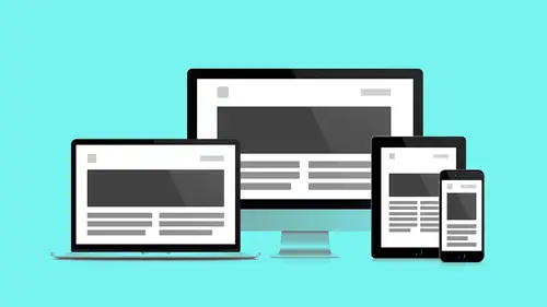
rst. We kept our ideas nice and lean. And we started to build and prioritize stuff. So now where are we goin'? What did I say earlier? I have no idea. Like, Moises, like you brought up. I have no idea. I don't know. If people use it I better get used to the idea. So, we need to work in such a way where we're okay with not knowing. We can't like rigid, fixed measurements won't do. We need to be more adaptable. So, the Future Friendly Manifesto Josh Clark, Brad Frost, and others, Jeremy Keith I think, lots of folks. Web designer type guys and developers, "By anticipating what's next, we can react to today's concerns but also build long-term value for people and businesses." So again, with an eye to the future, and not just set on, what are people doing right now, we can have the most options. We can set ourselves up to be adaptable. There's three concepts here that I wanna sort of talk through before we wrap up this segment. The first one is progressive enhancement. Progressive enhancement, two long words put together, builds naturally on mobile first. And we're gonna talk about how as we build small how do we begin to add layers? How do we think about that? Second is modular components. So we know we've got this push pull thing happenin' in the browser, right? Flowing and floating. That requires this object and that object to be things. So these are modules. As long as I have a module relationship with my design I'll have more options when it comes to responsiveness. And the last piece you don't have to dread anymore. Again, it's baked in. Testing. So we make guesses. We make assumptions. We put 'em in the browser. And then, we put 'em in front of people. And people use 'em. And they tell us what, what's right and what's wrong. So first, progressive enhancement. So how do we stay accessible with new technologies coming online every day. Progressive enhancement teaches us again, content first. Primary actions first. Everything nice to have second. It's a way to solving problems that's additive and not subtractive. Again, the way we used to design websites. Big multi-column experiences. I have to have a slide show out of the gate. You know. I gotta have my mp3s live streaming when the user shows up. I've gotta have all this stuff. But thinking in a subtractive way kinda just like doesn't feel so good. It feels so bad. It's gotta horrible name. So like, graceful degradation is actually a word that we used everyday to talk about the way we worked. I just feel dirty lookin' at it. (laughing) So, it focused on building the website for the most advanced, capable browser. And then taking stuff away. It just went on the chopping block. You know, as new devises came out, let's get rid of that, let's get rid of that, let's get rid of that. And the motto was, "Get it to work." I don't care. Does it work? No. Well take out that part. But I need the part. It tells the story. Get it. So, compromise, compromise. And it just, as a designer doesn't feel very satisfying. 'Cause they're all, these are all afterthoughts. I wanna be involved as a designer from the very beginning. I want to know, no matter what view port, the critical design elements in my mind are included. And it's only that sort of nice to have stuff that gets added in. So as, we reverse the flow. It's not going down. It's coming up. We start with core content and components. And then we add bells and whistles. I shoulda added a bunch of bells and whistles. (laughing) Next time. Next time. Next time. Maybe in the takeaway version. So, the philosophy of mobile first allows us to grow our feature set as a series of nice-to-haves for users who appreciate these features. I don't wanna give somebody retina images if they don't have a retina display. I only wanna give them retina images if they have the display to actually see that stuff. So in the end, it helps up cut down on bloat. And helps us, again, further ensure designing for reach and getting to, our product and our feature and our content in front of the most people that we can. A couple more concepts here. Modular components. So, this, we are building small first. And we're, the other thing that we'll get into in later segments is we're getting away, away from the idea of pages. Like, again, it's in the name. I design web pages. I'ma web page designer. We wanna actually kind of shift that a little bit. "What is an interface made of? What are my lego bricks. What are our Subway sandwich pieces that we combine into millions of delicious combinations?" I was really wondering what it would feel like to say that. It's awesome. (laughing) Brad Frost. Smart guy. Really progressive thinker. Member of Future Friendly Group. Has a product and a way of thinking that we'll look at later. And it teaches us to be modular. Again, going back to our flow and float idea. It's not just screen sizes that are changing. Like, websites, different instances of a website are different for different people. Let's say they're a profile site on a social network. Somebody has two lines in their bio. Another social, another person in the same social network 50 lines. I need the interface to flex. The only way to anticipate that is to think in modular separation. Understand that that profile widget is a piece of the interface. So as it grows, I can't have this other stuff in my way. I need to let that piece grow. And so as we work, as we sort of talk more, we'll talk about how we can do that. So let's step back, and again look at Brad's metaphor for atomic design. Most of us are familiar with basic chemistry. The idea of atoms, molecules, and organisms. All websites, all HTML, that crypto stuff we looked at before, the stuff in black, there's only so many HTML elements. I kinda wish I had a slide of this here. Somebody made a, the periodic table of elements, and you can actually contain all standard, not even, of substandard, HTML elements within that volume. That's the aray. So it's not infinite. People aren't makin' new ones. Well they are but they're slow to take off. So what we have is a limited palette of options. But how we put them together is sort of infinity variant. We can makes lots of really cool things with this limited palette. So, again, we're gonna use Brad's metaphor here, in chemistry atoms are the basic building blocks of matter. They have distinct properties and can't be broken down further without losing their meaning. And by themselves, atoms are kinda like, eh, they don't really do a whole lot. Just a word. It's just box I can type into. And a button by itself, connected to nothing, isn't a whole lot. So translated into interfaces, atoms are the basic tags, forms, labels, and inputs and they also include some abstract elements like color, fonts, and animations. But again, building blocks. All independent. Having no relationship to each other. That's our palette. We begin putting these atoms together. Ah, I recognize that thing. So in chemistry molecules are groups of atoms that are bonded together that take on new properties. So now my independent label that was just a piece of text. This input box that was just something I could type in. And this button, when combines have a function. Now I can search with this thing. This is my molecule. This is, now I've, I've fixed this in place. Now I can begin designing the rest of my interface. And that's, this is where I spend most of my design time. Is in the molecule organism stage. Because, the atoms are givens. I'm gonna skin the atoms, sure. But as I get into actually designing UI it's, I wanna design my molecules and organisms specific to this product. I don't start with a preset set of pieces when I build because I think that leads to bloat and excess. I like to take, work with a developer, work with the product owner, and figure out, how do I best design my lego blocks specific. It's like the Star Wars lego blocks. Or way cooler than the standard generic lego blocks. You know? Because they're specific to a specific item. I might not be able to reuse them as much. But they do what they need to do. So, when you're building these things, you should know it's not a matter of just building a framework and being done. But customizing that framework so it's efficient and lean, and specific to that product. You put a bunch of molecules together and you start to get parts of the page. And these are organisms. So, an organism is a group of molecules, and atoms. 'Cause like, this logo, that's an atom. But that navigation, that's a molecule. And the search bar is a molecule. Together, they're an organism. And they're part of the interface. Again, that, a developer will now use and populate all pages of your design. You don't have to redesign that. It's been designed. It's done. Put it in the can. So now your designs are gonna be anything but that. 'Cause you've closed that off. And this is how your developer works. Your developer also works in parts and pieces. So again, we're designing systems not pages. We're designing a way to put things together. Not the finished product. Which leads us to testing. The last part, piece of the segment. Again, used to really dread this. I think it was the browser thing. I think it was the browser thing. Because it was the last thing I did. I didn't do it from the beginning. I did it later. So bad. Just because, like, I would have to undo all of this stuff. And it was just a lot of work. And it, and yeah. Jeffery Zeldman will finish our quadrafecta of Ethan Marcotte, Luke W, Brad Frost, and now Jeff. All Event Apart speakers. The stuff, and Jeffery said this this last year at Event Apart here in San Francisco, "The stuff that happens when you're not in the room with the user, that's the design." I love this. All this other work you did. All this strategy. All this, like, stuff. That's, it doesn't mean anything if the user can't click on the button, get what they need, read the content, make a donation, find out about somebody on the other side of the world. Nothin' that you do like, really proves the point unless a user can actually do that thing. It keeps me humble. It keeps me really, like, really trying to win over the sort of testing stage. In this general, yeah, so designs need to be used. The term is called usability. The cool thing about responsiveness is it's, like, adding a handicap to testing. I'm not just testing one view port. Testing is now more rigorous because I don't know what the view port is. If I was just testing one view port I'd be done in a week. But I'm not. I'm testing a variety of view ports. And a variety of scenarios. That's why testing exists alongside design. Alongside development. Alongside product exploration. So, yeah. Small phrase. Test and test again. (laughing) So design early and often. Keep that browser DEV inspector open. We'll look at other products later that can help the browser stack. Other products that do device emulation. Keep that open. Keep testing. Design for the lowest spec first. And enhance. And this is gonna keep you humble. And this is gonna keep you working in the right direction. So, thank you.
Class Materials
Bonus Materials with RSVP
Bonus Materials with Purchase
Ratings and Reviews
CityGirl
I've already taken several web design classes, but there were still some details that I found confusing. Andy and Jesse did a great job of explaining things like; programming languages and how they interact to form the structure of a site, work flow responsibilities between team members and the blurry lines between them; and agile methodologies applied to work flow. They used case studies to illustrate how this all happens, where variations crop up, and how to address them. If you're new to web design, or just want to understand the functions of other team members, this is a great real world look at the whole process. I haven't found this in any other class, either on-line or local. Andy and Jesse are both very experienced working designers with current knowledge. They're very responsive to questions and seem to really enjoy teaching. Having two instructors is a great benefit because you get double the perspective, knowledge, etc.
Junko Bridston
I worked with Andy when he was a Creative Director at Funny Garbage, a design studio in New York City. I found him to be knowledgeable, articulate, and lovely to work with. I learned so much from him at the beginning of my career. In response to a previous comment: it seems silly to dismiss this class because Andy wears t-shirts with his blazers. If you think leaders only wear suits and ties, then maybe this class isn't for you. But if you want to learn from someone with loads of experience and a friendly manner, I really recommend it. You won’t be disappointed.
Jesah Segal
From A to Z, this class methodically covers everything you need to know to create a website from scratch. Great class. The teachers are great too.
Student Work
Related Classes
Branding